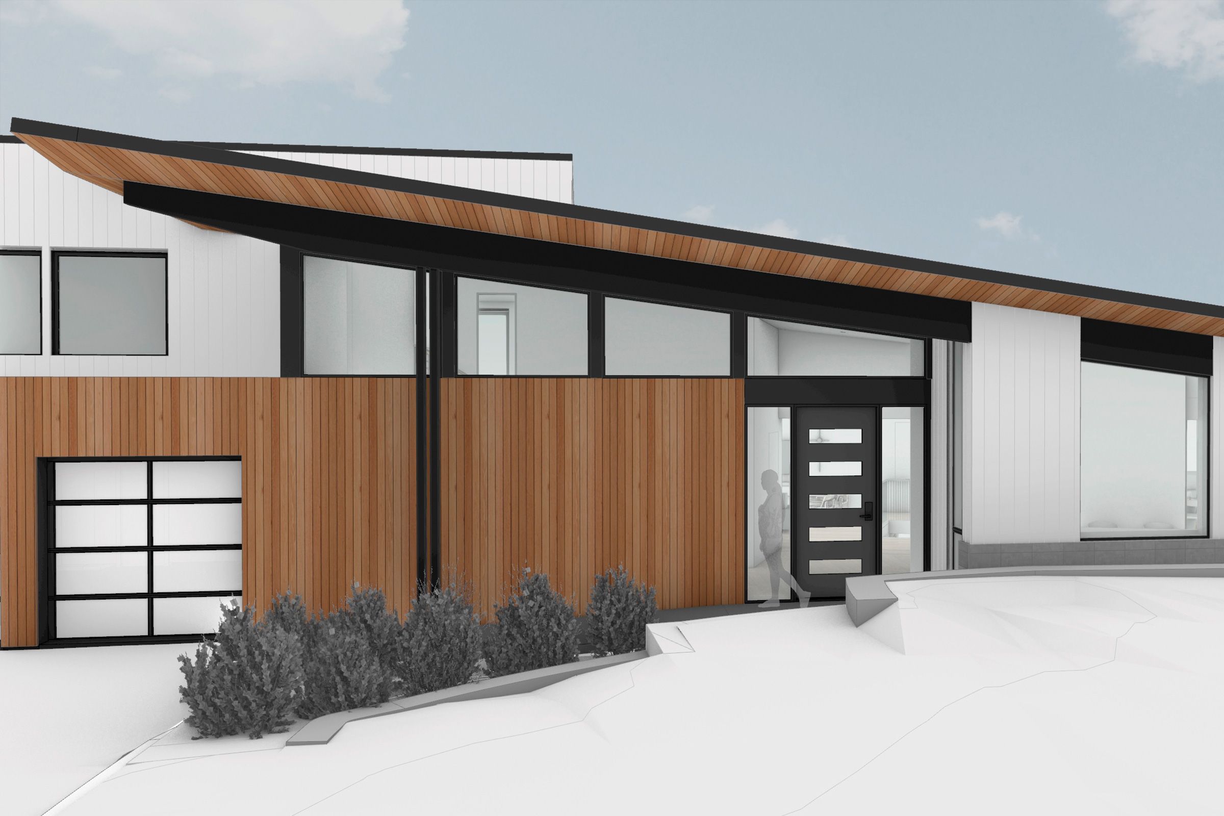
Imagine arriving home and effortlessly moving inside via a front door that opens with the touch of a button, no steps to climb or threshold to step over, and lights that go on when you say so. While everyone can enjoy a welcome like that, it’s especially important for a family member with mobility issues.
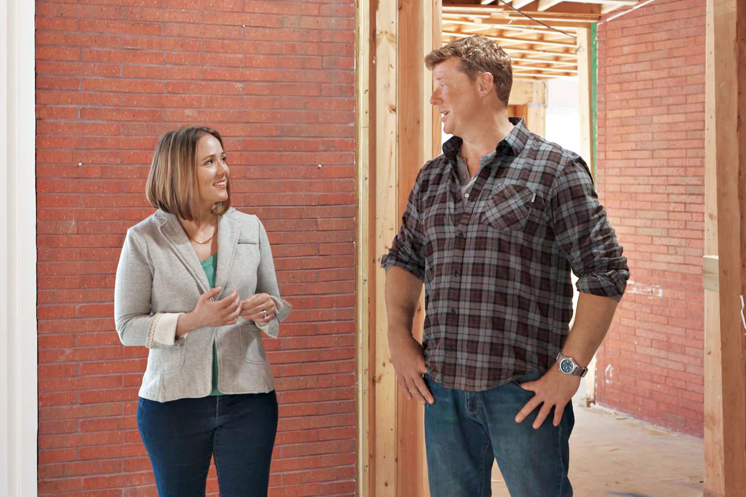
The Centers for Disease Control and Prevention estimates that more than 10 percent of Americans have a serious mobility challenge—and many more will face similar difficulties as the population ages. “Even without a disability, many people simply want to age in place, and that means thinking about details around the house that can make all the difference,” says This Old House host Kevin O’Connor.
TOH’s Lexington project house renovation is driven by a need for accessibility, as homeowners Billy Lester and Michelle Werner work to create a home equally comfortable for all five members of their family: 13-year-old Caffrey, who has Duchenne muscular dystrophy, a rare muscle-wasting disease; daughter Marlowe, 12; and oldest son Wix, 16; as well as themselves. Working with architect Sandra Jahnes, accessibility consultant Jackie Dobson, and interior designer Rachel Dunham, the couple understood early on that accessible design needs to be specific to the individual.
“ADA standards can be a useful baseline, but they are not required for private residential space and are written to suit a wide range of abilities,” says Dobson of accommodations such as ramps and curb cuts required by the Americans with Disabilities Act. “At home, you want customized accessibility.”
For Billy and Michelle, that translated into decisions throughout the house—from the front entry’s ramp to the kitchen’s touchless faucets to the elevator leading to the basement rec room—so that Caffrey has access to everything Wix and Marlowe do.
Because Duchenne is progressive, the family has to plan around some unknowns. “Stairs are difficult for him now and will be impossible when he’s in a wheelchair, but we don’t know exactly when that will be,” says Michelle. “We think about accessibility as how to accommodate his needs now, and in the future.”
Getting In and Out
Rarely are the entry points into a house seamless; typically, there are at least a few steps to negotiate, if not a steep climb. When an accessible entry is required, many homeowners are faced with retrofit options such as an aluminum or wood ramp or a vertical lift. Here, the architect’s redesigned front facade gives the house a more cohesive look and includes an integrated front ramp for accessibility.
“The aim was to use the roofline to gesture toward the original mid-century structure, and that also gave us the opportunity to integrate a covered ramp to the front door that feels like something to be celebrated instead of simply a functional necessity,” says Jahnes.
Technology truly can improve lives: Take home automation. The Lexington homeowners researched systems that turn on lights and open doors by pressing a button, waving a hand, using an app, or voicing a command to a sensor.
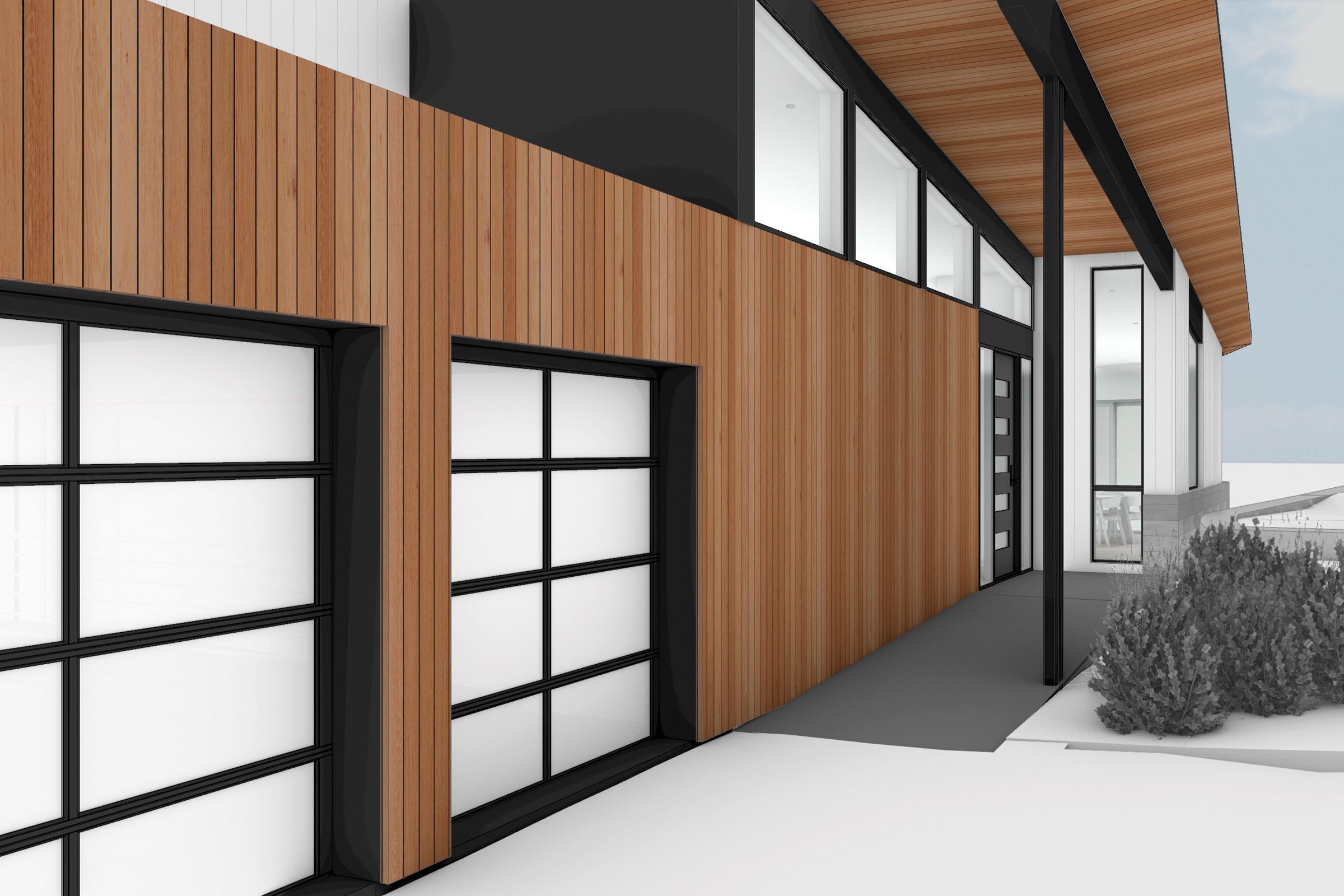
- Eliminating Steps: Previously, the house had a couple of steps up to the front door, with slightly more than 1 foot of elevation change. The architect’s design calls for a 19-foot-long, 51⁄2-foot-wide bluestone ramp that begins at the edge of the driveway and continues in a straight shot up to the new front door.
- A Gentle Slope: The ramp’s gradual incline of approximately 1:16 is gentler than the ADA recommendation of 1:12, meaning every 1 foot of vertical rise requires 12 feet of horizontal run. “Too often, a ramp looks tacked on,” says Jahnes. She prioritized ease of entry and creating a design totally integrated with the yard and house: A 9-foot-wide landing at the front door transitions to an accessible walkway that will run around the dining room and, eventually, all the way to the rear patio.
- Flush Thresholds: In addition, all the new entries into the house are designed with flush, zero-clearance thresholds, a welcome feature for everyone, as it eliminates potential trip hazards. For now, an existing rear entry near the garage will retain its steps, but it can accommodate a ramp in the future.
Making Daily Life Easily
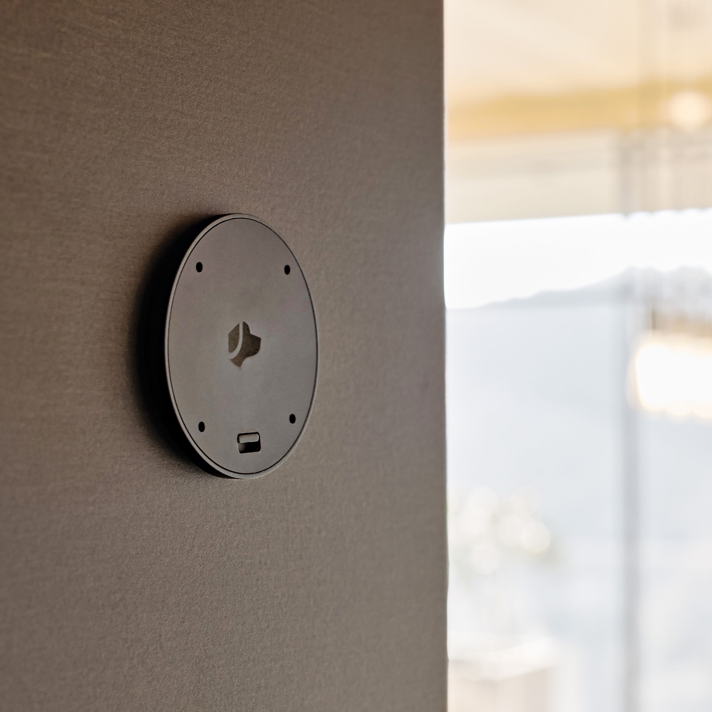
- Motorized Doors: For the key doors that Caffrey will use (into his bedroom and out to the patio) as well as the sliding patio door from the kitchen, a motorized system makes opening as easy as pushing a button.
- App-Based Lighting: All the lights will be operated by an app-based system.
- Voice Activation: The long- term plan is for motorized doors, lighting, and other features to be voice activated using sensors (such as Josh Nano) and a whole-house control center. To handle it all, at least two CAT6 data wiring outlets are being installed in every room now, one for Internet, another for future voice control. “Eventually,” Billy adds, “voice activation will control lights, doors, everything.”
A Barrier-Free Bath
Nowhere in a house is the need for customized accessibility more apparent than in the bathroom, where careful fixture placement is paramount. Jackie Dobson made numerous recommendations for Caffrey’s bath, which is part of his bedroom suite.
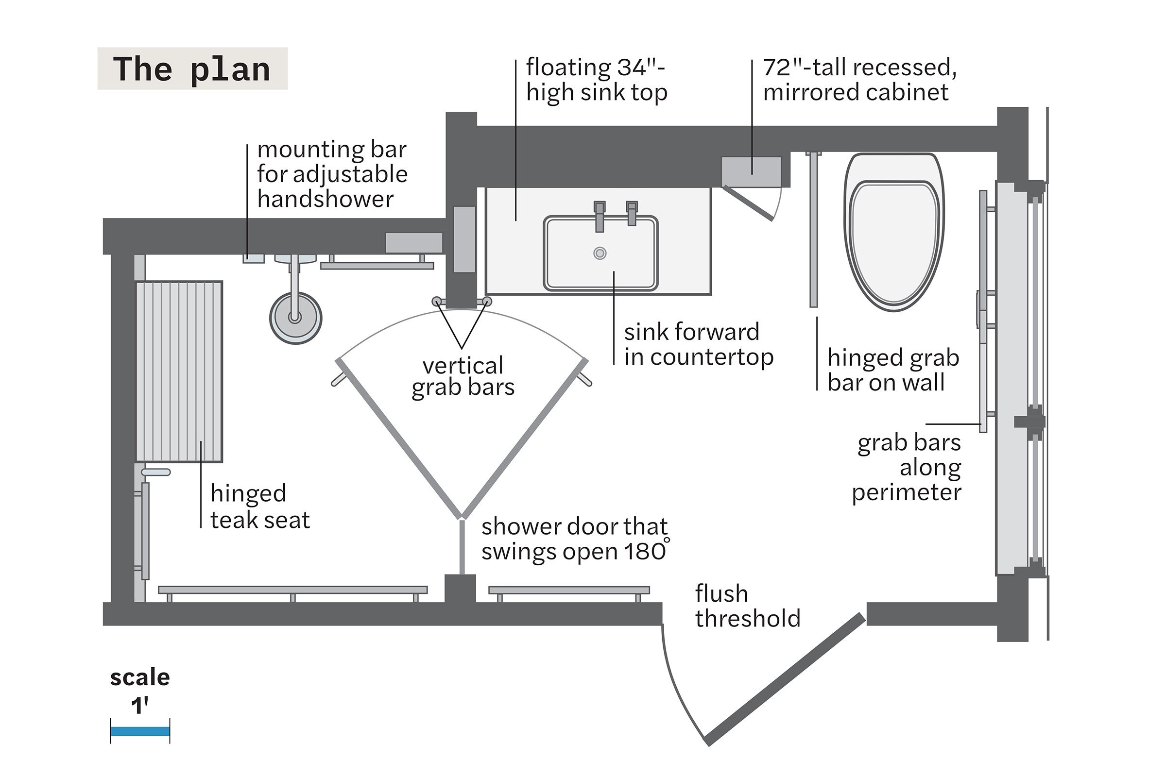
- Sink and Counter Locations: “There are 19 dimensions involved in choosing the sink, faucet, and countertop locations alone,” says Dobson, who factored in Caffrey’s current and future reach range, trunk strength, and ability to balance when determining how close to place the sink and faucet to the edge of the vanity.
- Shower Safety: In the shower, Dobson advised making the controls easily accessible for someone seated as well as for someone who may be assisting. A mounting bar— this one doubles as a grab bar—allows the handshower to slide up and down to easily be positioned within reach; a second holder will be mounted near the shower entry. The shower is curbless for ease of entry, and interior designer Rachel Dunham specified rectangular black mosaic tile for the floor to ensure slip resistance.
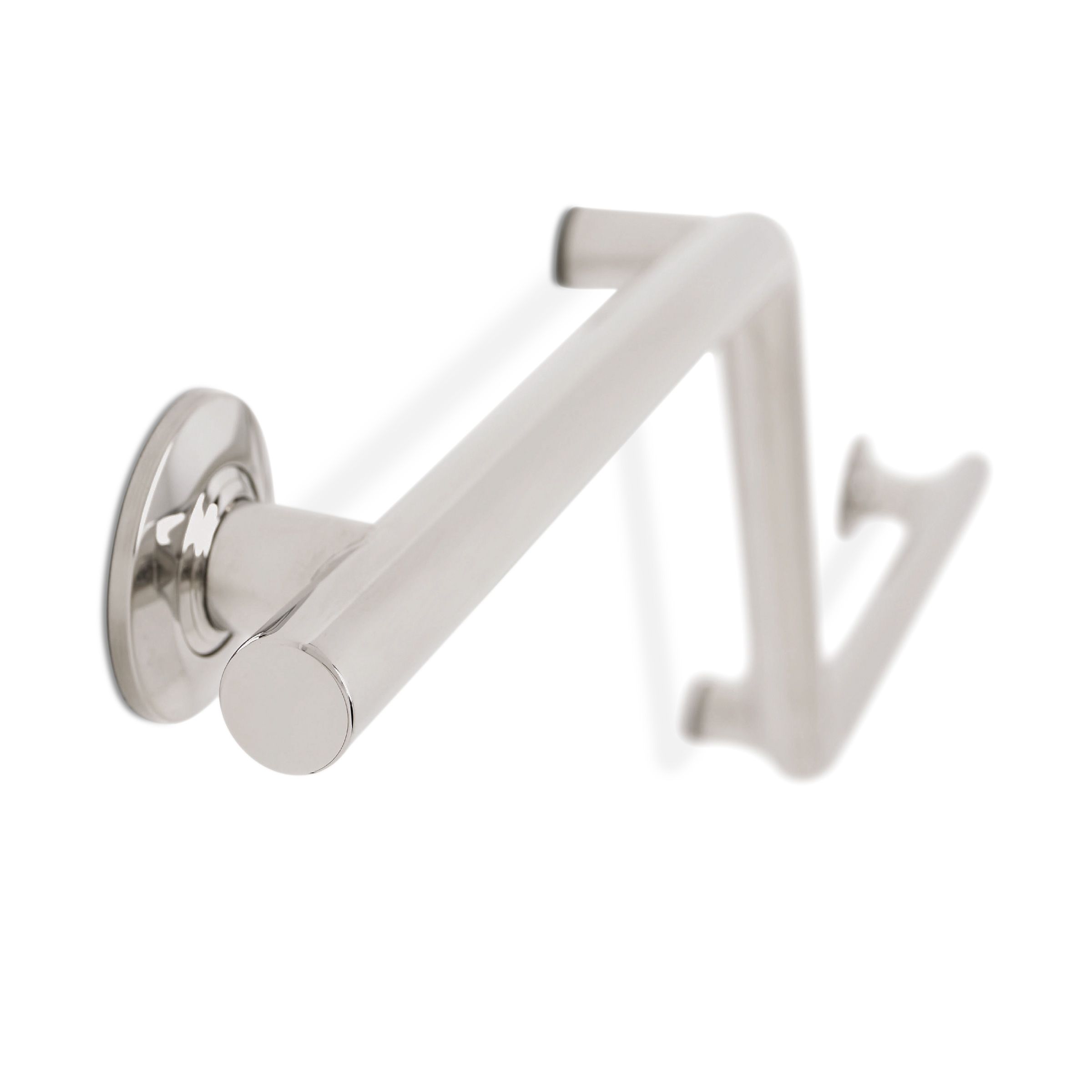
- Stability Bars: All four walls feature grab bars. “There are so many dual-purpose grab bars available now in a range of styles—shampoo-shelf grab bars for flat walls or corners, grab bars with a separate integrated bar for towels, soap-dish grab bars, toilet-paper holders that also act as grab bars, and more,” says Dobson. “It’s easy to find ones that blend in.” She included an innovative, modern-looking zigzag design near the toilet.
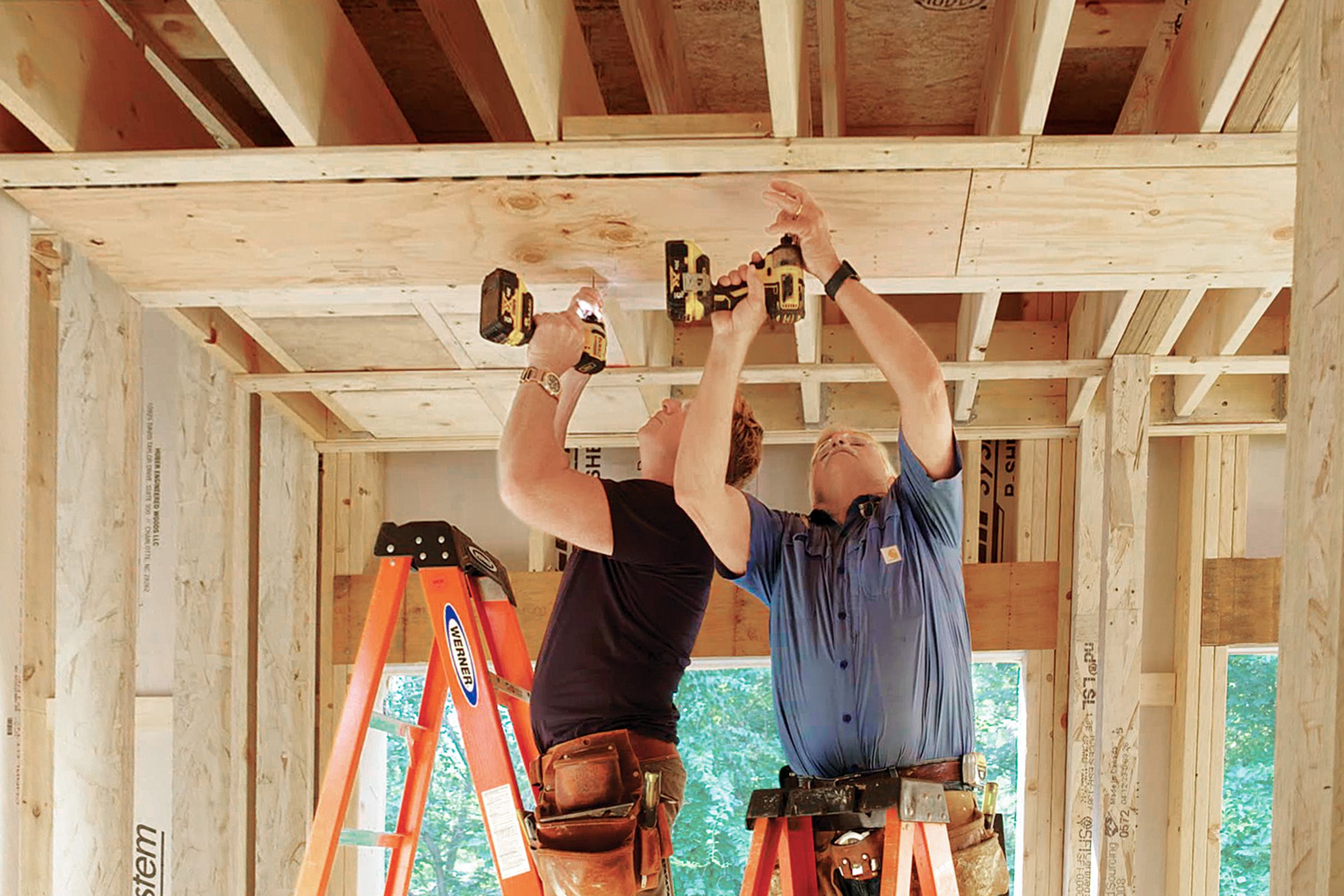
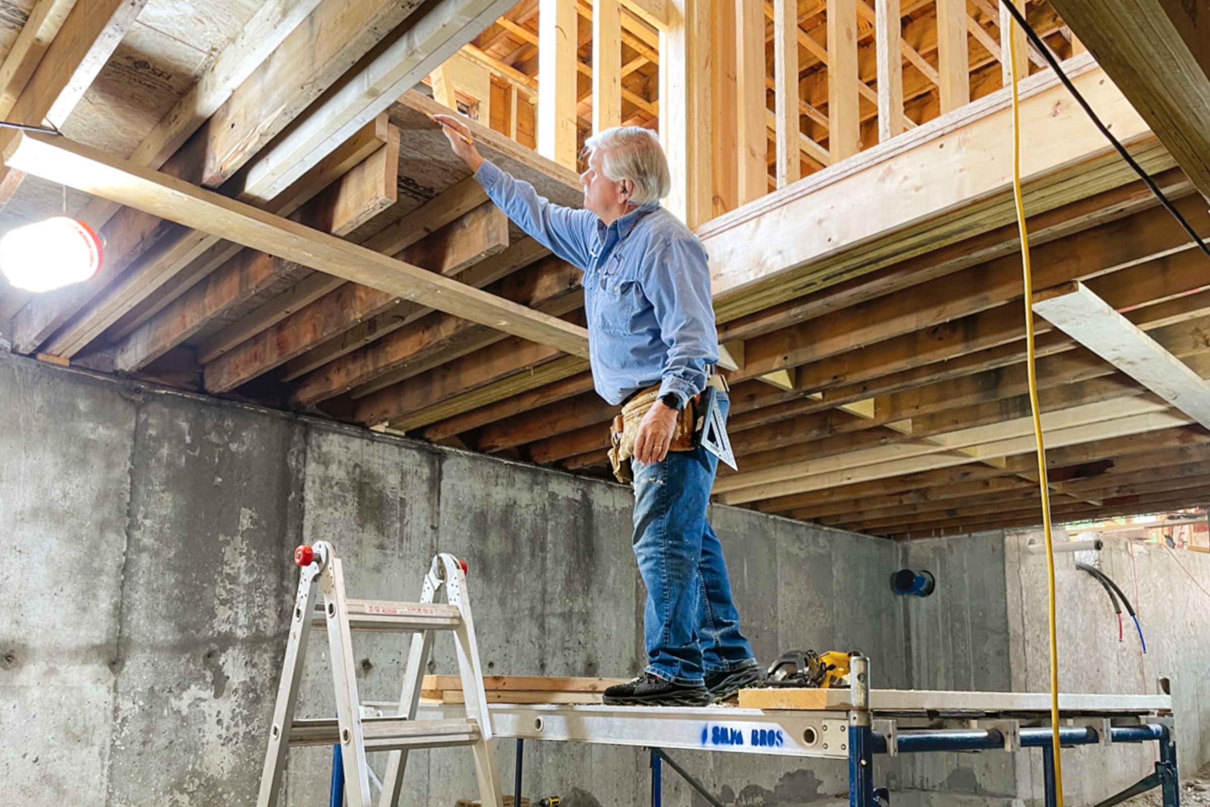
- Future Proofing :The TOH crew worked at the framing stage to ensure grab bars and a future lift system’s ceiling track in Caffrey’s suite would have the proper support by adding blocking in the bathroom walls and in his bedroom and bath ceilings. “Framing is the right time to do the blocking, while the walls and ceilings are open,” says TOH general contractor Tom Silva, who notes that here they added blocking in all four walls to support grab bars that will ring the room.
Supportive Choices
Thoughtful product picks foster independence.


One Kitchen for Everyone
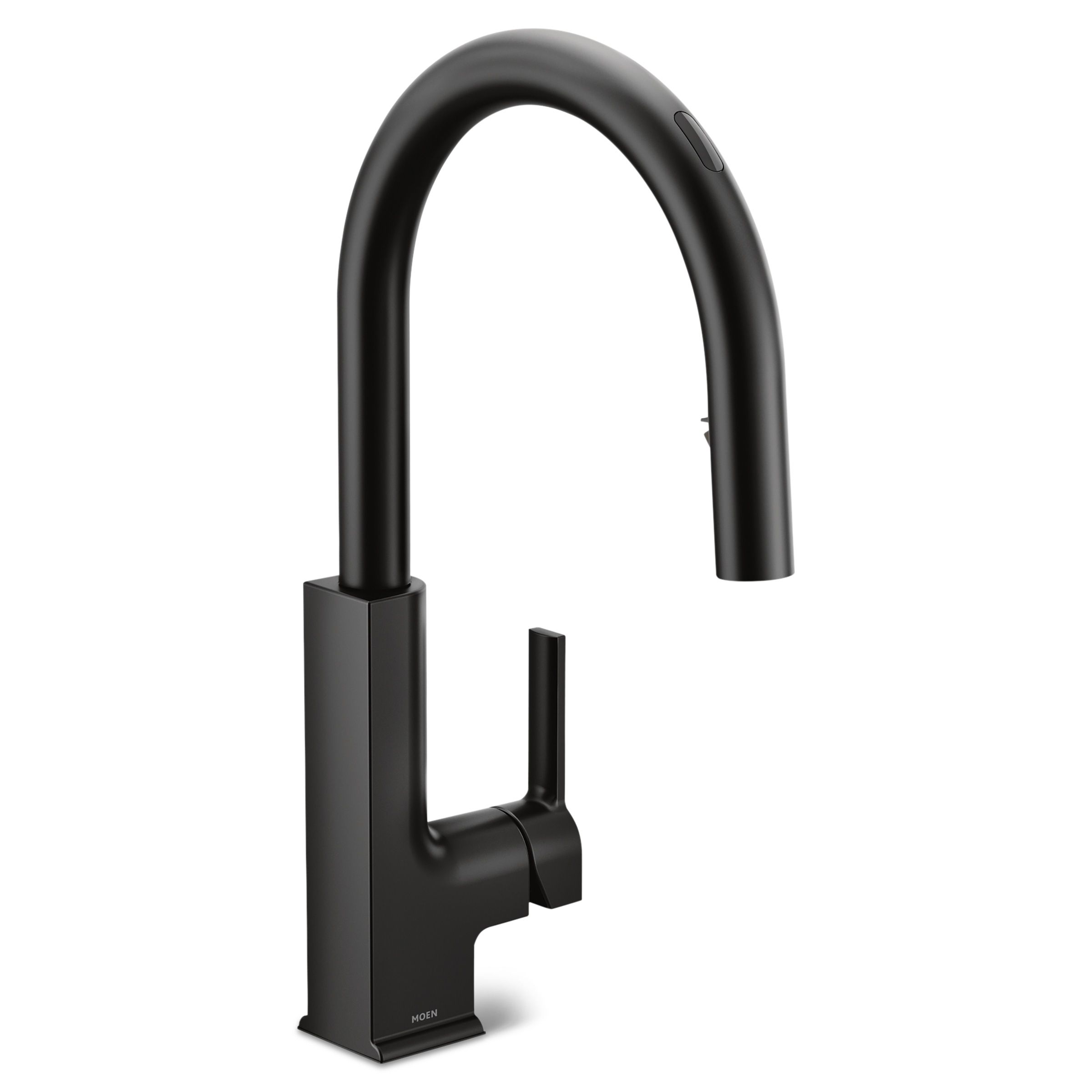
The new open-plan layout provides an accessible framework, with traffic corridors in the kitchen that range from 4 feet to nearly 5 feet wide and a benchmark 5-foot turning radius for a wheelchair in key spots. “Caffrey will never find himself in a corner where he can’t navigate,” Jahnes says. Billy and Michelle field-tested appliances and cabinets for accessibility and function, keeping aesthetics in mind.
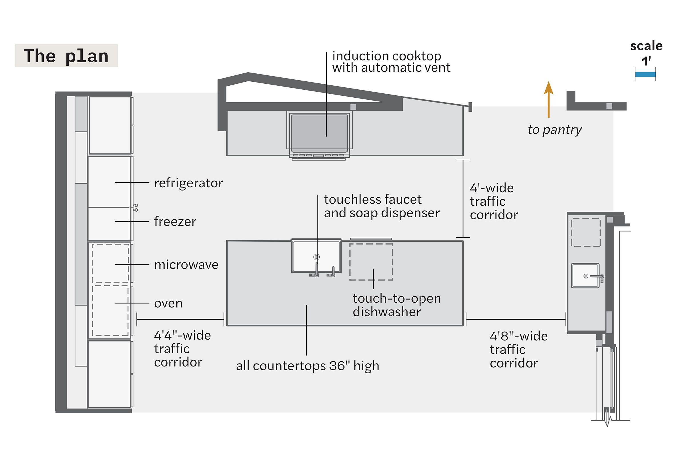
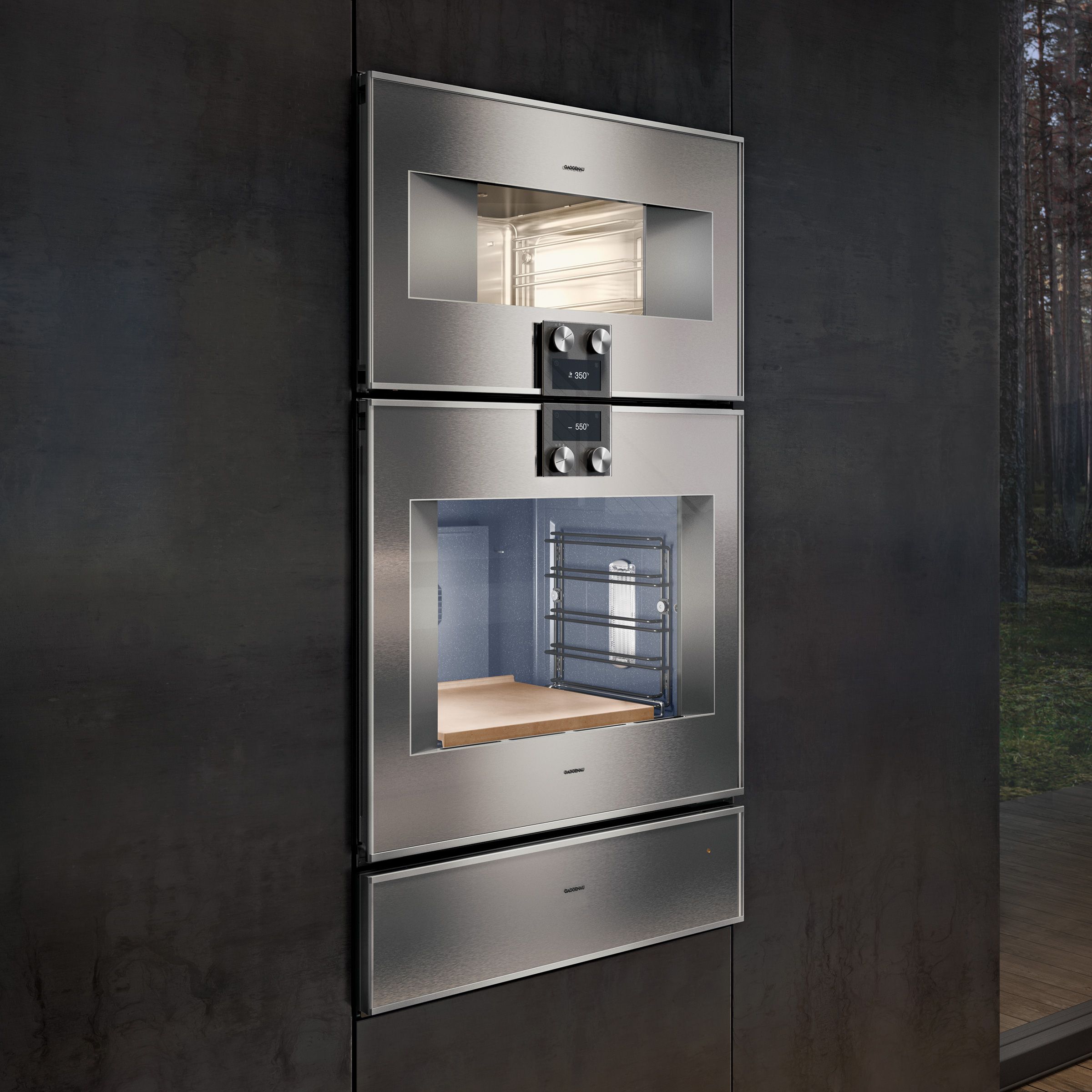
- Appliance Insights: Billy found that just because an appliance was labeled as ADA compliant, that didn’t mean it would necessarily work for their needs. Among his key discoveries: The weight of the refrigerator door was more important than automated seal breaking; not every touch-to-open dishwasher fully released on the first try; and ovens with side-hinged, swing-open doors are easier to access.
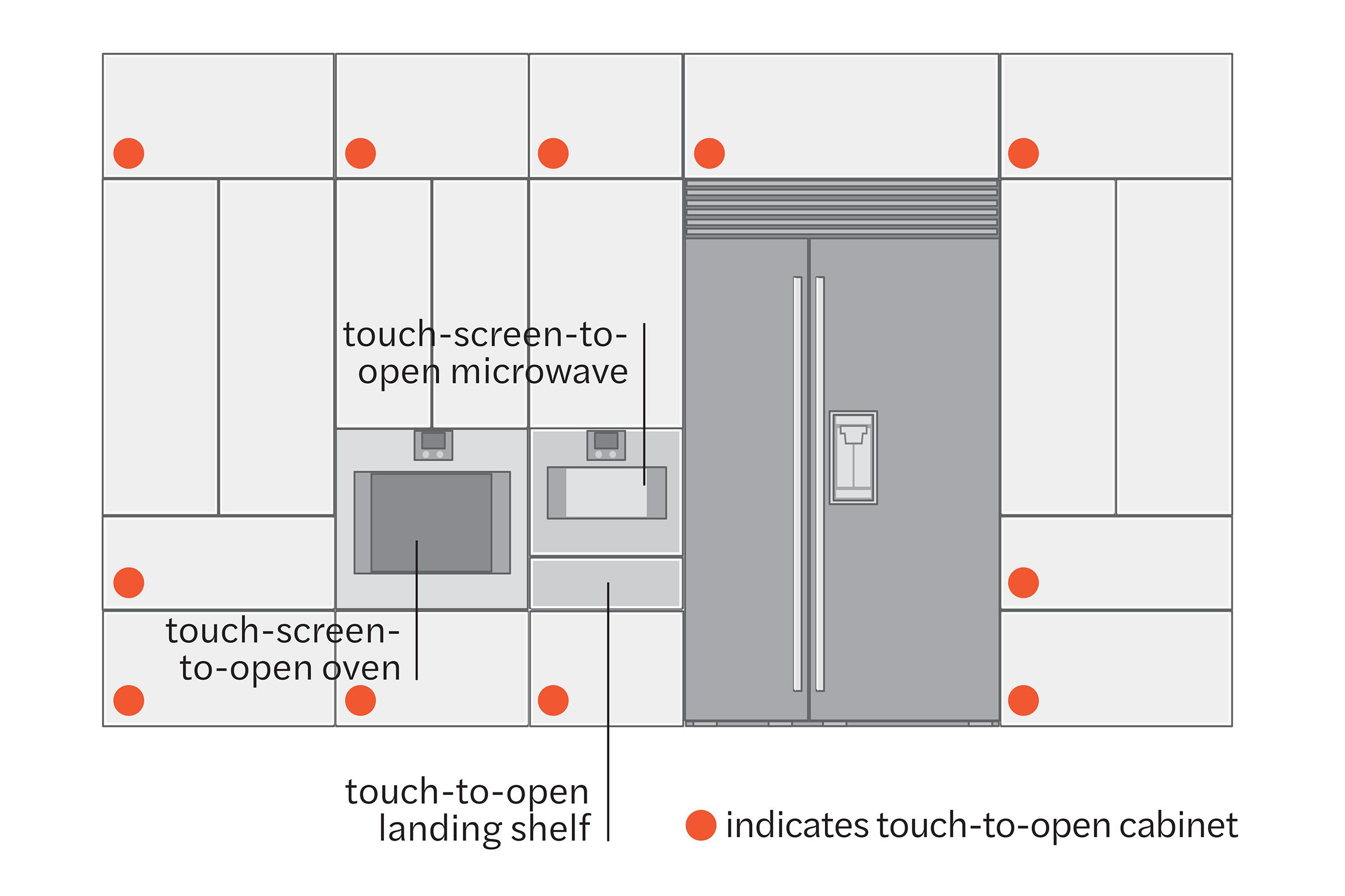
- Cabinet Strategy: Michelle thought through which cabinet drawers should be touch-to-open, enabled by a small servomotor inside: “We didn’t want drawers popping open when we worked at the counter.” They added the feature to those Caffrey would use the most, along the fridge/microwave wall, as well as to doors that are hard to reach. They also found an innovative polymer-based cabinet finish (na.rehau.com) that “self-heals” scratches and minor dings with heat and resists fingerprints, key with touch-to-open doors.
- The Right Height: They kept counters and the island the standard 36 inches high, since a motorized wheel- chair can rise up 12 inches. “That way, everyone sitting at the counter will be at the same level,” says Billy.
Ease of Use
The plan calls for side-by-side microwave and wall ovens, with their center point 36 inches from the floor, so they are within reach for someone seated; a touch-to-open landing shelf is located just below the microwave. A standard side-by-side refrigerator/freezer with a water dispenser in the door allows seated access to the lower half of the appliance. Here are a few design elements that reduce reach—and effort.



Whole-House Accommodations
Throughout the primary living areas, Jahnes specified 36-inch-wide doorways, 5-foot-wide hallways, curbless showers, and zero-clearance thresholds for ease of passage, with or without a wheelchair, echoing the entries in and out of the house.
- Home Elevator: For access from the main level of the house, where most of the bedrooms and all the living spaces are, to the basement, where a rec room and son Wix’s bedroom are located, the family is installing a hydraulic elevator, a choice quieter and more compact than an overhead-cable-drive elevator. Although pricey— elevators can start at $20,000 installed—elevators add unparalleled access.
- Zero-Clearance Sliders to Patio: TOH home builder Charlie Silva knew that the sliding doors from the kitchen would have to be installed flush with the patio outside. The 12-foot-wide opening, made up of four glass doors, two fixed and two sliding, has a flush, high-performance sill rated and certified for exposure to weather, with built-in drainage holes. For ease of use, the door will be motorized.
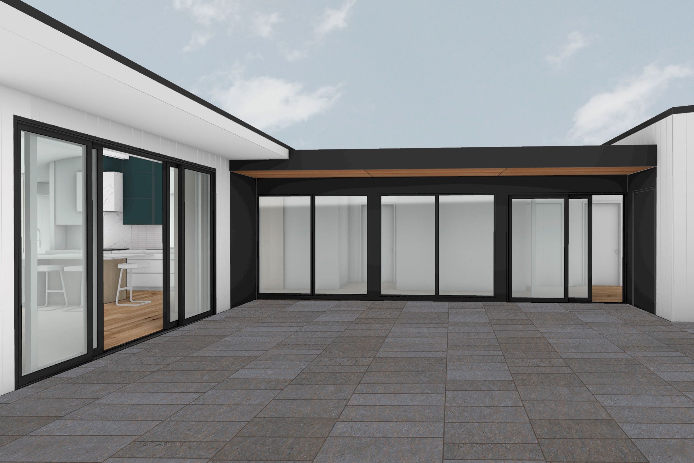
- Accessibility Can Be Beautiful: Creating an accessible house entails making hundreds of choices that factor in comfort for every member of the household. Throughout the planning, Billy and Michelle have been committed not only to accessibility but also aesthetics. “We try always to do two things: make the house as accessible as possible, but not awkward aesthetically, not industrial,” says Billy. “It needs to be stylish, too.
