Closet Design
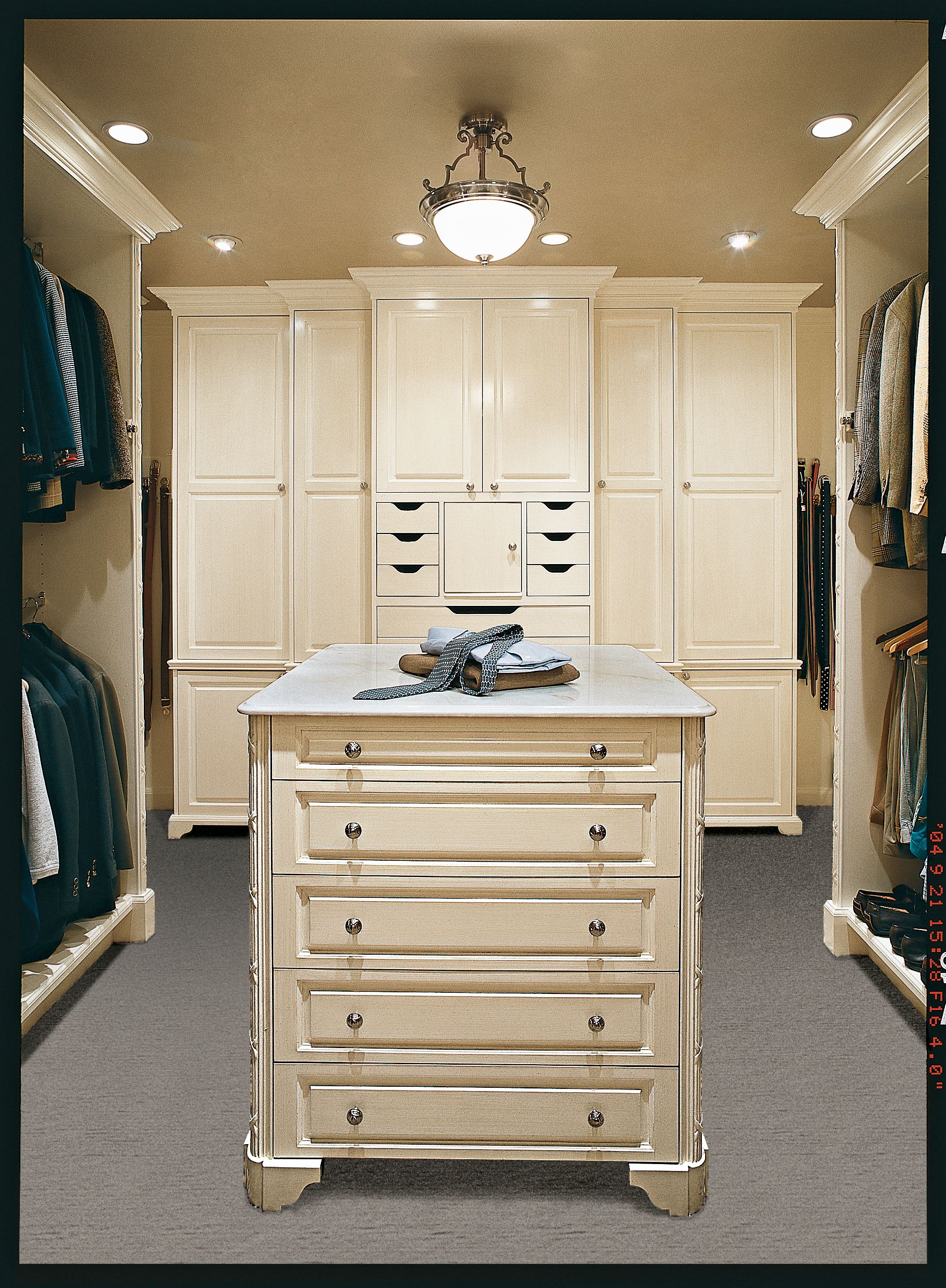
For anyone who travels year-round, packing a bag in the wee hours is largely routine stuff. But for the spouse who’s trying to sleep amid the bustle, it’s surely one of life’s little annoyances. Which is why one Kenilworth, Illinois, couple turned an unused bedroom off their master bath into a spacious closet when they moved into their 1928 Georgian a decade ago. The thinking was that this would allow the husband, who travels weekly, or the wife, who travels monthly, to comfortably lay out clothes without rousing the other.
Though the plan was a success, designwise the space wasn’t living up to its potential. Laminate built-ins ringed the walls, the lighting was dim, and the shelves couldn’t handle the couple’s growing garment piles. So they asked architect Charles Cook to rework it as part of a master-suite renovation.
Stepped-Back Armoire and Wardrobe

In addition to gutting the 14-by-16-foot room, Cook relocated the door from a corner to the center of the wall that connects it to the bath, improving traffic flow and setting the stage for a gracious, symmetrical design. On the far wall, he created a stepped-back armoire, and on each of the side walls, he added three wardrobes—for a total of 42 linear feet of hanging space.
Central Island

A marble-topped storage island provides a luggage-loading surface and serves as a focal point in the room. It has drawers on each side (five for her, five for him) to maximize storage.
Lights

And recessed cans and a pendant light ensure there ss no fumbling in the dark when trying to coordinate shirt and tie.
Tie Rack
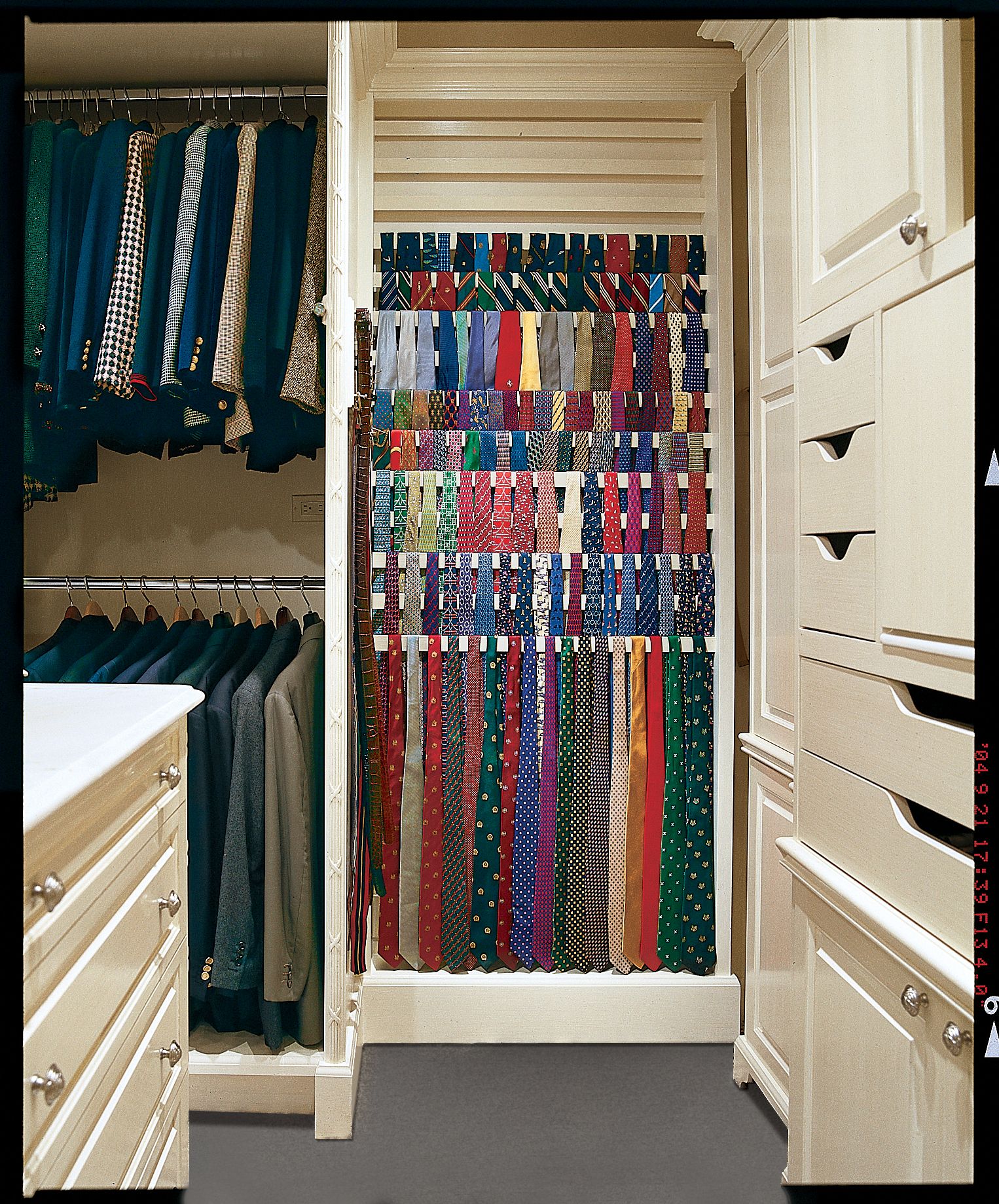
The tie rack’s wooden slats, which progress steplike from floor to ceiling, are tilted forward 20 degrees so that the ties hang unobstructed. The wood’s surface was left textured rather than completely smooth to keep them from slipping off. Double hanging in the wardrobes maximizes suit storage.
Mirror
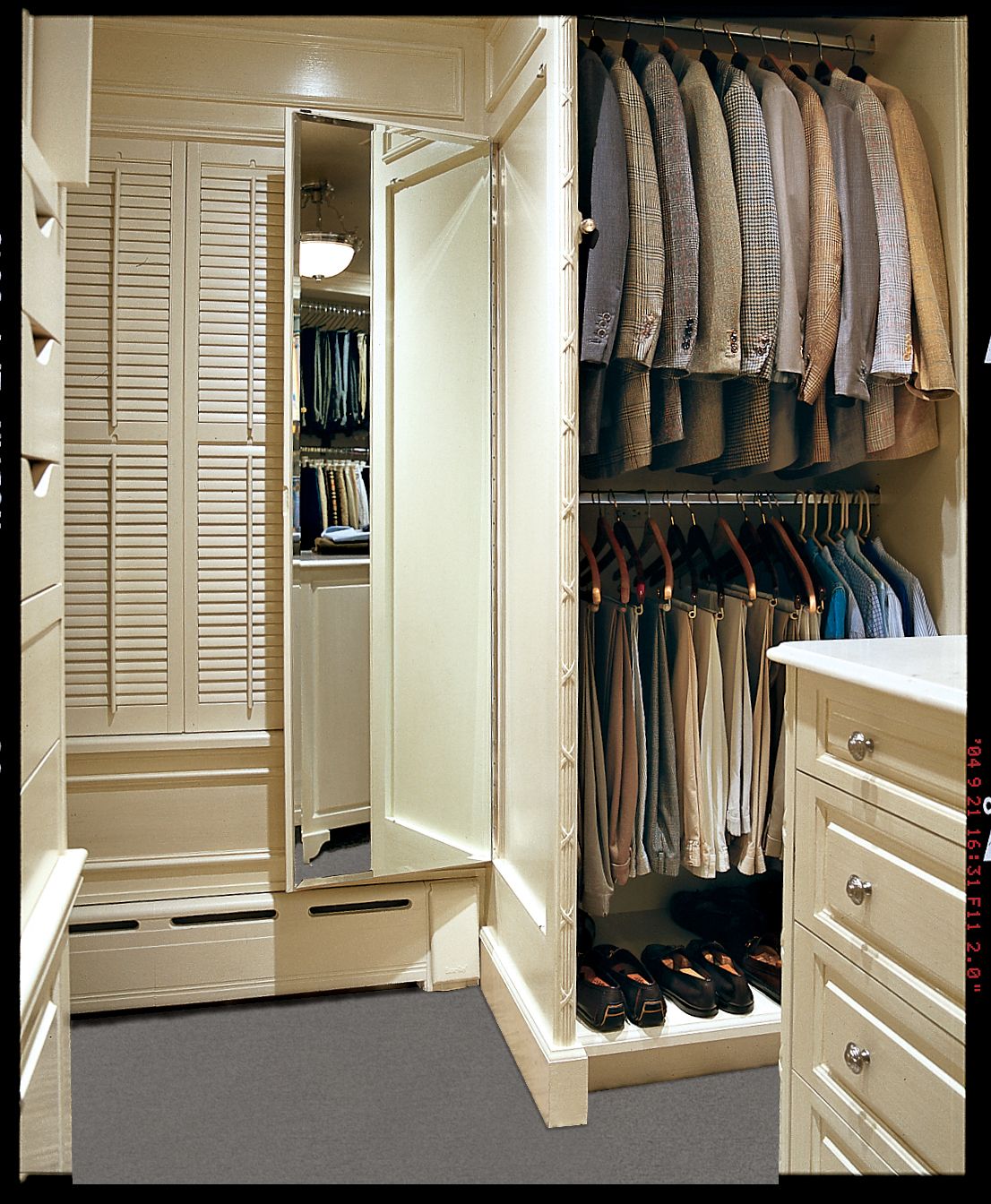
So as not to waste any wall space, a 5-foot mirror was inset on hinges at the end of one of the wardrobes; backed with the same cream-painted poplar used on the cabinetry, it blends right in when closed.
Built-In Armoire
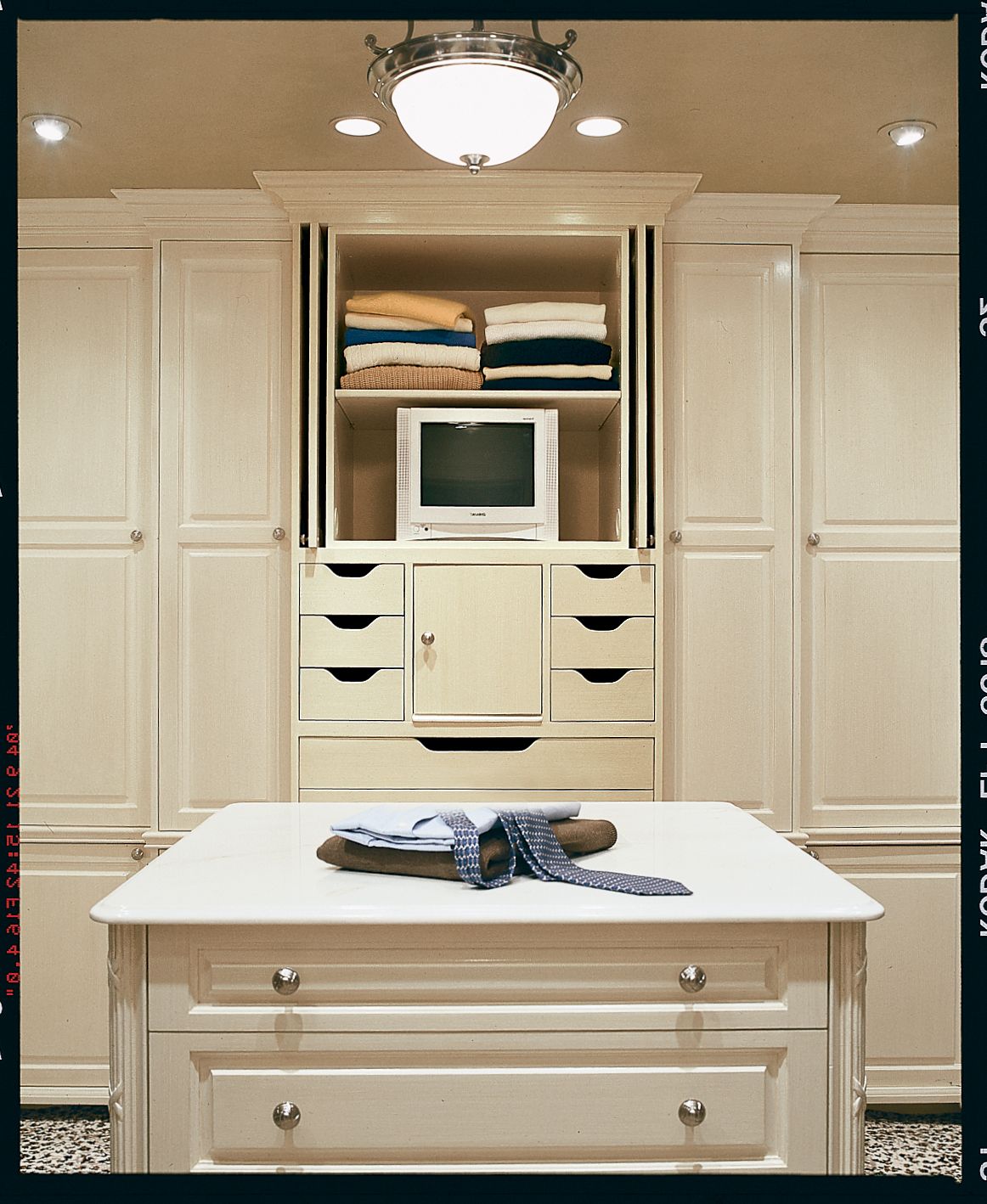
The built-ins, with furniturelike reed-and-ribbon detailing on the edges, were painted cream. “They wanted the space to look elegant, like a fine clothing store,” says Cook. “But the main thing was to make it not feel like a closet.” The built-in armoire holds a 13-inch television so that the homeowners can tune in to The Weather Channel.
What They Did
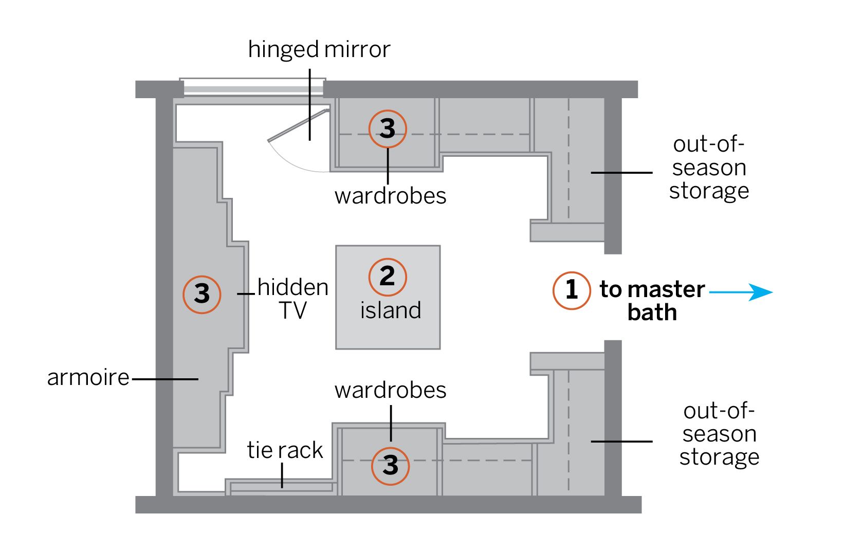
1. Relocated the door. Moving the entry from a corner to the middle of the wall improved the flow into the room and created a center point around which to execute a symmetrical design. The neat divide also establishes that one side is for his clothes and the other is for hers.
2. Put in an island. The freestanding island provides a surface for packing suitcases and drawers for organizing small essentials.
3. Lined the walls with built-ins. An armoire and two walls of wardrobes wrap the room with storage space. His side also has an alcove for a floor-to-ceiling tie rack. The wardrobes on either side of the door are reserved for out-of-season clothing.
