This article appeared in the Fall 2022 issue of This Old House Magazine.
From the moment we stepped into this house, I was redesigning everything,” says architect Derek Rubinoff, who, along with his wife, Robyn Marder, loved their home’s Victorian character but knew the house needed an overhaul. Its history as a two-family home had left behind some significant layout dysfunctions, including a bare-bones kitchen with its sink in the pantry and unattached lower and upper cabinets sitting on the floor.
On the second floor was another kitchen and a dining area where bedrooms should have been, and a glass-paneled wood door connected the couple’s bedroom with their daughter’s. But between raising two kids, then 8 and 5, working full-time jobs—Robyn teaches high school English—and no available capital after buying the house, the couple could only dream and make do with the place as it was.
That all changed last fall, when the exterior’s peeling paint couldn’t be ignored any longer. On close inspection, rotting fascia, soffits, and siding came to light, which put new clapboards, trim, and house wrap on the agenda, which in turn highlighted the need for new windows. Derek and Robyn realized that the time to give the house what it—and they—needed had arrived.
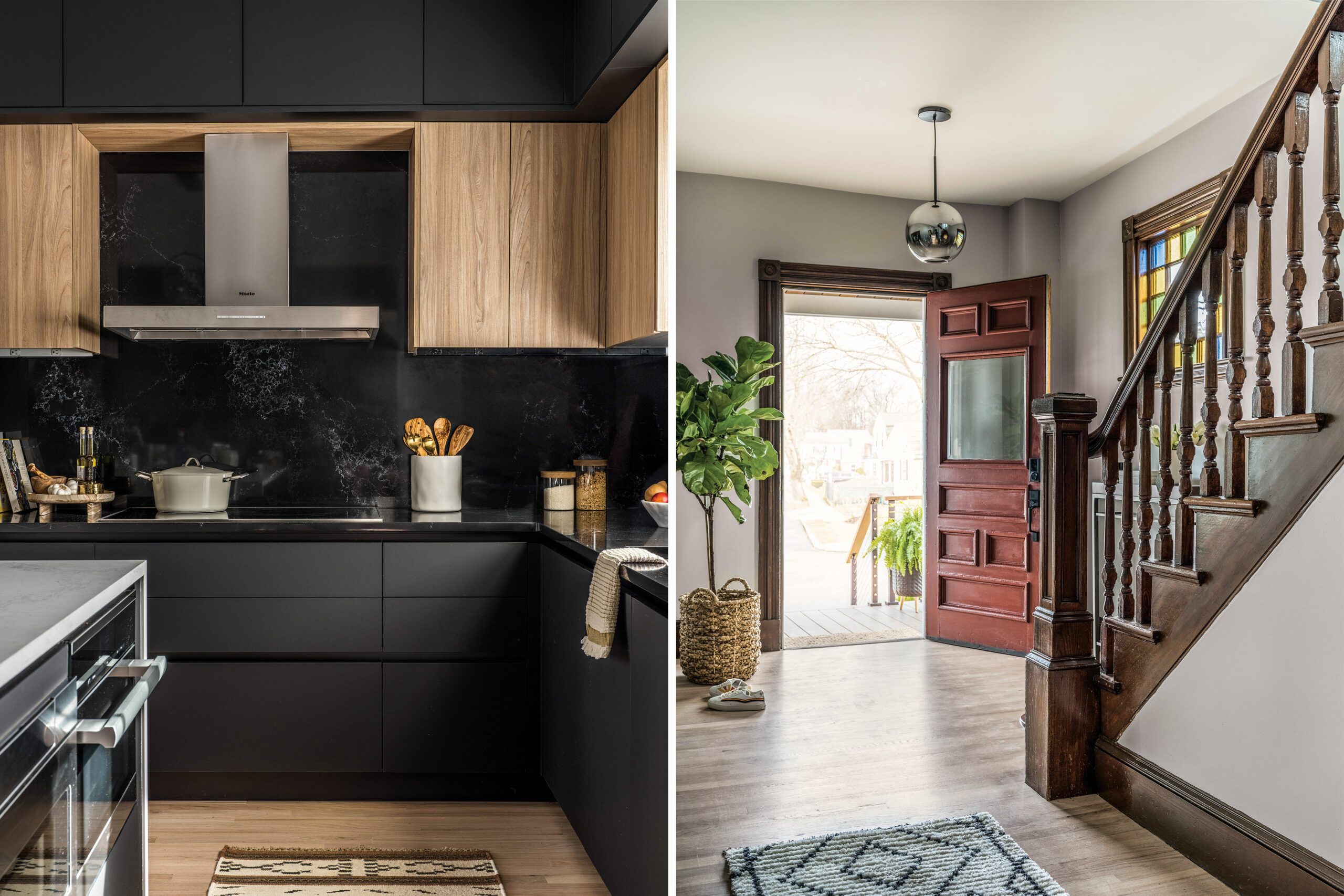
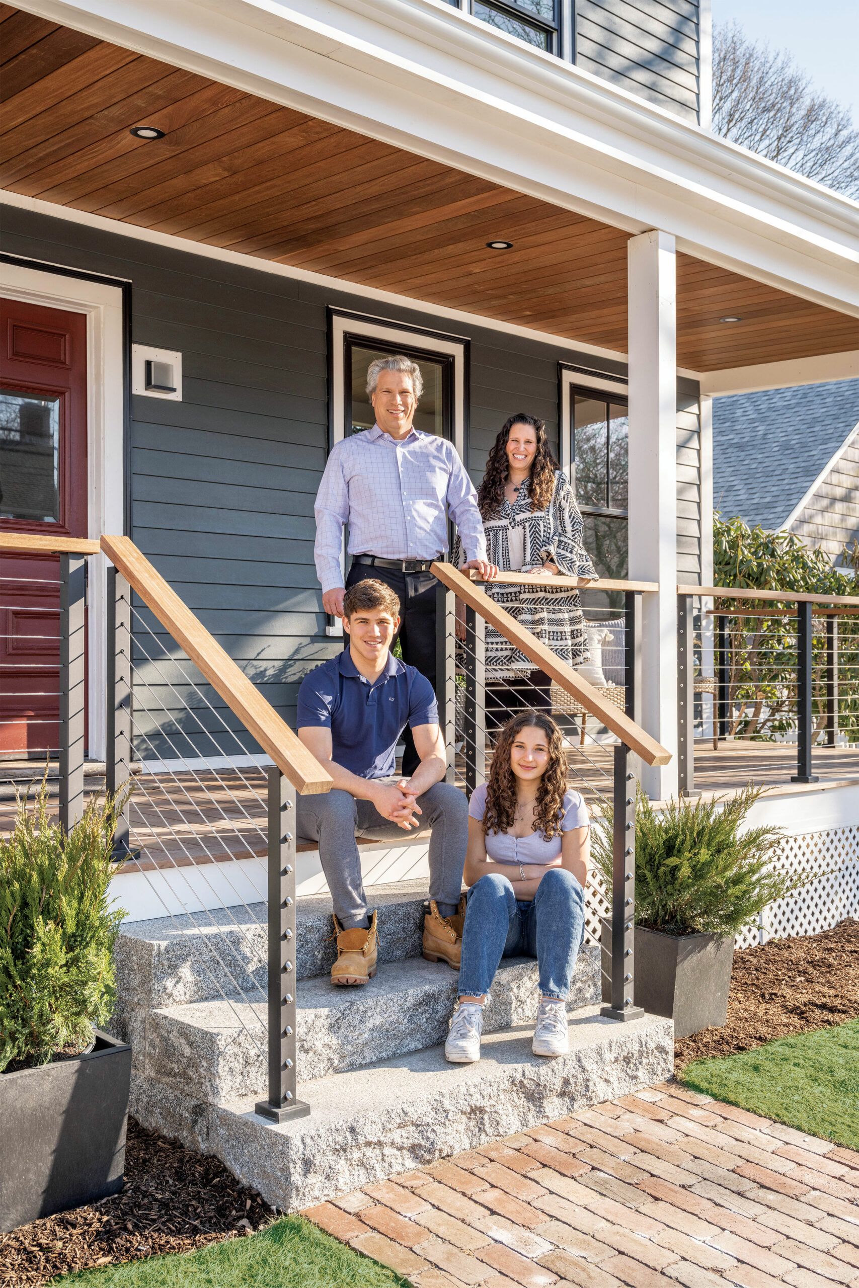
“I can’t believe we actually did it,” Robyn says eight months later, the family now settled back into their modernized forever home. “I have an amazing kitchen and so many improvements everywhere,” she says, marveling at the renovation work done by builder Deliandro Dias and his crew.
“Best of all, we did it while keeping the house’s original Victorian elements,” she adds. Lending a hand every step of the way was the team from This Old House, which documented the project as part of its 43rd television season.
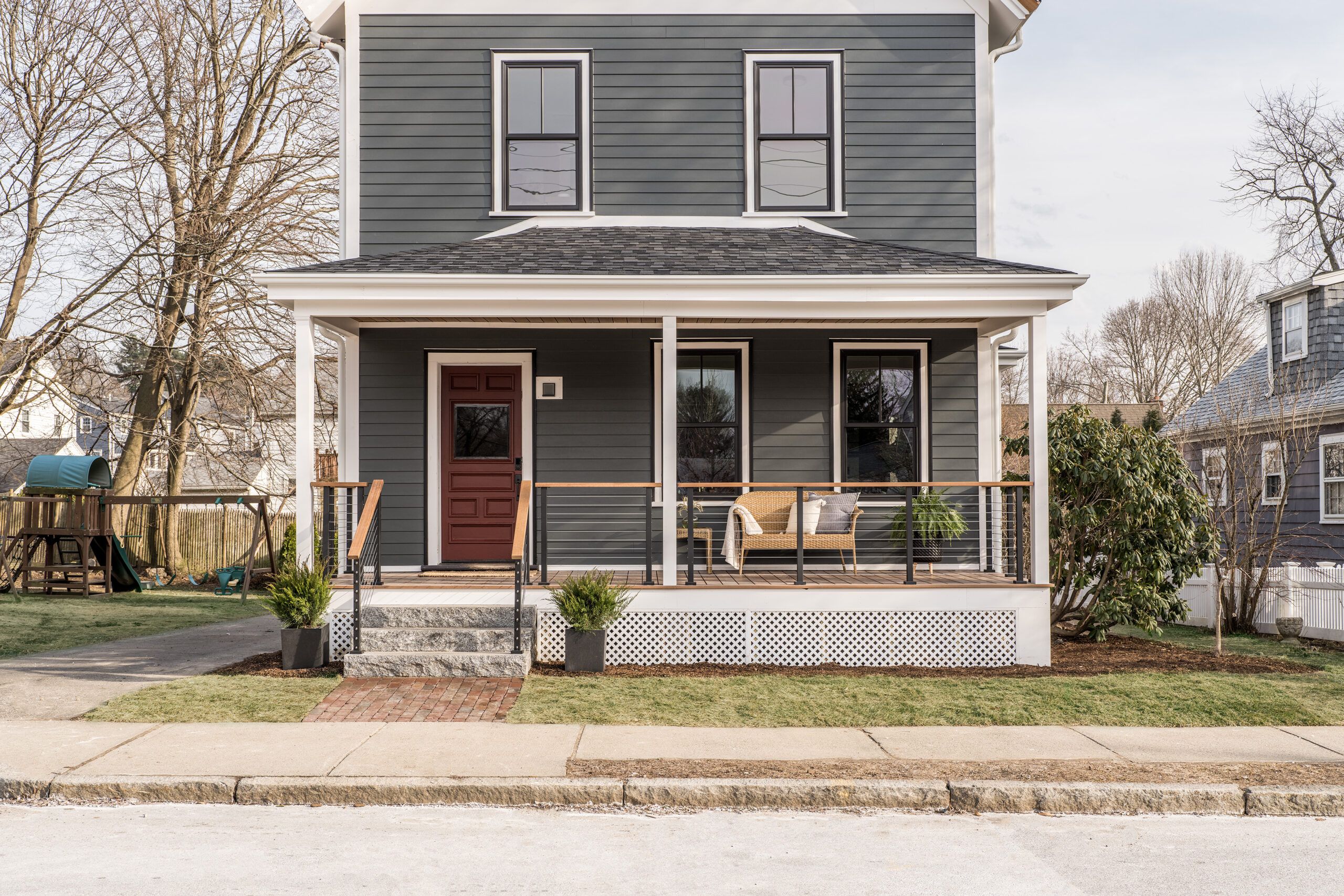
As with many old houses, there were obstacles both known and unknown. “These old houses present many challenges because floors are uneven or you find surprises once you get into the walls,” says Dias. Addressing the water-damaged exterior meant removing rotting clapboards, renailing the sheathing, and replacing deteriorated rosin paper with modern house wrap. Fiber-cement clapboards, PVC trim, and high-performance windows put a fresh face on the house and help make it weathertight.
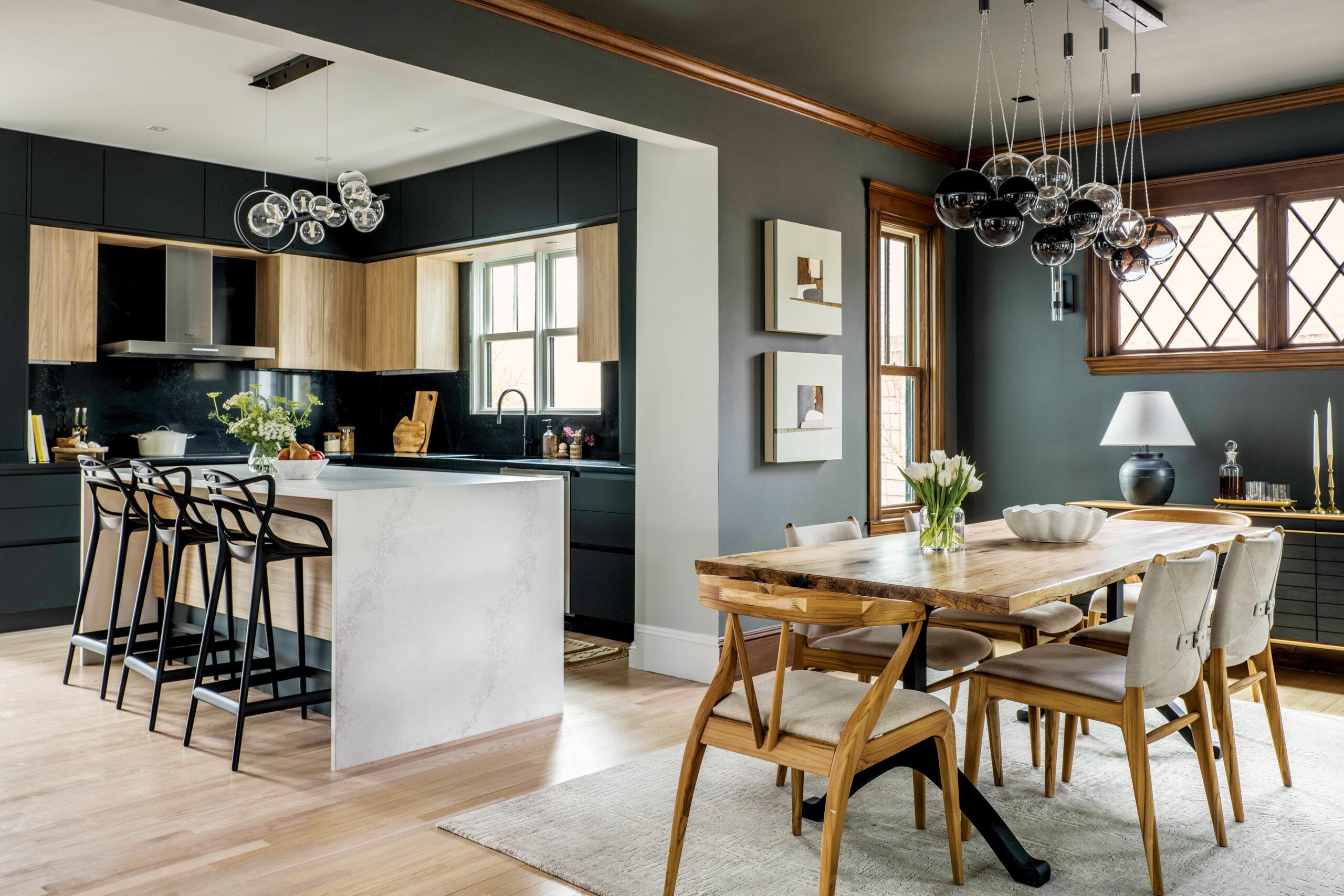
Returning the house to a single-family home meant resolving layout issues on both the first and second floors, which had been separate dwellings. On the main floor, the kitchen design drove the changes. Robyn and Derek were united in wanting a modern, European-style kitchen with sleek frameless cabinets and built-in appliances.
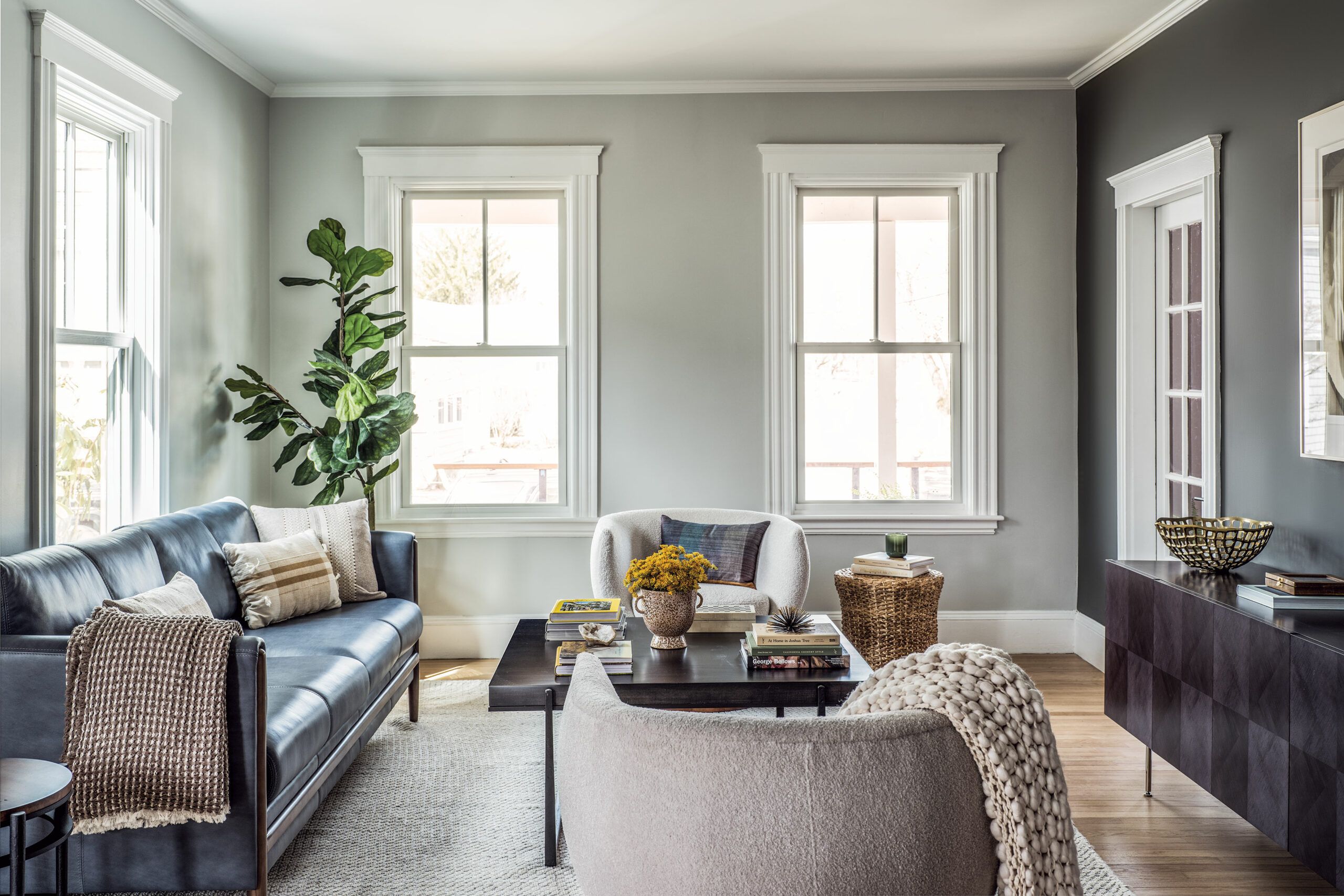
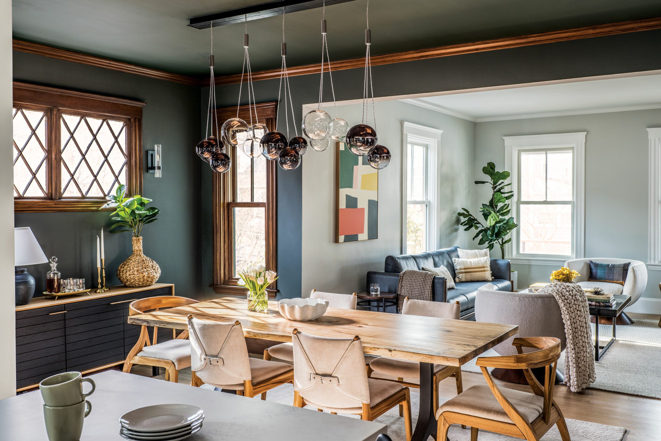
An open-plan layout was the best route to achieving the larger kitchen and better traffic flow they were after. Removing load-bearing walls opened up the kitchen to the dining room, and installing perpendicular laminated veneer lumber (LVL) beams provided the needed support. Closing up a doorway from the kitchen to a back guest bedroom created space for an L-shaped run of floor-to-ceiling kitchen cabinets. Demolishing the old pantry allowed for adding a full bath to serve the first floor, as well as guests.
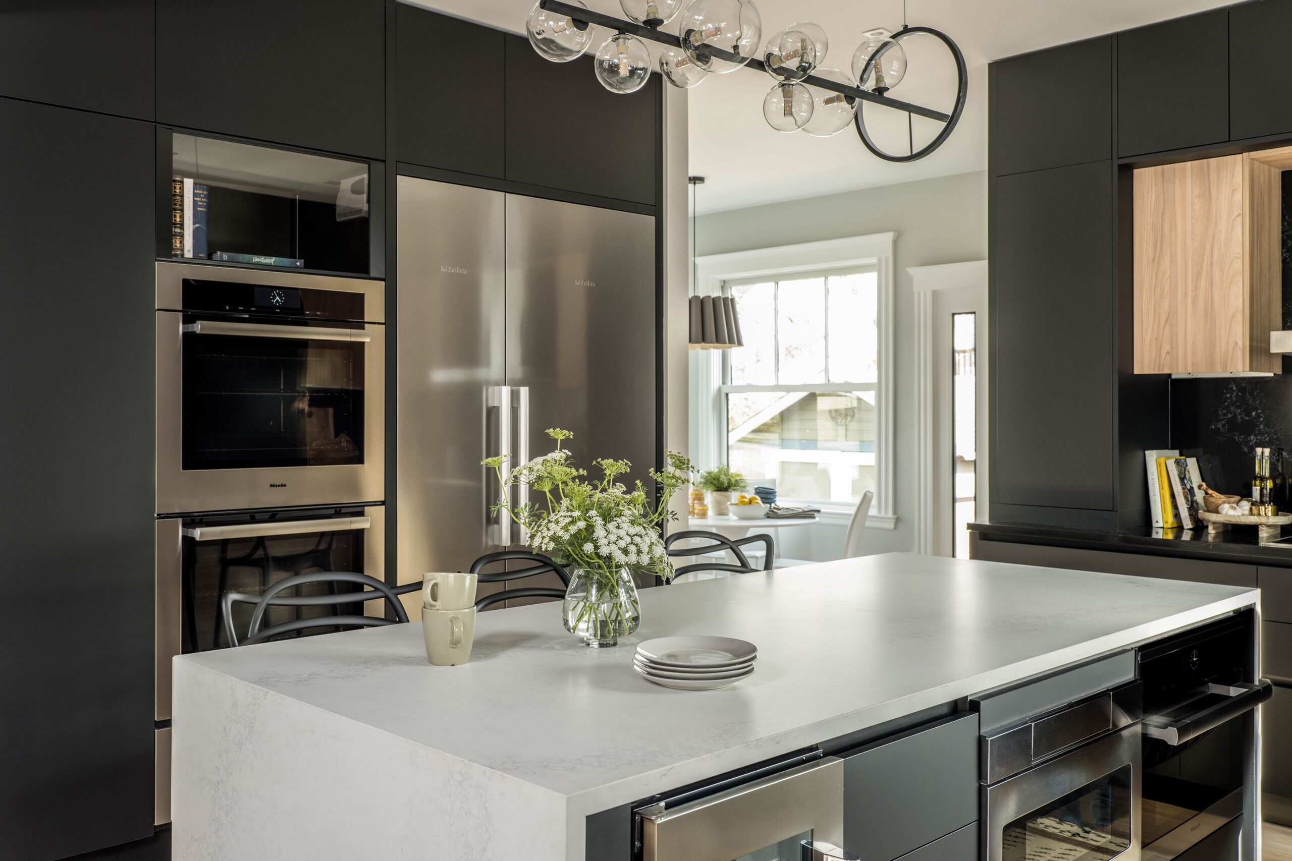
Working with kitchen designer Marissa Perez, Derek and Robyn chose matte-black cabinets, with an inset row of shallower natural-wood units that wrap the cooktop and sink walls. “The upper black cabinets create an architectural frame around the inset cabinets,” says Derek. The light-dark contrast is magnified by black-quartz countertops and backsplashes that highlight the angular, modern vent hood. Another wall of cabinets across from the sink holds a massive built-in refrigerator-freezer and double wall ovens. A 7-by-3-foot island holds more appliances and offers stool seating.
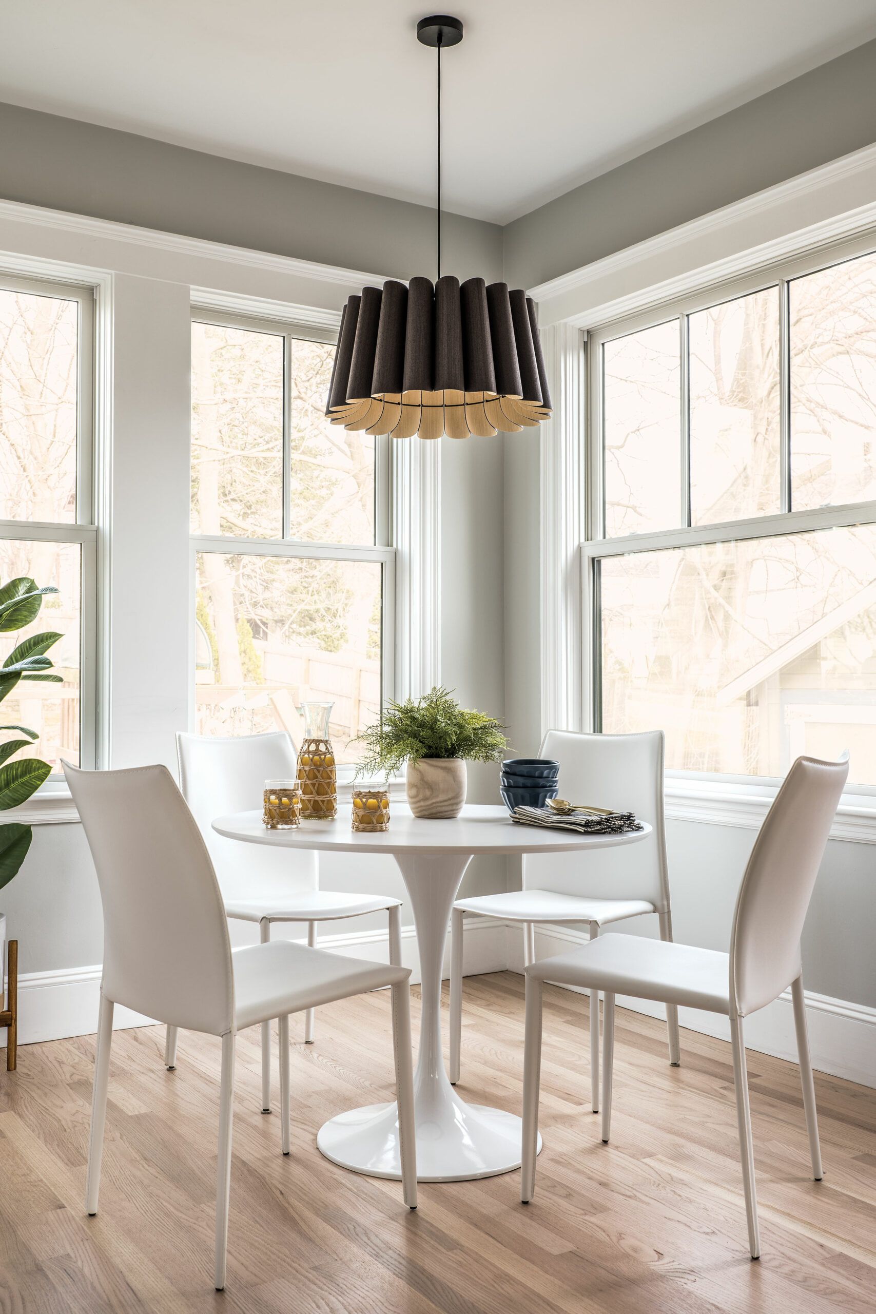
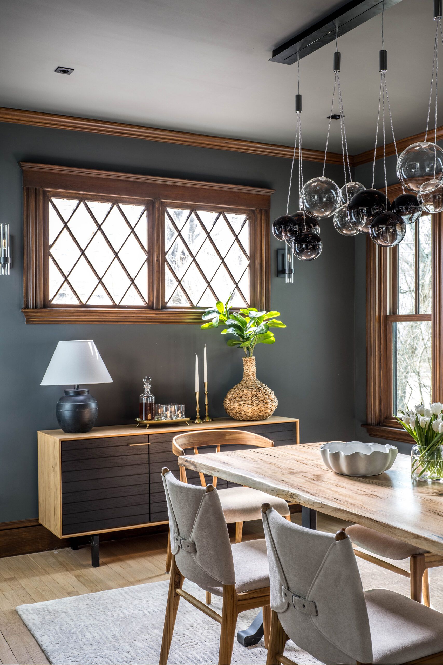
The first-floor spaces, while open to one another, are still clearly defined, each with its own personality. The dining room still showcases the soul of the original Victorian house, with its stained-wood moldings—the rest of the rooms have white-painted casings and moldings—and diamond-pane windows with aged-gumwood casings. For a cohesive look, Derek and Robyn wanted the trim on the new dining room windows to be stained to match the existing gumwood trim.
TOH painter Mauro Henrique assisted Alexsandro Cruz and his team in creating a patinated look by wiping on a 3-to-1 solution of stain and paint thinner. Then they went over it with a chip brush; once dry, they gave the surfaces a light sanding and a coat of wax. The dining room’s new LVL carrying beams help to set off the space, as do the dark-gray walls. Dias suggested going even bolder by painting the ceiling dark as well.
Adding another Victorian touch, he and This Old House general contractor Tom Silva installed new crown molding matching the original profile and using a combination of mitering and coping techniques to make the trim fit properly. “The corners aren’t always 90 degrees in an old house,” says Tom.
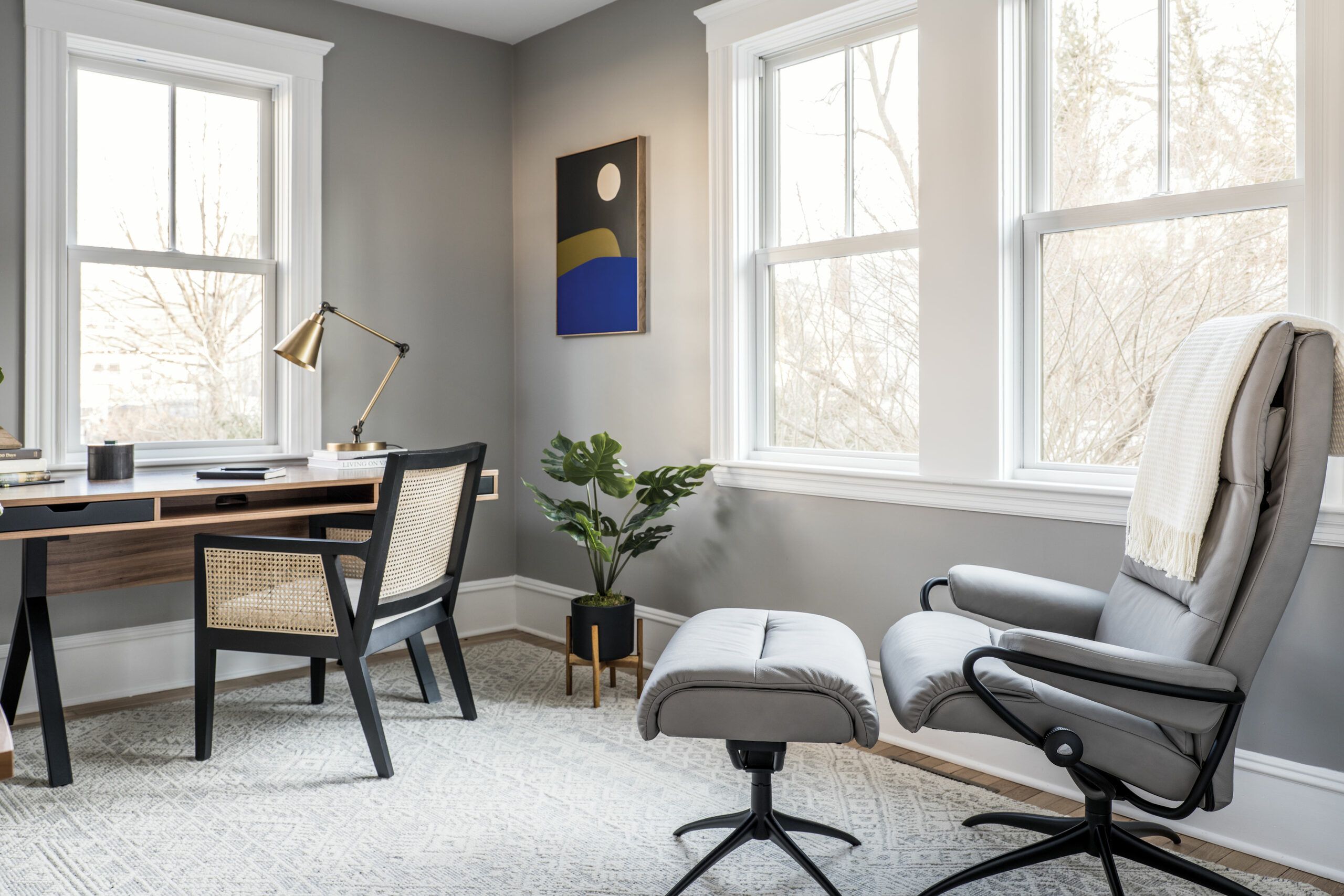
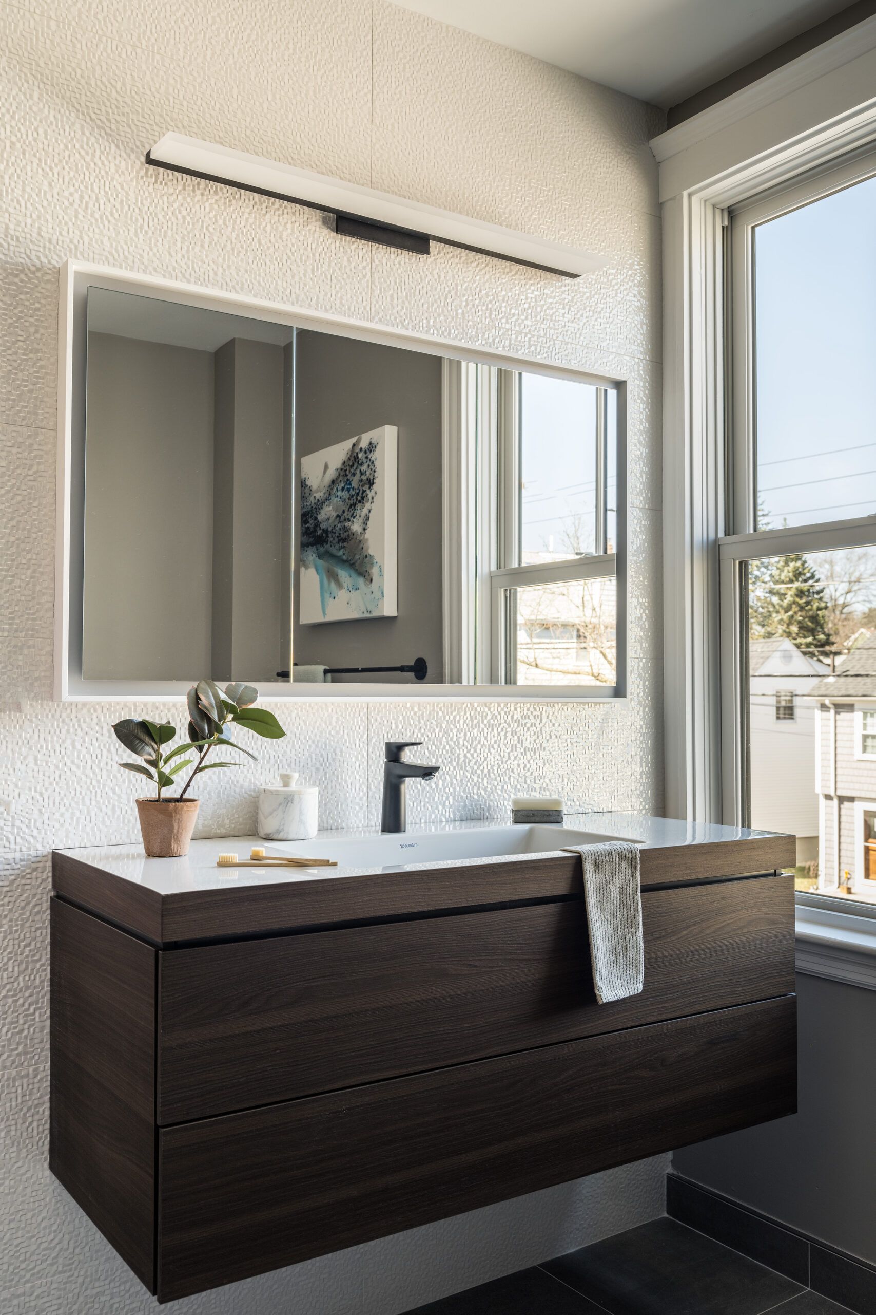
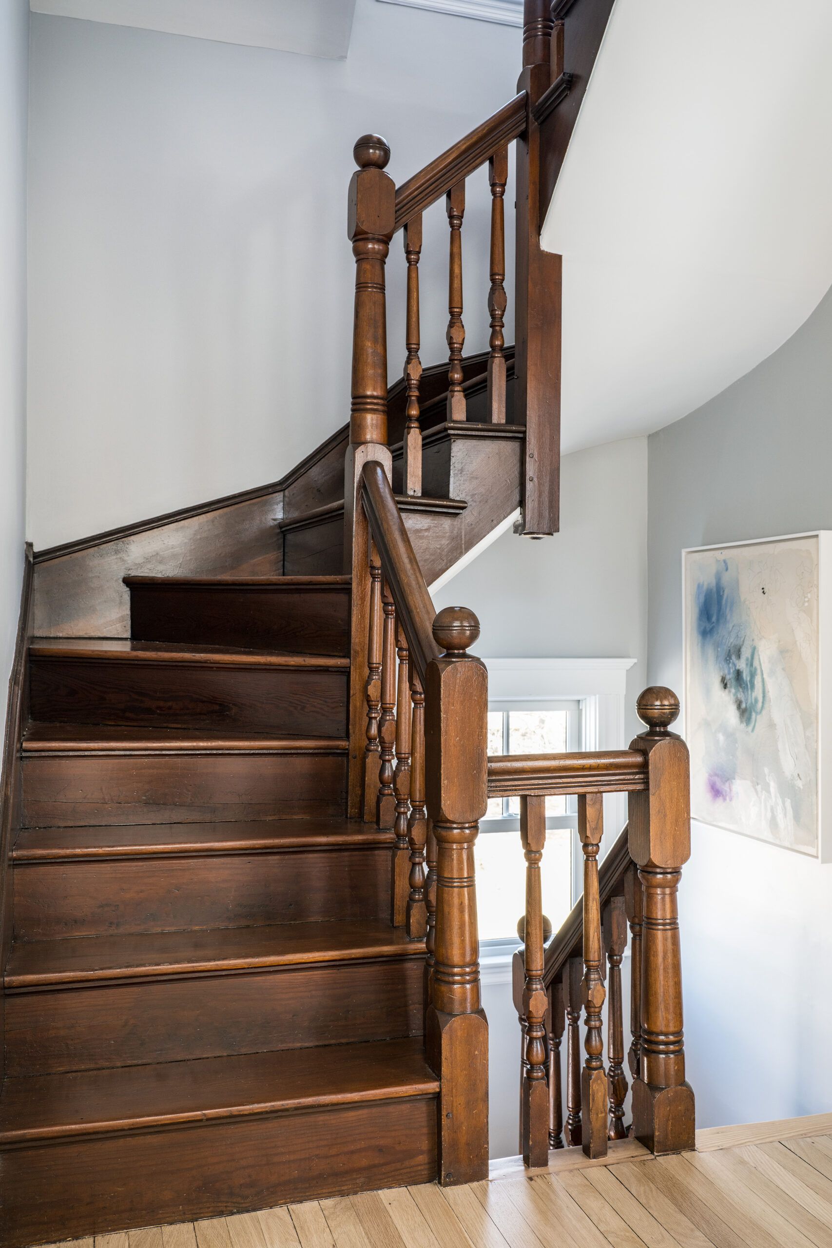
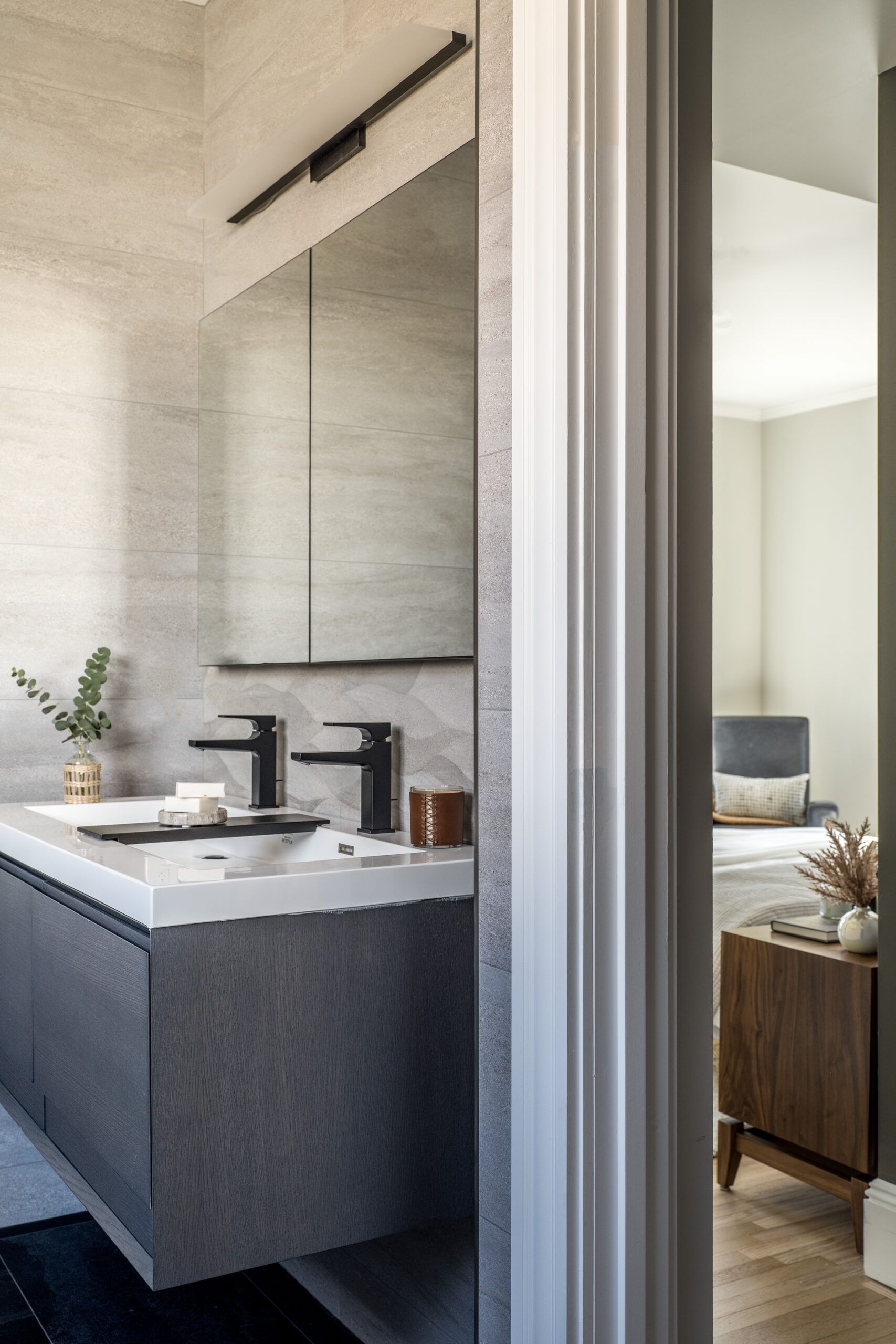
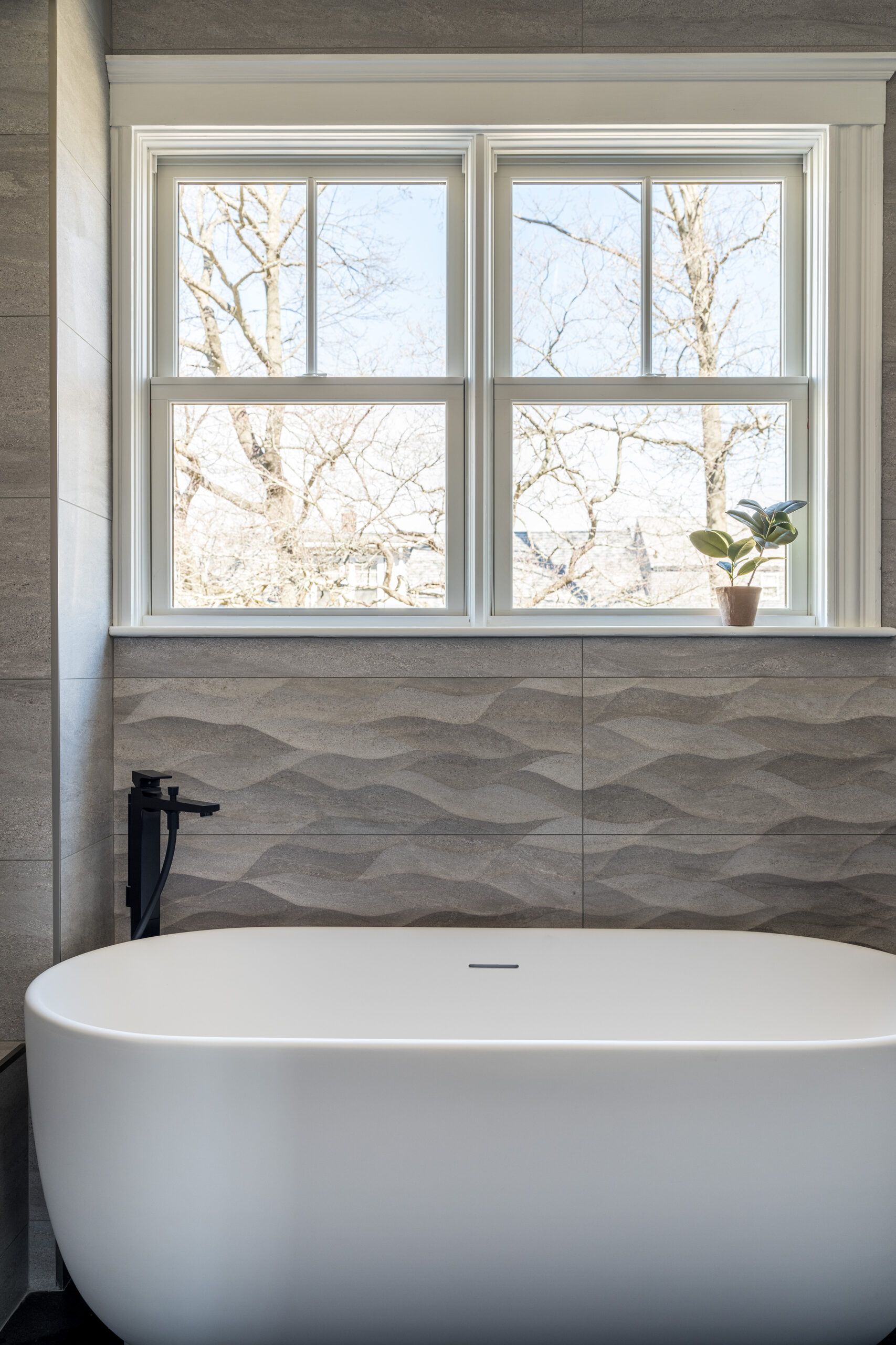
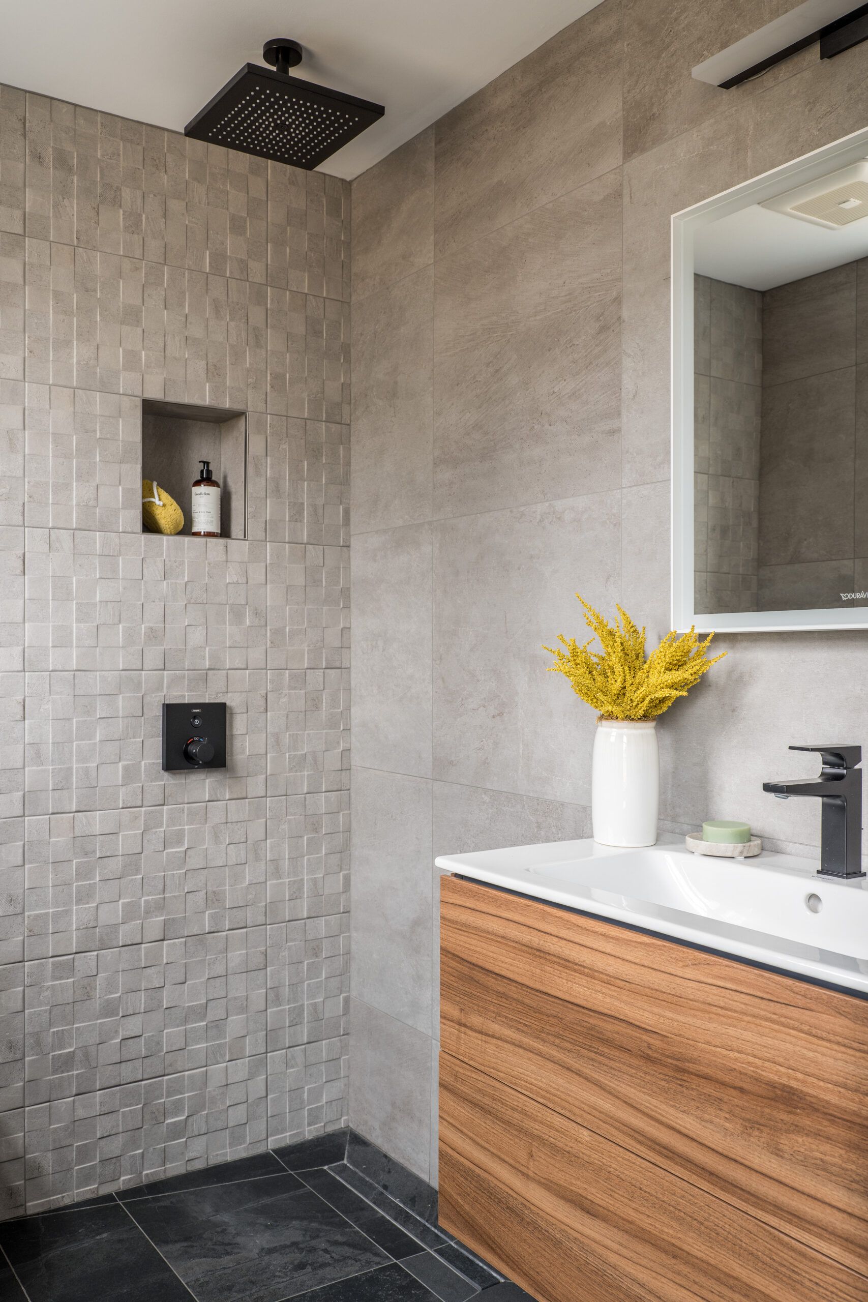
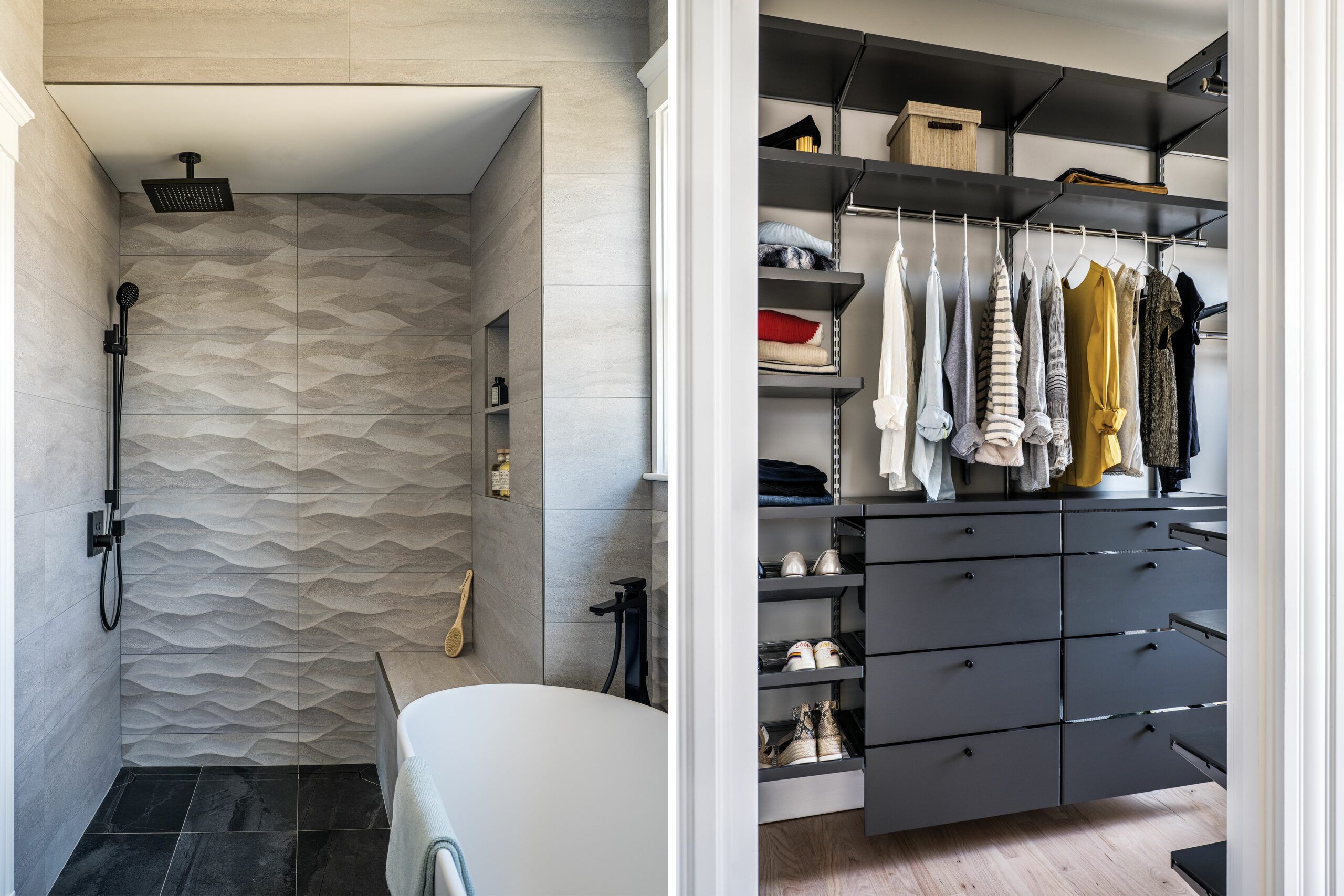
Removing a little-used, space-hogging back staircase freed up the needed area to improve the second floor. An original feature of the 1894 house, it continued to be useful when the structure was converted to a two-family home. But excising it was key to giving Robyn and Derek a true primary suite with room for a private bath, complete with a spacious shower, a soaking tub, and a double vanity, as well as a walk-in closet.
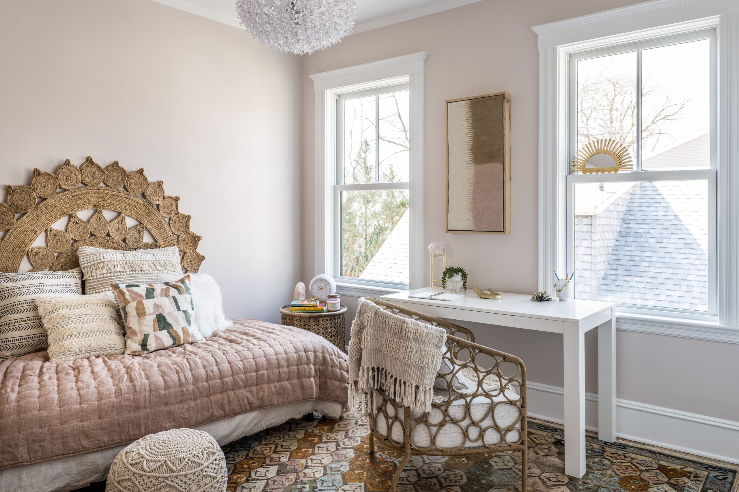
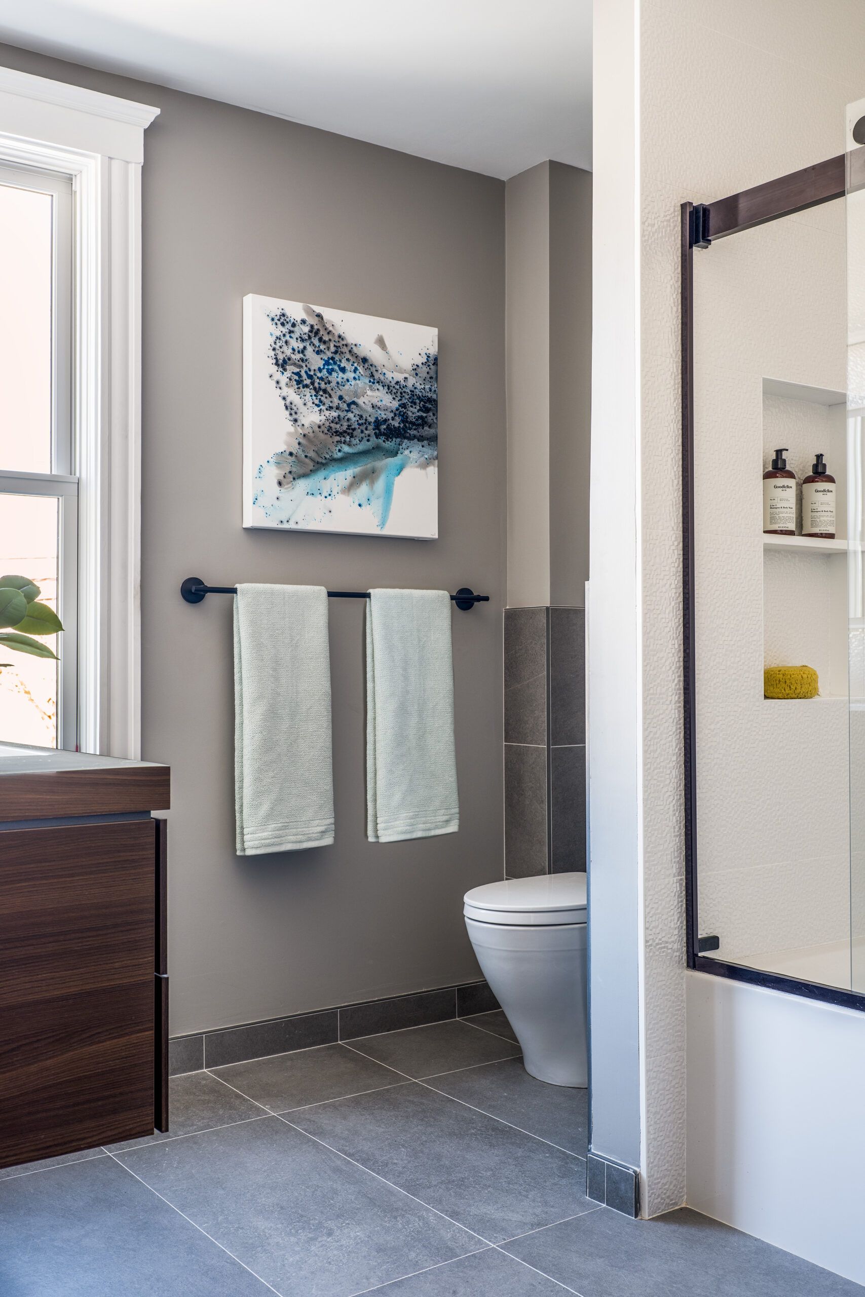
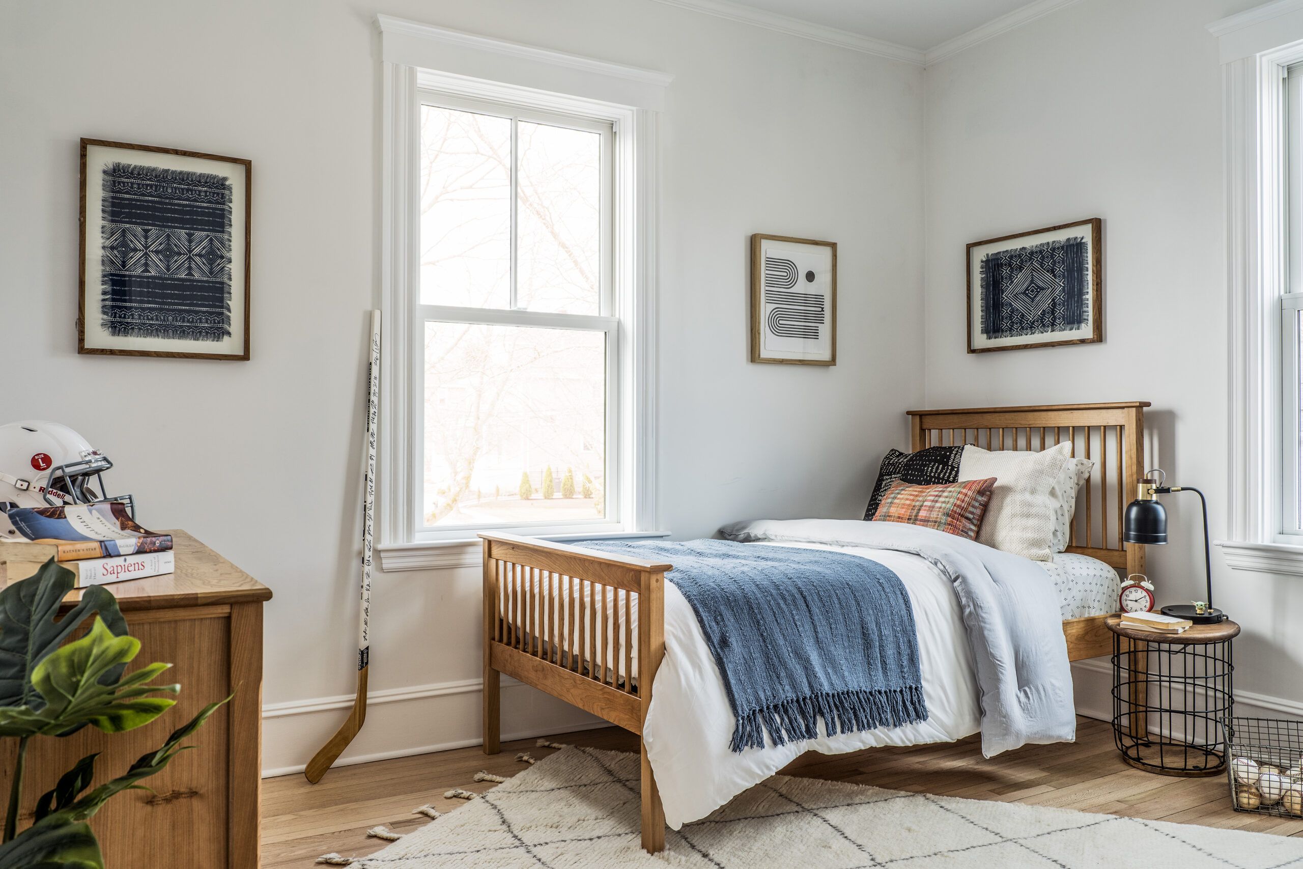
The renovation also improved the teenagers’ upstairs bedrooms. To give son Zach a bedroom closet, Dias’s crew took space from the hall bath, and to give daughter Aria’s bedroom privacy, they closed up a door to Robyn and Derek’s room.
The renovation also increased the homeowners’ indoor comfort with HVAC upgrades that combined existing and new systems. “We kept what we could here because budget was important,” says TOH plumbing and heating expert Richard Trethewey.


While the gas furnace that serves the first and second floors was still functional and efficient, adding a heat pump coil tied to a cold-weather inverter condenser outside will provide additional heating and all the air-conditioning. A separate pump will supply heating and cooling to the previously unconditioned third-floor space, which will function as a teen hangout.
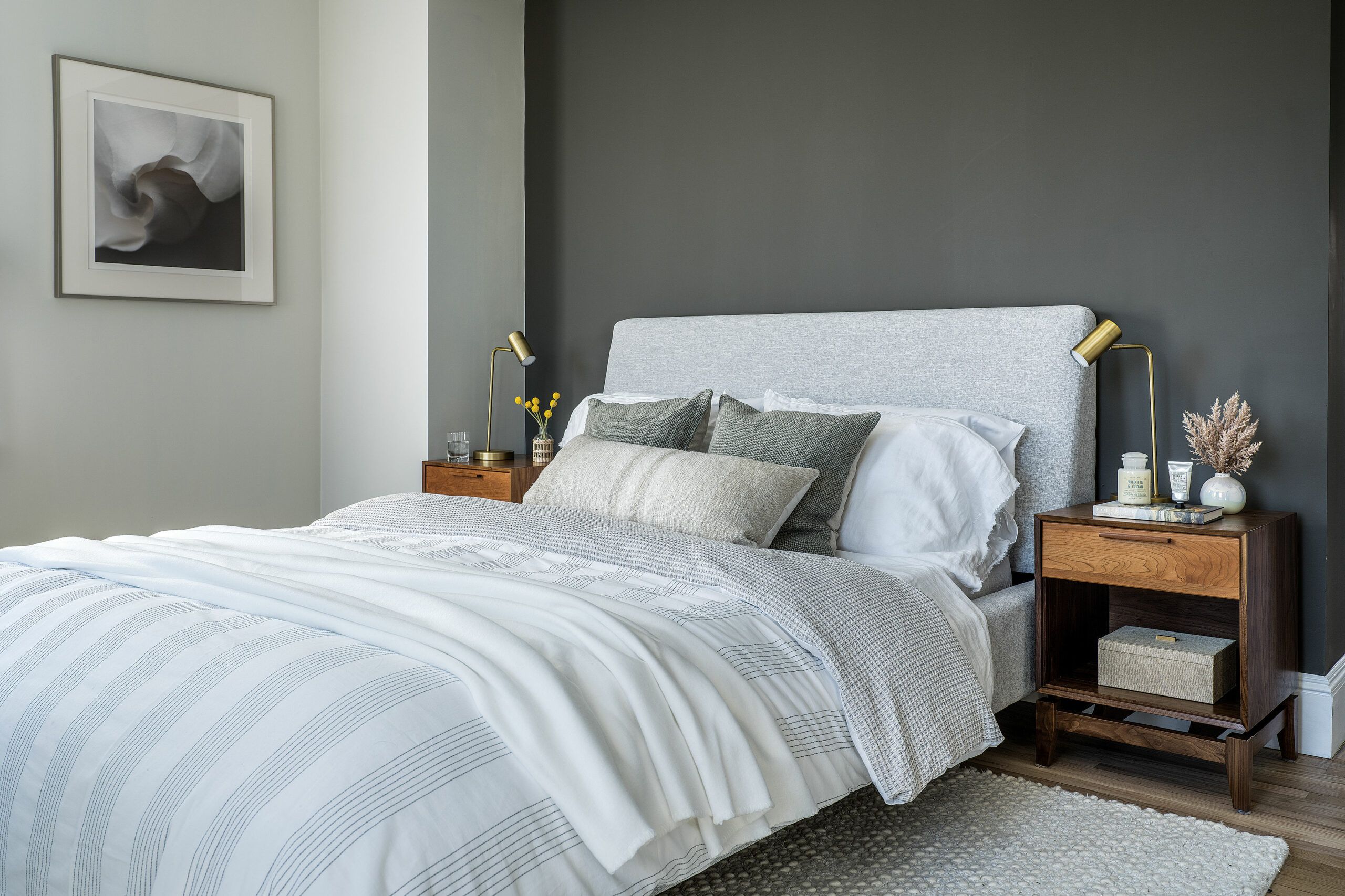
Throughout, new paint in shades of cool gray and white, with darker-gray accent walls, gives the refurbished interior a clean, fresh look. Sanded and finished with a clear coat, the original red oak floors took on a paler hue that blends with new flooring in a similar shade feathered in as needed.
Outdoor upgrades provide finishing touches that give the family more use of their urban lot. TOH landscape contractor Jenn Nawada and TOH mason Mark McCullough laid a herringbone brick patio in back. In front, a new brick walkway and granite steps replaced crumbling masonry.
With no budget for new landscaping, Jenn cleared overgrown beds and transplanted mature plants. “We really opened up the front of the house by moving the large rhododendrons to the backyard, where they add a lot of privacy,” says Jenn, who kept a color accent in front by replanting a red Japanese maple from the backyard.
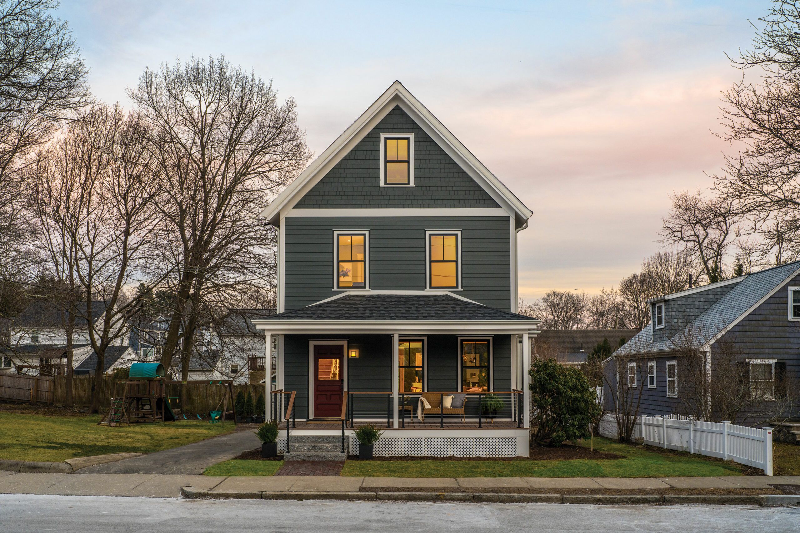
Dias rebuilt the water-damaged front porch, adding a new ipe floor and ceiling and replacing the old wood balustrades with a more open cable-rail system in keeping with Derek and Robyn’s contemporary aesthetic. “It gives a modern look to a traditional porch,” says TOH host Kevin O’Connor. “It’s another good lesson that you can use new elements and keep the Victorian feel.”
For the family, the years of waiting were worth it. “We bought the house intending to renovate and convert it back to a single-family, and after the long wait, we have our dream house,” Derek says now. “I imagine these things for a living, and, wow, this is even better than I imagined it.”
Floor Plans
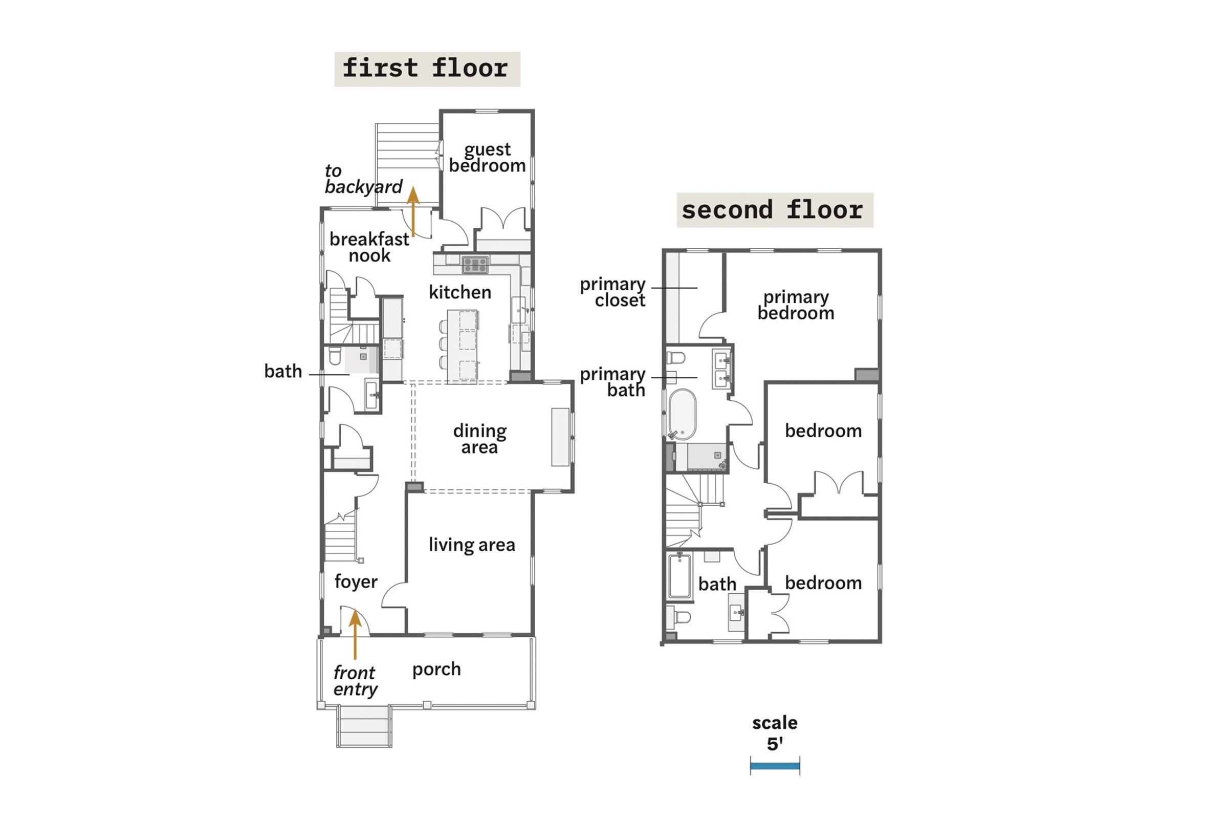
The existing footprint of the 2,400-square-foot house remained virtually the same, but the, renovation removed awkward remnants of a two-family conversion. The four-bedroom, three-bath home now boasts a sight line from the front, foyer to the back door. This was, made possible by reworking the existing pantry—now a full bath—removing a wall between the dining room and kitchen, and adding 26 square feet for a new back entry, a breakfast nook, and relocated access to the guest bedroom. Upstairs, removing the back stairs allowed for a primary suite. The front bedroom gained a closet with space taken from the shared bath.
