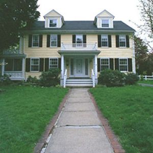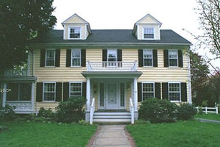
Some people could spot it right away; some people could barely see it, even after it’s pointed out to them. Some people didn’t seem to care; some people cared a lot. One who did care, importantly, is our Winchester homeowner Bruce Leasure. His opinion is important because what we’re talking about are the dormers on his house.
The problem, for those who could see it, was that the dormers were ugly. Why? Architect David Stirling (he sees it) explained that they were relatively large for the house, and their largeness was exaggerated by their detailing. While the main house had massive,10-inch clapboards, the dormers were clad in normal-sized claps, a busy look that made them seem out of place. The corner boards were narrow, making the dormers seem wider. The windows—vinyl replacements—were wide and squat, exacerbating the clunkiness. Finally, they didn’t line up with anything particular on the house. They weren’t centered over the windows below, and they didn’t split the difference between the two columns of windows.
In short, for those who lovers of symmetry and balance, these dormers stunk. And symmetry is what much of the Colonial Revival style is about.
So, what to do? Bruce and Kim asked David to explore a range of options, which he did. One was to remove the offending structures altogether. That would surely restore a certain kind of symmetry to the building, but it would radically change the look of the building, not to mention make the upstairs rooms more cramped and dark.
The next idea was to change their shape and location, slimming them down and centering them over the windows below. With many historic examples to point to, Stirling had little difficulty designing and detailing the perfect new dormers. The hitch was that building them—tearing out the old ones, repositioning the new ones, and constructing what amounts to two little houses—would cost about $15,000-$20,000. Even the most devoted fan of symmetry would balk at that.
The route we chose could be called the trompe l’oeil approach, an attempt to fool the eye into seeing the dormers as more graceful and light than they used to be. Tom ordered and installed replacement windows (wooden this time) whose narrower, taller aspect seem to slim the dormer down. The narrow-gauge clapboard is gone, replaced by the same 10-inch boards as the rest of the house. The corner boards were beefed up both in thickness and in width, and Tom formed the face of the dormers’ pediments out of smooth MDO, giving them a less busy look. The cost: $5,000-$6,000.
The irony is that the redone dormers look a whole lot like the dormers on the house’s little garage, which everyone loves. Too bad the original builder got the look right out back and wrong in front. With the right detailing, we hope we’ve evened things up some.

