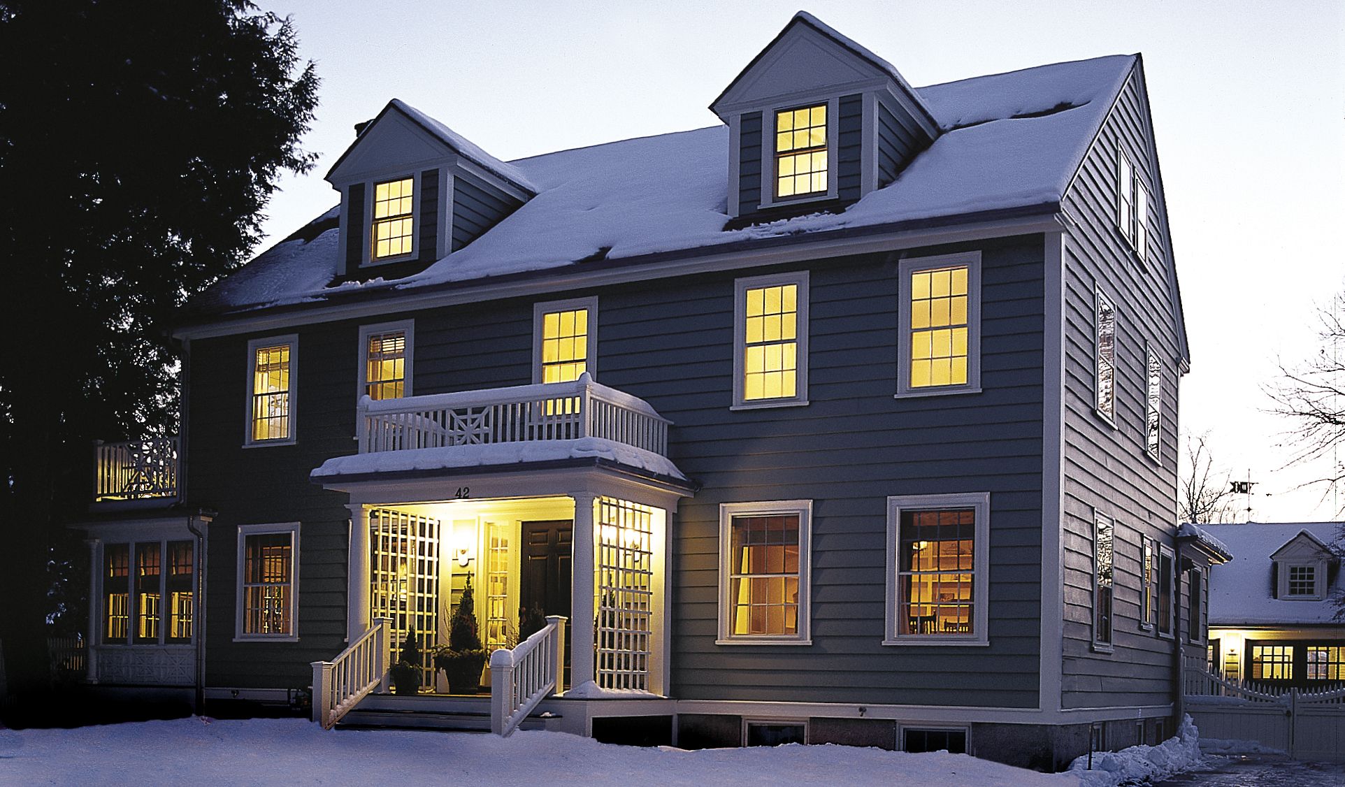
Like a freshly pressed shirt, the Colonial Revival house that we documented in , pleases the eye with crisp edges and smooth surfaces. Nearly nine months of reworking its innards and skin have given the building a sharpness of detail it hasn’t had since it was built in 1922. Yet it avoids a just-out-of-the-package feeling because so much care was taken to restore the original materials rather than replace them with new: instead of a shirt brought home from the store, it’s an old favorite just back from the laundry.
When we started on this TV show project with owners Kim Whittemore and Bruce Leasure back in April, a common comment from the sidewalk out front was, “Why renovate? It looks fine from here.” Up close, however, the imperfections hinted at deferred maintenance and the simple effects of age: tired asphalt roof shingles, alligatored and peeling paint, rot around the sunporch. Those jalousie windows on the porch weren’t too appropriate, either. Inside, became stronger: cracked plaster, mysterious soot marks in the living room, an even more mysterious roll in the upstairs floor, and a dated kitchen whose shape and size were off just enough to preclude a simple change-out of cabinets and appliances.
The house detectives went to work, and the inevitable surprises appeared. The roll in the upstairs floor turned out to be the result of severed floor joists, legacy of a careless plumbing job. Up came the entire bedroom floor and in went several engineered joists. The soot in the living room came from an oil burner improperly vented up the chimney. Ten thousand dollars later, the flues were rebuilt.
One Room at a Time
Outside, the porch rot conspired with footings that were inadequate for supporting a new four-season room to doom the old sun porch — except for its roof — so Tommy and crew suspended the roof overhead and put in a new deck and walls underneath, properly footed, framed, and insulated. turned out to be short on the symmetry that defines Colonial Revival, and cried out for a face-lift. Tom installed narrower windows that had a slimming effect, and replaced narrow-gauge clapboard with 10-inch boards to match the rest of the house.
Painting contractor Jim Clark determined that too many layers were causing the paint to literally fall off the building. The wide, thick siding that so distinguishes the house was stripped down to bare wood. Three fresh coats later, in a period-appropriate sage green, the house is transformed, with a smooth finish that will last a good, long time.
And then there was the kitchen. called for a clearing-out of closets, back hall, and a back stair, plus an expansion towards the rear, to create something more than the existing cramped space. The bump-out, though modest in square footage, nonetheless required a proper foundation and roof. But when it was done — complete with a restored butler’s pantry, painted cabinets, soapstone counters, a new oak floor, and windows that take in the beauty of the backyard — the kitchen became a handsome and comfortable place that will surely be the heart of the new house.
The backyard was another source of surprises. At first glance, the mature trees in its far corner seemed wonderful: strong, tall, shading the yard from the hot afternoon sun. But Roger Cook soon found good reasons for their removal: the Norway maple was beginning to rot out, and it had so compromised the nearby sugar maple that the latter would never be much more than a top-heavy lollipop, even if the Norway went. So they both came down. Then came the day that the house behind us was sold, and the day after that when that had obscured the property for so long. Suddenly, we needed a whole new line of trees, some of which arborist Matt Foti dug up, literally, from yards where they were no longer wanted. , Roger brought in shrubs and plantings for new, expanded beds, and the fence company replicated the house’s original arbor, adding a pergola for good measure. The result: a paradise for master gardener Kim.
Amid all this heavy lifting, plans had to be laid for furnishing the comfortable rooms Kim and Bruce hoped to enjoy when the dust settled. The interior design team of Manuel de Santaren and Carolina Tress-Balsbaugh took on the task, specifying room layouts, paint colors, fabrics, window treatments, carpets, and, where necessary, new furniture to mix with the pieces Kim and Bruce are moving up from . The result is warm, calm, inviting, and sophisticated, totally in keeping with the historic house, yet very clearly fresh.
In the end, nearly every surface of the Winchester house was worked on, another example of just how much can go into revitalizing a structure that may look pretty good from the sidewalk. Sooner or later, age catches up with a building and its grounds. Often, the job gets done in stages, over years. In this case, we did a top-to-bottom clean-up. With extra starch.
For information on all the products and services used on the Winchester house, see the Resource Directory.

