With the birth of their second daughter, the owners of this Denver ranch house had to face the fact they were losing ground in the space race. Having already turned their garage into a bedroom for their first child, they had run out of rooms to convert to other uses. But they still needed more space. Their goals: a bedroom and bath for each of their children, as well as an eat-in kitchen.
Working with a real estate broker, the couple weighed moving versus staying put and adding on. The location of their home was the determining factor. They live in a central Denver neighborhood that’s convenient to work and to the kids’ schools. Buying a larger house would have meant moving farther out of town and having to cope with the city’s daunting traffic. Remodeling their postwar ranch house was the smart investment.

Adding Out Or Adding Up?
The next question the family faced was what form the renovation would take. A typical addition attached to the rear or side of the house would have been less complicated and less expensive. But local setback requirements prohibited adding a ground-level addition large enough to meet their needs. So Denver architect Doug Walter designed a 1000-sq.-ft. second-floor addition.
Adding a second story radically changes the exterior appearance of a home, more so than several room additions (which would not have been visible from the street). With their low-slung rooflines and basic ground plans, ranch-style homes offer designers a versatile blank slate, but simply dropping a second floor on top of the first can make the house look top-heavy.
To avoid this, Walter balanced the size of the new floor with that of the existing house. He set the walls of the second story back from the perimeter of the house, leaving a skirt of the original roof around the front and sides of the house. That strip of roofing and the fact that the pitch of the new roof is the same as the old one tie the two floors together visually. Walter managed to accomplish this while keeping the house under 23 ft. at the ridge in accordance with local height restrictions.
On any project of this type, it’s important to try to match the look of house with that of others in the neighborhood. And if the house itself is going to look like it has always been two stories, attention must be paid to exterior details. The placement of the new windows must be balanced with the locations of the old ones, and the second-story roofing, siding and trim should match the existing materials.
In this project, the design of the exterior was kept simple and low-key, yet every element was carefully considered. An example is the main heating stack. Poking up from the roof, the furnace vent — normally a spindly length of galvanized pipe — was enclosed in a chase so it resembles a real chimney. “Houses without chimneys look like a face without a nose,” says Walter.
Solving one problem led to another: Setting the second floor back from the first-floor walls meant the weight of the addition couldn’t be borne by the outer walls. The structure needed supplemental support that could be built without completely tearing out the foundation. “This was the biggest challenge of the job,” Walter admits. “We inserted a grid of steel columns through the first floor into the basement where they were cut into the concrete slab, and new footings were poured for each of them.” The columns are concealed inside the walls.

First-Floor Changes
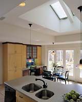
With the kids moving upstairs, their old first-floor bedrooms were put to other uses. One was transformed into a walk-in closet for the master suite. The other became the kitchen, a shift that not only gave thefamily much-needed elbow room — it grew from a claustrophobic 7×4 to a comfortable 18×20 ft. — but also connected it directly to the garage as well as to the back patio. Because the addition stops just short of the kitchen, Walter put skylights over the island, bringing more daylight inside. A pair of glass doors, matched to the ones in the adjoining family room, brightens the room even more and provides backyard access.
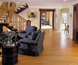
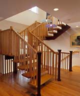
Walter built the new staircase over the existing basement stairs. It’s in the spot once occupied by the old kitchen and is part of the living room. Given its location, that makes it central to the kitchen and family room as well. Walter added windows in the stairwell to channel light into the heart of the house. It’s also a great spot to showcase unusual design and craftsmanship. The steel-backed wood treads appear to float off the steel stair stringer, painted a rich red. Rough-hewn newel posts add an Asian accent, one that’s also seen in the door casing to the kitchen and outside, where a small footbridge leads to the front door.

The New Upstairs
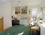
The stairs lead up to a carpeted, 12×17-ft. light-filled study that’s shared by the kids. Each has a built-in work space with lots of drawers and shelves. Linking the two workstations is a cozy corner window seat. “The office is really open,” notes the girls’ mother. “Sometimes that’s good; other times, when you want quiet, it’s not so good. When they need to study on their own, they go into their bedrooms.”
The children’s bedrooms and baths are separate, but not exactly equal when it comes to square footage — a fact that hasn’t been lost on the younger sibling. “The little one notices the difference! If we were to do it again, I would want to make the girls’ bedrooms the same size,” says their mother.

Where to Find it:
Doug Walter Architects
280 Columbine St., Suite 205
Dept. TH600
Denver, CO 80206
303/320-6916
