A New Chapter
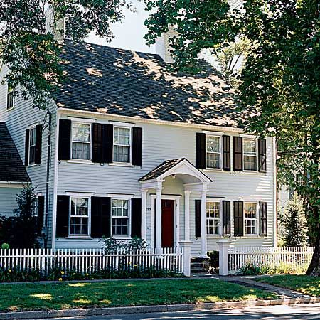
This 242-year-old Georgian home in Fairfield, Connecticut was built in 1765 by a local cabinetmaker, Justin Hobart. In 1890, a two-story service wing was added directly behind the original box-shaped structure. Around the 1940s or ’50s, the kitchen on the ground floor of that wing was updated, and a sunroom extension was added on one side. The changes had been carefully done, but when its new owners purchased it in 2001, there was more work crying out to be tackled.
The couple called on David Raymond, whose design/build firm is known in the area for its historically correct millwork. At first glance, Raymond identified the fundamental problem: no flow. If you wandered from one arm of the space’s U-shape to the other—from kitchen to dining room to living room and sunroom—you were obliged to retrace your steps to get back to the kitchen.
Structural Solutions
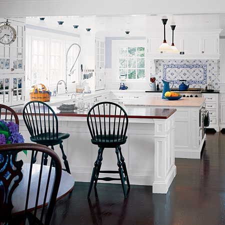
Working with Raymond and local architect/historical consultant Wilfred Tressler, the couple fleshed out a coherent design that would be acceptable to the town’s historical commission. They gutted the old service wing—a rabbit warren of atttic maid’s quarters—from basement to rafters, making ample room for a modern kitchen, a powder room, and a mudroom area, with an upstairs master suite. The redesigned kitchen was linked to the sunroom through a new eating area, which transformed the U-shaped structure into an O that allows the family to move easily around the ground floor without having to retrace their steps.
Dream Kitchen
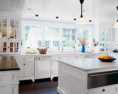
The couple longed for a commercial-style kitchen where two cooks could work easily without getting in each other’s way. The remodeled space hews to tradition with white-painted flat-panel cabinets and marble countertops, though the pro-grade stainless-steel appliances are marks of its modernity. A wall of windows above the Kohler kitchen faucet and Miele dishwasher brightens the space. Task light is provided by short pendant lamps over the counter and two longer fixtures over the island, which holds a Miele warming drawer.
Crafted to Last
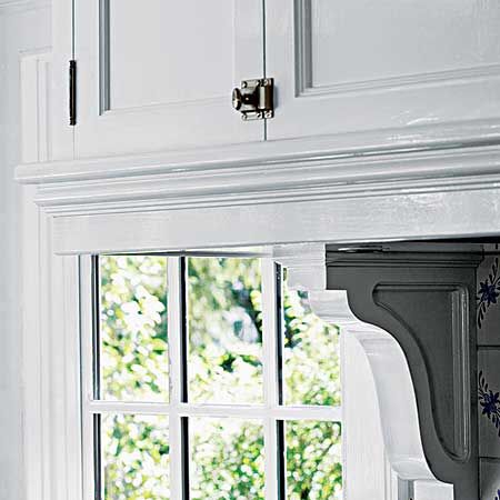
Almost unheard-of today, all the kitchen cabinetry was custom-built on-site. The latches from Rejuvenation add to the kitchen’s old-fashioned appeal. Wood brackets finish the undersides of the cabinets.
Artistic Details
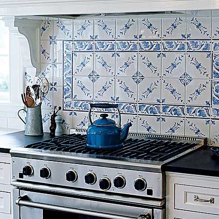
The backsplash tile behind the DCS range was hand-painted by a local artist and ties in with the blue pantry, which is built-in around the corner in the mudroom.
Modern Mudroom
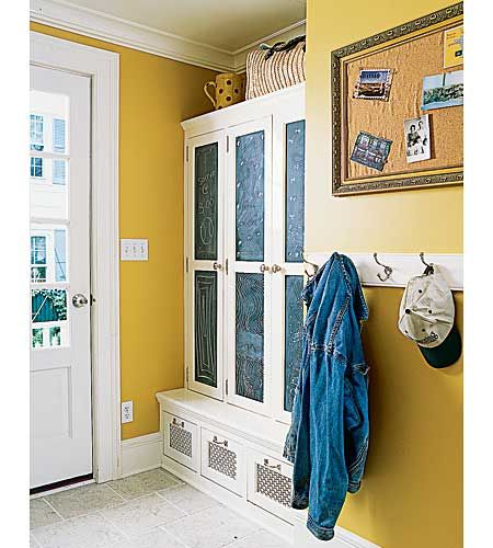
The relocated back door is now a side entry that leads to the new mudroom, which features three lockers with chalkboard doors, providing a place for coats, boots—and messages. More kid-height hooks help keep outerwear organized.
Parisian Pantry
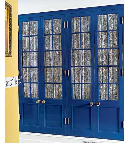
A custom-built pantry stores kitchen and mudroom overflow; lace curtains inside the glass-front doors screen the contents from view. Its high-gloss blue paint was inspired by the homeowners’ frequent trips to Paris.
Meticulous Millwork
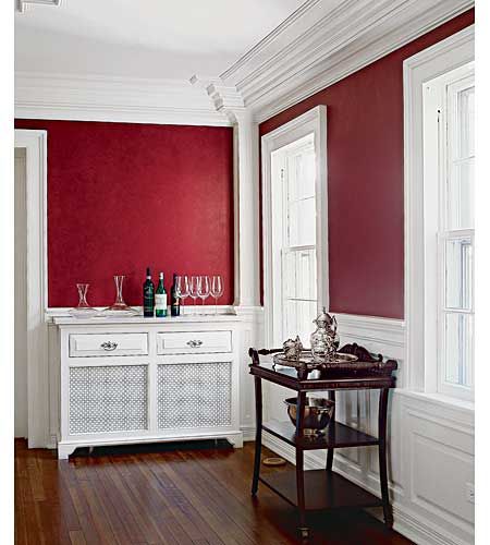
Clues to the home’s past were sparse, since much of the house lacked ornamentation. “Houses of the period could be really plain or very ornate, depending on the wealth of the homeowner,” says Raymond. “This one wasn’t an elegant house when it was built.” He pulled together designs based on his knowledge of historic homes in the area.
The dining room’s dramatic period- appropriate moldings and wainscoting are mostly new and help make the 8-foot ceiling height appear higher. Carpenters added flatware-storage drawers and a marble top to the furniture-grade radiator cover.
Remnants of the Past
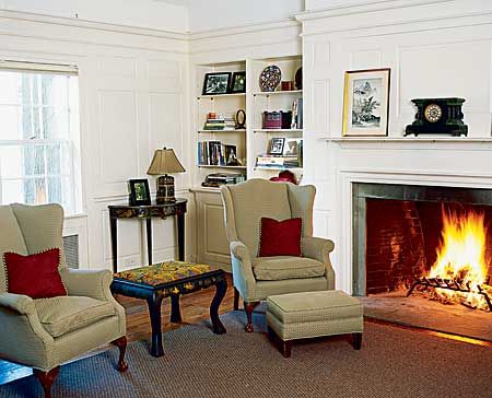
The living room paneling and built-in shelves were inspired by bits of trim found in the dining room, presumably added during an earlier remodel.
Original Handiwork
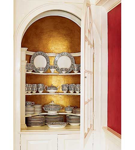
The china cupboard in the dining room is the only example of the original homeowner’s handiwork, dating back to the 18th century.
New Heights
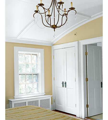
Upstairs, the master bedroom and master bath gained a dramatic amount of headroom from curved barrel-vault ceilings—here the ceiling reaches 9 1/2 feet at the center, though it gives the impression of being even higher.
Seamless Construction
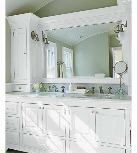
The on-site cabinet-building helps account for the seamless look of this storage-packed vanity in the master bath. Finished with crown molding along the top, which ends well below the curved vaulted ceiling, it appears to be a single piece.
Fine Furniture
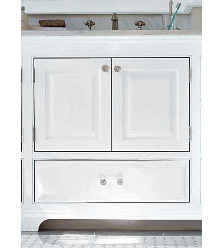
Flush inset doors and drawers and curved feet add to the double vanity’s furniturelike look.
Traditional Fixtures
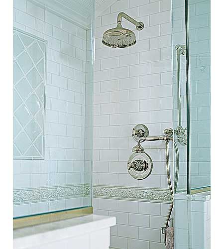
The rounded lines of the Rohl nickel fixtures give the modern-day shower old-world appeal.
Vintage Style
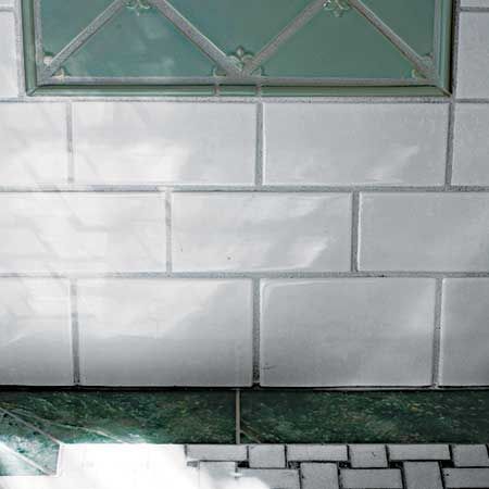
Basket-weave marble tiles on the floor and white subway wall tiles create a vintage look; pale green tiles with a relief pattern form a decorative inset.
Floor Plan: 1st Floor
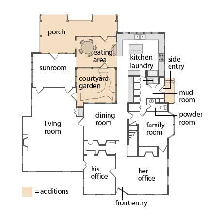
On the first floor, as part of reworking the kitchen, a back door was moved to become a side entry with a mudroom and laundry area just inside. The new kitchen eating area, the courtyard garden, and the porch bring the formerly U-shaped plan full circle.
Floor Plan: 2nd Floor
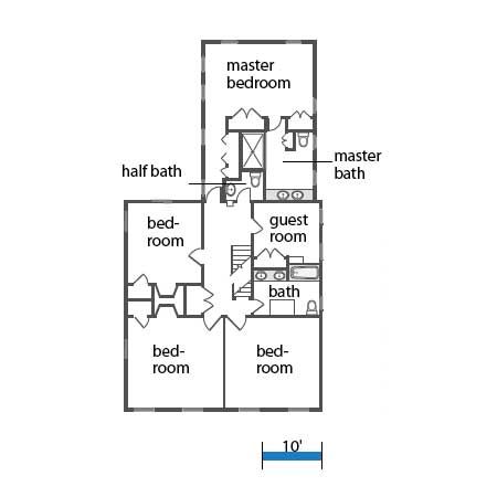
Above the kitchen and mudroom, where three maid’s rooms had been, is the master suite; the remaining bedrooms share one-and-a-half baths.
