Ugly Ceiling Joists Surprise: Before
My wife, Rachel, knew trouble when she saw it, but even I could tell something wasn’t right. The ceiling joists weren’t resting on top plates—they were just nailed to the tops of the walls’ 2×4 framing. The only thing keeping that ceiling up was three layers of beadboard paneling and drywall inside and, we later learned, three layers of siding. We were lucky the ceiling hadn’t fallen right on our heads.
Almost-Newlywed Sweat Equity: After

It wasn’t the most romantic activity for near-newlyweds, but there we were, sledgehammers in hand, taking down a wall in our new house. I pulled off a large chunk of the interior wall we’d started with, and Rachel and I peered up inside the hole. We looked at each other, then up again. We couldn’t take our eyes off of what we saw.
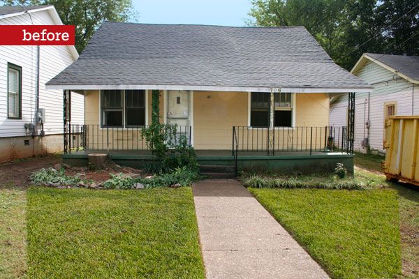
Shown: Joel and Rachel Banta transformed the sad facade of their 1920s house by centering the new door—built by Rachel’s carpenter dad-—and reinstating the original dormer. New, Craftsman-style piers replaced old metal railings.
The Opposite of Open Plan: Before
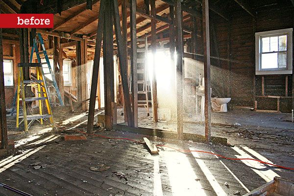
As for how we got into this mess: Money was tight. I had gone out on my own as a filmmaker, and Rachel had left a job in New Orleans to come to Huntsville, Alabama, and marry me a couple of months earlier. We saw the 1920s bungalow in the Five Points Historic District near downtown Huntsville, and we loved it. Yeah, boy, it was run-down—and chopped up, with rooms added on as porches and later enclosed, and an odd ceiling drop from 10 feet to about 7 as you moved from the house’s original front to its back. But we bought the house “as is” at a low price, thinking we’d Sheetrock the walls, put in a new kitchen, and be done. Well, I guess you could call it the house that love built, because we definitely had a lot more of that than we did hard construction experience.
Shown: The existing house was chopped up by numerous walls, which made it seem even smaller.
Lofty and Full of Light: After
One other thing we had a lot of? Problems. After we found out about the dangerous framing, we discovered termite damage, too. We had to face facts: Just making the place livable was going to take way longer than the four months we’d projected for the remodel. Restoring the house’s historical character would be icing on the cake.
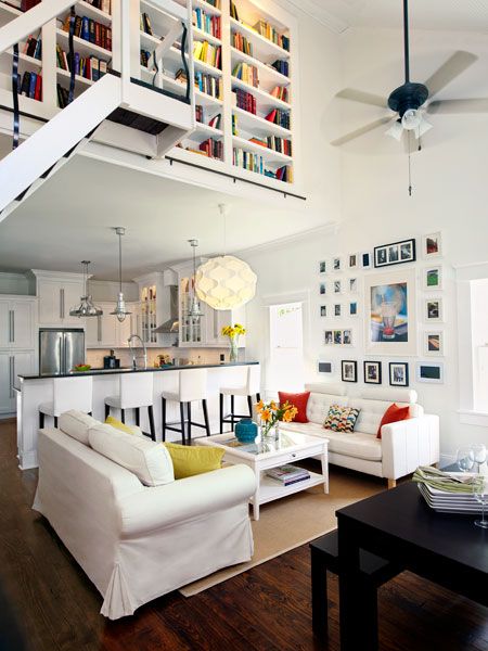
Shown: The new, open first-floor layout merges the living room and kitchen to create a spacious feeling inside the bungalow. A vaulted ceiling allows natural light to stream in from the attic-level dormer.
Updated, Bright Kitchen
Rachel understood old houses better than I did because she’d grown up hearing her father, Paul Capitano, talk about his work restoring historical homes. He turned out to be our hero. During our renovation, he drove seven hours to Huntsville from his house in New Orleans once a month, spending a weekend teaching us what to do: everything from retrofitting the framing to laying floorboards and tile. When he left on Sunday, we’d try to do everything he’d said. I’m a film guy with a graphic-design background, and I’d never even held a nail gun. That would change, and fast!
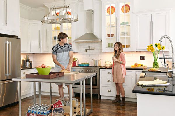
Shown: Cabinets and drawers built by Rachel’s dad are fitted with a mix of contemporary bar pulls and period-style bin pulls. The stainless-steel appliances and center worktables give the vintage home’s kitchen an updated look. New southern yellow pine floors resemble the longleaf pine originals that Joel and Rachel reluctantly scrapped.
Fridge and cabinet bar pulls: IKEA
Bin pulls: Hickory Hardware
Range: Fratelli Onofri
Islands: Restaurant Equippers
Faucet: Kraus
Rolling Ladder for Library Access
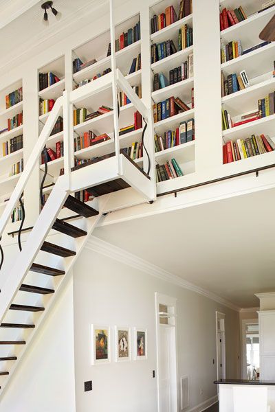
We knew we wanted a three-bedroom, two-bath house—the same room count we started with, except we wanted to do away with two of the existing bedrooms and a bathroom to open up a large living room–kitchen area. Since the house is in a historic district, we could make only cosmetic changes, not additions, to the front, so to give us more living space we decided to add a master suite off the back. Rachel and I poured the concrete footings and laid the cinder-block foundations ourselves, under Paul’s guidance. We also finished a room in the attic, making a total of 2,100 square feet of living space.
Shown: Bookshelves take advantage of the ceiling transition between the kitchen and living room; to access them, Joel added a rolling library ladder with platform for his heights-shy wife, Rachel.
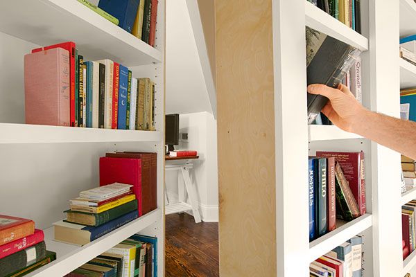
Hidden Bookcase Door
The glory of the new open-plan kitchen and living room would be the house’s original longleaf pine floors. But we’d need to refinish them, not to mention add a new subfloor, since we could see the bare ground peeking through gaps between some of the boards. I spent a month pulling up the floorboards, which required removing carpeting and then, piece by piece, a layer of glued-down linoleum. We took the floorboards to a floor restoration shop to have them shined up and to find some to match. The shop owner took a close look and said, “You can’t use these. They have asbestos glue on them.” Forget the potential dangers—a month of wasted labor flashed before my eyes. Even now, Rachel can barely talk about it, except to say, “That was a day for me. I cried.”
Shown: A hinged section of the bookcase serves as a secret secondary entrance to the finished attic office.
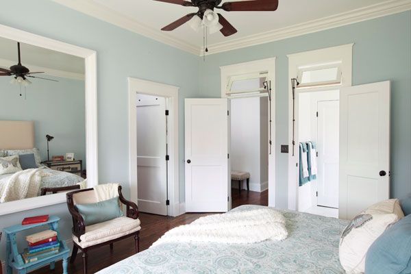
Transom Flow in Master Bedroom
We ended up replacing the wood with new southern yellow pine, stained to look like the old longleaf we’d hoped for. And, aside from the floors, Rachel got her dream kitchen, a mix of historical and modern. The vintage-style cabinets are a real testament to her dad’s abilities. He arrived one night with 28 sheets of birch plywood, and he and I spent three days making cabinet and drawer boxes. He made the doors in his shop at home, and on his next trip we installed everything. Rachel chose period-style bin pulls for the drawers and vertical bar pulls from IKEA for the cabinets. We had pushbutton switches installed, too, for a period touch.
Shown: Operable transoms over the doors are fitted with vintage hardware and funnel light and air into the new master bedroom, located in the rear addition.
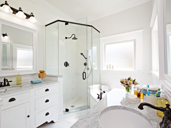
Expansive-Feel Bath: After
The kitchen is perfect, but the house’s showpiece is the living room, where the plan evolved from a series of lightbulb moments. When we were clearing out the attic, we discovered the framing of an original dormer on the front of the house; we decided to give the living area a vaulted ceiling, peaking at about 18 feet, to show it off and open up the room even more. Since we had to put in a regular 10-foot ceiling in the kitchen to conceal electrical systems, there was a transition from a flat ceiling to a vaulted one. My father, who helped with everything from cutting asphalt shingles for the roof to painting the rooms, thought it would be a great spot for bookshelves—but 10 feet up in the air, how would we get to the books? We made pencil sketches and came up with a platform library staircase, like something you’d see in an old movie. I mail-ordered library-ladder hardware, and when Rachel’s dad came we built it in four days. Done. Many of the other historical details, like interior transom windows, beadboard ceilings, and simple flat trim, were inspired by a local tearoom housed in a 1926 bungalow. Most of our home’s trim had been removed over the years, so Rachel’s time at the tearoom, taking notes and measurements, really paid off.
Shown: A windowed space in the addition makes for a light-filled master bath, with a glass-enclosed shower and large mirrors.
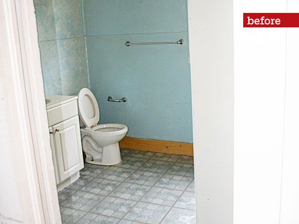
Dank Bathroom Look: Before
It’s amazing that a few years ago, when we bought the house, I didn’t know what a nail gun was. Now I have several of them, and a builder’s license too. Renovating a house is a lot like making a film: Both involve many layers. Maybe Rachel and I will even do another house since we are now a family of three, having welcomed baby Elizabeth. If we do, one thing’s for sure: I’ll line up a crew to help me with the concrete and cinder blocks.
Shown: The old bath was dark and lacked storage.
Bath Details for a Vintage Look
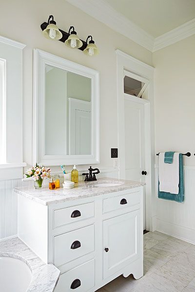
Light fixtures with glass shades, marble counters, and handmade footed vanity cabinets establish a vintage look. Period-perfect bin pulls and faucets complement the classic style.
Faucet: Delta
Floor Plan Before: Needless Bedrooms
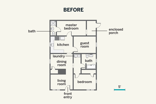
Doing away with two of the bedrooms allowed the couple to center the front entry and create one large open-plan living room and cook space.
Floor Plan After: Rear Addition
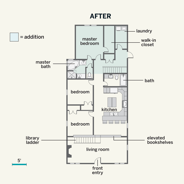
A 16-foot rear addition houses the new master suite.

