Downsizing
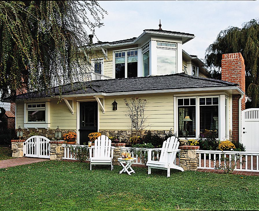
Downsizing from a big house has its upside, that’s for sure: There’s less square footage to heat and cool, fewer rooms to declutter and clean. The trick is to figure out a compact size that’s just right, one where you use every inch but don’t feel cramped. That was the puzzle Steve and Janet Dowd were trying to solve as they prepared to leave the rambling, suburban Laguna Hills, California, house where they had raised their two sons and move full-time to Steve’s childhood home.
The 1940s cottage offered many pluses. Located about 300 feet from Newport Bay, the house featured a private courtyard and a living room with a charming, vaulted wood ceiling. On the minus side, it was a one-story, nondescript stucco house that totaled just 1,225 square feet; their old house held 3,800. The 8½-foot-wide kitchen would never suit serious cook Steve, and the dining room was barely bigger than a hallway, with no room for Janet’s heirloom hutch. Plus, only one of three small bedrooms had a closet, and it was tiny.
Built-in Bookcase
By the time the couple turned to local architect Carol Tink-Fox for help, their wish list had grown to include an office for Steve, a proper master suite, a laundry room, and a guest suite for visiting family, as well as a larger kitchen. They also wanted to maximize storage and views of the bay—all without destroying the vintage cottage’s character. “We really wanted to keep the house as close to original as possible,” says Steve.
Given the home’s narrow, 45-by-97-foot lot, Tink-Fox knew a second-floor addition was the only way to get the Dowds any extra space, as well as those water views. So she created a two-story section in the central portion of the house. The back, street-facing side of the house, where the garage is located, remained unchanged. But everything between it and the kitchen—the dining room, three bedrooms, a bath and a half—came down. “We essentially built a new two-story house between the kitchen and the garage,” says the architect.
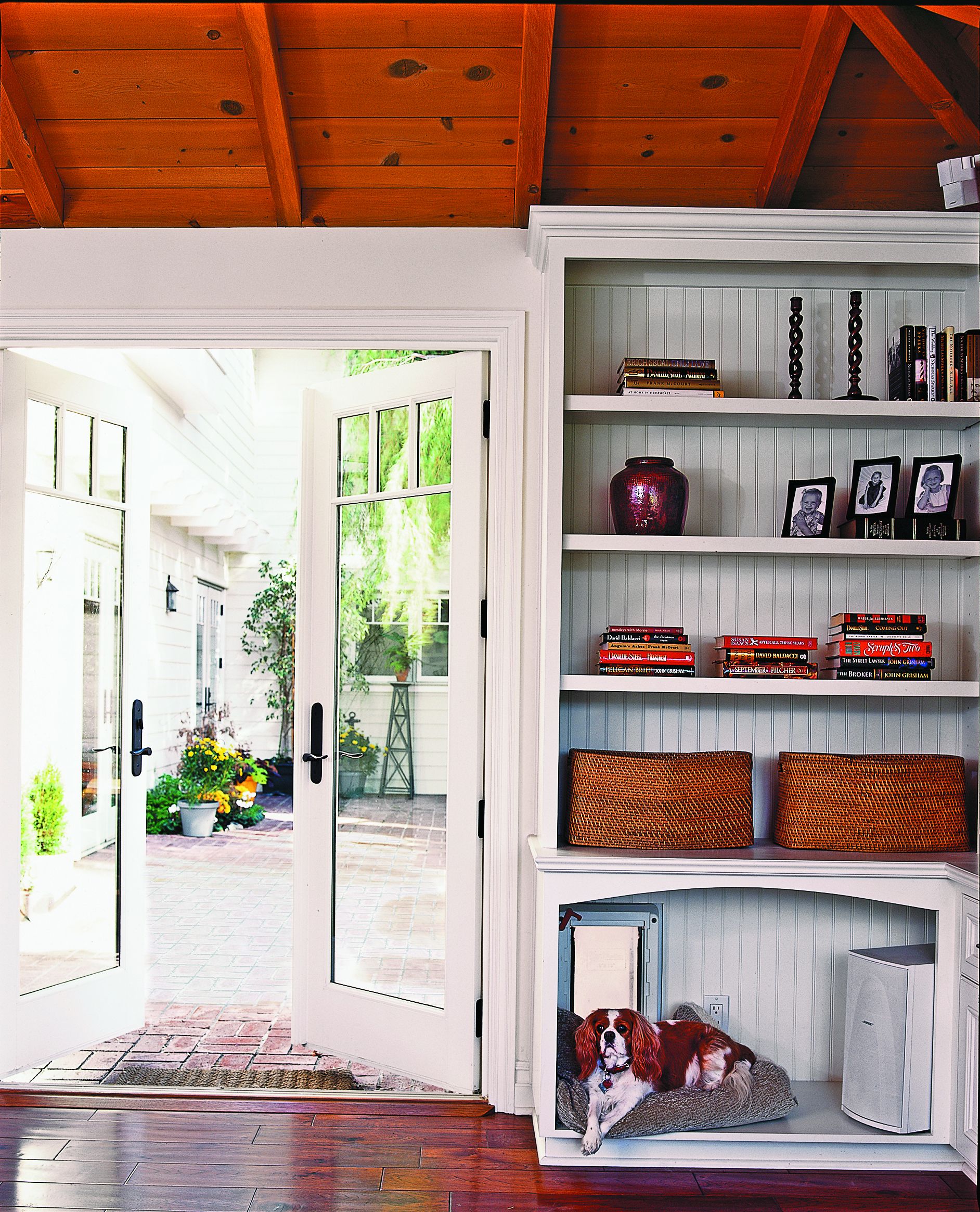
Chloe, the couple’s Cavalier King Charles spaniel, got a cozy nook away from foot traffic in the bottom of a built-in bookcase, complete with doggie door and bed
Dining Room
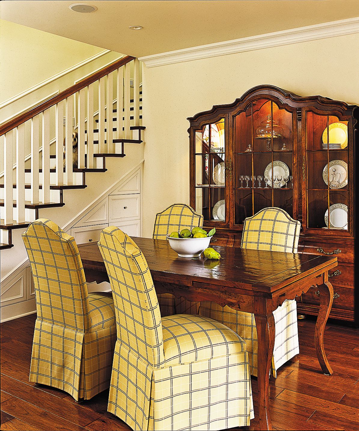
Even though the new spaces added 775 square feet, the house was still compact enough to -require some innovative thinking. One of the most unusual aspects of Tink-Fox’s revised layout was that it eliminated nearly all interior hallways, using rooms as traffic corridors instead. When entering the house from the garage, for example, the traffic flow leads you through the mudroom/laundry and the guest bedroom before you reach the living room. “We made a mental leap that it would be okay to walk through rooms,” says Tink-Fox. “In the first-floor guest bedroom, we would have lost 50 square feet of space if we had created a hallway.” Since just Steve and Janet were going to be using the house on an everyday basis, the compromise made sense. Similarly, the only door from the side yard into the house opens directly into the first-floor bathroom, making it a convenient stop for cleaning off sandy feet. And instead of creating a hallway to accommodate the added stairway, Tink-Fox placed the stairs at one end of the new dining room, reasoning that the open space above the stairs would add a sense of airiness in the modest dining space.
Courtyard Patio
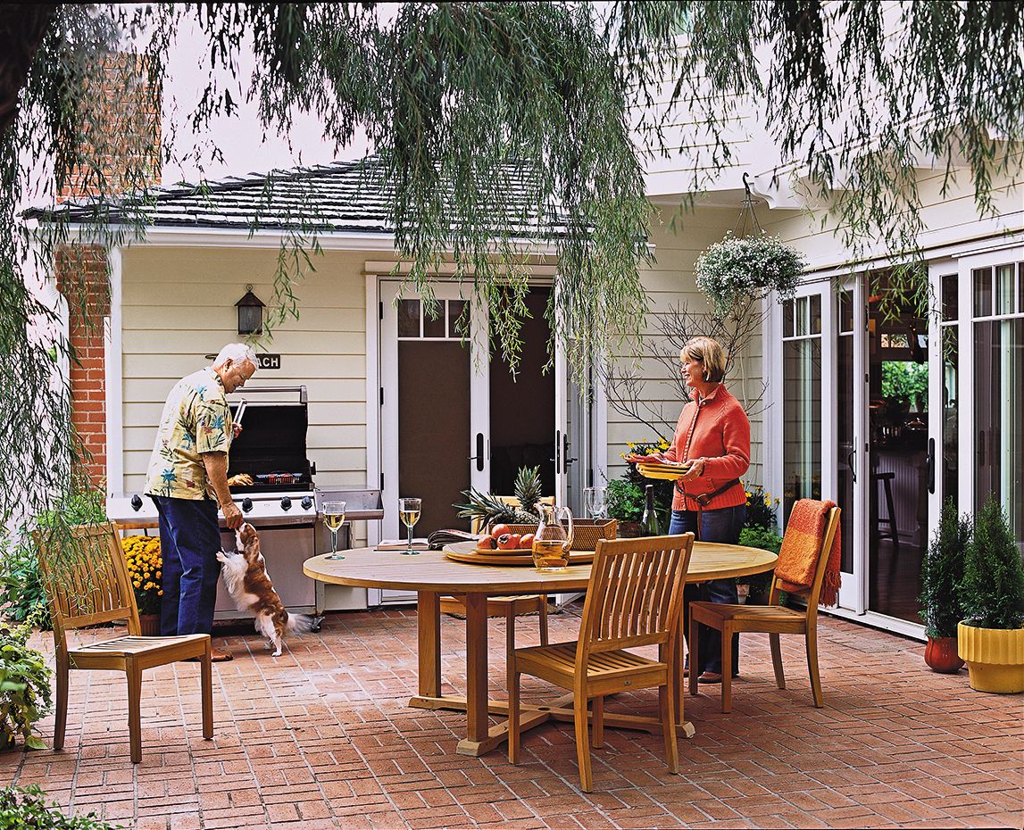
Even the courtyard functions as a hallway, an option in southern California’s warm climate. “The courtyard is an extension of the house, another room,” says Steve, who strolls across it to reach his new office, which doubles as a storage and display space for his collection of fishing rods and lures.
Master Bedroom
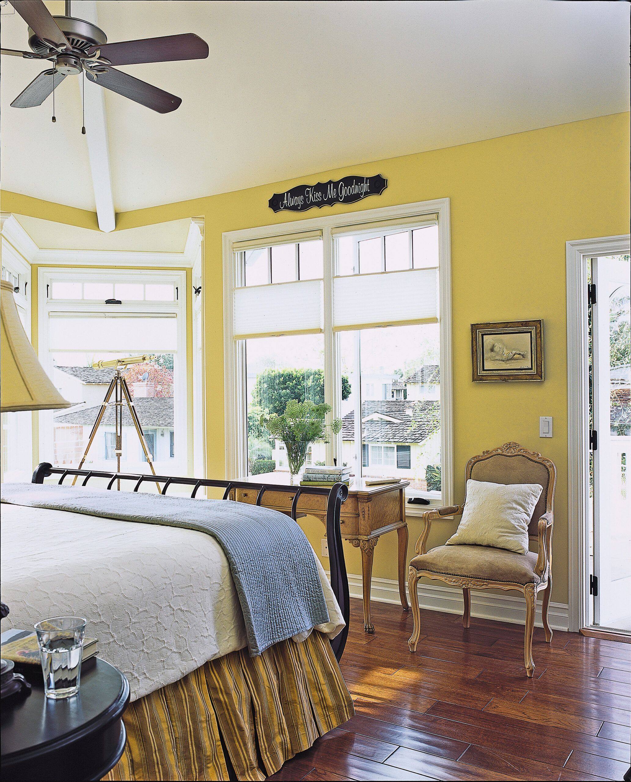
Upstairs, the architect maximized interior spaces by cantilevering the second floor over the courtyard. “We extended it a foot and a half as a way of sneaking in some extra square footage,” she says. Enhancing the size of the master bedroom even more—and creating an interesting architectural feature on the bay-facing corner of the house—Tink-Fox added a pulpitlike window-seat projection. Because the small, windowed bumpout is located diagonally opposite the door to the bedroom, it makes the room seem bigger. “When you can put windows in a corner opposite the entry, your eye is drawn right through to the outdoors, so you perceive a bigger room,” she says.
Master Bath
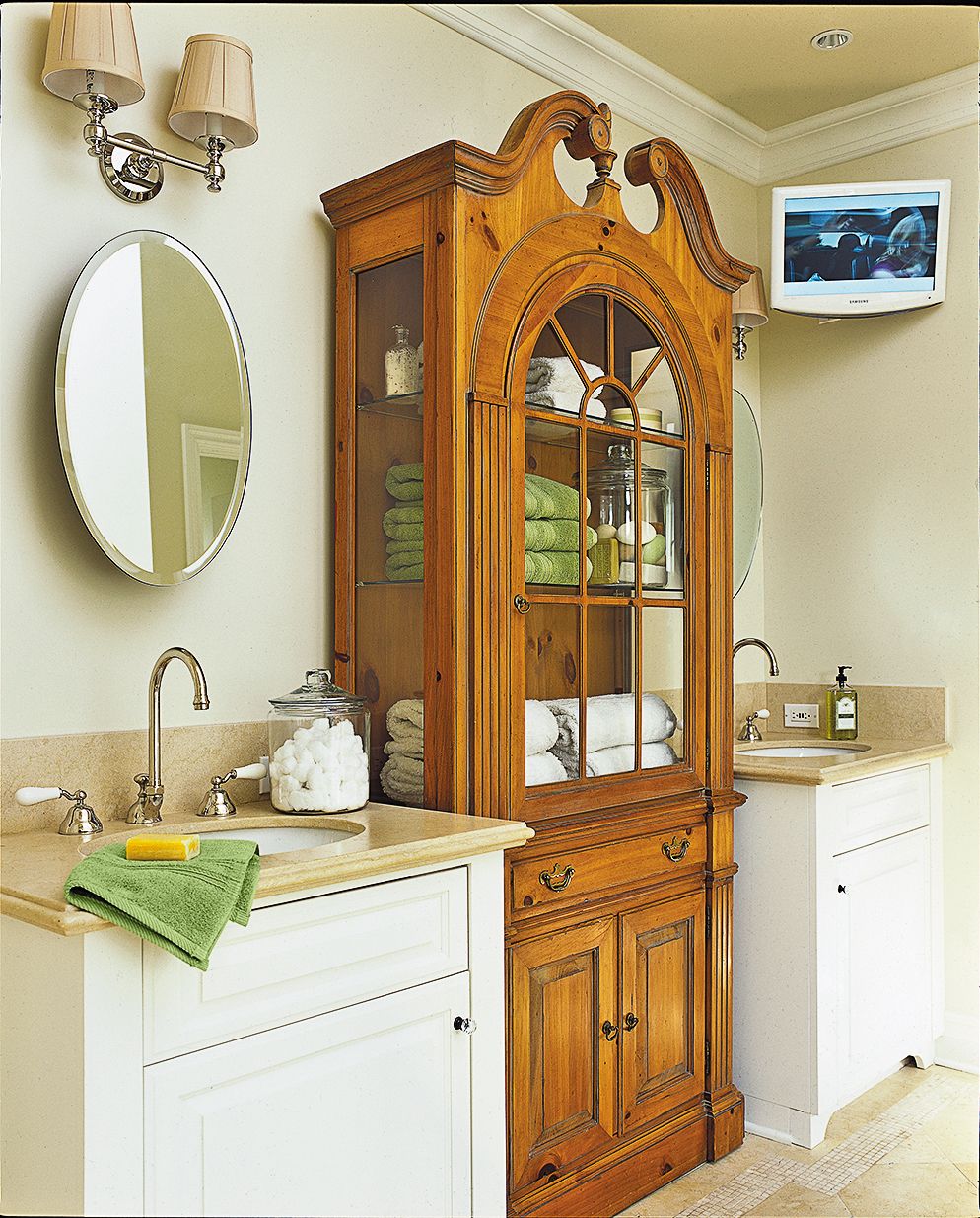
A treasured antique hutch was incorporated into the master bath as a linen cupboard.
Shower
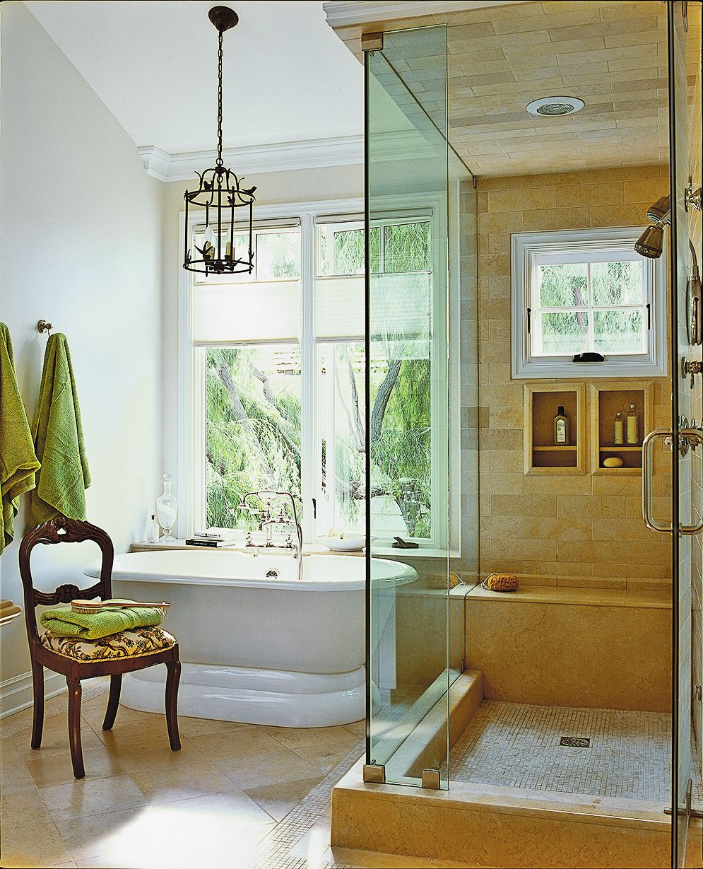
The clear glass shower enclosure allows for an open sight line straight to the outdoors, making the modest space feel bigger.
Storage Under the Stairs
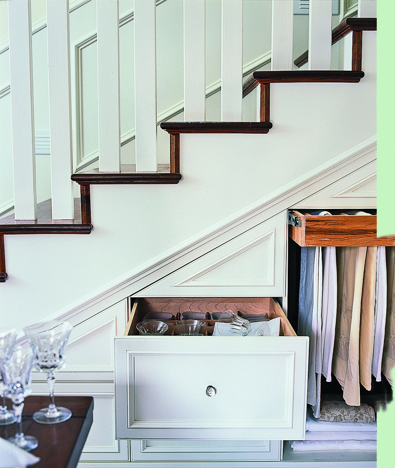
Unconventional solutions and visual tricks aside, it is the built-ins that really make the cottage function in a big way. “We took advantage of every space that would otherwise be empty and created a closet or a drawer,” says local contractor George Oliphant. Under the stairs in the dining room, for example, carpenters created drawers for china and hanging rods for table linens.
Concealed Safe
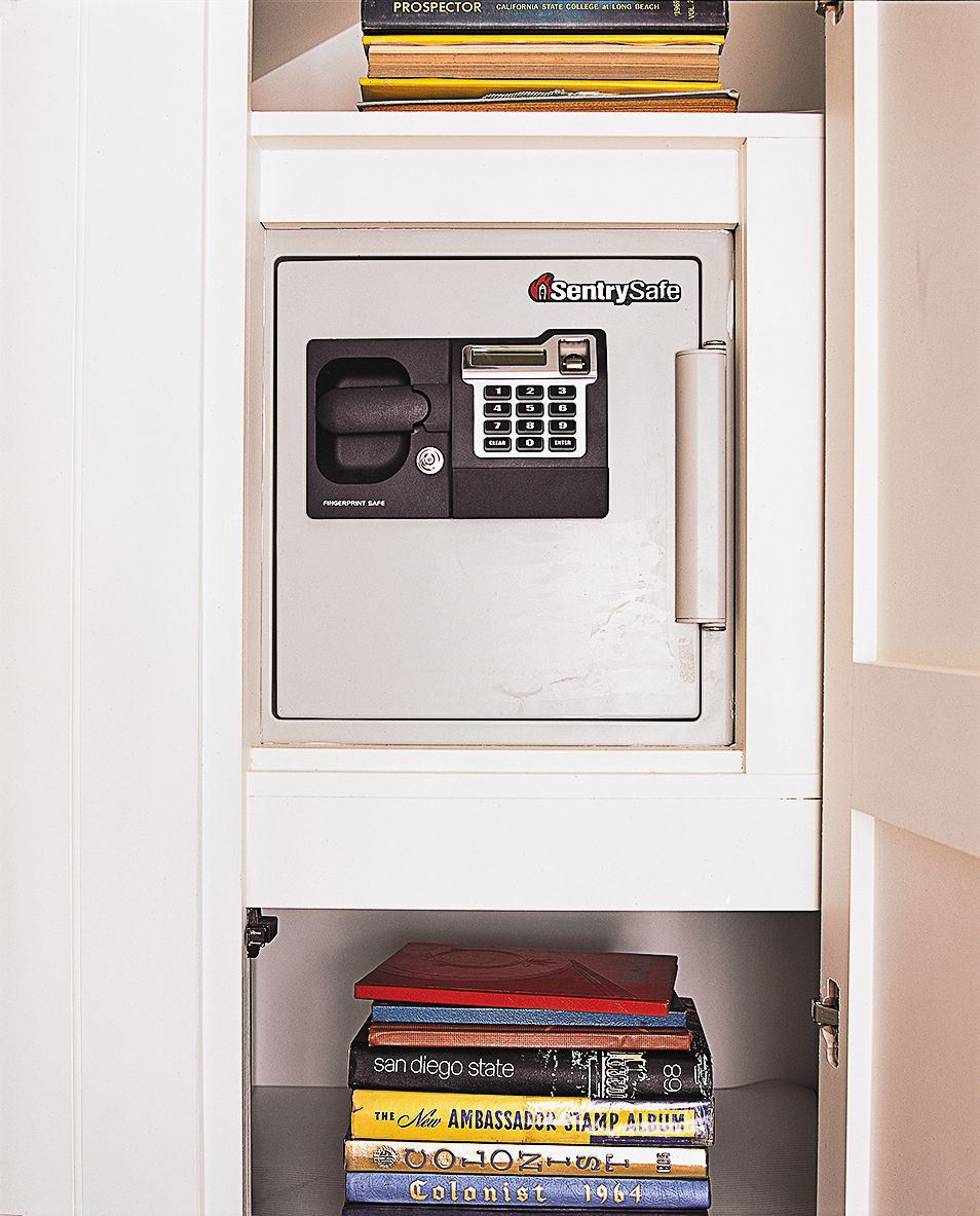
Taller under-stair space, along with part of an old bedroom, was claimed to make a pantry for space-gobbling quantities of household staples and a safe.
Pantry
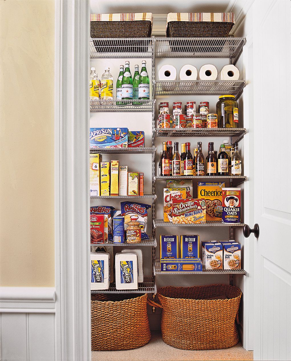
Instead of putting the pantry door in the dining room, where it would interrupt the only wall free for furniture, the architect located it in the first-floor bath.
Mud Room/Laundry Room
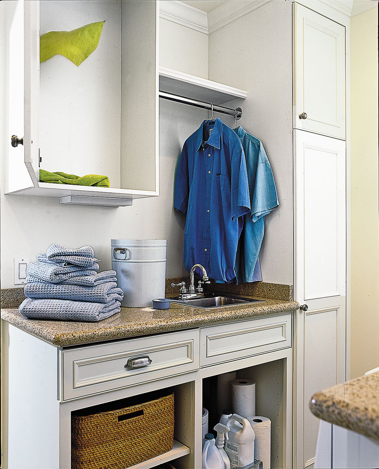
Cabinets stretch to the ceiling in the mudroom, which doubles as a laundry room. An upper cabinet in the mudroom/laundry conceals a chute for dirty clothes that originates in the master bedroom closet.
Office/Sewing Room
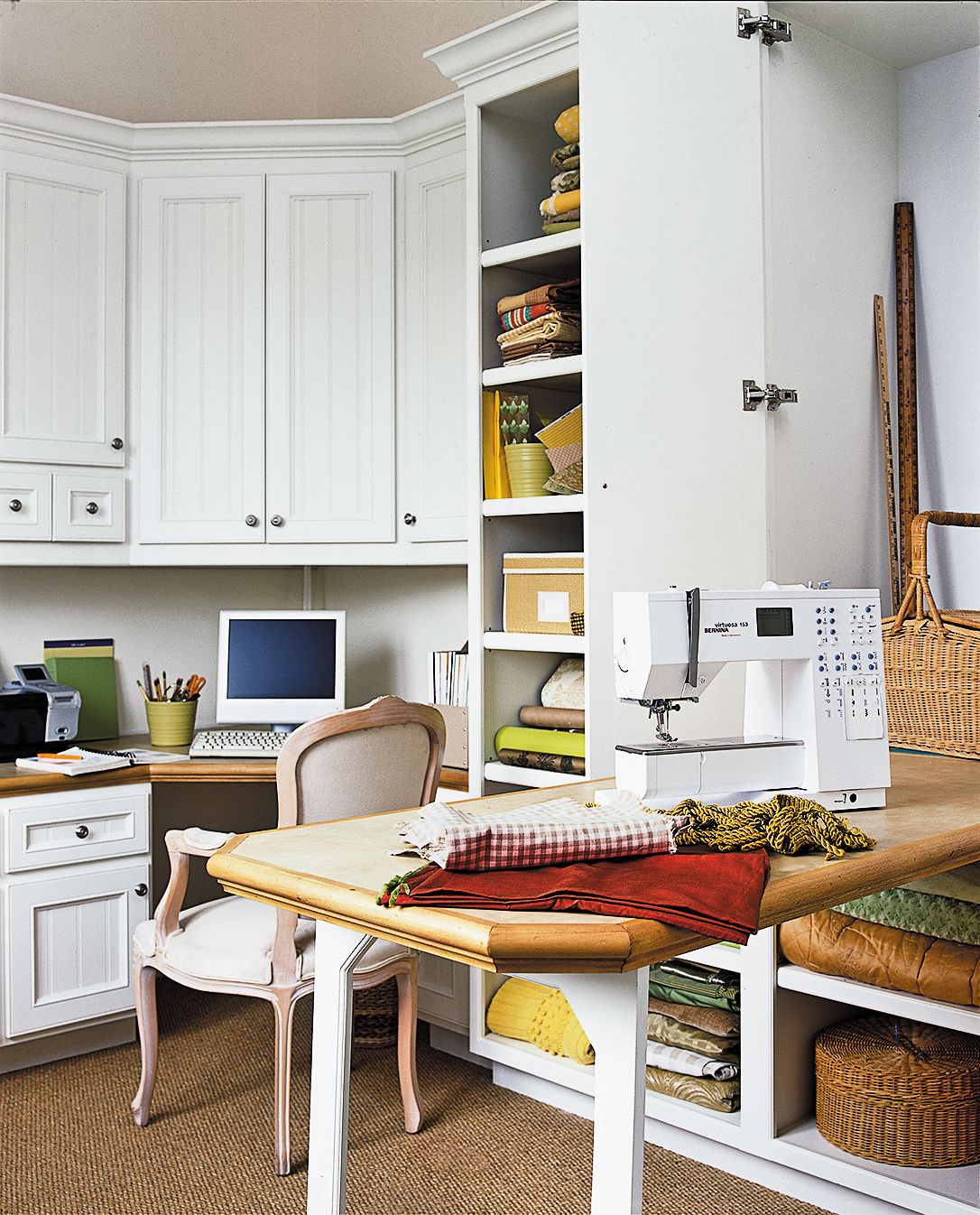
In Janet’s sewing room, built-ins hold fabric -supplies and a fold-away table for her sewing machine, as well as a desk. Making both home offices double as hobby rooms—Janet’s for needlework, Steve’s for fishing gear—and locating the laundry in the mudroom were additional ways Tink-Fox made every space work to full capacity.
Kitchen
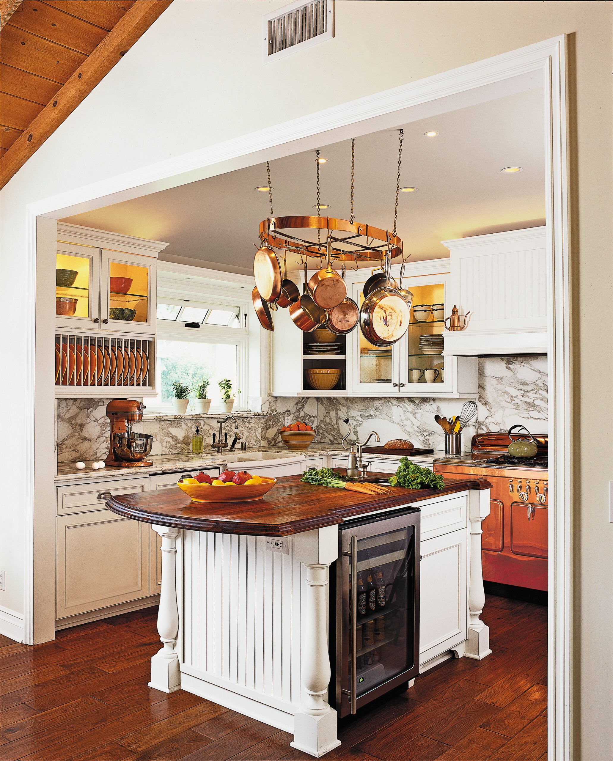
For Steve, the home cook, the kitchen grew from a meager 8½ by 10 feet to an adequate 14 by 10 feet, every bit of it packed with storage. Upper cabinets line three walls, with a plate rack and glass-door cabinets for visual variety. A copper 1950s Chambers stove, beadboard cabinet doors, and Calacata Gold marble give it updated vintage charm. Both corner cabinets contain swing-arm slide-out shelves; deep drawers in the island and a hanging rack overhead hold his collection of copper pots and pans. With a U-Line wine cooler, plus a small overhang for seating, the island is packed with function. It is topped with iroko, a sustainably harvested (and well-priced) exotic hardwood.
Kitchen and Living Room
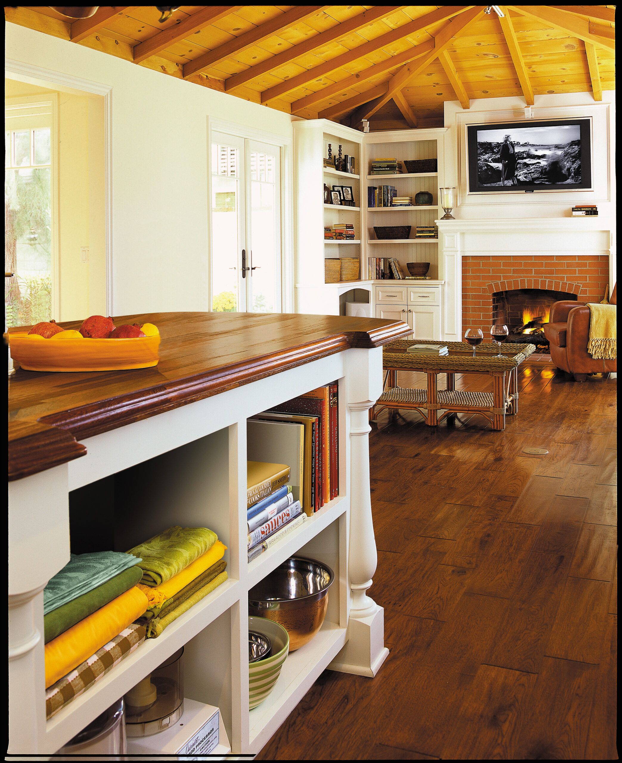
To make the kitchen feel more spacious, the ceiling was vaulted, rising to 9 feet above the island, echoing the original exposed ceiling in the adjacent living room, which rises to 10½ feet.
The living room’s original fir ceiling was stripped of stain and then clear-coated for a lighter look. The bookcases, mantel, and moldings—including the frame for the flat-panel TV—are all new but in keeping with the clean, simple style of the 1940s cottage.
Living Room Ceiling
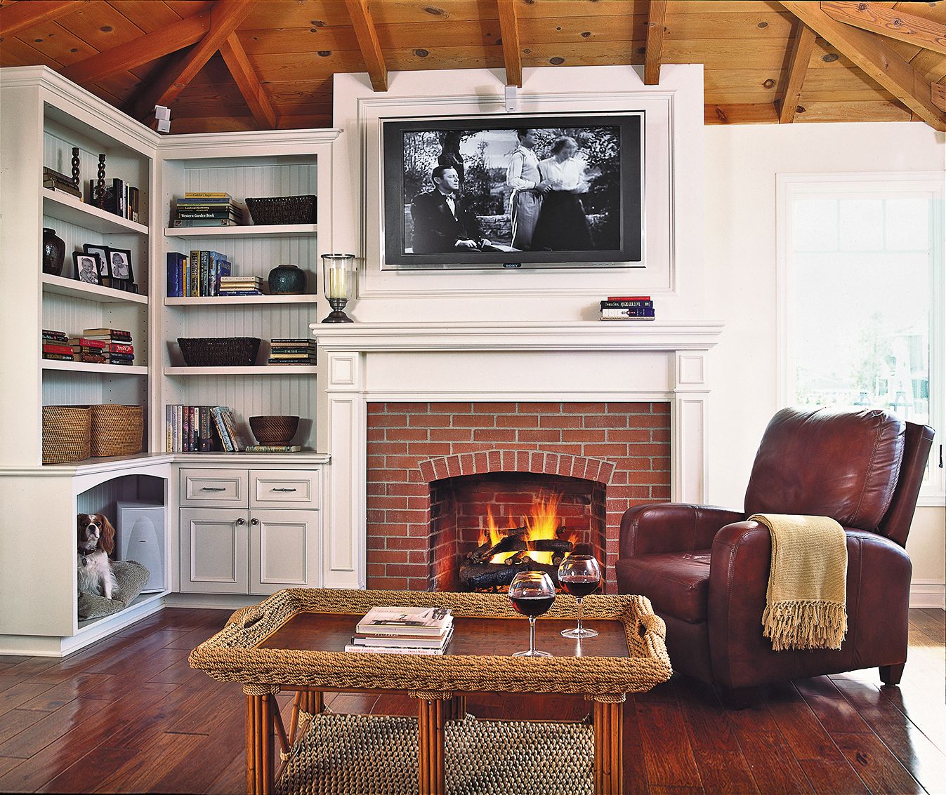
The living room remains the heart of the original house, with its newly sandblasted fir rafters and brick fireplace. It set the tone for the cottage-style materials used throughout, including hickory floors and raised-panel or beadboard cabinetry on the interior, and clapboard siding and shingles on the exterior.
And what of the 1,800 square feet of space the couple sacrificed in the move? They don’t miss it a bit. “We have everything we need right here,” says Steve. “This is our forever house.”
First-Floor Plan
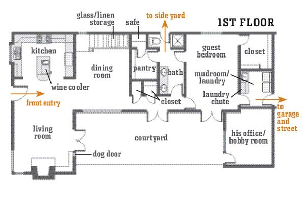
A new two-story section rose between the kitchen/living room end and the garage end; a new office was also created off the courtyard.
Second-Floor Plan
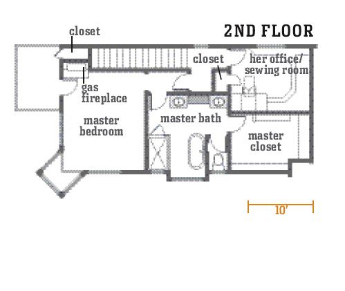
The end result: a compact, comfortable 2,000 square feet of space, with one short hallway and tons of storage.

