Harmonious Coexistence
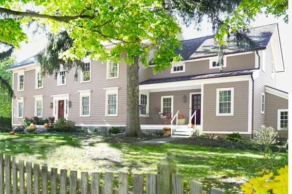
Things have a way of coming back around. Especially in old houses—woodwork resurfaces, doorknobs return, pantries reappear. Heck, entire porches find their way back from oblivion. But in these days of frenzied family life, function almost always trumps nostalgia. And so the oldfangled elements that rise again, or simply endure, must find a place of peaceful coexistence alongside the new. That’s what happened at the house on Four Corners Road.
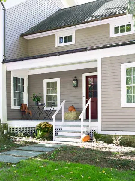
Shown: The new wing, with its porch and lowered roofline, mimics traditional farmhouse additions.
Landscape designer: Summerset Gardens
Architect: DeGraw & DeHaan Architects, Middletown, NY
General contractor and cabinetmaker: Robert M. Singer Construction, Warwick, NY; 845-986-3615
Paint: HC-172 Revere Pewter (exterior siding), HC-30 Philadelphia Cream (exterior trim), PM-15 Cottage Red (front door), Benjamin Moore
19th-Century Style
This four-bedroom, one-and-a-half-bath farmhouse, on five acres in Warwick, New York, belongs to Mark Silvestri, a commercial real-estate developer with a sincere respect for the time-honored. Some years ago, when he first saw the place, he was recently married, ready to start a family, and drawn to the rural setting and the creaky feel of the rooms. The home had plaster walls, wide-plank floors, and double-hung windows with wavy single-pane glass. “It was the only Warwick house I looked at,” he says. “What I liked was that it hadn’t been modernized. Nothing had been done.”
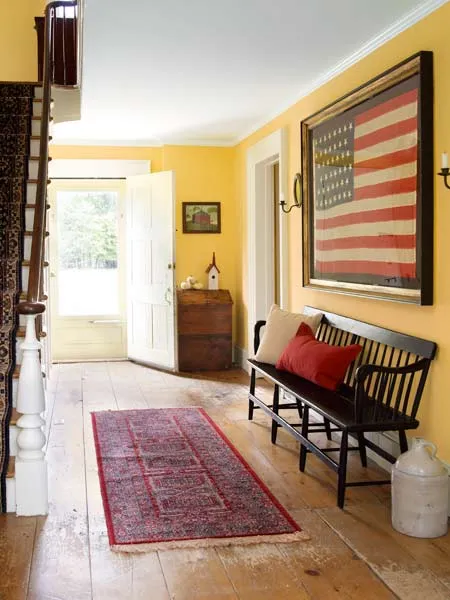
Shown: The core of the house and its center hall predate the Civil War.
Paint: Pale Cowslip 4 (entry walls), Valspar
Vintage flag: Jeff R. Bridgman
New, Sensible Revisions
Actually, some things had. At different points, the 19th-century home’s kitchen had most likely been moved from the basement to the first floor, joined by a bath, two closets, and a couple of claustrophobic hallways connecting the rooms. The revisions had in some ways made sense, but they had robbed the 3,000-square-foot house of its formal dining room, along with some original woodwork and detail, and left one side of the house feeling chopped up, recalls Jeff DeGraw, the architect Mark hired to improve the flow. DeGraw says the desire his client had is a common one: “He wanted to open up the convoluted space and restore the original bones.”
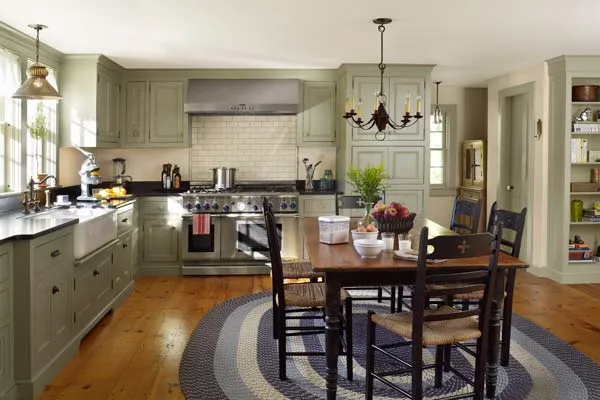
Shown: A farmhouse table with ladder-back chairs takes the place of an island in the new kitchen. Random-width floorboards, made of eastern white pine and finished with tung oil, contribute to the room’s warmth and character.
Paint: 950 Natural Wicker (kitchen walls), HC-111 Nantucket Gray (kitchen cabinets and trim), Benjamin Moore
Range: Thermador
Table and chairs: Lillian August
Spacious Period Kitchen
By the time DeGraw entered the picture, Mark and his wife, Lisa, had been in the house for five years and were the parents of two daughters. They had an idea of what they wanted to preserve and let go. “The kitchen was bad,” Mark says, recalling a few stingy feet of counter space and a utilitarian electric stove. The small dining room, at the back of the house, zigzagged too far from the kitchen. The downstairs bath supplemented the one on the second floor but was hardly handy to the bedrooms. A screened porch off the right side of the house, a 20th-century addition, was terminally infested with carpenter ants and had to come down.
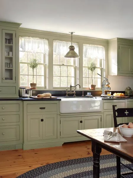
Shown: New double-hung windows and an apron sink echo the period look.
Windows: Smith Restoration Sash, Providence, RI
Sinks and faucets: Shaws and Perrin & Rowe; rohlhome.com
Light fixtures: Lighting by Hammerworks
Countertops: Stone Surfaces Inc., East Rutherford, NJ
Hidden Function
The couple agreed with DeGraw’s assessment: The first floor’s previously renovated side and the second-floor area directly above it, which included a master bedroom with no bath, needed a redo. They settled on a two-phase renovation, beginning downstairs. The Phase One wish list included a cook-friendly kitchen, a butler’s pantry, and a traditional dining room; upstairs, they simply wanted to update the existing bath while they figured out how to approach the master suite, a large-scale project to be tackled in Phase Two. Also slated for the first round of renovations: window improvements, systems updates, and an overall streamlining of the first-floor layout to make it work better for a family.
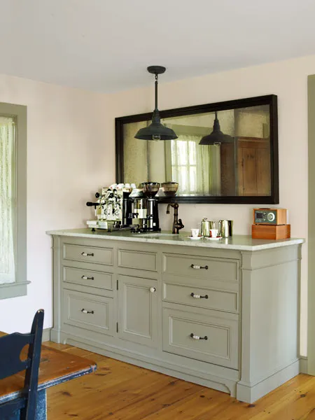
Shown: Coordinated cupboards and panels mask modern amenities, including a water line for the espresso machine and refrigerator drawers.
Espresso machine and grinder: Fiorenzato Bricoletta and Macap, 1st-Line Equipment
Mirror: R Squared Mirrorglass Company; oldmirrorglass.com
Seamless Finishing Touches
There was little question that Mark, who’d been planning the renovation for years, would call the shots. But first, he and DeGraw had to synch their visions. Mark wanted to change as little as possible about the original structure. DeGraw pointed out that the main floor’s mishmashed half amounted to about 450 square feet, a clue to how the overcrowding began. “There was no way to stay within the original footprint,” DeGraw says. The answer was an addition on the house’s right side, and he and Mark agreed that it should be stepped back and lower than the original roofline, to fit under an old pine tree in front. On the side, it would line up with a barn-style garage the couple hope to add later.
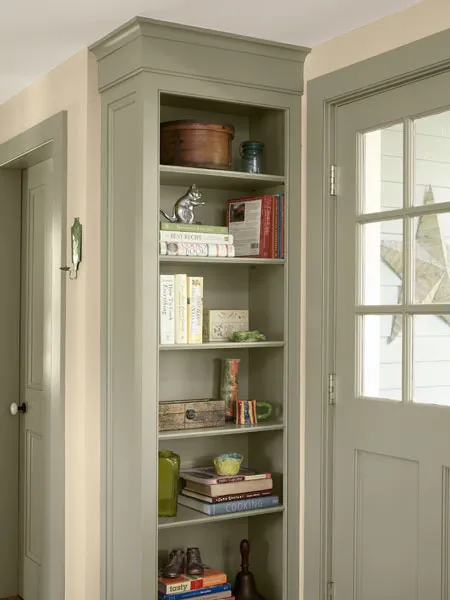
Shown: Crown molding gives open shelves in the kitchen a finished look.
Modern Amenities Hidden Behind Period Details
Mark, an avid researcher, was learning more and more about the house—which the original deed suggested was older than the 1850s vintage that had at some point been assigned—and realizing that the property had undergone many revisions. A barn out back had bitten the dust in the 1920s after being hit by a tornado. (Its replacement went up in a spot more accessible to the home and the road.) A porch spanning the house’s front, visible in a 1904 photo he’d unearthed, had been an add-on that vanished some 70 years ago. It dawned on him, Mark says, that as a house ages, even big changes can eventually come to feel like they have always been there.
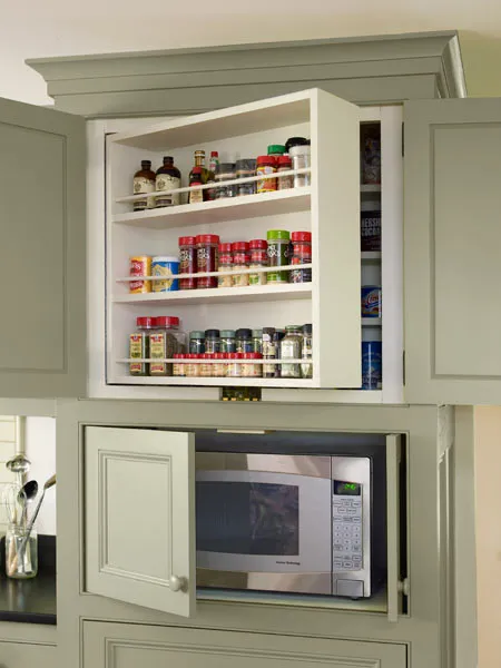
Shown: Coordinated cupboards and panels mask swing-out spice shelves and a microwave.
Living Room Untouched
Mark signed off on DeGraw’s plan for a two-story side-gabled wing of almost 1,300 square feet, with a fully loaded kitchen and a second-floor space that would remain incomplete until the reno’s next phase. The new wing, taking roughly the space vacated by the screen porch, would also add a stepped-back front porch.
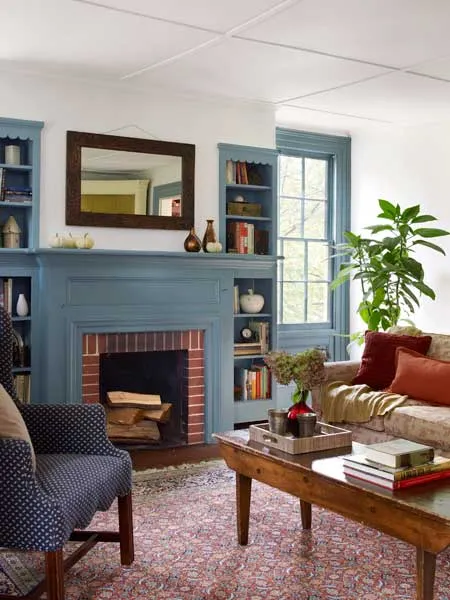
Shown: The original sitting room provided a handy “look book” of molding and trim details for the renovation.
Paint: 1671 West Coast (fireplace surround and trim), Benjamin Moore
Savvy Mudroom
A number of interior reconfigurations were also on the roster, and they came first, led by general contractor and cabinetmaker Robert Singer. The house’s left side sat undisturbed while the right side was torn apart. “I came home one day and the floor was gone,” Mark remembers. Galvanized-aluminum pipes were replaced with PEX and copper, and new wiring went in.
Piece-by-piece removal of the titanic furnace—”Old Ironsides,” as Singer called it—made way for a three-zone forced-air heating and cooling system, and rotted joists necessitated some reframing. The bath was pushed to the rear in order to reclaim the original dining room space at the front of the house; the new butler’s pantry would connect the dining room and kitchen.
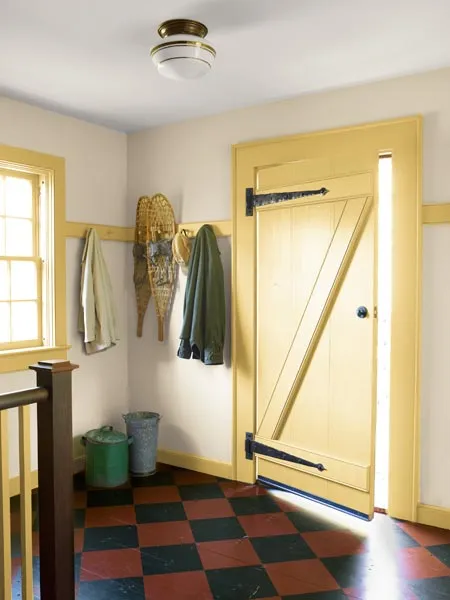
Shown: The mudroom has a barn-style door and a pine floor painted to mimic old linoleum.
Paint: 950 Natural Wicker (mudroom walls), 208 Da Vinci’s Canvas (mudroom cabinets and trim), 2005-10 Red Rock (mudroom floor), Benjamin Moore; and Coach Black (mudroom floor), Sherwin-Williams
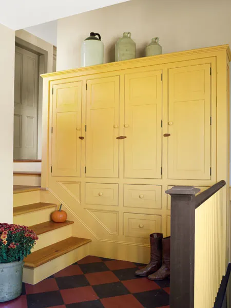
Step-by-Step Mudroom Lockers
A funny thing happened during all the poking around. Singer discovered that the original house was an asymmetrical structure, much smaller, that had been added on to over the years. The left side, and possibly a portion at the back, dated to different times. While DeGraw says his plan is all about function and flow, both on the first floor and leading outside, it may also recall the profile of the house before its 20th-century modifications. “The home’s new shape and form most likely echo those of the original house,” says Richard Hull, a historian whose family has owned the house across the street for the better part of a century and who remembers playing in the Silvestri home as a child.
All this historical head-scratching and cautious updating took time. Mark asked Singer to save and restore the existing double-hung windows. New copies for the addition, made by an expert a couple of states away, took the better part of one summer. Singer painstakingly re-created five-piece moldings around some of the windows, as well as decorative panels beneath.
Shown: A set of descending built-ins, finished with wood clasps, provides coat and boot storage in the mudroom.
Upstairs Bath
As often happens during drawn-out renovations, the shape of the house wasn’t the only thing that changed. The timeline was extended once again when the team decided to add a mudroom to the plan. The revision also stretched the budget, more so as Singer customized that space with storage lockers and a hand-painted checkerboard floor. Mark, clearly pleased, calls the room a “happy accident.”
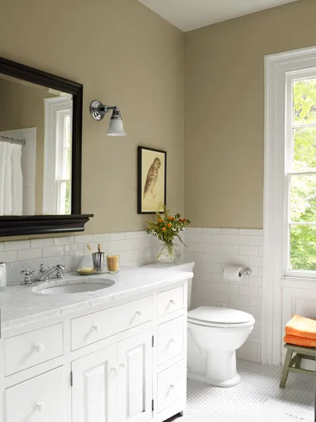
Shown: White finishes reflect natural light in the upstairs bath.
Paint: HC-111 Nantucket Grey (upstairs bath), Benjamin Moore
New Design Quirks
Though the groundwork laid in Phase One is complete, it leaves the house with a new set of quirks: The second-floor space DeGraw planned for the master bedroom and bath is currently accessed via a closet and houses laundry and exercise equipment. But, per Mark’s priority list, the house looks period-perfect from the road. “I thought it was very important to design from the outside in,” Mark says. “Even if it means that we now have to figure out how to make the upstairs work.” Stay tuned for Phase Two.
First Floor Plans: Spacious Addition
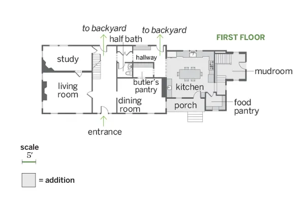
The nearly 1,300-square-foot addition holds the new porch, kitchen, pantry, and a step-down mudroom, as well as space above them intended for a future master suite.
Second Floor Plans: Refreshed Bath
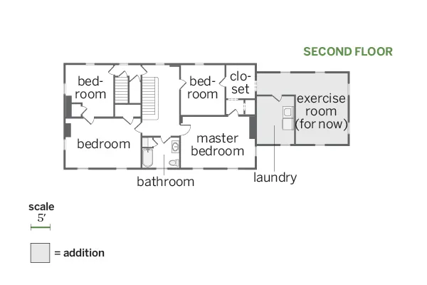
The dining room and half bath were relocated, and the second-floor bath was redone.
