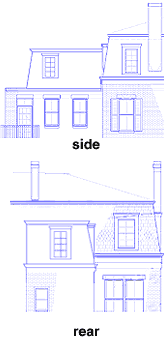
Charlestown homeowners Dan and Heather Beliveau wrestled with the question of how their addition would look from the outside. Our architect, Jack French, drew up a rather traditional scheme (top pair of drawings), in which the existing building’s shingled mansard roof was continued onto and around the new addition. In the contemporary scheme (bottom pair), however, the addition was clad in copper and sports a striking quarter-round “light scoop” to bring daylight into the bathroom.
In discussing the more unconventional scheme, French remarked that many historical review boards actually support the notion of building additions in materials and “language” different from the historic structure onto which they are being added. This allowed the past to remain distinct and separate from later work, and allowed that new work to make a statement of its own.
Our homeowners continued to ponder the merits of both designs. Aside from the fact that the copper sheathing was his idea, the light scoop offered Dan and Heather what Dan calls “a more dynamic interior” for the bath, with the play of light animating the room. Its contemporary appearance didn’t put him off, either, since he uses a lot of modern forms and materials in his own design work. On the other hand, he liked the way the traditional design would allow him “to try working in a historically accurate language,” something new to him.
