Restore a Period Look: Before
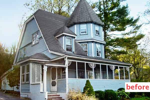
Eye-catching exterior upgrades can be simple—repainting the front door and putting in new foundation plants—or complex, such as adding a new porch. It all depends on your wallet and the work you put in. But whichever approach you take, there’s no question that enhancing your house’s outward charm will make you prouder, your neighbors happier, and potential buyers more intrigued someday. Coming up, your fellow readers share eight inspiring before-and-after makeovers that show the range of successful improvements.
Restore a Period Look: After
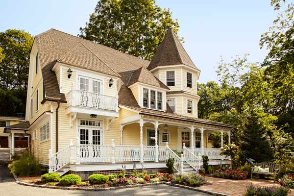
Before homeowners Charles and Christine Gentile got their hands on this 1895 Queen Anne manse, in Centerport, New York, it was a neighborhood blemish. The gracious front porch had been enclosed, the clapboard siding was rotted, and the roof was so neglected that saplings had sprouted on it. Working from a historical photo and taking cues from nearby homes of the same vintage, Charles, a contractor, and Christine, an interior designer, restored the home to its once-proud status. They even upped its grandeur with a spacious addition.
Restore a Period Look: Doors and Windows
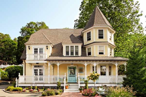
Charles and Christine restored the stained-glass entry door and the accent window beside it, using salvaged jewel-toned glass from the same era to replace broken panes. The rest of the home’s windows are new, energy-efficient replacements with simulated divided lights. Also new is a paneled-wood screen/storm door. Painted in Benjamin Moore’s Stratton Blue, the door has beaded trim and swings on repro Victorian-era spring-loaded hinges.
Landscaping
Eschewing the fuss of formal Victorian plantings, the couple wanted to play up the area’s coastal vibe—the house overlooks Centerport Harbor—by surrounding the foundation and a new brick walkway with easy-care perennials, such as beach grass and sedum, as well as peegee hydrangea standards. Potted annuals, like pink and purple petunias, add bright pops of color at the entrance to the porch.
Restore a Period Look: Porch
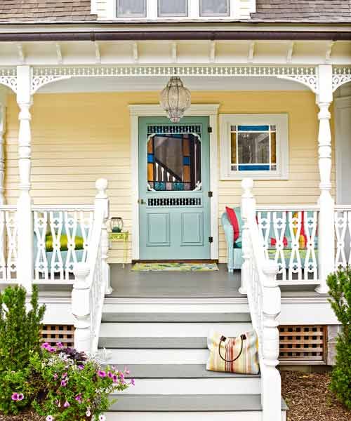
In addition to re-creating the original open porch, Charles and Christine had hoped to extend it across the new addition. But the plan was vetoed by the local historic-district commission, which wanted a delineation between the new and old portions of the facade. Instead, the couple went with an open deck and a Juliet balcony above that’s bordered with the same cypress reproduction gingerbread railing used on the porch.
Siding and roof
The couple had the rotted blue siding replaced with new cedar clapboards finished with Cabot’s solid-color stain in Linen. Beneath the 1930s gray asphalt roof shingles were the original cedar shakes, but they were too damaged to save. So the couple took the roof down to the strapping and added plywood sheathing before installing new asphalt architectural shingles in a cedar-like color.
Play Up The Architecture with Paint: Before
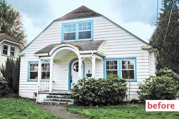
It was the arched “hobbit” door that first attracted Taylor Kirchner and Josh Cabot to this 1923 cottage, in Portland, Oregon. When they decided to refresh the facade, the couple chose a paint palette that would put the focus on the entry. “We started with the red door and worked our way out from there,” says Taylor. Lit by a new Moravian-star pendant, the door is now what visitors admire most.
Play Up The Architecture with Paint: After
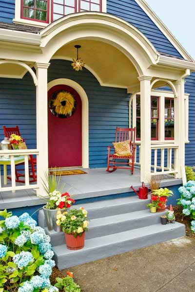
Paint
The couple hired pros to do the work but selected the energetic five-color paint scheme themselves. Their picks: Benjamin Moore’s Raisin Torte for the prized door and the window sashes, and Van Deusen Blue on the body. For the trim, they went with Sherwin-Williams’s Tea Light. A local paint manufacturer supplied the flagstone hue for the porch floor and the yellow-gold for its ceiling.
Play Up The Architecture with Paint: Siding and Trim
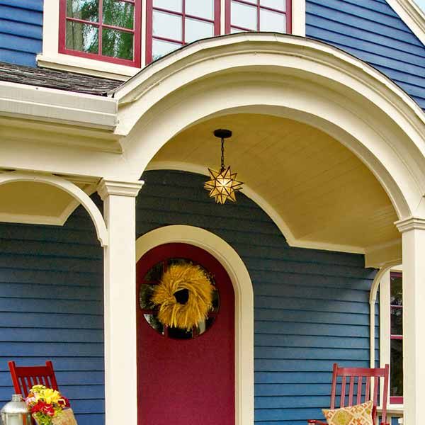
Beneath 1970s clapboards with a 10-inch reveal the couple uncovered the original 4-inch-reveal Douglas fir claps. “Narrower courses make the house look more traditional, and taller too,” says Taylor. The original trim had been removed, but its shadows remained on the sheathing. So they matched its beefy dimensions, except above the windows, where adding crown molding created a ledge for new stainless-steel flashing.
Play Up The Architecture with Paint: Windows
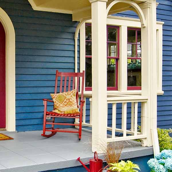
On the first floor, Taylor and Josh simply stripped and reputtied the original sashes. Upstairs, the original casement windows had been replaced with vinyl double-hungs, so they tore those out and had new casements made.
Brighten a Dark Facade: Before
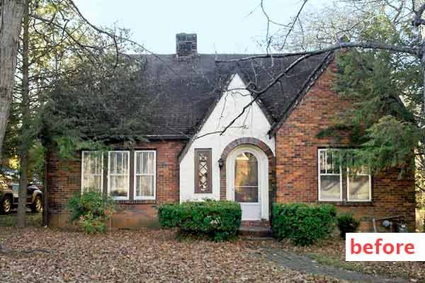
Many buyers in Nathan Lyons’s Nashville neighborhood demolish the old, modest homes to build new. But Nathan loved the style of his 1928 Tudor, so instead he set about restoring it himself and lightening up the look of the front to make it more inviting from the street.
Brighten a Dark Facade: After
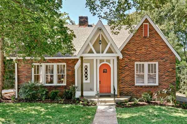
Entry
Nathan planned to repair the damaged stucco around the front door, but the studs behind it were rotted. So he removed the masonry and replaced the framing. For a stucco look, he sheathed the area with fiber-cement panels in a warm gray hue and created a faux-timbering effect by covering the seams with rot-resistant composite trim painted white. A new, open-gable portico protects and highlights the entry without blocking natural light.
Brighten a Dark Facade: Windows and Door
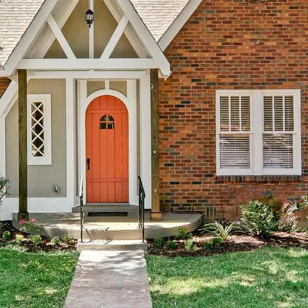
Nathan stripped six layers of paint off the original double-hungs and refinished them in a crisp white. The original arched front door was stripped and then brushed with glossy orange paint.
Brighten a Dark Facade: Landscaping
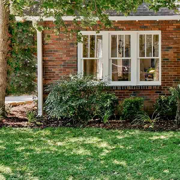
To transform the patchy and weed-filled front lawn, Nathan had to give it more sun and nutrients. He started by thinning an overhead shade tree, which allowed more light to reach the lawn and brightened the look of the home’s facade. He then removed the existing grass and started from scratch with 2 inches of new topsoil and a fresh carpet of sod.
Layer on Classical Details: Before
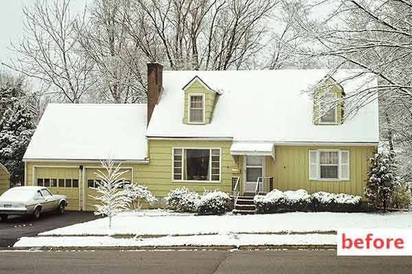
Sure, it had a dreary yellow paint job and an awkward combo of vertical and horizontal siding, but Bob Bliss saw potential in this Prairie Village, Kansas, home. It was built in the Cape Cod style, which traces its roots to colonial-era America. Bob figured that the best way to improve the house was to give it some character. Armed with his sketchbook, he devised a plan for what would become a more than 10-year DIY revamp.
Layer on Classical Details: After
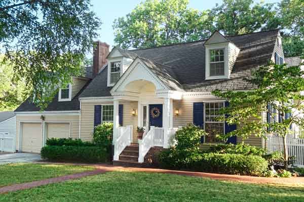
Entry
By tearing out a closet in the foyer, Bob was able to shift the entry 2 feet to the right, centering it on the house to create symmetry. He then built a gabled portico accented with a dentil-molding cornice that continues across the entire facade. The portico’s supporting posts are wood, but Bob used cellular PVC for the majority of the balustrade. A new, poured-concrete stoop sheathed in red brick completes the now stately entry.
Layer on Classical Details: Siding
In place of the board-and-batten siding on one side of the entry and shingles on the other, Bob installed new clapboards finished with Benjamin Moore’s Sag Harbor Gray. He painted the trim white and highlighted the door with a custom-mixed inky blue.
Layer on Classical Details: Dormers and Windows
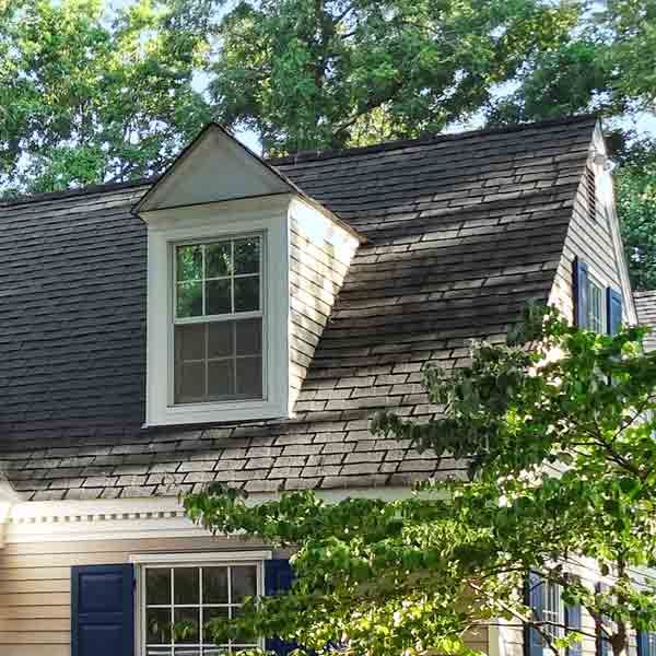
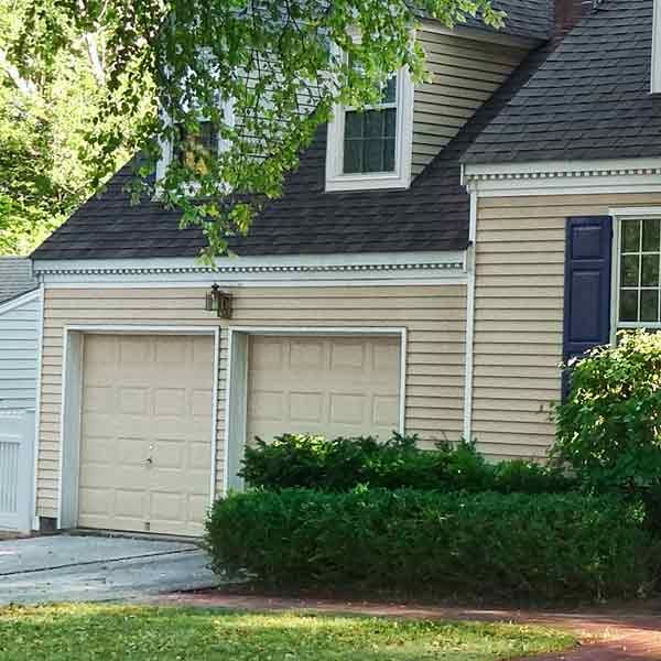
To create a bedroom over the garage, Bob rebuilt the structure, raising the roof and adding gabled dormers that match the originals on the main house. He then added all new wood windows with simulated divided lights and highlighted them with raised-panel red cedar shutters. Painted blue like the front door, the operable shutters are held against the house with traditional “rattail” shutter-dog hardware when open.
Layer on Classical Details: Fence
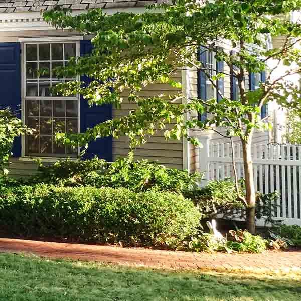
The fence is a Colonial Williamsburg style—but made of vinyl, so it won’t rot, warp, or ever need painting. This also allowed Bob to protect the fence from wind shear by anchoring the posts in concrete, a no-no for wood because the masonry holds water and can hasten rot.
Layer on Classical Details: Landscaping
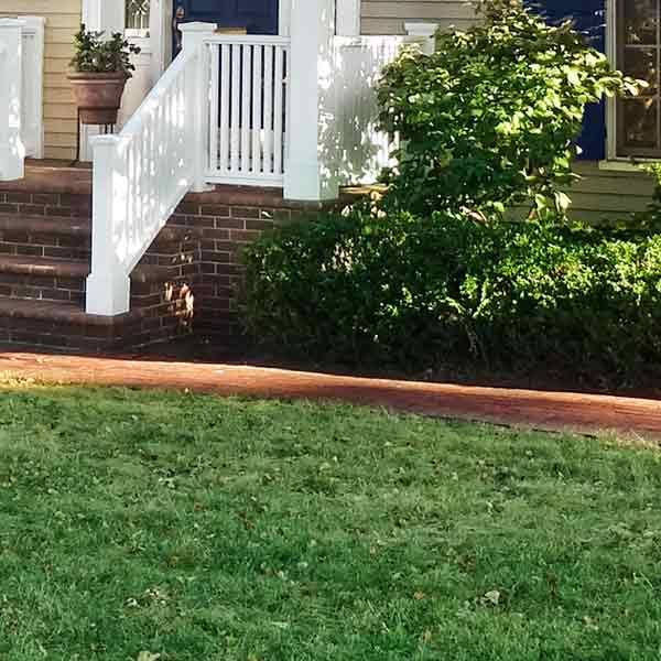
Yews and boxwoods bordered by a new brick walkway frame the entry, and a dwarf dogwood helps to balance the visual heft of the garage on the opposite side. Because colonial-era homes didn’t have gutters, Bob installed a drip edge, hiding a half-round drainage pipe behind the foundation plantings.
Open Up The Porch: Before
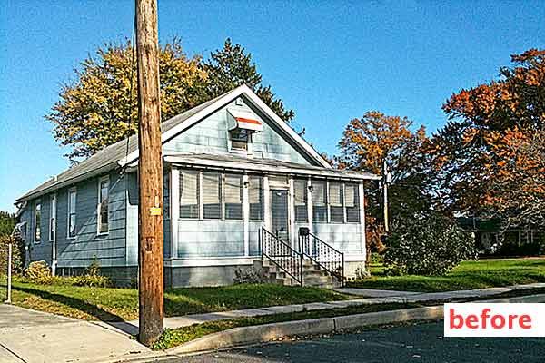
The once-quaint cottage that Brenda Jones purchased had been in the same family since it was built, in 1929. But over the years, the Lewes, Delaware, home had been “updated” with asbestos siding and jalousie windows that enclosed the porch. Brenda knew the home could be a charmer again by simply undoing the unfortunate work others had done.
Open Up The Porch: After
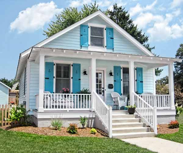
Porch
The only salvageable parts of the porch were its concrete-block foundation and its roof structure. The rest was rebuilt, using new composite decking for the floor and wood clad in cellular PVC for the posts. Because the porch is less than 30 inches above the ground, Brenda wasn’t required by code to install a railing, but she added a 24-inch-high one anyway for a vintage look.
Open Up The Porch: Siding
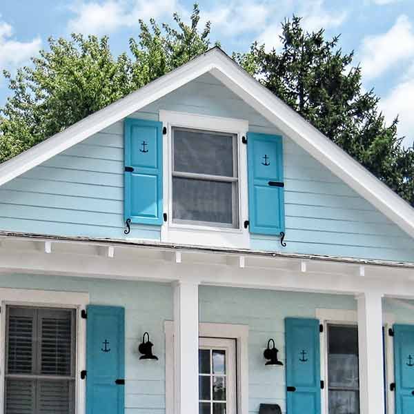
Brenda did the demo but hired a contractor to properly dispose of the asbestos shingles and to install the new siding. The original wood clapboards had been damaged, so she had them replaced with fiber cement, which won’t rot or warp.
Open Up The Porch: Paint
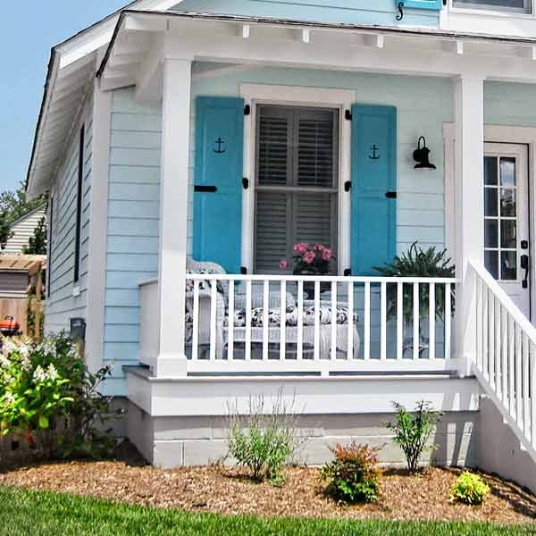
Playing up the house’s Delaware Bay setting, Brenda chose a beachy color palette. She used Benjamin Moore’s Icy Moon Drops for the body, Bahaman Sea Blue for the shutters, and white trim paint.
Open Up The Porch: Windows
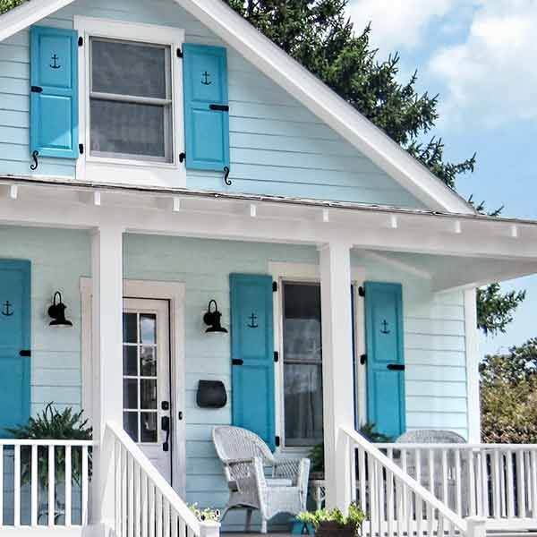
All the windows were replaced with double-hungs that have a wood interior but a no-paint vinyl exterior that blends with the white trim paint. New composite shutters with a ship’s-anchor cutout have operable vintage-look hardware and are wide enough to cover the windows during storms.
Refresh by Revisiting The Past: Before
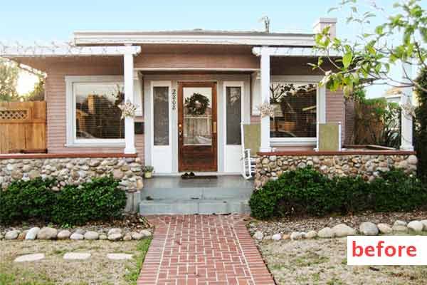
Ashley and Adam Feist loved that the inside of their 1923 Prairie-style bungalow, in San Diego, California, hadn’t been altered. “It was a case of preservation by neglect,” says Adam. But the outside had a wacky concrete porch addition with a stone wall and pergolas that blocked the view of the house. The couple’s solution: Remove anything that wasn’t original to the facade.
Refresh by Revisiting The Past: After

Porch
After tearing out the pergolas, the Feists began jackhammering out the floor—and discovered the original concrete stoop underneath. “That gave us the footprint for our newly poured one,” says Ashley.
Refresh by Revisiting The Past: Roof and Soffits

During a previous remodel, a roofer had improperly flashed the flat roof, causing the soffits to rot. So the Feists had the roof, flashing, and gutters repaired and the soffits rebuilt with tongue-and-groove redwood planks. To help divert water away from the house, the couple added new, heavy-gauge aluminum downspouts.
Refresh by Revisiting The Past: Paint

The Feists chose a multicolor scheme, using Sherwin Williams’s Bunglehouse Gray for the body, Wool Skein for the trim, Arresting Auburn for the red accents, and Garret Gray for the porch, chimney, and foundation.
Refresh by Revisiting The Past: Landscaping

A landscape designer mapped out the drought-tolerant yard, but the Feists did the planting—which included golden dewdrop, salvia, elephant ear, copper spoon, and a groundcover called silver carpet. Adam also installed a low-voltage LED lighting system.
Repair and Spiff Up What’s There: Before
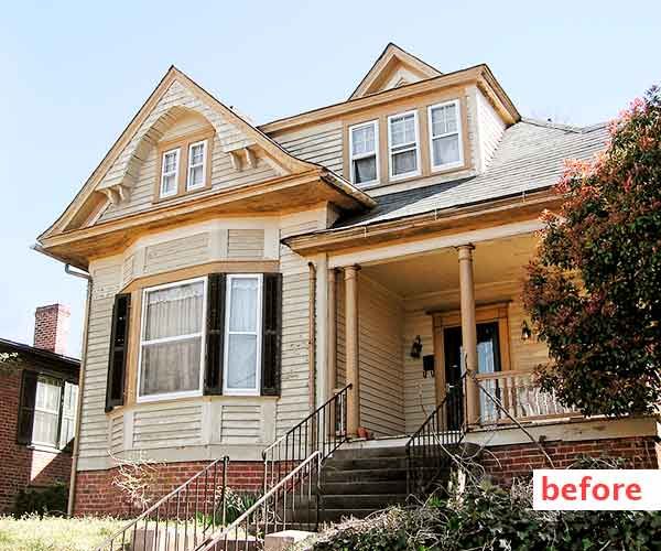
Soon after she got married, Kelly Green Sowers started hunting for a home in Winston-Salem, North Carolina, that she and her husband could share. “But Jeffrey is an architect, and he’s super picky,” she says. Finding something that he liked—and they could afford—was a challenge. “Then we found this place, which was such a wreck that Jeffrey knew he could transform it into exactly what he wanted.” The 1905 Queen Anne hadn’t been painted in 30 years and needed a new roof, and the porch columns and floor were rotted.
Repair and Spiff Up What’s There: After
Windows
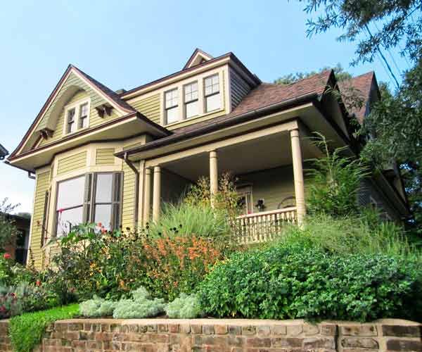
The original windows were in excellent condition, so Kelly and Jeffrey simply repaired them, replacing any broken panes with vintage salvaged glass. To improve the windows’ efficiency and protect furniture from fading, they coated the panes with UV-blocking film.
Repair and Spiff Up What’s There: Paint
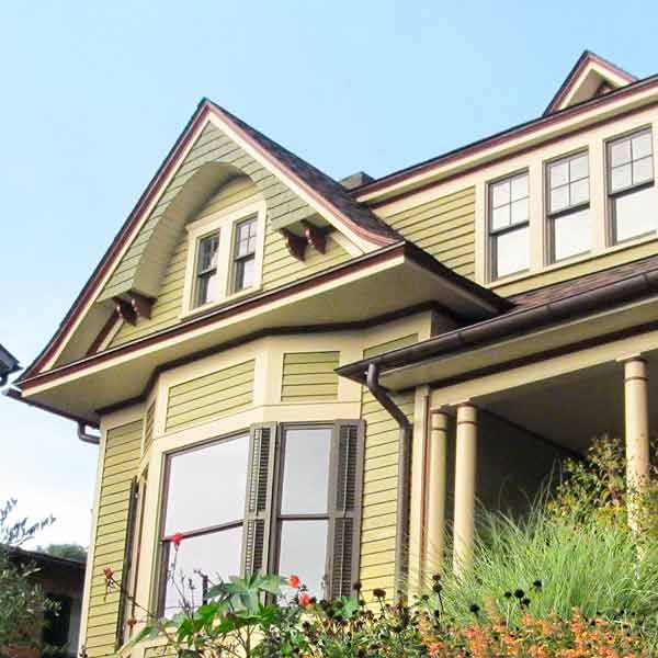
The multicolor scheme was inspired by San Francisco’s “Painted Ladies” but with darker, more restrained hues. “If you live in an urban area—or near a busy road—deeper colors hide pollution and grime better,” Jeffrey says. The entire house was tented to contain the lead-paint dust while every speck of paint was being stripped from the clapboards, windows, and moldings, which were then repainted using custom colors.
Repair and Spiff Up What’s There: Gutters
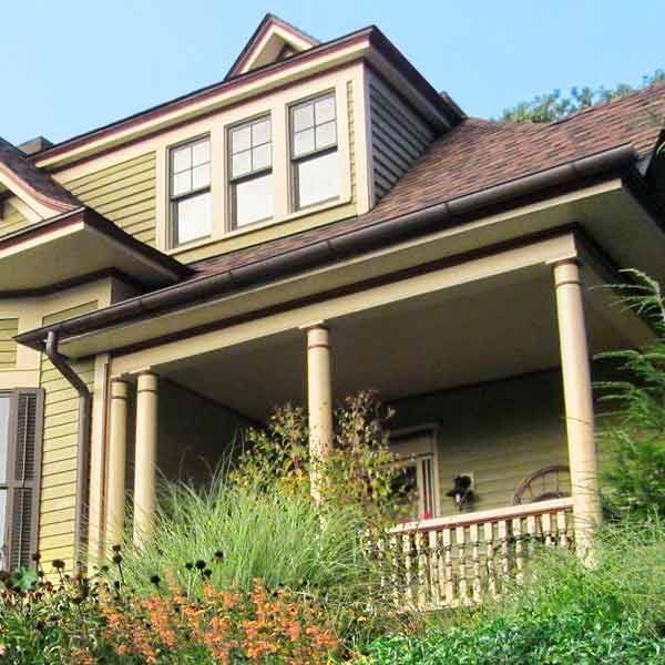
The couple splurged on old-fashioned copper half-round gutters with round downspouts. Each one empties into a rain barrel, with a spigot at the base to supply water for the yard.
Repair and Spiff Up What’s There: Landscaping
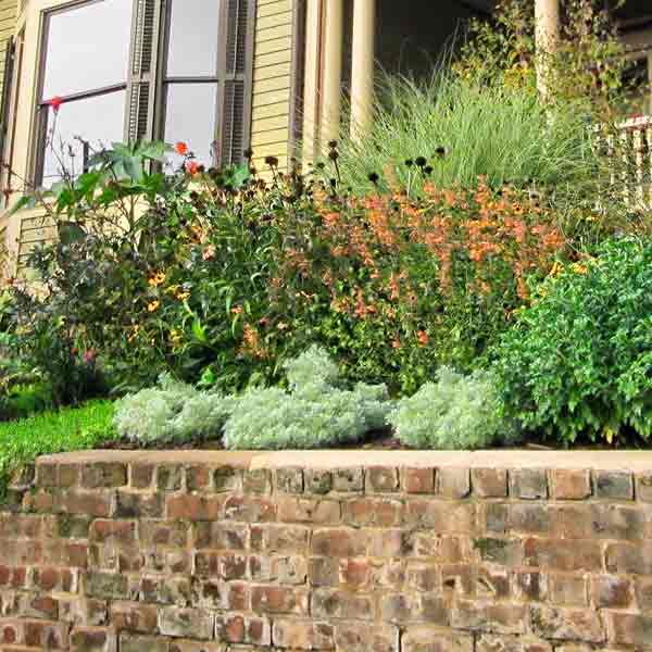
Behind the brick retaining wall, which the couple had repointed, is a lush front yard. Taking cues from Victorian-era gardens, Jeffrey planted perennials that need little water, such as black-eyed Susan, coneflower, guara, aster, heather, lavender, rosemary, thyme, creeping phlox, cardinal flower, and castor bean. Only in July, when the sun is very intense, does he need to supplement the collected water that the new rain barrels supply.
Build Out The Entry: Before
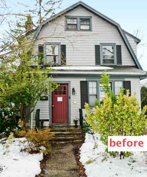
When Ken Malian and Steve Moran integrated the enclosed porch on this 1927 Dutch Colonial, in Glen Ridge, New Jersey, into the main living area, they lost what had been a valuable transition between indoors and out. By adding a portico, they reclaimed that space while also creating a new focal point for the home’s facade.
Build Out The Entry: After
Porch
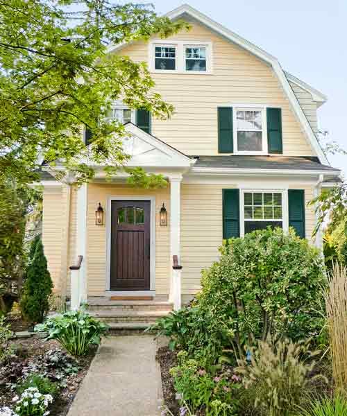
The portico over the existing front stoop enhances the entryway and provides shelter from the rain and snow. A pair of sconces flank a new mahogany front door that replaced the rotted original.
Build Out The Entry: Windows and Shutters
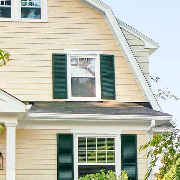
They replaced a vinyl-clad triple window with a single wood double-hung that matches the house’s originals. The local historic commission required wood shutters but not necessarily operable ones. So Ken and Steve cut the cost about in half by choosing slim stock units, rather than custom widths to match the windows, and by skipping the hinges and shutter dogs. The new shutters are simply screwed to the wall.
Build Out The Entry: Paint
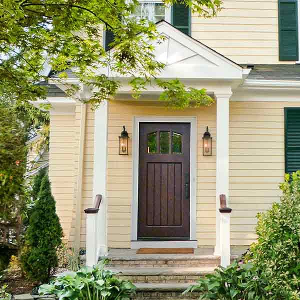
The cedar clapboards were in good shape, so Ken and Steve just repainted them. They opted for a cheery three-color palette, using Benjamin Moore’s Montgomery White for the body, Black Forest Green for the shutters, and crisp white for the trim.
Build Out The Entry: Landscaping
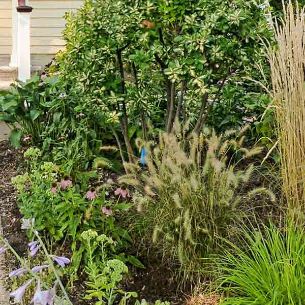
“We eliminated the lawn and planted a cottage garden in its place,” says Ken. To supplement an existing Japanese maple, they added dwarf Alberta spruce alongside the portico and filled the 18-foot-deep front yard with hydrangea, dwarf Japanese holly, ornamental grasses, echinacea, hosta, bamboo, and ‘Green Ice’ rose.
Planting for Curb Appeal
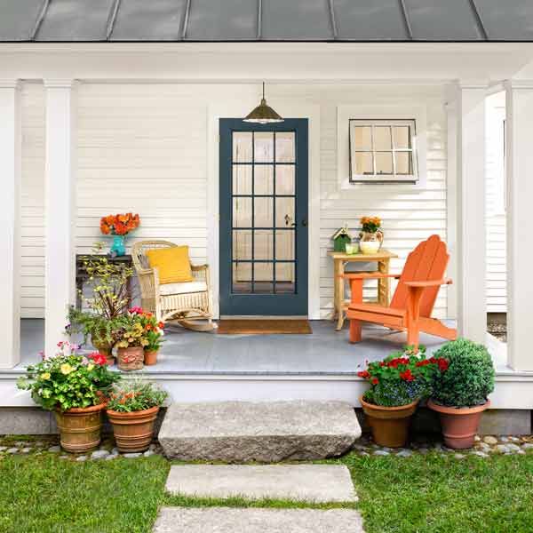
There’s no more affordable—or DIY-friendly—way to improve the look of your home than with new landscaping. Here are six ways to ensure success.
1. Add containers: Set on a stoop or hung from the edge of a porch roof, potted plants can draw attention to and frame an entry. Choose blooms that tie in with your paint scheme or porch furniture, such as the bright orange, red, and yellow ones shown above.
2. Go for year-round interest: Too many yards look lifeless and dreary in the colder months. Avoid this by choosing a mix of plants that put on shows at different times, from spring and summer flowers to colorful fall foliage to eye-catching winter berries and seedpods.
3. Choose dwarfs: Nowadays, many popular foundation plantings come in growth-restricted varieties, so you needn’t constantly prune them to keep them from shrouding the windows.
4. Vary textures and shapes: Syncopate the look by using different plant shapes, from narrow to bushy; textures, from fine needles to broad leaves; and leaf color, from pale to deep greens and even yellows, blues, and purples.
5. Create architectural depth: Rather than make a single-file row of plants along the house and property lines, place them two or three deep, always with the tallest in back so that all rows are clearly visible.
6. Plant for mature size: Don’t space plants by eye—or else what looks right when new shrubs are a foot wide will become an overcrowded mess when they’ve grown fivefold. Unless you’re creating a hedge, treat the spacing suggestions listed on plant labels as the minimum.
