From Sketch to Finished Facade
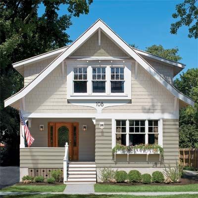
“We loved the designer’s sketch but never imagined it could be re-created to a tee,” says Jim Steele, who lives with his family in this freshly transformed 1925 cottage near Syracuse, New York. As you can see, however, the result is pretty dead-on. The contest winners’ cottage has gone from worn to wonderfully charming, thanks to designer Rick O’Leary’s reimagining of the exterior, using little more than a palette of fiber-cement clapboards, shingles, and trim from James Hardie. But it was the installation skill of Right Choice contractor David D’Agostino that brought the highly customized design to life.
Before
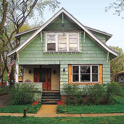
It all started with a simple plea from Lisa and Jim, who entered This Old House’s Real-Life Photoshop Redo Contest in hopes of winning all-new James Hardie siding for their 1925 cedar-shingled cottage near Syracuse, New York. “They say don’t judge a book by it’s cover, but it’s hard not to,” she wrote in her entry. “Please help us with our book cover.” And so we did.
The Photoshop Rendering
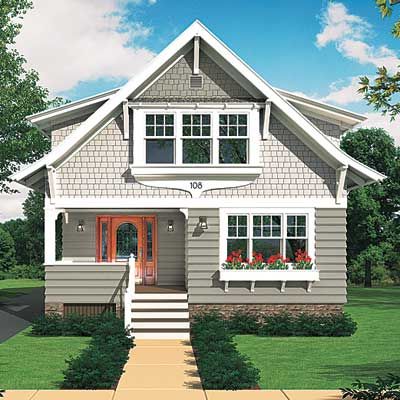
“The process was really fun,” says Lisa Steele of seeing the plan on paper take shape on the house. To speed up the job (and save some money), off-the-shelf corbels from a home center stand in for hand-cut gunstock porch brackets. The most time-consuming part of the project had to be the “stepped coursing” clapboard design, with its overlapping boards of varying exposures. But the look is so special that D’Agostino says he can’t wait to try it again.
The Details
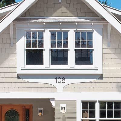
The Steeles love all the new details, especially the apron trim under the upper windows. “We named it ‘the teardrop,'” says Jim. “It’s a real focal point that does a great job of creating symmetry in an asymmetrical house.” And it’s a house they intend to stay in. “This is our first home,” says Lisa. “Thanks to everyone involved, it will likely be our last.”
Working Hard

Jim and Lisa Steele (here with son Coby) pitched in wherever they could, ripping off the old cedar shingles and painting the porch.
Instant Curb Appeal
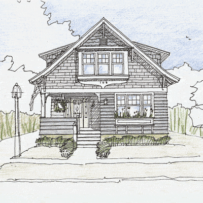
O’Leary used modern materials in the form of fiber-cement siding, applied with a big dose of creativity, to transform the Steeles’ weathered cottage into an original yet period-appropriate charmer. “Having a designer come in from the outside with new ideas is a real value,” says Jim Steele.
A Mix of Siding
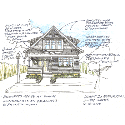
To bring a sense of order to the design, O’Leary used three types of siding—lap, straight-edged shingle, and staggered-edge shingle—to divide the facade into layers, creating a definitive base, middle, and top. He also gave each treatment its own shade within the same color family. “It just breaks up the massing a little bit, and it’s a detail that doesn’t cost money,” says O’Leary.
Laps With a Twist
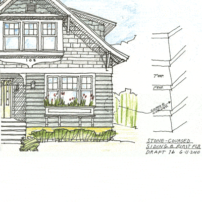
To give the bottom story a look of strength, O’Leary specified overlapping clapboards with varying exposures, a technique known as stepped coursing.
Rounding Out the Look
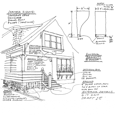
Adding the gunstock brackets to the corners of the porch was a small detail that had a big impact on the overall composition of the front. “It doesn’t look as raw,” says O’Leary. “Architecturally it makes sense—they look like they’re doing something—and visually it just softens those corners.”
Truck Full of Siding

The order of James Hardie siding arrived at the Steeles’ house on a flatbed truck from Vermont. “It’s so exciting to see the process move from paper to reality,” says Lisa.
New Materials, Old Methods

Chris King of Right Choice Home Improvement checks his measurements before fastening the first row of lap siding. The design called for stepped coursing with “woven corners,” unusual applications for fiber-cement siding that hark back to the feeling of the original cedar.
Custom Cutter

Each piece of lap siding had to be ripped down to achieve the narrower exposure for the stepped coursing.
Shelter Shelter
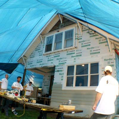
To meet TOH’s publication deadline, Right Choice Home Improvement set up tarps from the gable to the sidewalk and kept working through torrential rains—not to mention the weekend. “It was an amazing sight to see,” says Jim. “Keeping up with the water was a full-time job for them, and they kept our son, Coby, entertained.”
Just a Touch
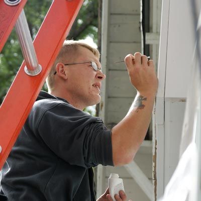
Per James Hardie’s specifications, every exposed nail hole has to be filled and sealed with touch-up paint to match the factory color. “When I walk around the house and imagine that I had to do it, it’s totally overwhelming,” says Jim. “To think that somebody’s going to take that much time and look at every nook and cranny is pretty amazing.”
Framing the Canvass

The 12-inch trim board, also called a spandrel board, serves as a natural break between the lap on the first story and the straight-edge shingles on the second. “It just really tidied up the whole front of the house,” says Lisa.
A Little Trim Goes a Long Way
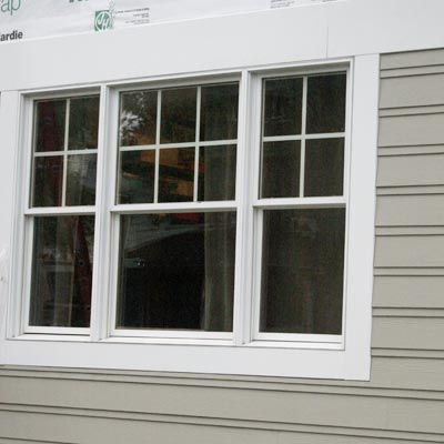
Trimming out the original windows was an obvious improvement that needed to be made. Still, says Lisa, “it probably would have been years before we could have gotten to it.”
Piecing Together the Design
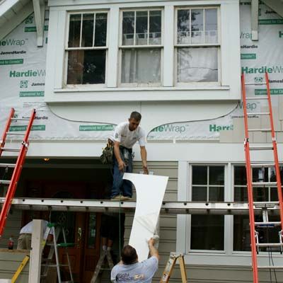
To fabricate the teardrop-shaped apron beneath the second-story windows, Right Choice owner Dave D’Agostino used aluminum coil to trace the curving design on a sheet of Hardie board. Then, after cutting out the design with a jigsaw, he used it as a template. Each sheet is 4×8, so he had to marry two mirror images to cover the full 11-foot span of the windows. The teardrop is three layers thick.
Light Box
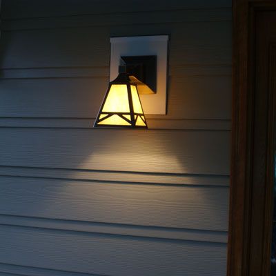
Anything that protrudes from the house, such as wiring for these lights from Rejuvenation, has to be blocked out in fiber cement and flashed to ensure it’s watertight. “I’m fine with white, but we can paint it to match the siding if we want,” says Jim.
Sweat Equity
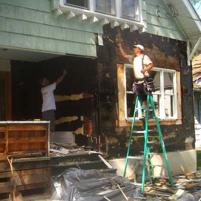
Jim and Lisa helped D’Agostino’s crew tear off the original shingles the first day of the job. “We’re not afraid to jump in and do what we’ve got to do. And it was nice to start off on that foot with Dave so that he knew we weren’t taking anything for granted,” says Jim.
A Welcome Improvement
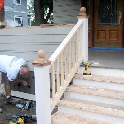
“We were so excited to see the beautiful stairs and handrail. It’s such a dramatic improvement from what was there,” says Lisa.
Nice Skirt
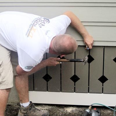
Right Choice employee Rick Mann finishes the custom detail enclosing the porch’s crawl space. “This is another element of the design that would normally have been boring lattice or just forgotten about,” says Jim. “Adding original design ideas to different areas adds up to a house you don’t see on any other street,” says Lisa.
Big Numbers

The Steeles chose 8-inch-tall numerals from HouseArt that are large enough to be seen from their placement on the second story. “They’re much more dramatic,” says Jim.
Tying It all Together
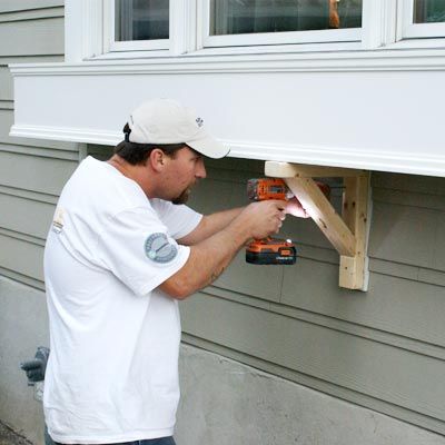
Contractor Dave D’Agostino mounts brackets beneath a custom 9-foot-long flower box from Hooks & Lattice. The box is held up by its own sturdy cleat system, and the brackets, while they provide reinforcement, are meant to tie in with the look of the larger ones on the gable.
Pitching In
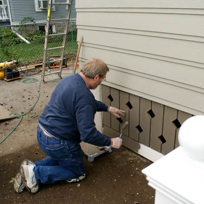
Lisa’s father, Cave Luther, dives in to help with the painting. Here, he uses Sherwin-Williams exterior paint to match a piece of primed lumber to the Hardie trim boards used in the porch skirt.
Pick Your Battles
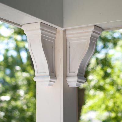
To save time and money, the Steeles purchased the gunstock brackets for the porch from their local home center. “It just made more sense than trying to make them,” says Lisa.
First Impressions
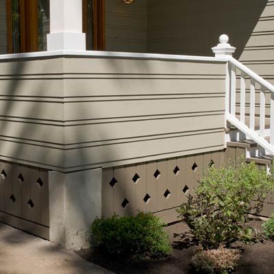
“People drive by and turn around and come back to tell us how amazing the house is,” says Jim. “It’s different than anything around.”
The Sum of the Parts
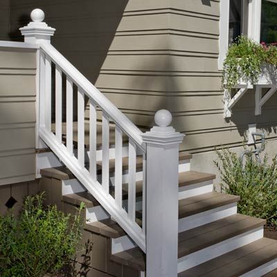
“I always hated our porch steps,” says Lisa. Not anymore. “All the details pull together to give it that look of the quaint house we always wanted.”
