When reviving an old house, little things matter. Because it’s only when you add up the little things that you can appreciate the bigger story.
When Amy and Billy Reed came upon a modest 1937 cottage in Mill Valley, California, it was the small, everyday details that convinced them the 1,036-square-foot house was not a teardown. And so they felt compelled to safeguard the home’s humble charms as they set about adapting it as a home for themselves and their two children, Margaret and Townsend.
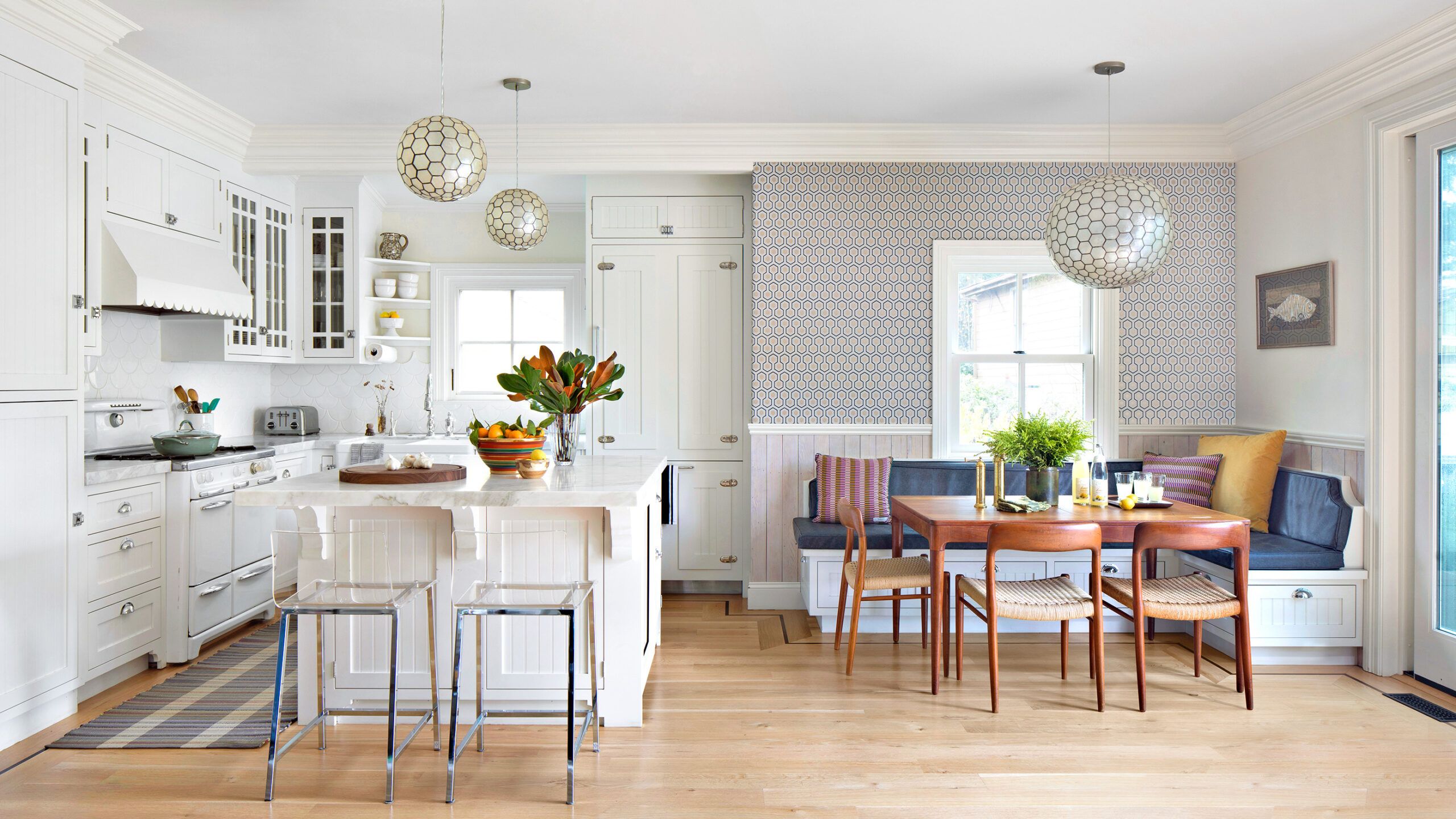
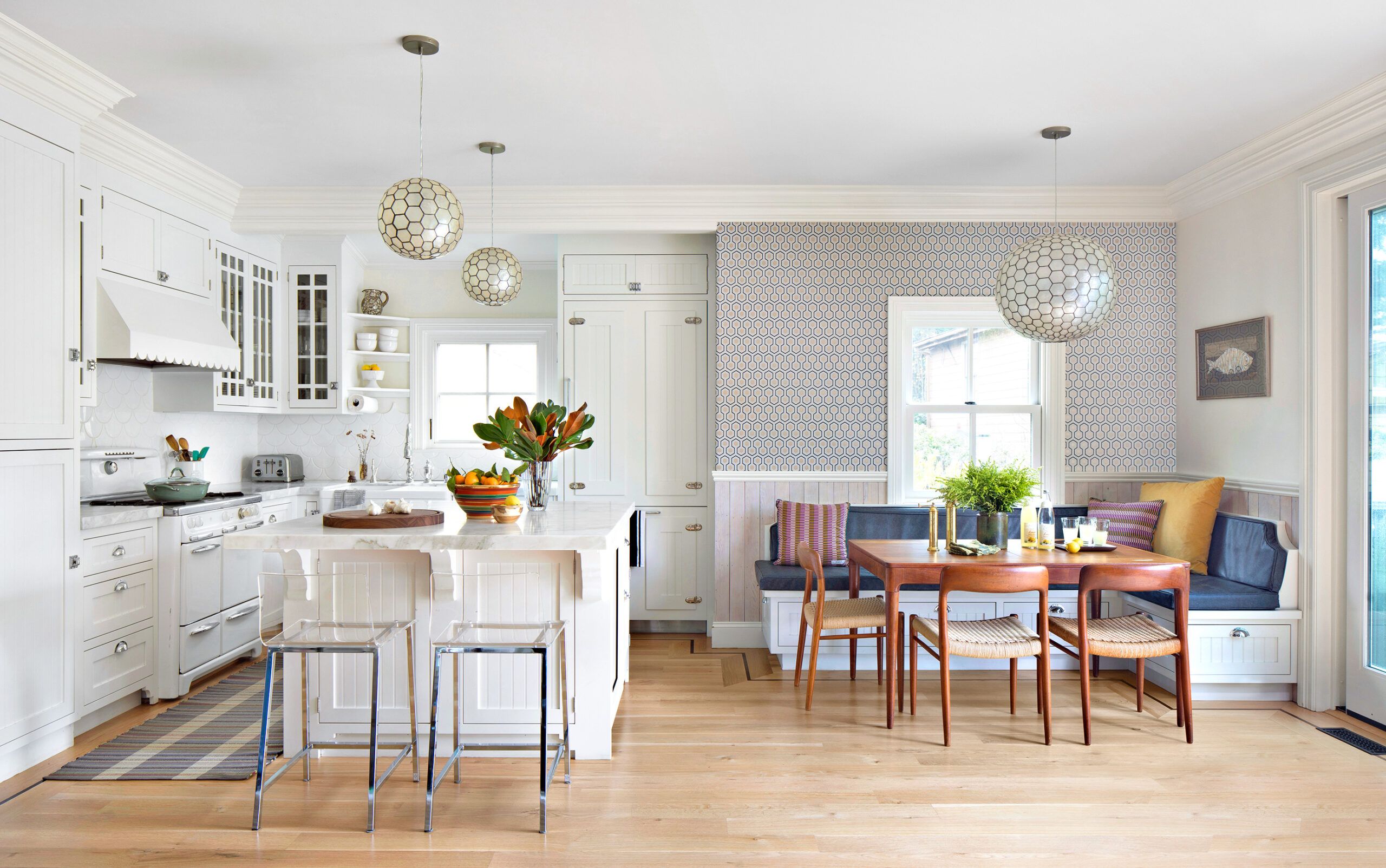
Repro hinges give a paneled fridge vintage cred.
Refrigerator: Thermador
Wallpaper: Hicks’ Hexagon, Cole & Son
Lighting: West Elm
Like many Mill Valley homes built in the waning years of the Great Depression, the cottage was a bit of a hodgepodge. “Sweet, historical, and worth preserving” is how project architect Whitney Schrauth describes it. But in addition to necessary updates like new wiring and plumbing, the family of four would need more space. Given the confines of the 50-by-140-foot lot, there was only one way to go: up.
Architect: Whitney Schrauth, Schrauth Architecture & Consulting
Paint: Slate Blue (front door), Benjamin Moore
Billy was sold on the home’s sturdy construction and its inviting front porch, a refreshing alternative to the houses he’d seen with facades dominated by monolithic garage doors. Amy loved its funky, homespun details. “I’m a sucker for old buildings,” she says, although she had hoped to find a house that didn’t need quite so much work. “I wasn’t that excited about that part of it,” she admits. While both she and her husband are fearless entrepreneurs, and Billy has some building experience, they called on Schrauth to guide them on the design, and contractor Michael White to tackle the construction.
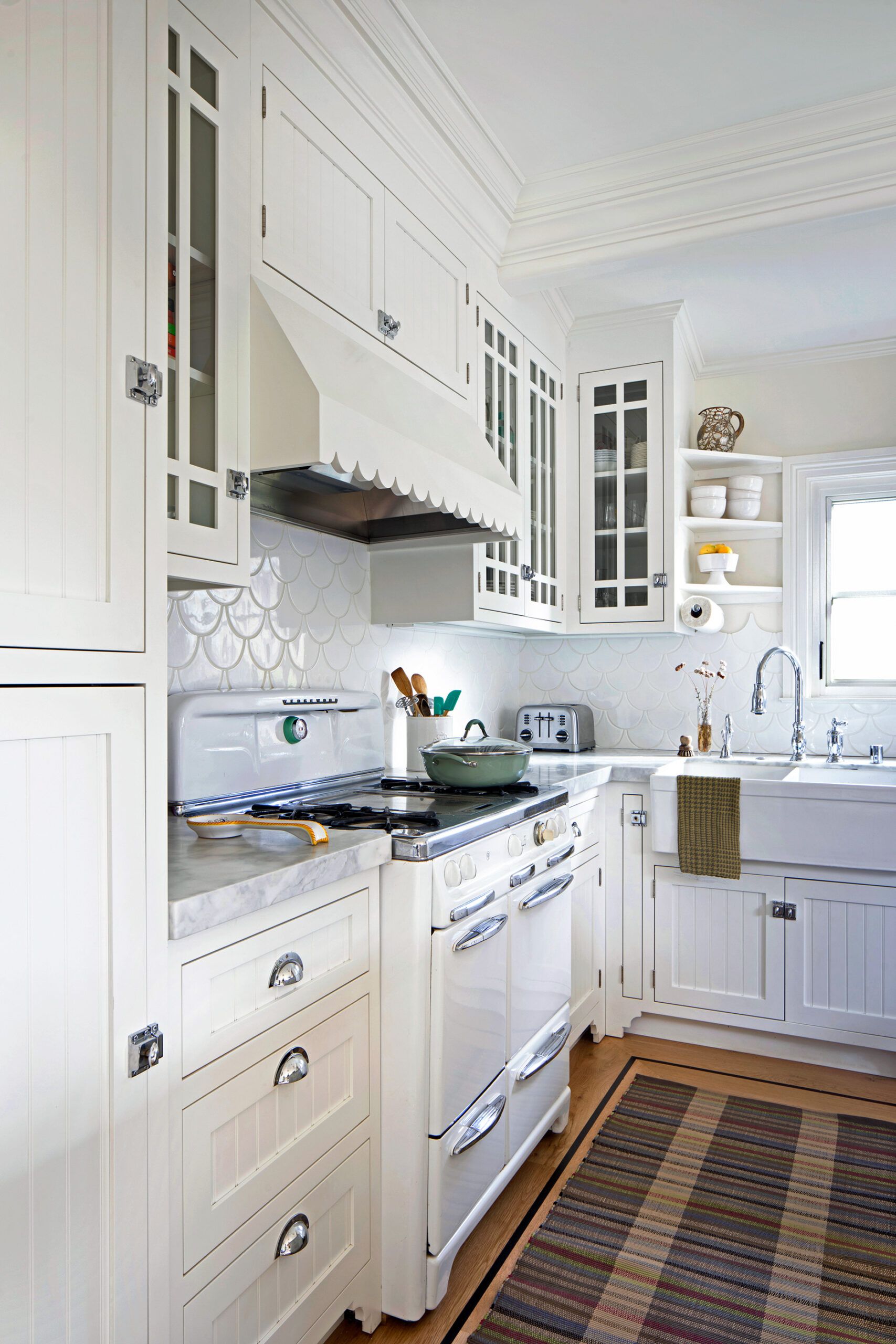
A scalloped border evokes 1930s trim.
Contractor: Michael White, M/W General Contracting
Vent liner: Vent-A-Hood
Wall tile: Escama CW CA Art Tile, Ceramic Tile Design
Sink: IKEA
Faucet: American Standard
Cabinet hardware: J Sharone’s
Schrauth began her work by calculating how much the little structure might be allowed to grow under local ordinances that limit square footage based on lot size. She discovered that tearing down a dilapidated, 858-square-foot accessory cottage on the property would enable the Reeds to more than double the living area of the house to 2,131 square feet—and still leave 335 square feet to build a new mini casita for guests in the backyard.
Then Schrauth dove into the home’s original blueprints to plan the redesign. “When I say ‘original blueprints,’ I mean blue,” she says. “Twenty-four by thirty-six inches, with gobs of information. A floor plan and four exterior elevations, hand-drawn but accurate enough to provide exactly what the builders needed to know.”
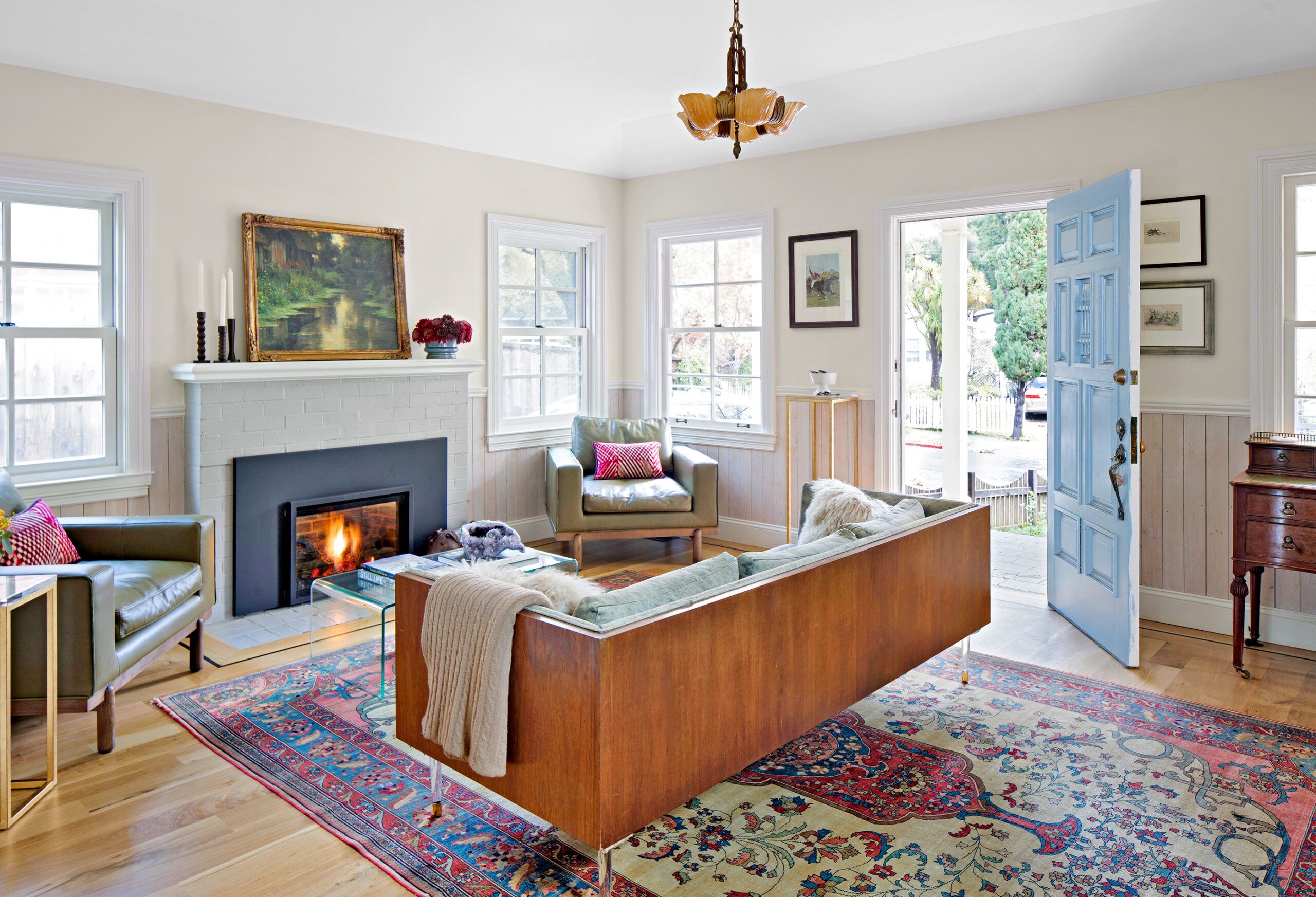
A refurbished Art Deco chandelier adds a warm glow.
Windows (flanking fireplace): Milgard
But building in Mill Valley had changed significantly since those blueprints were drawn. For one thing, seismic codes now require a moment frame—a steel reinforcement—to be embedded in the walls to reinforce the house in the event of an earthquake. But even that would prove less of a challenge than obtaining approval for a second story from local zoning authorities.
A few years of runaway development had led to a clampdown on applications in an effort to preserve Mill Valley’s hometown character. It would take patience, intense lobbying, and some design tweaks for the renovation plans to finally get approved.
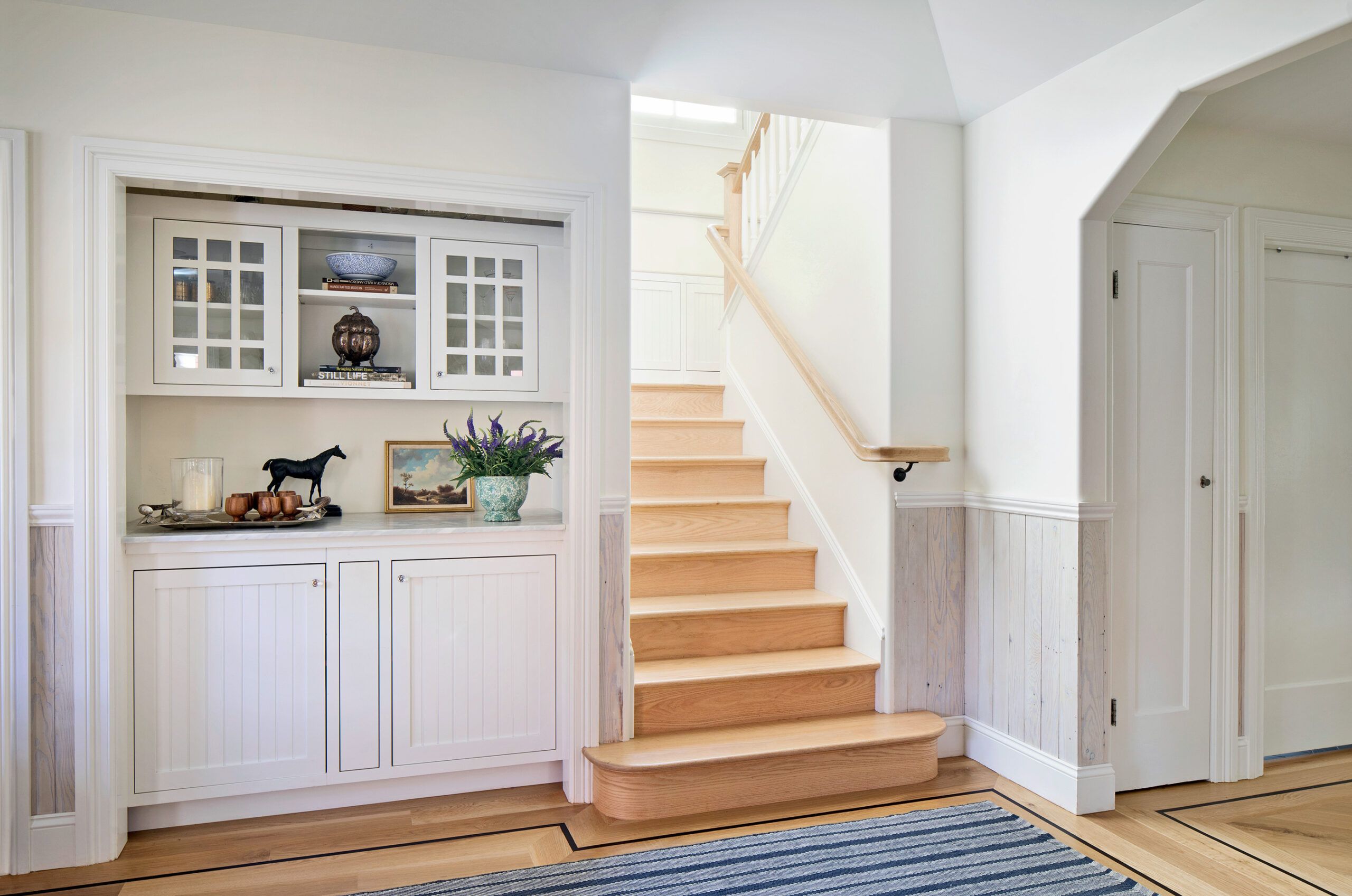
A nostalgic walnut inlay frames the oak flooring.
Flooring: Amber Flooring
Such hurdles might have led other buyers to give up, tear down the house, and build new. But the Reeds never considered demolishing the little house. In fact, Amy says, “The further along we got in the process, the more I wanted the home to be preserved in honor of the era in which it was built.”
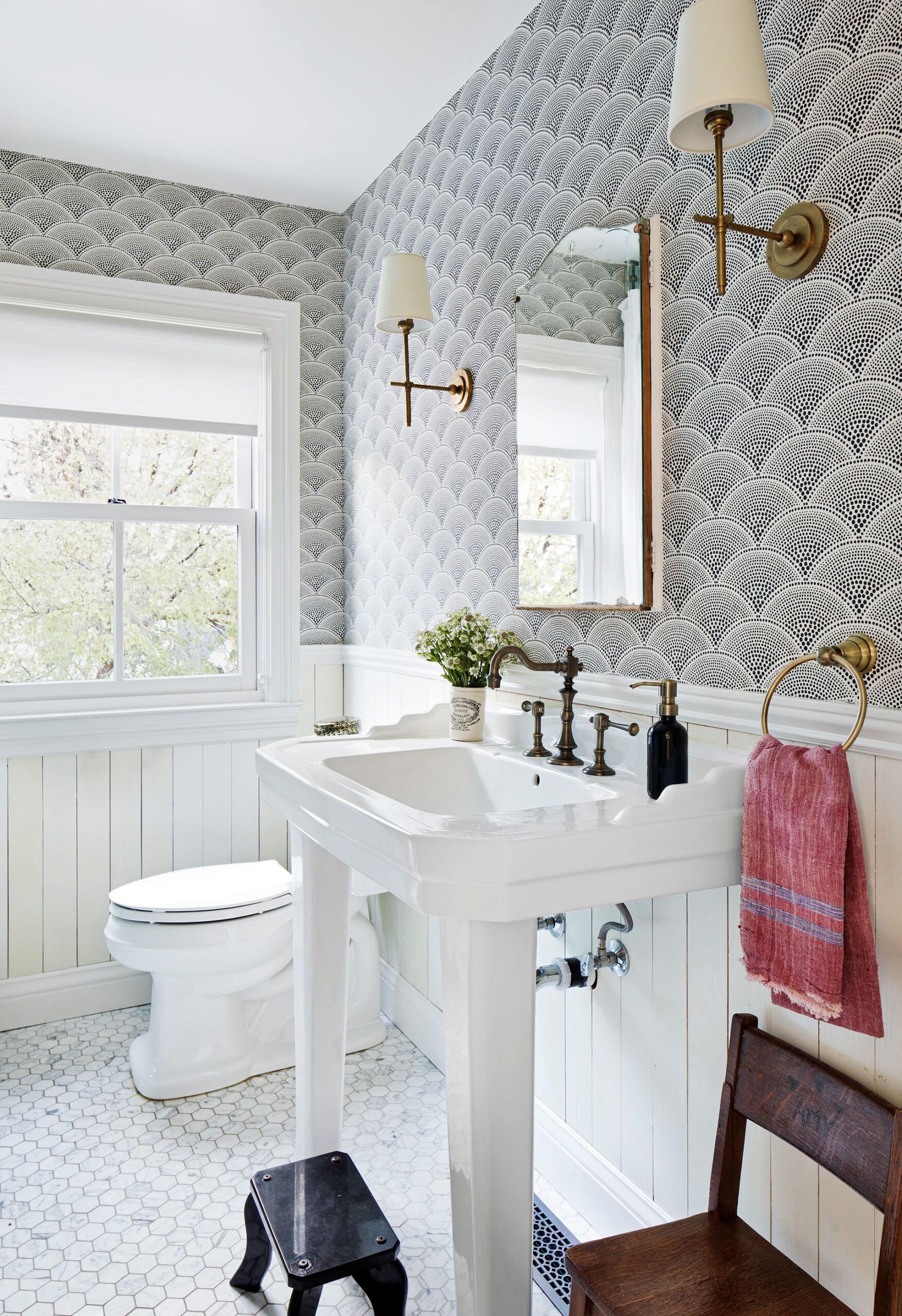
Sink and faucet: Signature Hardware
Sconces: Shades of Light
Wallpaper: Feather Fan, Cole & Son
Toilet: Toto
While the Reeds knew the year the house was constructed, its style was harder to put a finger on. It’s easier to say what it’s not than what it is. Schrauth ticks off a few familiar historical styles before concluding, “It’s a Mill Valley cottage. It’s a wonderful hodgepodge of different details put together in random ways that comes off as appealing.”
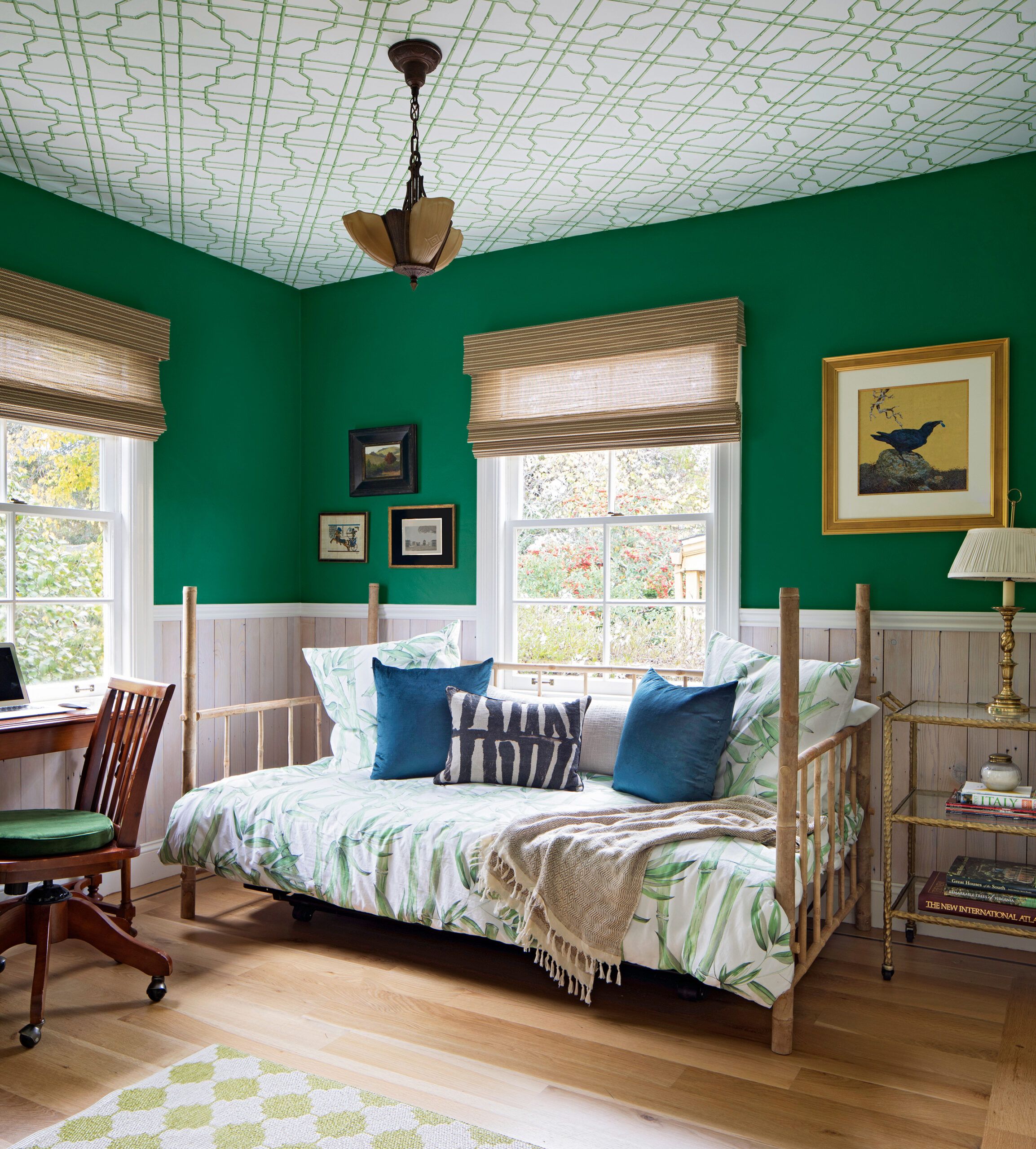
Rafters and roof sheathing get new life as wainscoting.
Painting: Andy Hamill Painting, Mill Valley, CA
Paint: Kelly Green (walls), Benjamin Moore
Ceiling wallpaper: Bamboo Trellis, York Wallcoverings
To maintain that appeal, Schrauth paid close attention to the “massing”—architect-speak for a structure’s collection of shapes—that made up the original house. “You need to make sure the massing is appropriate to homes of the era,” she says, and to keep or replicate the details that make the house what it is.
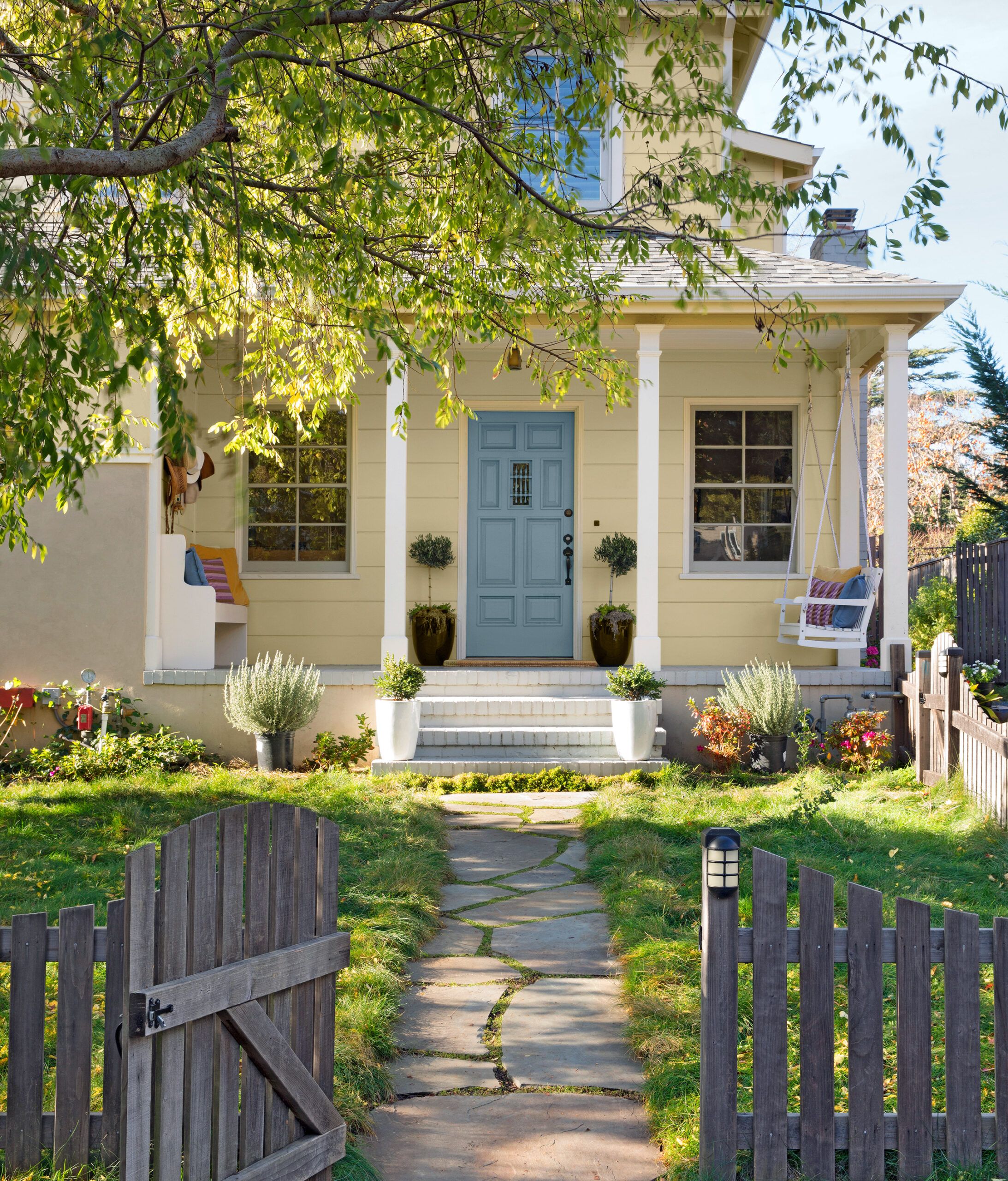
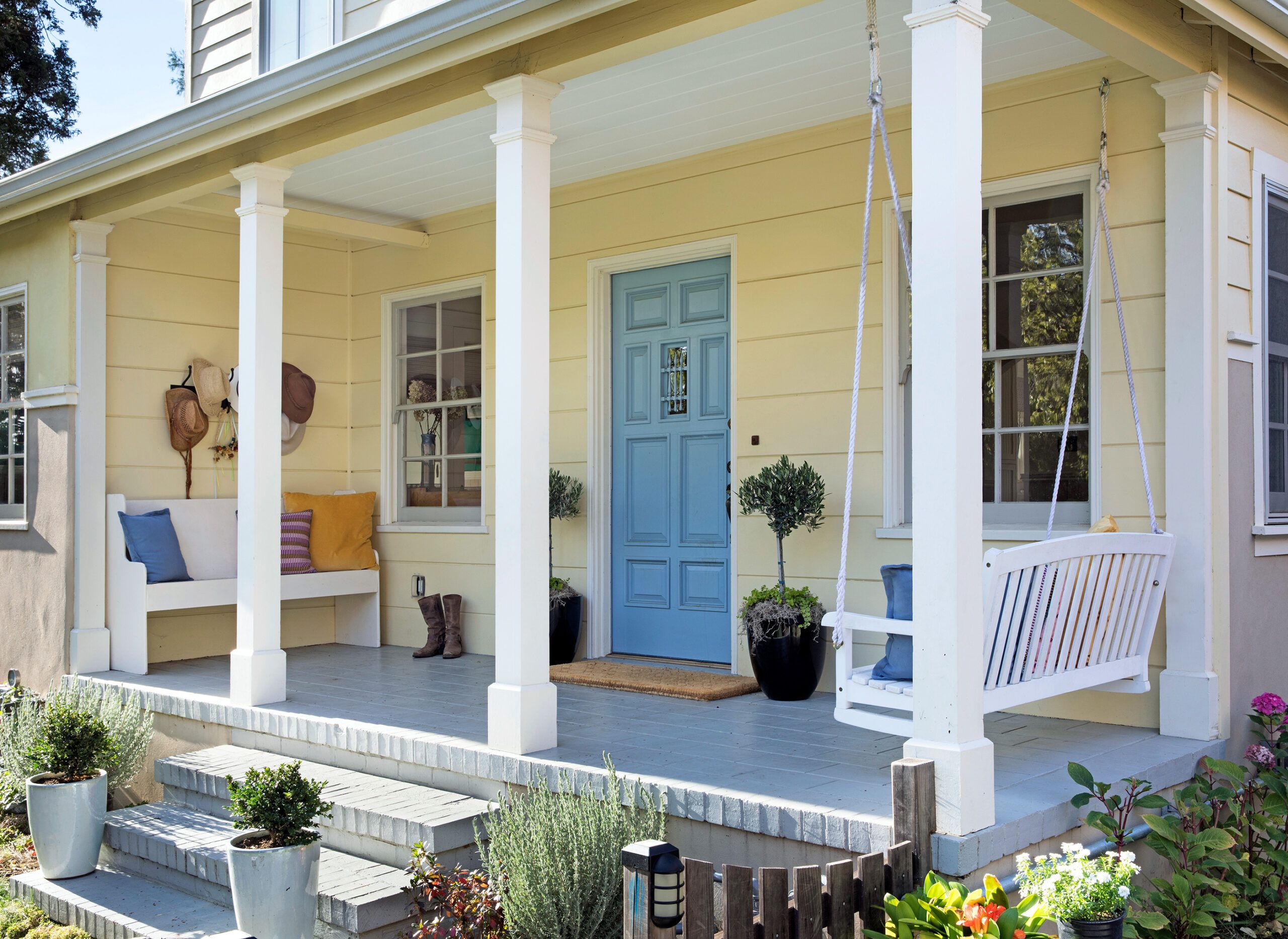
For the Reeds’ home, that meant a modest second floor whose roof barely clears a small tree in the front yard. It also meant preserving the existing front porch and its light fixtures, the paneled front door, the front-facing four-over-four windows, and matching the wood siding with nearly identical, fire-resistant boards.
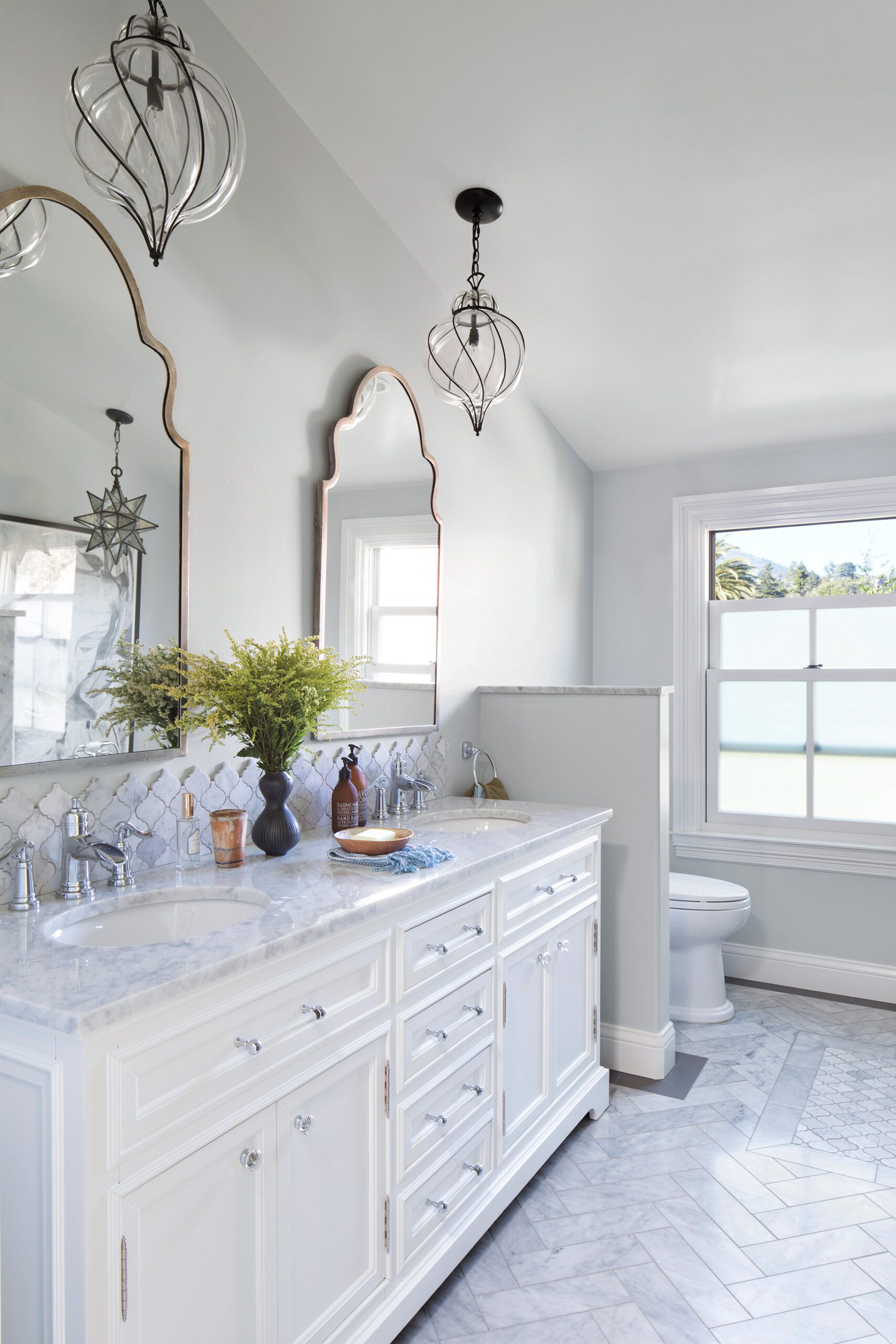
Vanity and mirrors: Ballard Designs
Pendants: Shades of Light
Floor tile: Honed Carrara Marble M701 (field) and Exhibition EXO (border); Daltile
Faucet: Kohler
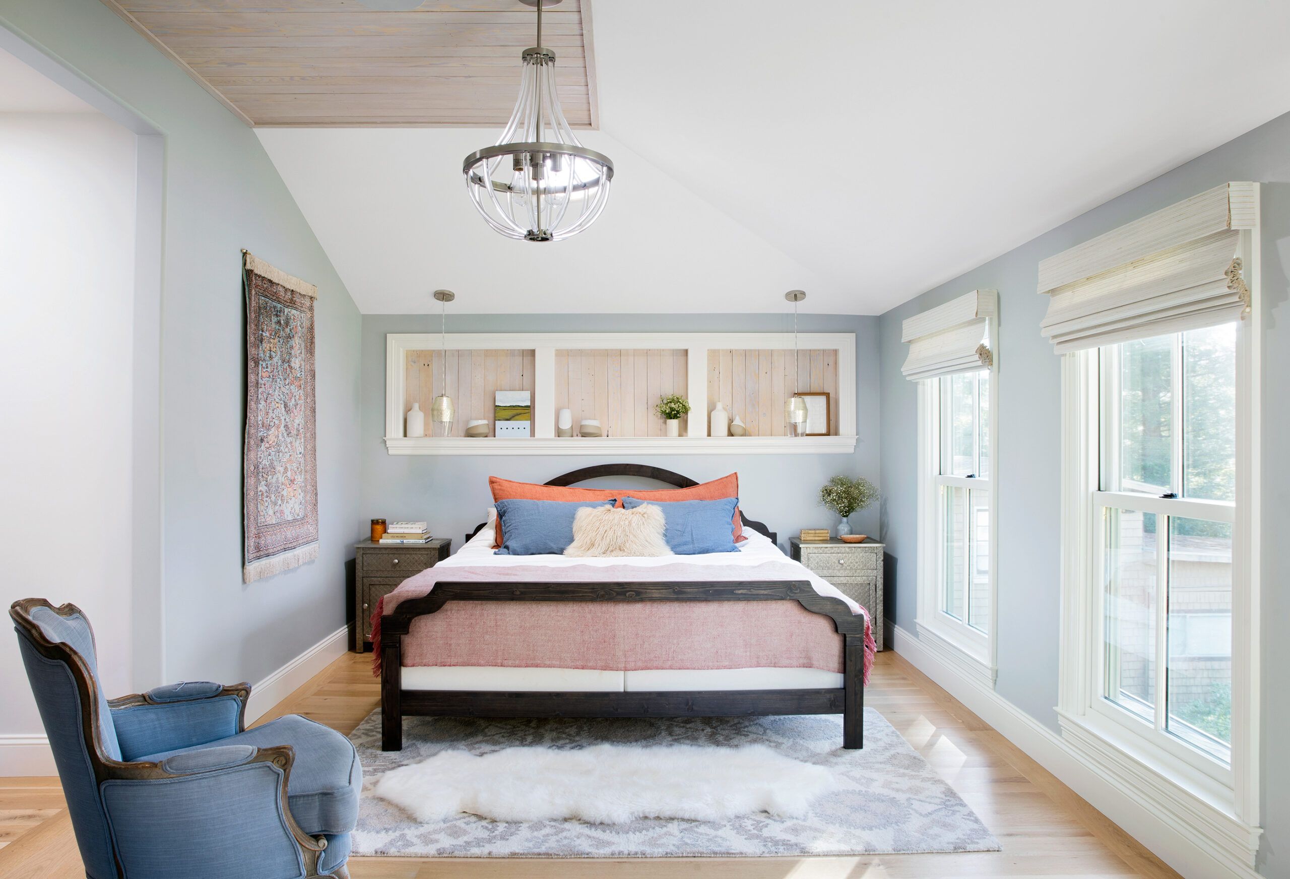
The new second floor’s master suite and two additional bedrooms are accessed via a spacious landing at the top of the stairs. “One of my pet peeves is being dumped into a hallway,” Schrauth says.
She placed the new staircase where the original kitchen had been and, by bumping out the back of the house 10 feet, created enough room for a new open-plan kitchen, dining area, and family room.
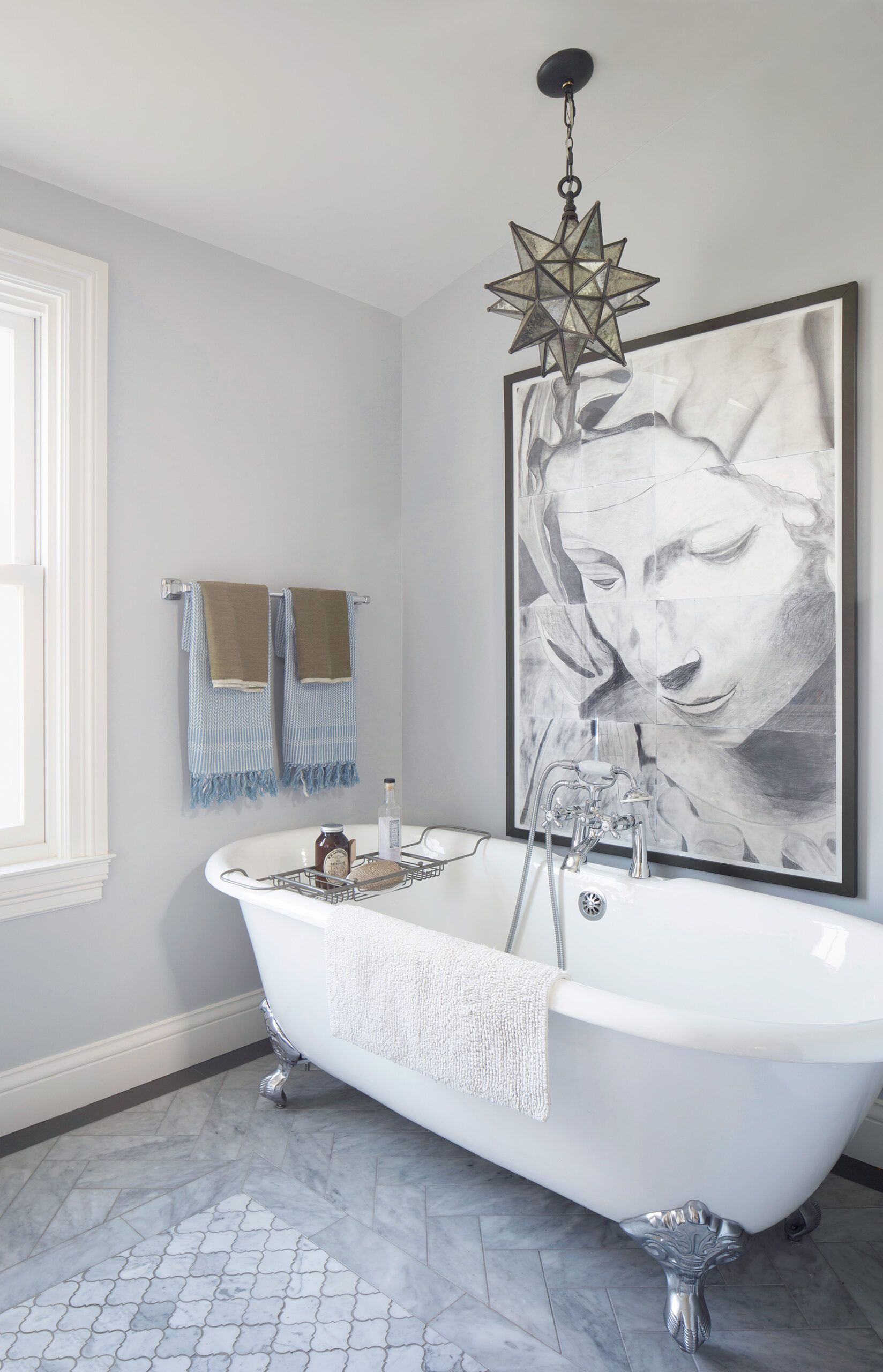
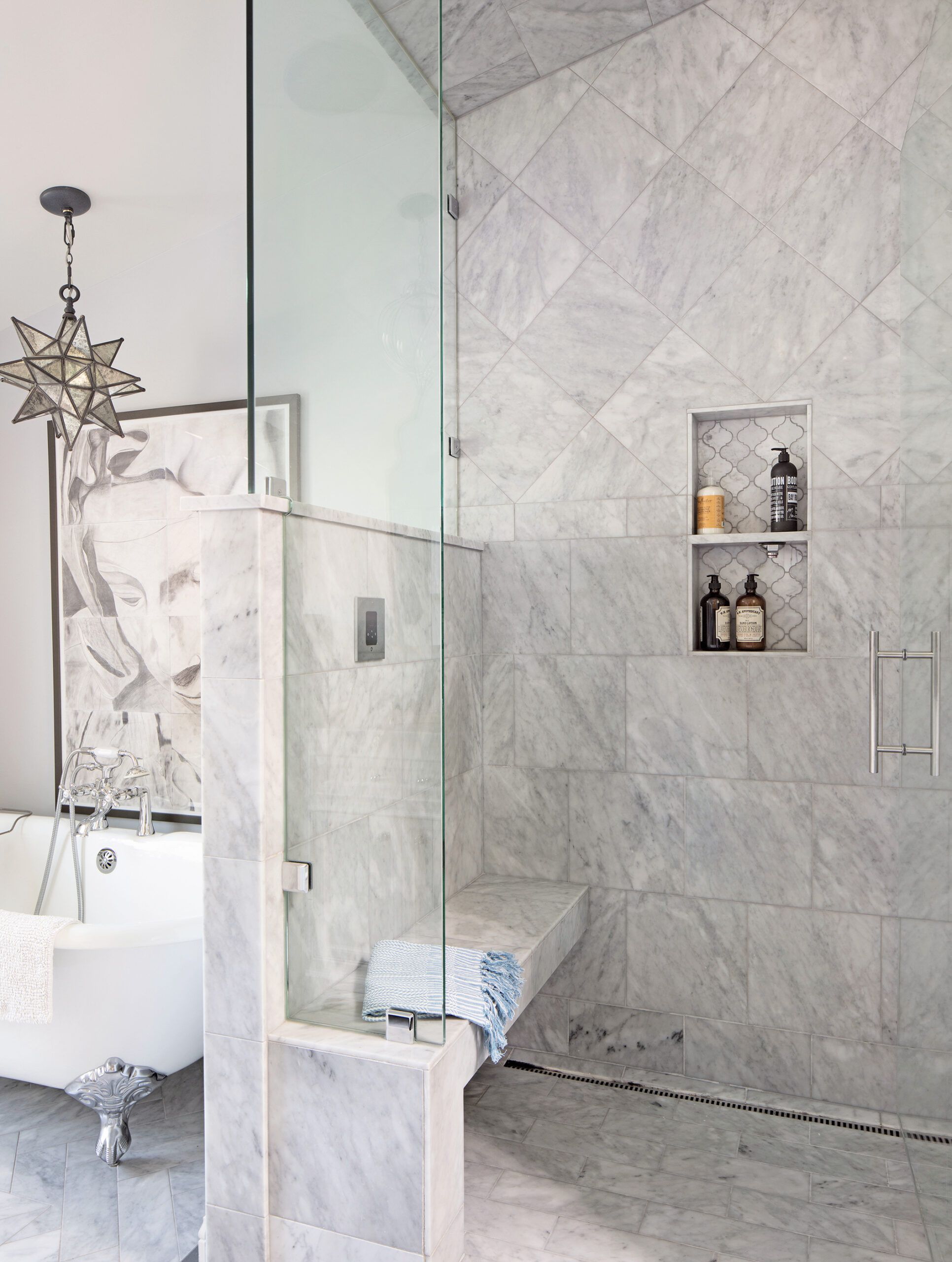
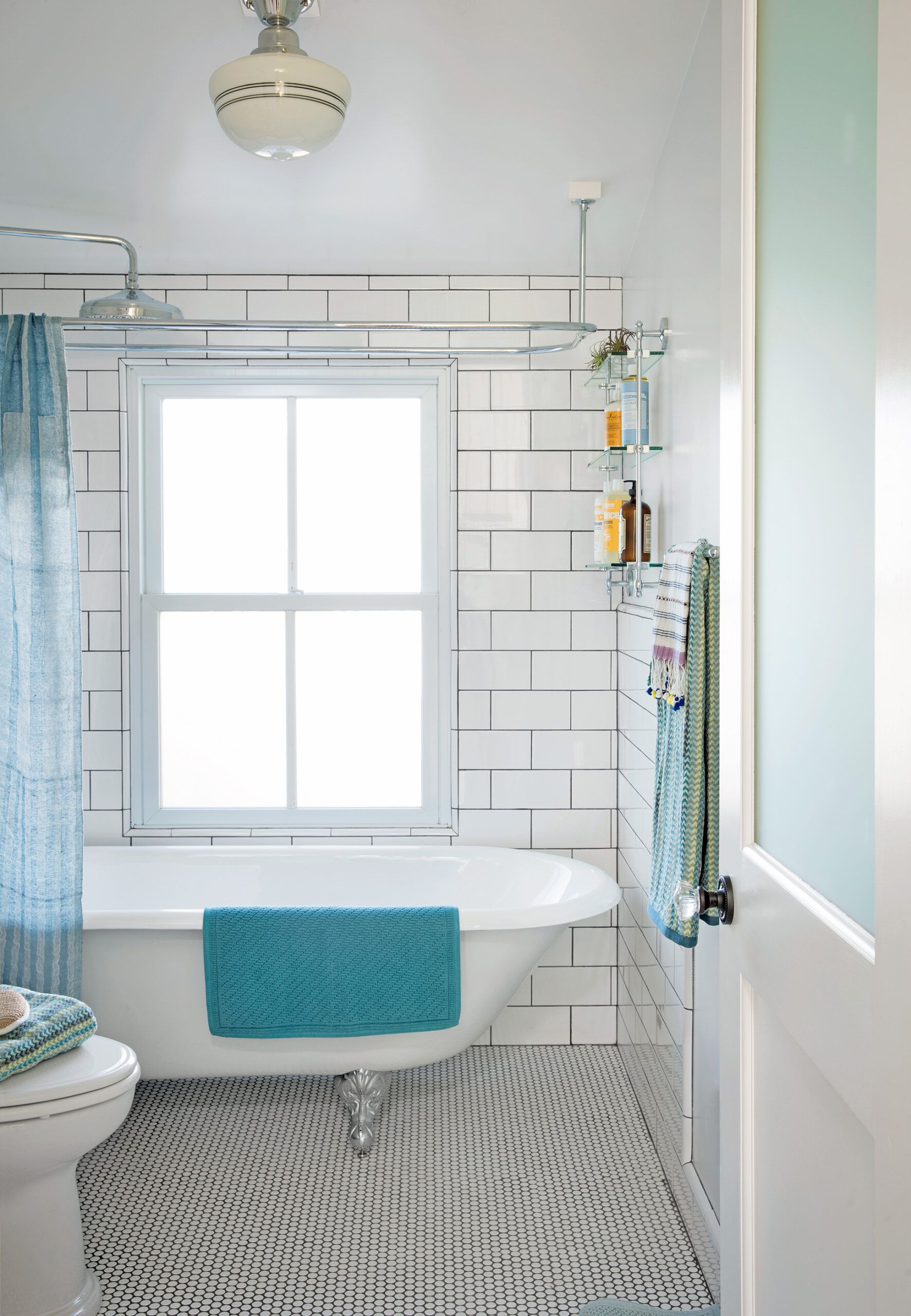
The modern claw-foot tub is old-school cast iron.
Tub: Signature Hardware
Tile: Daltile
The rest of the first floor remains unchanged save for some cosmetic improvements, and a few sleights of hand to disguise mechanical updates.
To accommodate waste lines from the second-floor bathrooms, for example, White widened the frame around the living room’s tray ceiling. To disguise a return for the home’s new HVAC system, he hid it inside a built-in bench on the stair landing.
Two-over-two windows have true divided lights.
Windows: Milgard
Electrical: OFD Electric
Paint: Silver Lake (walls), Benjamin Moore
Lighting: West Elm
Challenges like this, White says, keep his work interesting and his clients engaged. As is his practice, he took Amy and Billy for a walk-through once the framing was in place.
“It’s a great time to walk around and talk about the options or changes that may need to come about,” he says. “A building project is a three-legged stool—there’s the architect, the homeowner, and the contractor, so you want to keep that line of communication open,” says White.
He’s learned, he adds, that it’s easier for people to communicate about a project when they’re standing in the middle of it.
While Billy weighed in on the construction, Amy focused her attention on the home’s interior, channeling period design details into the remodel. In the kitchen, she had Schrauth add vintage-style scalloped detailing on the vent hood above an existing 1950s Wedgewood range; the motif is repeated in the backsplash tile and again on the corners of a new built-in banquette.
Paint: Slate Blue (front door), Benjamin Moore
Siding: HardiePlank Woodland Cream, James Hardie
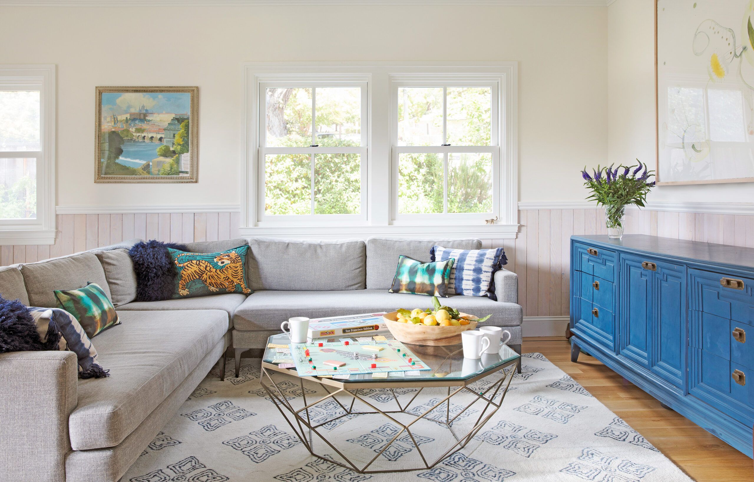
Amy and Billy also accepted guardianship of an antique mirror left in the original bathroom, Depression-era slip-shade chandeliers in the two front rooms, and the home’s original interior doors, all of which they refurbished. In a bold move—one Billy isn’t sure he’d do again—they had Douglas fir rafters and sheathing from the original roof de-nailed and re-milled as wainscoting throughout the first floor.
A gray semitransparent stain gives it a whitewashed look. “We kept everything that could possibly be kept,” said Schrauth. “It gave me a lot of respect for them. They could have just gone with a ‘modern farmhouse’ look, but it wouldn’t have the same soul or authenticity.”
The new second floor, though, permits some nods to Amy and Billy’s own history. “I really wanted to keep the ’30s vibe going downstairs, but we saw the upstairs as an opportunity to do something different,” Amy says.
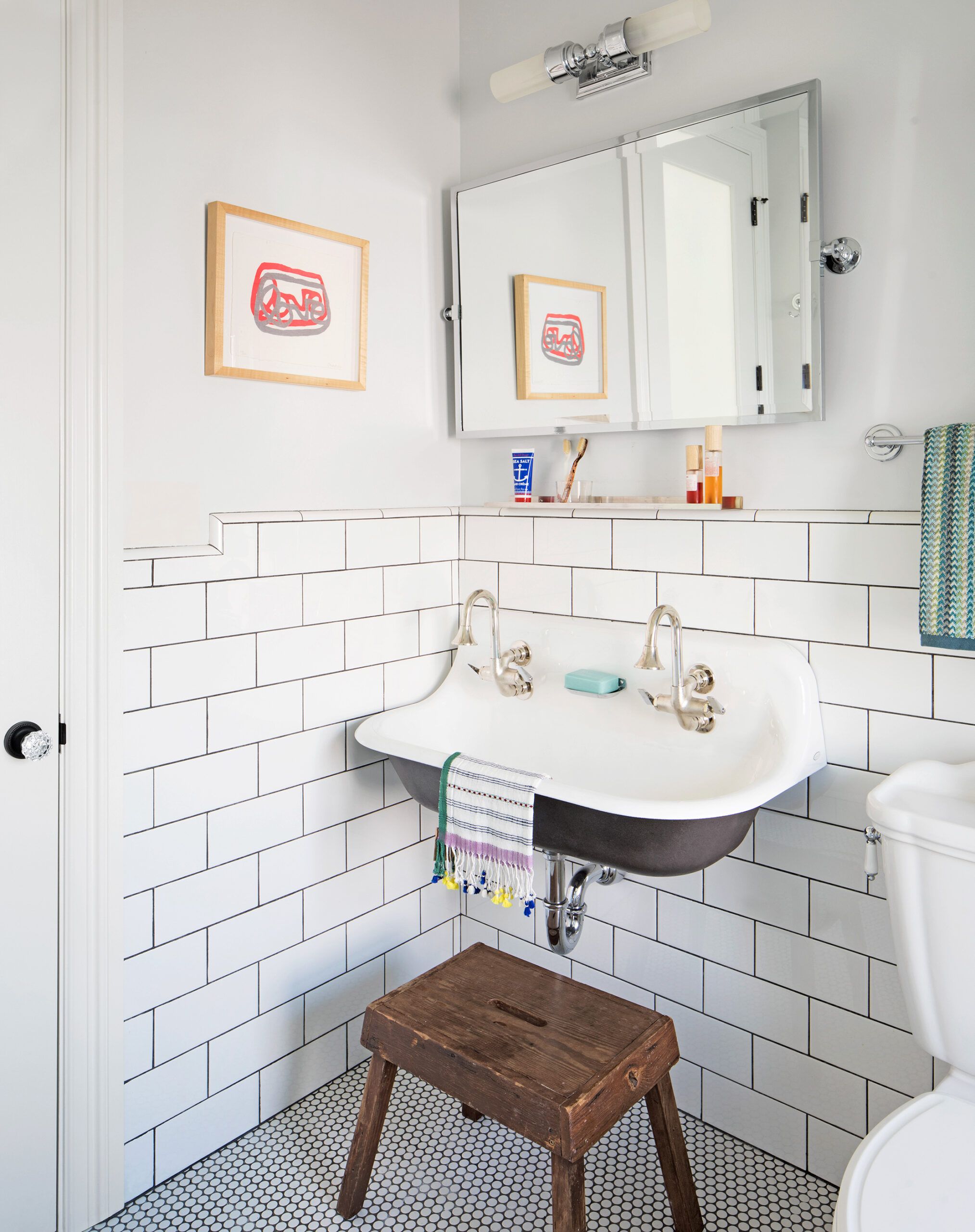
The arabesque-shaped mirrors and tiles in the master bathroom are a reminder of a trip the couple took to Turkey, where they got engaged. Meanwhile, the children’s bath returns to the 1930s with its schoolhouse-style lighting, wall-hung sink, and subway-tile walls.
Those Depression-era details recall a simpler time in which the unassuming house—and its new family—still seem to reside. The town center is a short walk away, as is Townsend’s and Margaret’s school.
As it did four generations ago, the small front porch sits close enough to the sidewalk to allow the family to easily exchange greetings with a steady stream of neighbors passing by. “There are not a lot of places like it,” says Amy. “Neither one of us grew up that way, never having to leave our neighborhood.” Now that they’ve made this sweet historical house their own, there’s little reason for them to ever want to.
Sink: Kohler
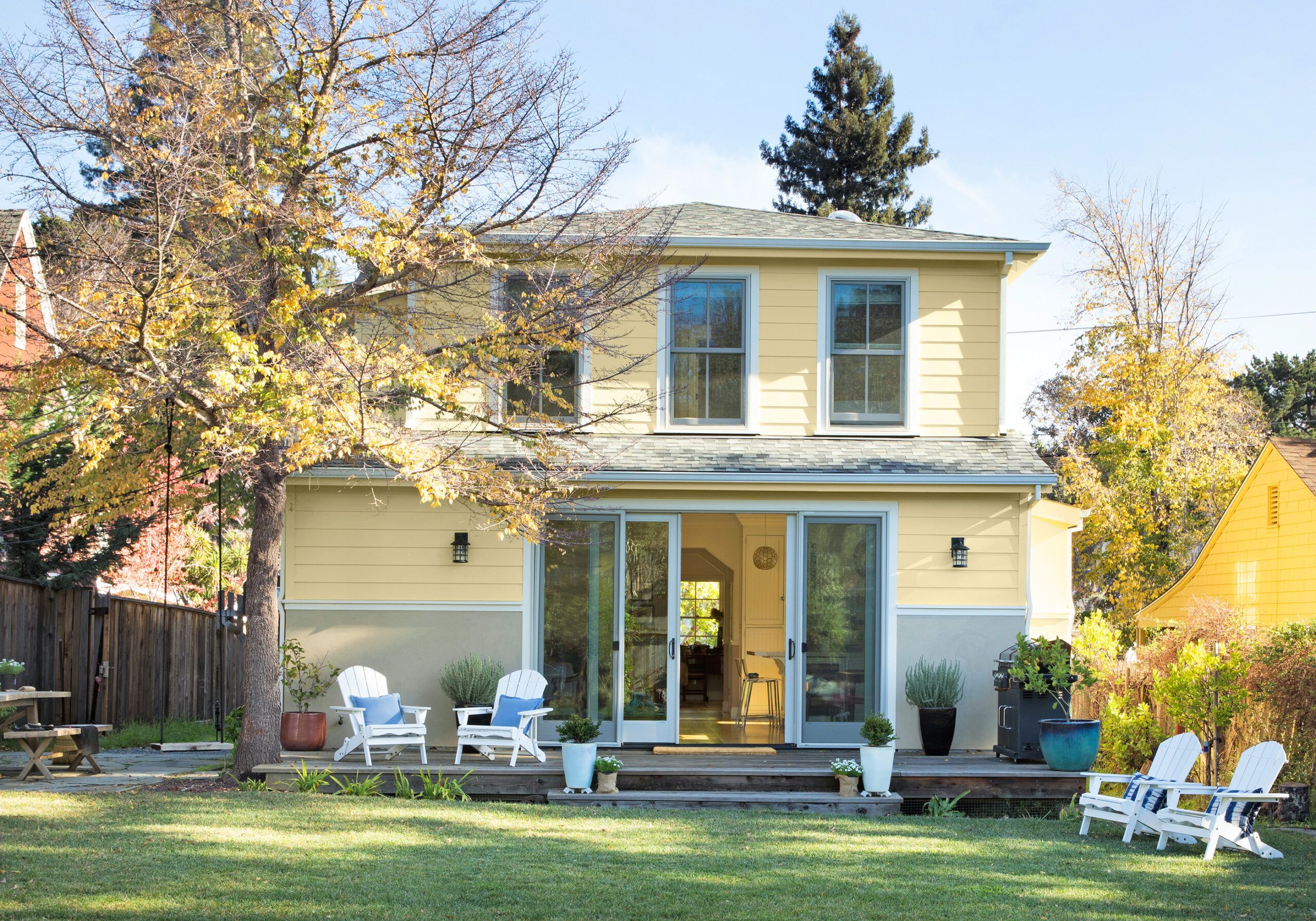
Sliders connect the home to a deck and a pleasant, private backyard away from the bustle of the street. The home’s shallow roof pitch helps diminish the height of the new second floor.
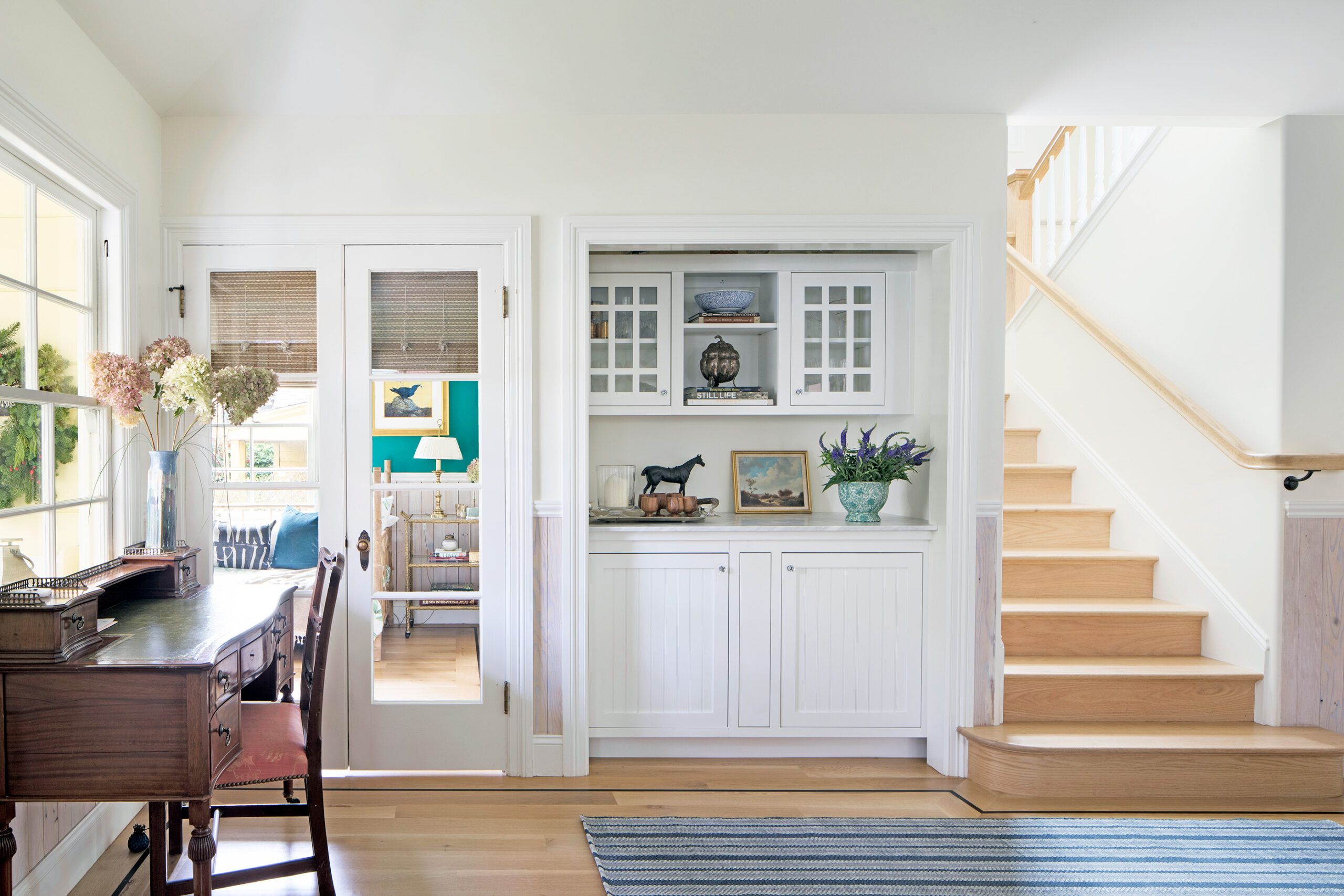
A dry bar sits in between the office/guest room on the left and stairs leading to the second floor on the right.
Floor plans
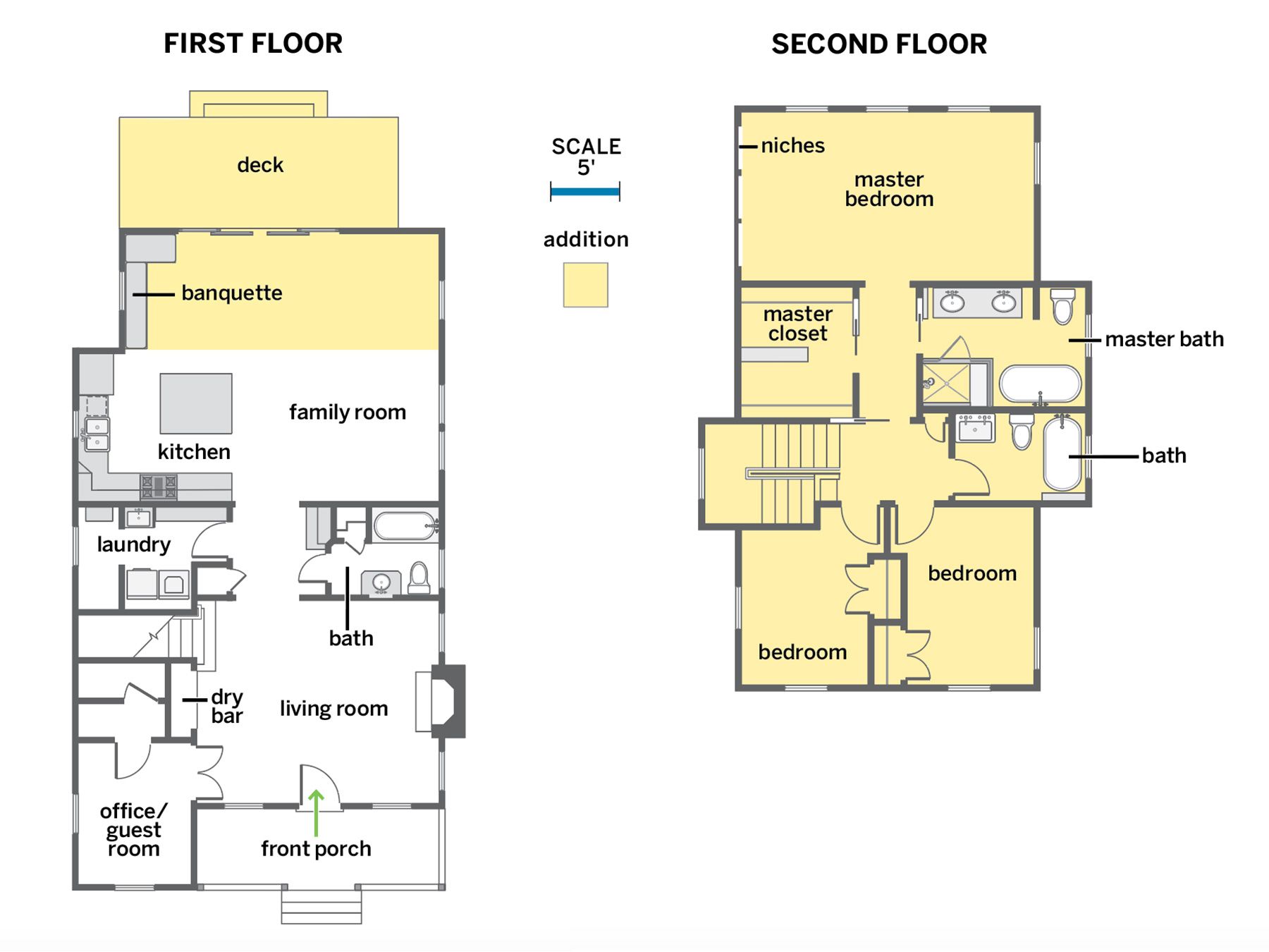
The existing cottage was tight, at just 1,036 square feet. To accommodate their family of four, the Reeds pushed out the back of the house 10 feet and added a second story, for a total of 2,131 square feet of living space with three bedrooms and three baths.
Renovation Recap

- The homeowners: Amy and Billy Reed and their children, Margaret, 8, and Townsend, 7, shown above.
- The house: An existing 1,036-square-foot, one-story cottage built in 1937 on an approximately 50-by-140-foot lot in a close-knit community.
- Why they chose it: They were charmed by its surviving period details and the walkable neighborhood.
- The plan: Add a second floor with additional bedrooms to suit a family of four; bump out 10 feet in back for a larger, more modern kitchen; maintain and enhance the house’s charm by reusing lumber, refurbishing existing light fixtures, and adding period-appropriate details.
- Timeline: About a year of house hunting; three years planning and getting zoning approval; 15 months from start of demolition to finished house.
- What had to stay: Art Deco slip-shade chandeliers in the living room and dining room, which they had cleaned and rewired.
- What had to go: A decrepit 858-square-foot cottage in the rear yard; removing it allowed the family to add that square footage to the house.
- Biggest challenge: Gaining approval for the remodel from local zoning authorities concerned with overdevelopment.
- Best surprise: The tons of great light that pour into the house thanks to the placement of new windows and interior walls.
- Budget buster: Repurposing roof lumber as wainscoting cost more than expected.
- Guiding philosophy: “We wanted a house in a walkable neighborhood,” says Billy. “It only made sense to keep the history and make use of the well-built bones of the original house.”
