Renovations almost always take longer than expected. But for Wendy and Tom Braun, it wasn’t bad weather, building permits, or back orders that held up their home’s remodel for more than a decade.
It was getting unstuck.
They had found their dream house in the Los Angeles suburb of Yorba Linda in 2005. Like much of Orange County, Yorba Linda is crammed with ranches and Spanish-style homes. So when Wendy—who had grown up in Tennessee, and is drawn to more traditional architecture—saw the only Cape around for miles, she was sold.
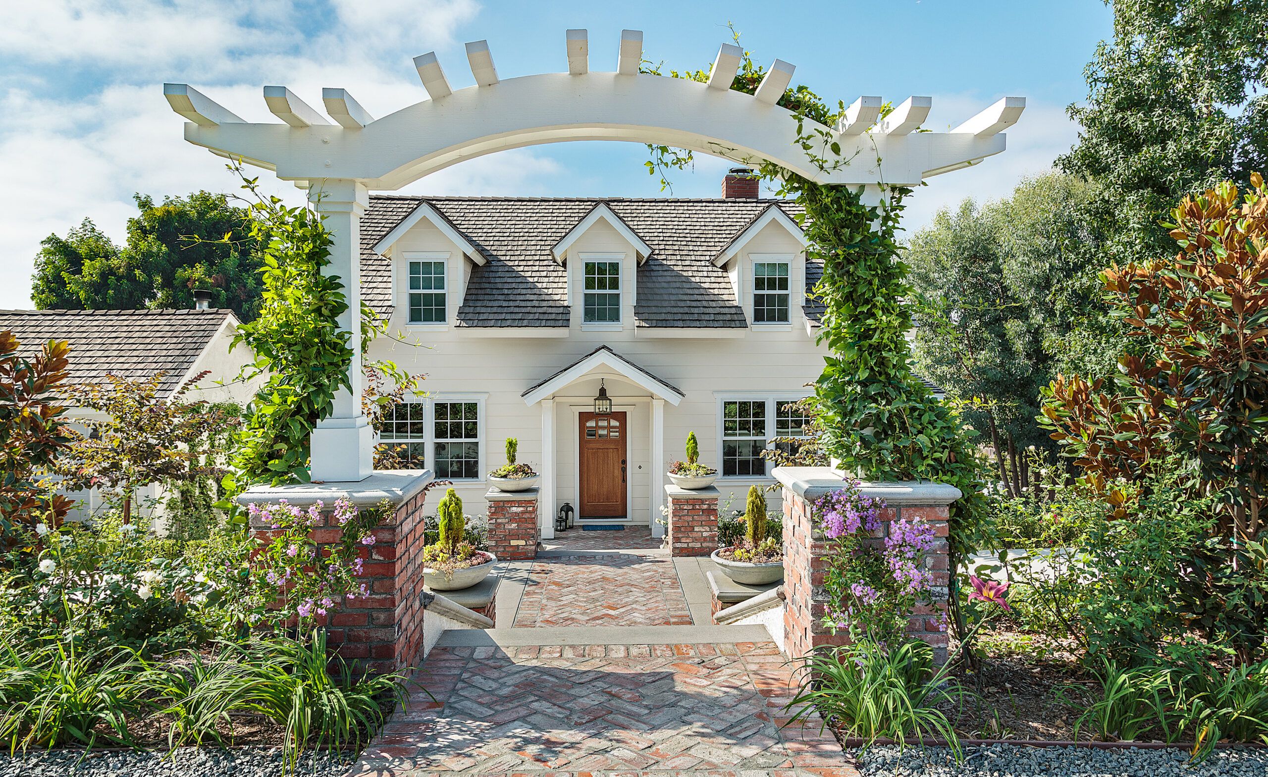
Shown: An antique-brick walkway, gracefully framed by an arched arbor and lined with planters, welcomes visitors to this no-longer-plain Cape Cod-style home. The once unadorned entry got a makeover, too, with the addition of a portico, a new front door, and a statement light fixture.
Siding: HardiePlank, James Hardie; Paint: Wimborne White, Farrow & Ball; Front door roof light: Suzanne Kasler Brantley Lantern, Visual Comfort; Windows: Milgard Windows & Doors
Built in 1974, the house held 2,800 square feet, with three bedrooms and two and a half baths, and was in surprisingly good shape. Wendy also knew it wasn’t perfect.
“Everything was dated, but it functioned well enough,” she says. “We were in no hurry; we wanted to live in it, see how it worked—or didn’t work—for us.” At the time that the Brauns bought the house, one of their sons was grown and living on his own, leaving two teenagers at home. The nest wasn’t empty yet, but it wouldn’t be long.
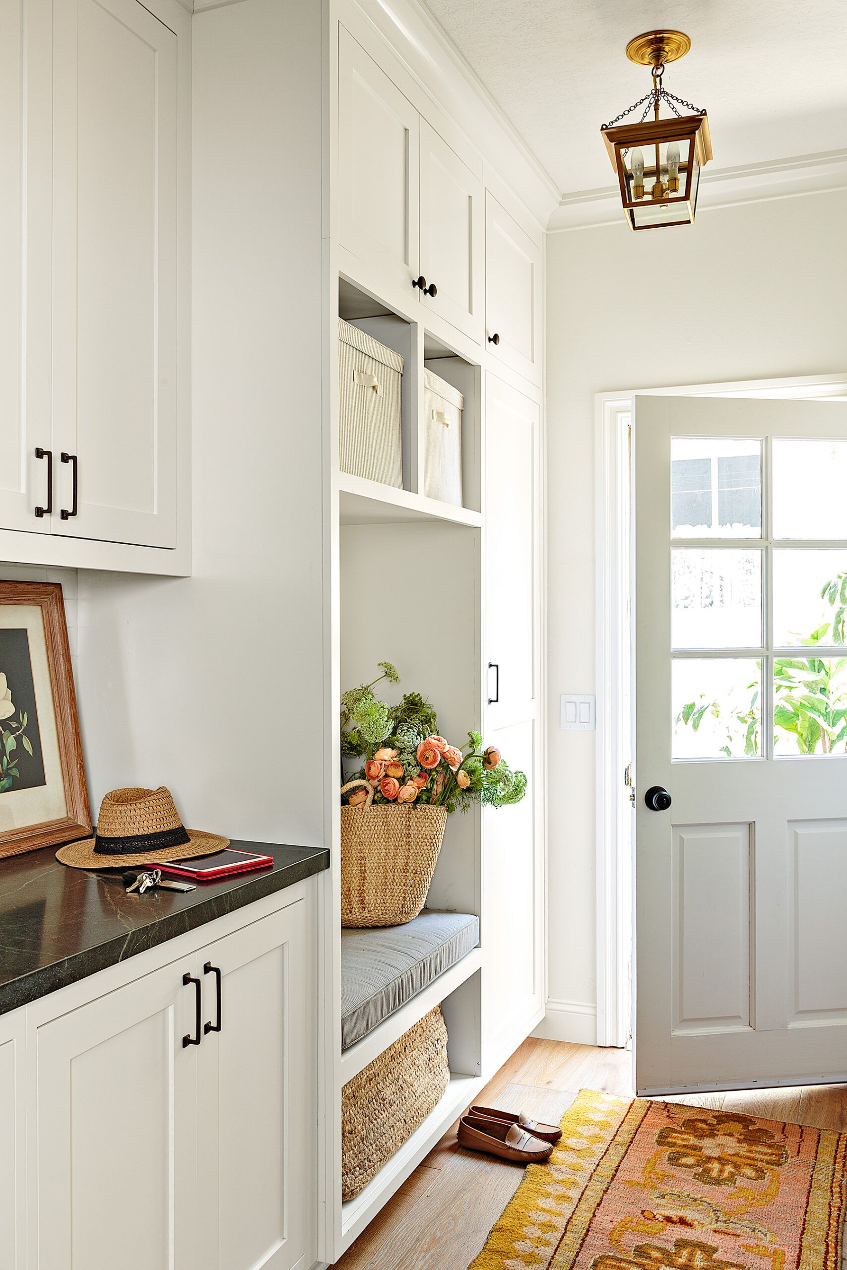
Shown: A bright, inviting mudroom/butler’s pantry with seating and storage replaced what was originally a laundry room off the kitchen. The Brauns use the cabinets there to store tablecloths and servingware and as a drop-off point when coming in from the detached garage.
The classic Cape had an unadorned facade with three gabled dormers on a steeply pitched roof, and its interior was a warren of smallish, darkish rooms. Off the front entry, there was a small sitting room to the right and a dining room to the left. A center staircase led up to the second floor, and, just past it, four steps led down to the family room and kitchen. From the family room, one more step down led to a sunroom that had been built over a deck. Upstairs, also on two levels, was a master bedroom with a dressing area and a small bathroom along with two bedrooms and a shared bath.
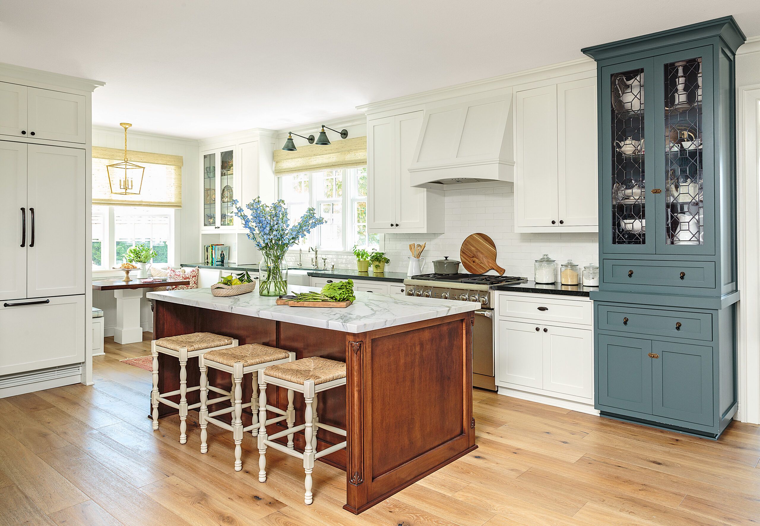
Shown: Shaker-style cabinets, an island with fine-furniture detail, and a hutch with leaded glass reflect the homeowners’ taste for the traditional. The orientation of the island keeps it from cutting off the family room. An awkward corner became the perfect spot for a cozy dining booth.
Cabinetmaker: Ruben Mercado, Mercado Woodworking, Inc., Anaheim, CA; Cabinet paint: Knoxville Gray (blue) and Moonlight White, Benjamin Moore; Sink: Shaw Farmhouse Sink, ROHL; Faucet: Perrin & Rowe, ROHL; Sconces: 20th C. Library Sconces, Restoration Hardware; Window treatment: Rustic Jute, Blinds.com; Breakfast nook light: EF Chapman Darlana, Visual Comfort; Range: Pro Harmony, Thermador; Refrigerator: Thermador; Hardware: Timely Hardware; Stools: Ballard Designs
“I was frustrated by the way the downstairs of the house functioned,” says Wendy. “The dining room was not easily accessible from the kitchen, which was small and cramped. We had a nice big yard, but few windows through which to see it. We didn’t really use the sunroom, and we had no office space.”
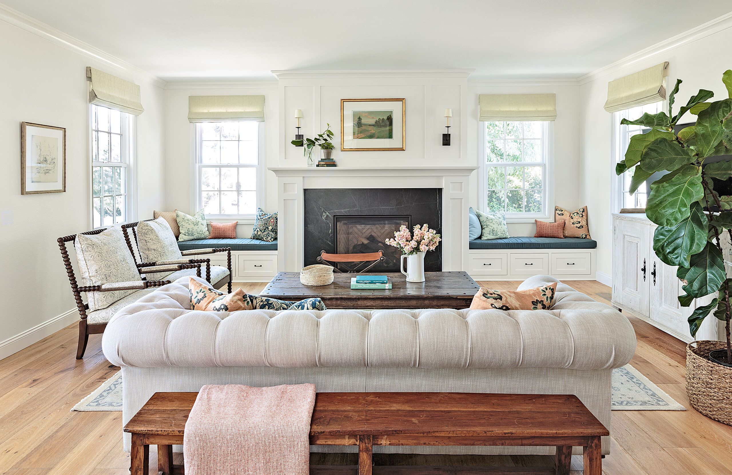
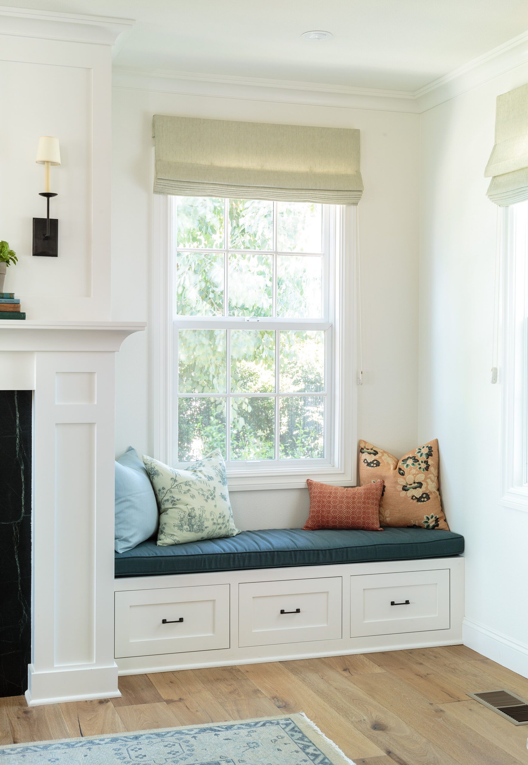
Shown: In the expanded family room, a new gas fireplace flanked by built-in benches adds warmth and charm. Drawers under the seats hold grandchildren’s toys, DVDs, and throw blankets.
Sofa: Restoration Hardware; Paint: Moonlight White (walls), Benjamin Moore; Flooring: Ligurian, California Classics; Chairs: Jamine; Hickory White
For years Wendy envisioned changes she hoped to make to the house—a new kitchen, a bigger master bath—but something always seemed to get in the way. There was their own indecision, for one: The Brauns wanted change, but they wanted to maintain their home’s Cape Cod identity. They were also stymied by how to deal with the floor-level differences, which had been built into the house in part because of its sloping yard. And the longer they waited, the more life events caused them to pause. “We did a major landscape overhaul in 2007, but then the market crashed and we put everything on hold,” Wendy explains. More time passed, and the last of their children moved out, causing them to rethink their remodel wish list yet again.
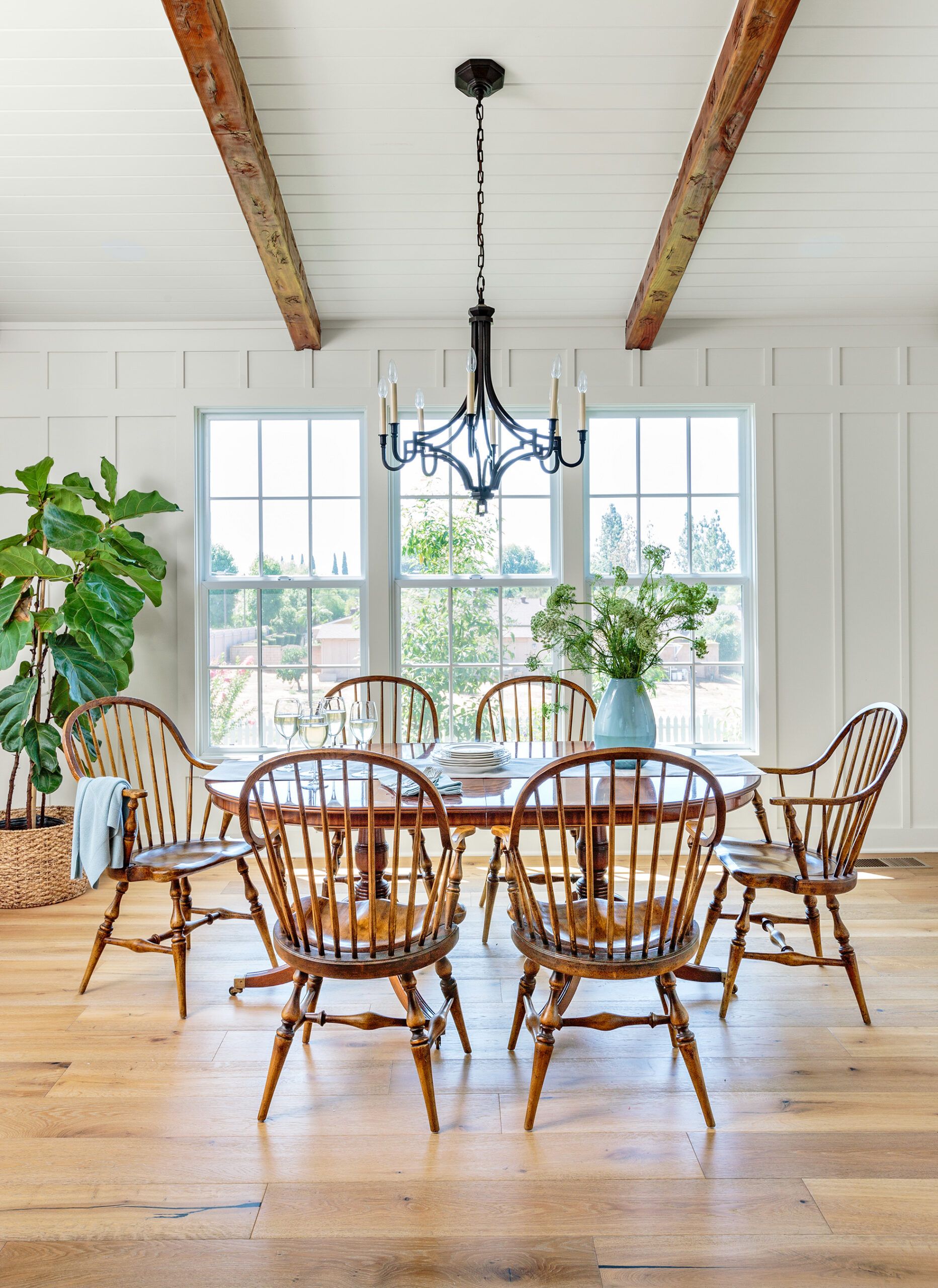
Shown: The new dining room was built on the footprint of a sunroom that had been added on to the back of the house. Its decorative beams, French-oak flooring, and simple trim details are styled to complement moldings in the rest of the house.
Windows: Milgard Windows & Doors; Flooring: California Classics; Paint: Moonlight White, Benjamin Moore; Light fixture: Mykonos Chandelier, Visual Comfort
Finally, in 2014, they reached out to an architect, Martin Harvey, who drew up plans to remake the first floor and remodel both upstairs baths. It was a significant step forward. Harvey’s proposal opened up a world of possibilities the couple hadn’t even considered, including enlarging the family room and tearing down the sunroom to build in its place a dining room that would fit the whole family, which now included two grandchildren.
But second-guessing set in again. They followed through with some changes to the guest bathroom—moving the toilet and sink to new locations—then stopped. “At that point, we were getting frustrated with all the things that needed to be done to the house, but we didn’t really know where to start,” Wendy says. “We thought we’d just go room by room.”
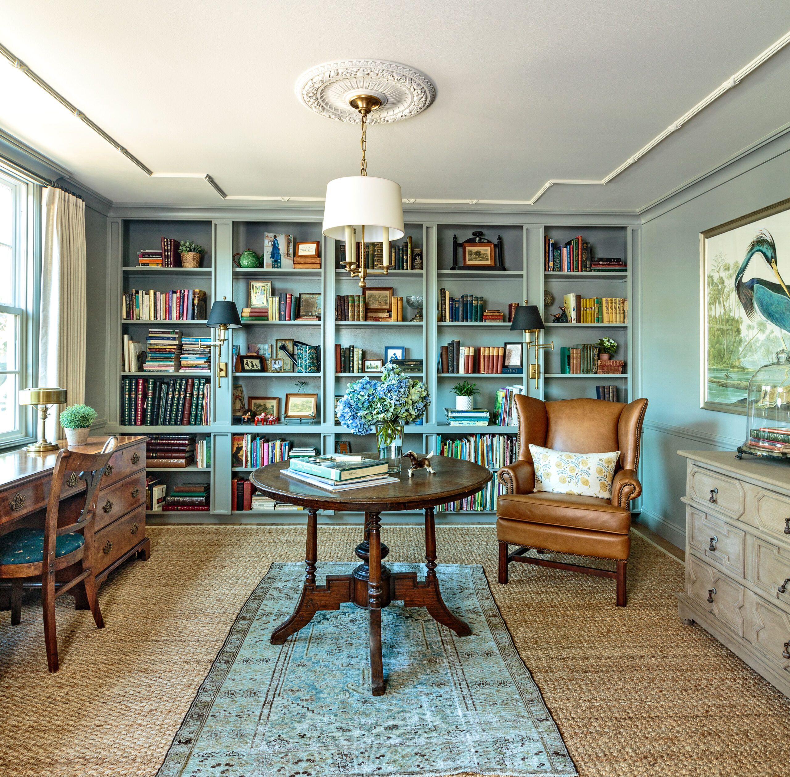
Shown: The former dining room, at 13 by 14 feet, turned out to be the ideal location for the library that Wendy had always wanted. The walls and new built-in bookcases are wrapped from base molding to crown in a sophisticated blue-gray.
Architect: Martin Harvey, Martin Harvey Architectural Illustration, Midway City, CA; Paint: Sabre Gray (bookcase and walls), Benjamin Moore; Light fixtures: Classic Candle Hanging Light and Dorchester Double Backplate Swing Arm Sconces, Visual Comfort; Chair: Leather Wingback, Pottery Barn
Two more years would go by before they revisited the remodel, this time with interior designer Kristina Braun, who happens to be Tom’s niece. “We still weren’t sure, but our family was growing and I really wanted the house I love to work for all of us,” Wendy says. “Kristy convinced me it was time. She understood what we wanted to do, and gave us the confidence we needed to go forward.”
When the Brauns met with Kristina and builder Mike Cruz, they were finally able to visualize the ideas they had mulled over for so long. It also helped that Cruz, who served as GC for the project, gave the previously drawn-up architectural plans a thumbs-up, and reassured the couple he could handle the floor-level challenges. They decided to proceed.
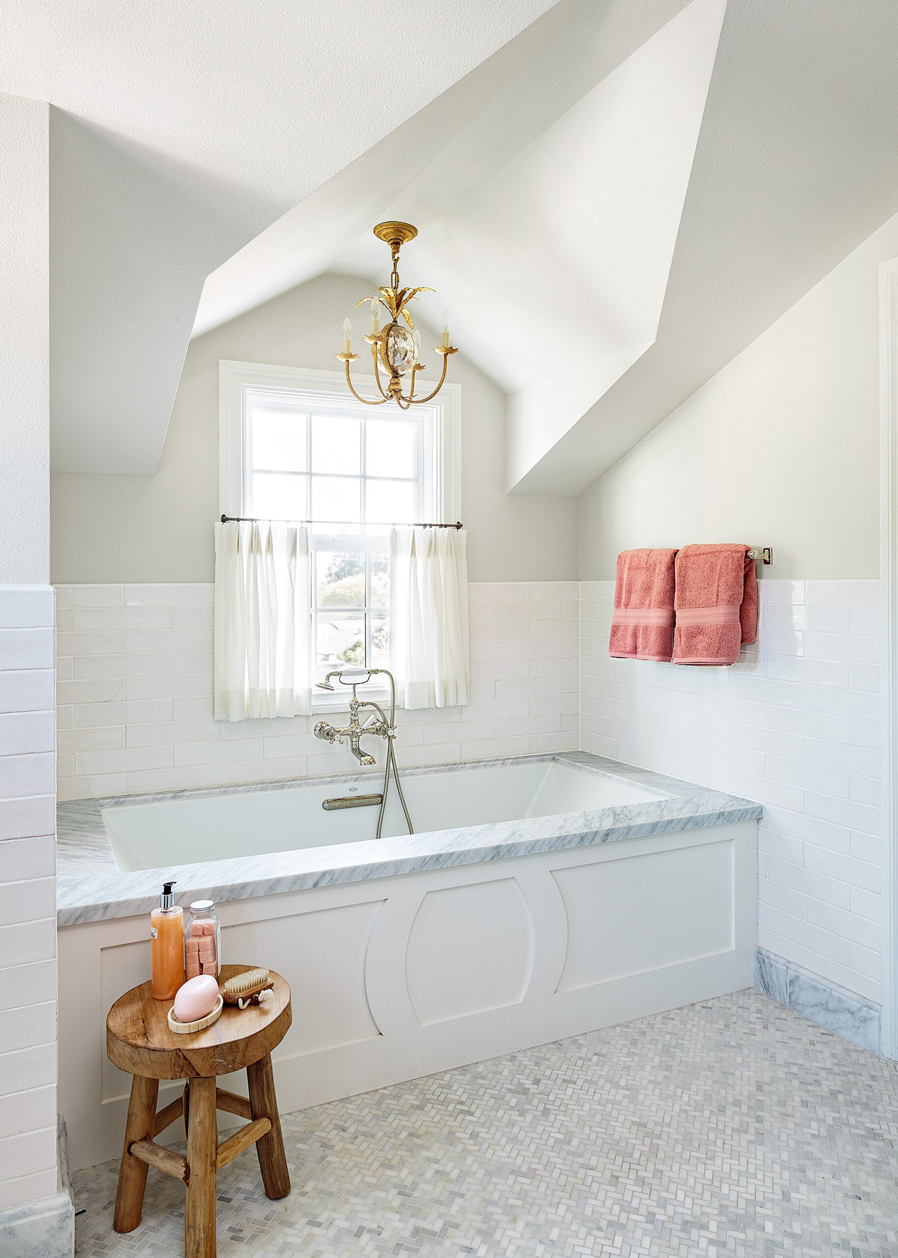
Shown: By moving a wall about a foot into an existing dressing area, the master bath gained enough room for a slightly longer tub, now brightened by a dormer window above it. A trip to Italy inspired the bath’s Carrara herringbone floor tile and marble accents.
Interior designer: Kristina Braun, BRAUN+ADAMS; Builder/contractor: Mike Cruz, MCCI, Fallbrook, CA; Floor tile: Carrara Venato Herringbone; The Builder Depot; Paint: Seashell (walls), Benjamin Moore; Tub: Kohler; Faucet: Highgate, Waterworks; Mirrors: Bristol, Restoration Hardware; Light fixtures: Gramercy Small Chandelier and Holton Sconce, Visual Comfort
First and foremost, their goal was to open up the small, dated rooms and invite in more light. They started by removing the little-used stepped-down sunroom and replacing it with a 12-by-7-foot dining room on the same level as the family room.
“It’s the only entirely new space in the home,” says Kristina. “There’s so much detail there—from the millwork and window placement to the distressed ceiling beams. We really created something out of nothing.” Introducing new furniture was always part of the Brauns’ plan, and the mahogany dining table is one of only two original pieces they decided to keep.
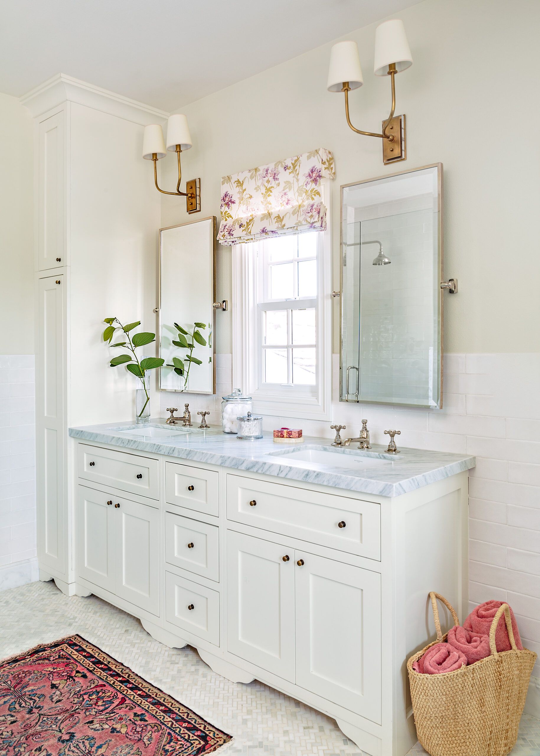
Shown: Annexing part of a storage room in the hall made space for this double-sink vanity, as well as a large shower on the opposite wall.
Sconces: Visual Comfort; Mirrors: Restoration Hardware; Paint: Seashell (walls), Benjamin Moore
They turned to the kitchen next, gutting the space and removing the peninsula to open it up to the adjoining family room. In the process, they raised the kitchen’s dropped ceiling by a foot to match the 9-foot height of the family room. “We wanted it to be open and inviting, a place where we could cook together and gather together as a family,” says Wendy. They also bumped out the family room slightly, adding 137 square feet to the space. The original fireplace was removed from the center of the family room’s interior wall and a new one built on the new exterior wall, where it anchors two built-in benches, encouraging use of the entire room.
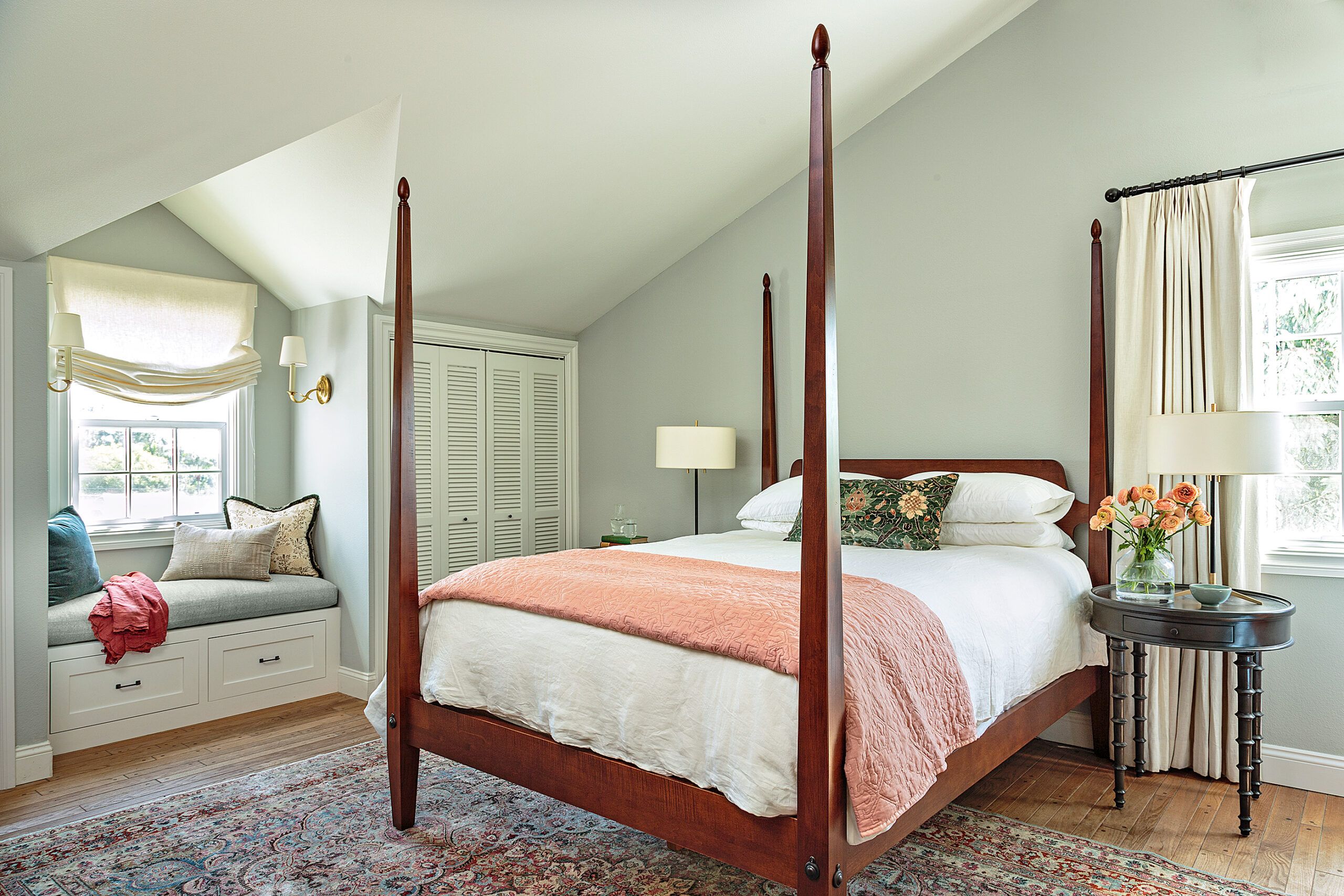
Shown: An existing dormer in the master bedroom is enhanced with a built-in bench with storage drawers.
Paint: Cromarty (walls), Farrow & Ball; Bed: Ethan Allen
“The overall vibe is very family oriented, comfortable, and connected,” says Kristina. “This was a new beginning for the homeowners, an opportunity to embrace a more modern mood with elements of traditional style.”
For the home’s interior woodwork, Kristina collaborated with cabinetmaker Ruben Mercado, whose work introduced a level of detail that elevates the home’s interior while blending in well enough to look as if it’s always been there. He gave the kitchen a furniture-like touch with a painted hutch fitted with leaded-glass doors, used trim details to add character to the new fireplace surround and mantel, and boosted coziness with window seats in both the family room and the master bedroom.
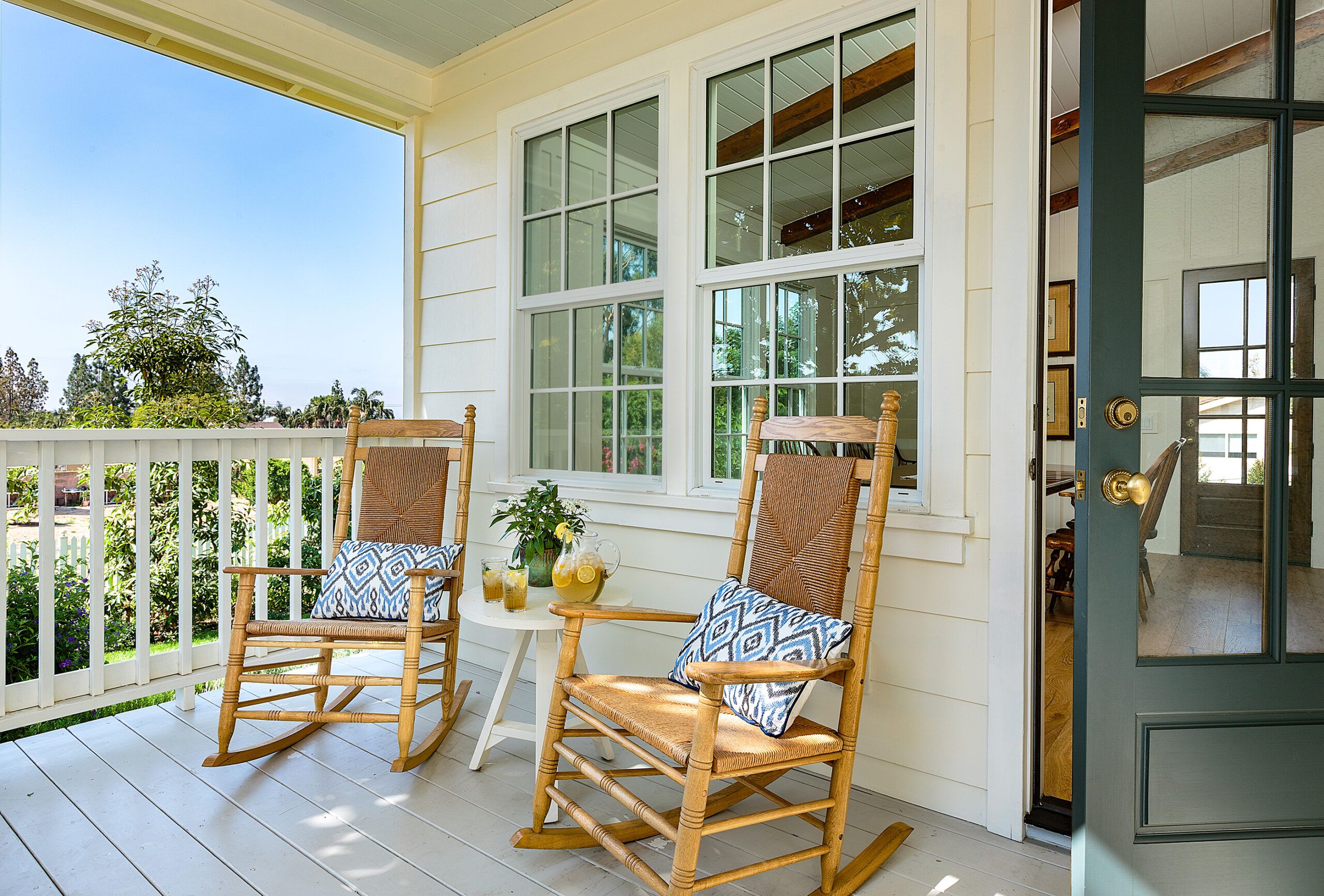
Shown: Dual porches on either side of the new dining room have given the Brauns new access to their backyard, which has increased their enjoyment of the outdoors.
With a new dining room worthy of family gatherings, the Brauns turned the former dining room into the library Wendy had always wanted. It has a more intimate feeling than the rest of the house. “It started with a Pinterest board,” says Kristina. “Wendy kept pinning moody libraries, interesting spaces. She wanted a practical place to work, but more than that, she wanted a cozy room.” Kristina and Wendy settled on blue-gray-painted walls, and covered one wall with floor-to-ceiling bookshelves.
Shown: On both sides of the fireplace, windows with built-in seating invite grandchildren to snuggle in with a book.
On the second floor, they followed through with plans to enlarge the master bath and add clothing storage to a pass-through dressing area leading to it. They removed a sink that had been in the dressing area and added built-in drawers and space for hanging clothes. They also shortened it slightly to add another foot to the bathroom, and then enlarged the bathroom even more by annexing part of an oversize storage closet off the stair landing. The master bath now has not just one sink but two, all-new fixtures, and two new windows, including a dormered one over the tub.
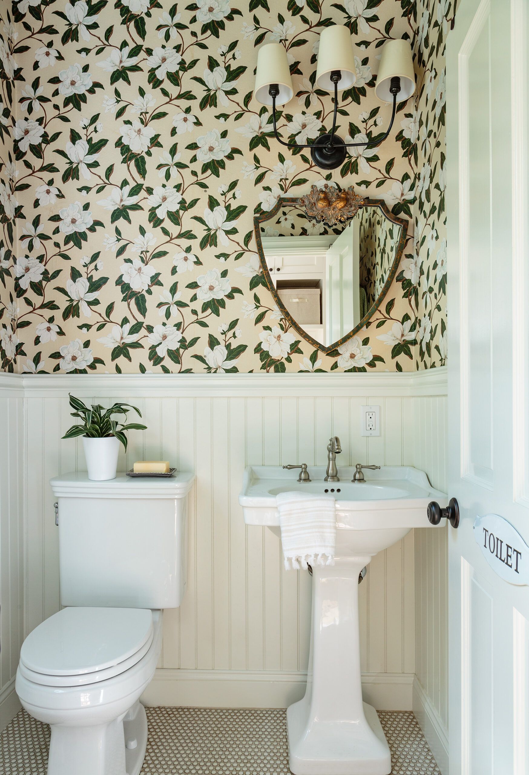
Shown: The bold magnolia pattern on the existing first-floor powder room walls inspired the color palette for the rest of the house.
For a finishing touch, they made small but significant changes to the home’s plain facade by replacing the siding, adding a portico, and upgrading windows and trim. Then they added impact with an arched arbor and a brick walk leading the way to a new front door.
Their remodel finally complete, Wendy and Tom couldn’t be happier. “It’s easy to beat myself up and ask, ‘Why did it take so long?’ ” says Wendy. “But if we’d done it all in the beginning, I don’t think we’d be as happy with the result. A day doesn’t go by when I don’t think to myself, ‘We got just what we wanted’—and I’m glad we waited.”
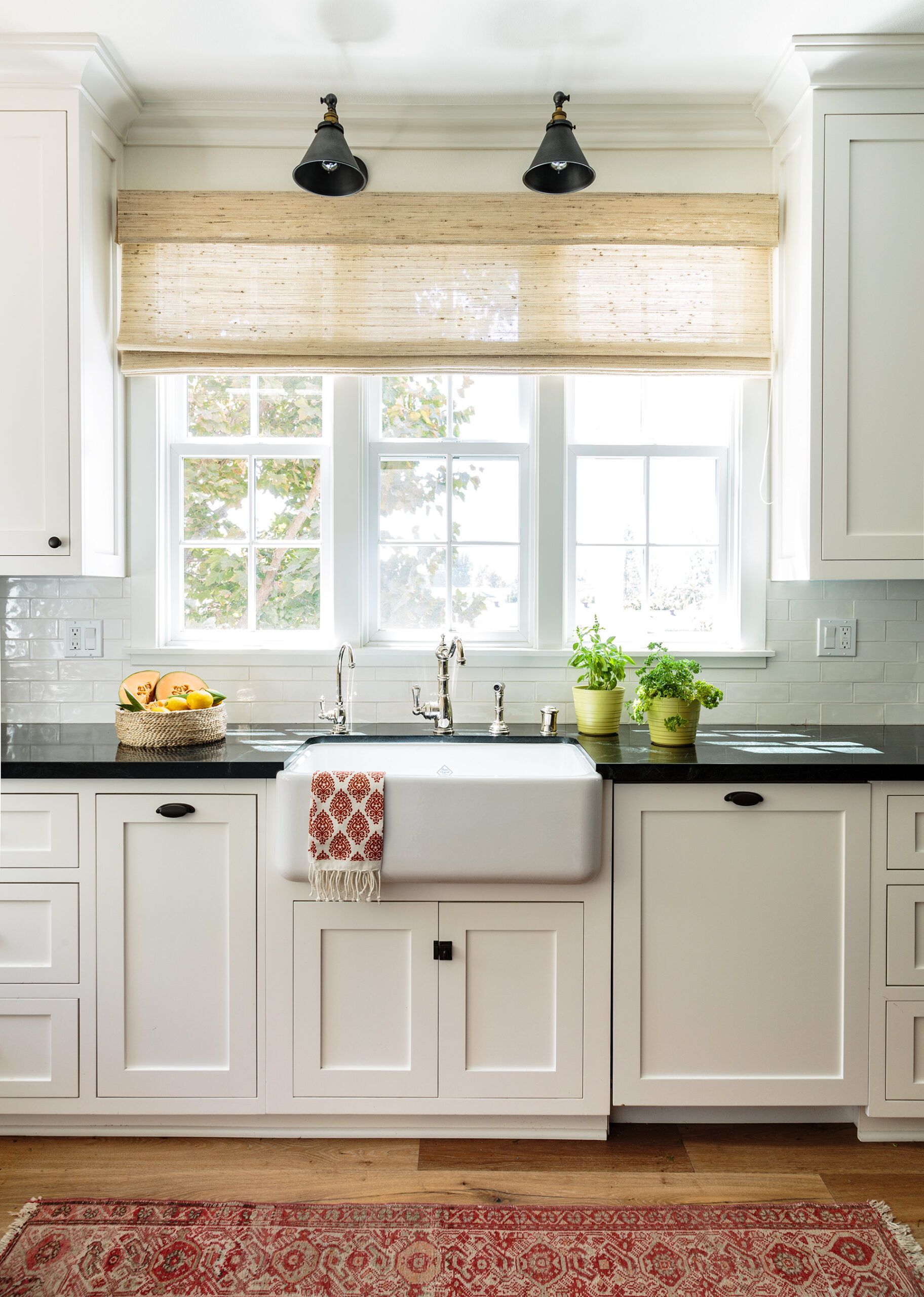
Shown: Soapstone countertops contrast with the white cabinets in the kitchen.
Farmhouse sink: Shaw, ROHL; Light fixtures: Restoration Hardware
Renovation Recap
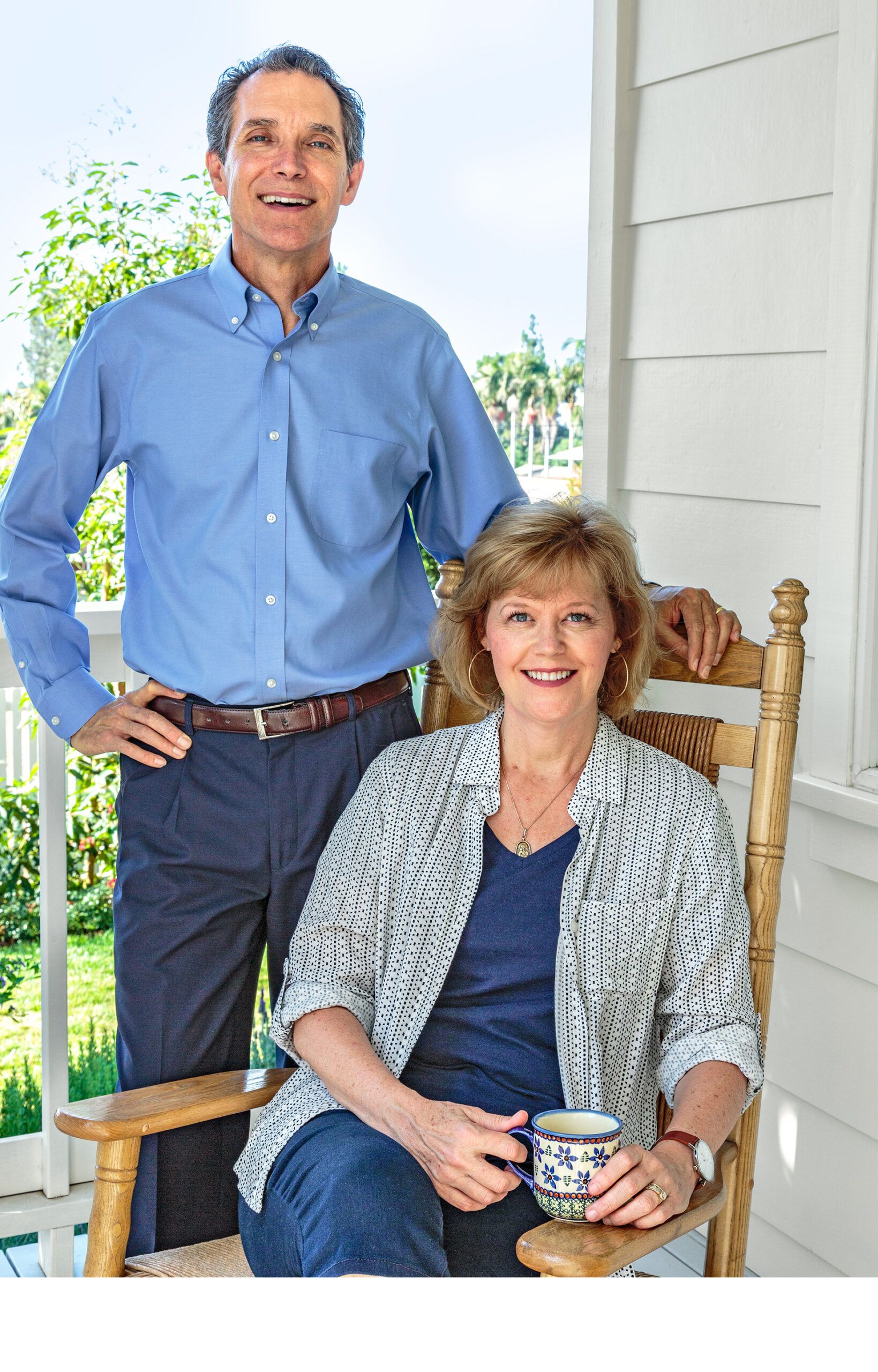
The homeowners: Wendy and Tom Braun
The house: An existing 2,800-square-foot, two-story Cape with three bedrooms and two and a half baths, built in 1974 on a half acre in Yorba Linda, CA.
Why they chose it: The Cape was love at first sight for Wendy, who grew up in the South and prefers more traditional houses over those typically found on the West Coast.
The plan: Remodel the kitchen and open it up to an enlarged family room; tear down an unused sunroom on the back of the house and add a dining room in its place. Expand the master bath with a larger shower and double vanity. Add curb appeal with a portico, new windows, new siding and trim, a new front door, and a new walk.
Timeline: Plans were developed nine years after purchase, with the bulk of the remodel beginning two years later and lasting nine months.
What had to stay: Nothing. Wendy was eager to make the house more open and airy. The couple were also happy to part with nearly all their furniture and start with a clean slate.
What had to go: The sunroom, which had been added on to the back of the house and actually blocked the sun from entering the main living area.
Biggest challenge: Remaining in the house during construction. For the Brauns, this meant setting up a temporary kitchen in the laundry room, living out of a guest room, and escaping on weekends to maintain their sanity.
Lesson learned: “It may seem counterintuitive, but sometimes living in your space and letting life happen, and not moving forward with renovations too quickly, can get you where you need to be,” says Wendy.
Floor Plans
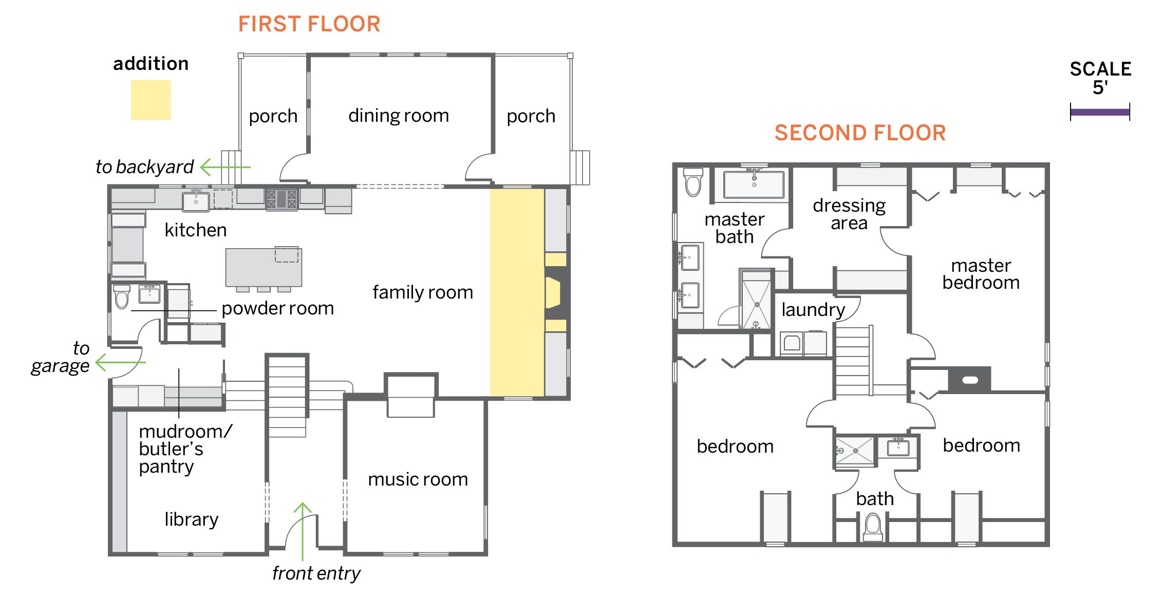
While space was reapportioned—primarily on the first floor—the existing three-bedroom, two-and-a-half-bath house’s 2,800 square feet grew by just 137 square feet with an extension to the family room.
On the first floor, the kitchen was opened up and rebuilt, a two-sided interior fireplace was removed, and a new one was added to the family room’s exterior wall. To bring light and backyard views into the house, a sunroom was torn down and a dining room was built in its place.
The old dining room became a library, and a sitting room became a music room with a new piano. Upstairs, the master bath co-opted space from a large closet for a double vanity and an enlarged shower, and gained two more windows.
