Homeowners are often in it for the long haul, but not many of them get in shape for a major renovation by long-distance running.
“I ran a marathon when I was six months pregnant,” says Sarah Madeira Day, one half of the brains and brawn behind the kind of whole-house reno that would give pause to a seasoned general contractor. “I have energy like a ten-year-old!”
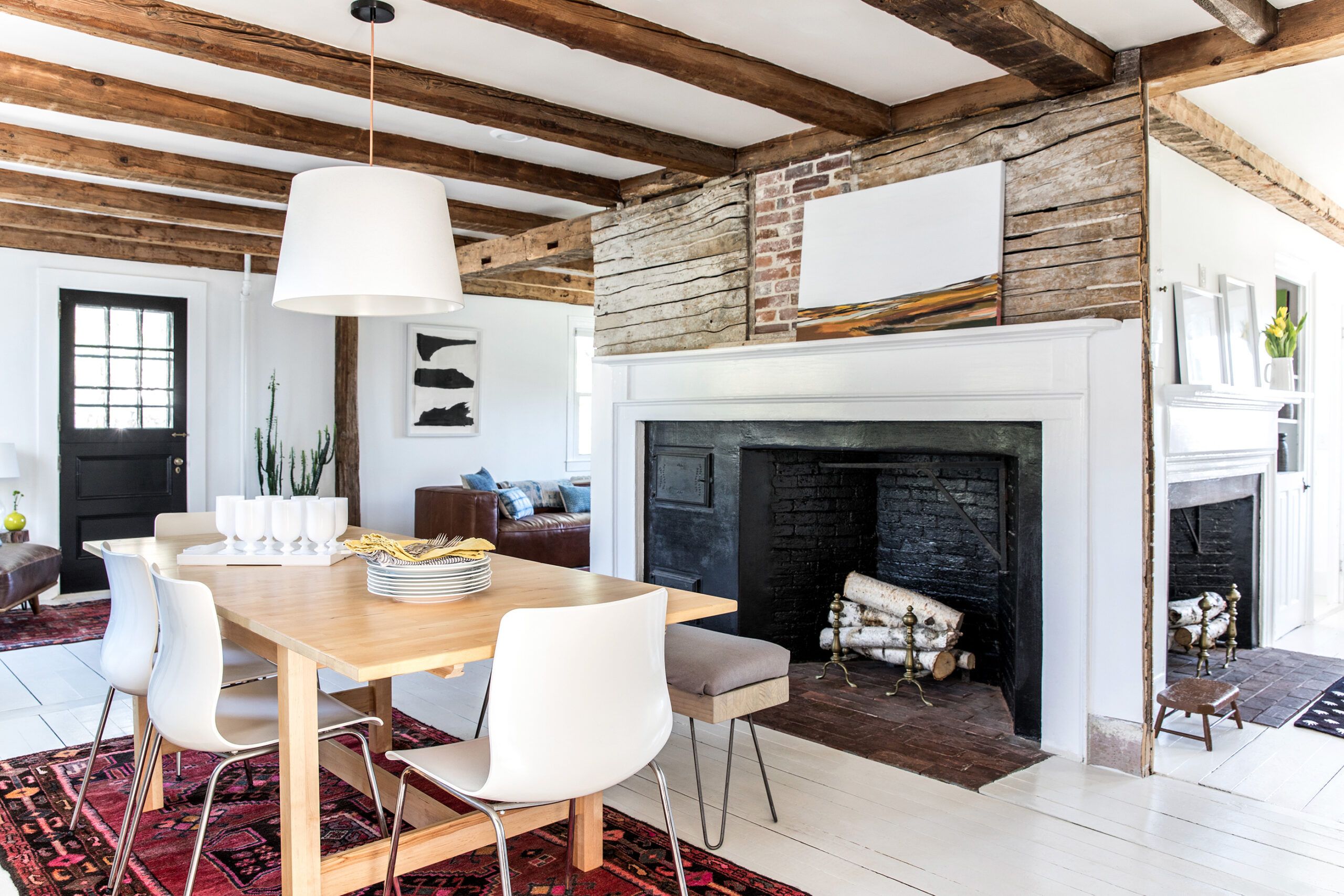
Shown: The core of the original house, believed to be nearly 300 years old, was built around three back-to-back fireplaces. The homeowners modernized the living space with a frugal blend of rustic materials like exposed beams, bricks, and lath—treated as artwork over the dining room fireplace—and fresh furnishings and paint colors.
Interior design: Sarah Madeira Day. Table, chairs, hutch, and pendant: IKEA. Pendant cord: West Elm. Paint: Behr’s Ultra Pure White (walls) and Benjamin Moore’s China White (floors). Painting over fireplace: Anita Madeira
Energy is handy when your new house, perched seaside in Cumberland Foreside, Maine, is in shambles, and you’re living out of one room while gutting others and also working full time. Also useful: having a track record as a DIYer, a background in design, a hard nose for a budget, and a great eye—not to mention an equally hardworking spouse and supportive family members.
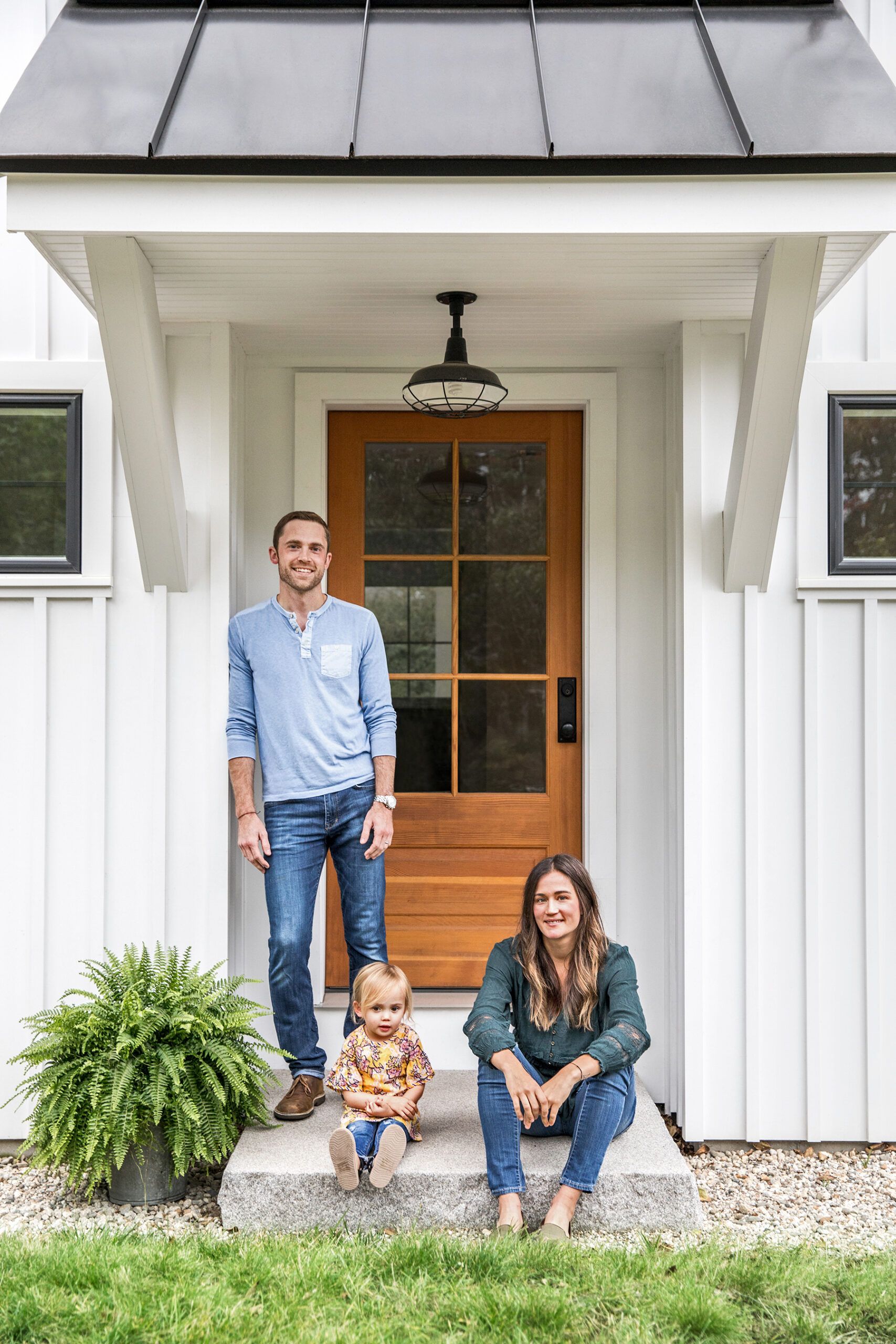
Shown: Wesley and Sarah Madeira Day, with daughter Elle, now 4, updated the clapboard Cape by grafting on a two-story addition with board-and-batten siding, a standing-seam metal roof, and a new everyday entry.
Portico light fixture: Northern Tool + Equipment
With a soft spot for rescue dogs, forgotten heirlooms, and neglected houses, Sarah has heart as well as muscle—and a dry sense of humor hasn’t hurt. Asked how two young professionals like her and her husband, Wes, know how to ply a tractor and crane, she says, “We don’t!” Pause. “We’re so lucky we’re still married.”
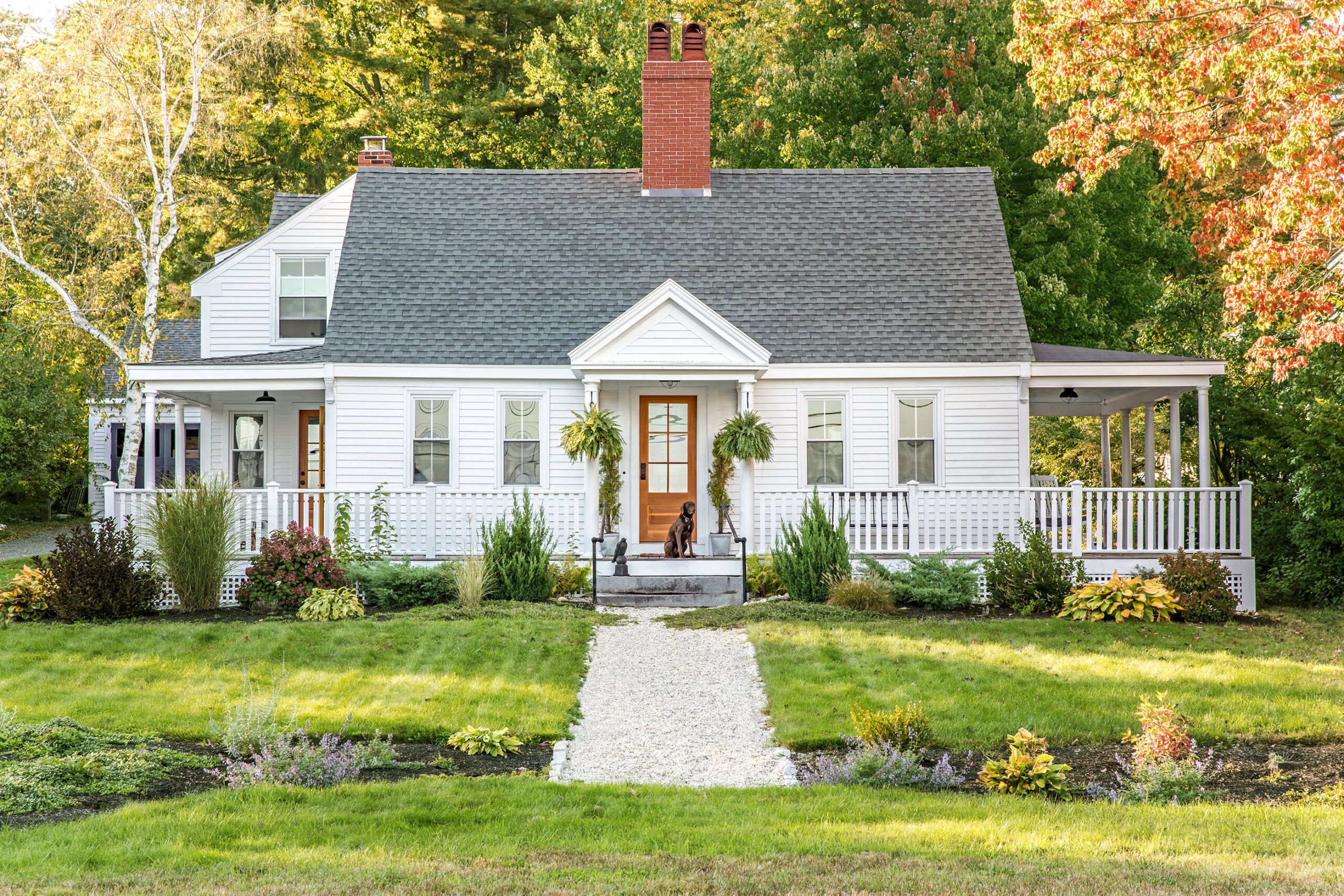
Shown: Previous owners added two wraparound porches, a front portico, and a two-story side addition, which is now augmented by another two-story addition behind it.
Addition siding: James Hardie. Addition and portico roofs: Hancock Lumber. Doors: Brosco. Paint: PPG’s Base White (exterior)
He’s a pharmacist and skilled woodworker; she’s an artist who sells her prints online and has worked for an interior designer. Both grew up in Maine, in do-it-yourself families. Sarah’s skilled dad and uncle worked at a pile of a hotel on Mount Desert Island, keeping its aged infrastructure functioning. “If my sisters and I wanted to hang out with them, we’d do what they were doing,” she says. “We learned a lot through just being with them, and the same with Wes and his family. You get the gist of things, mess up, do it again, and eventually catch on.”
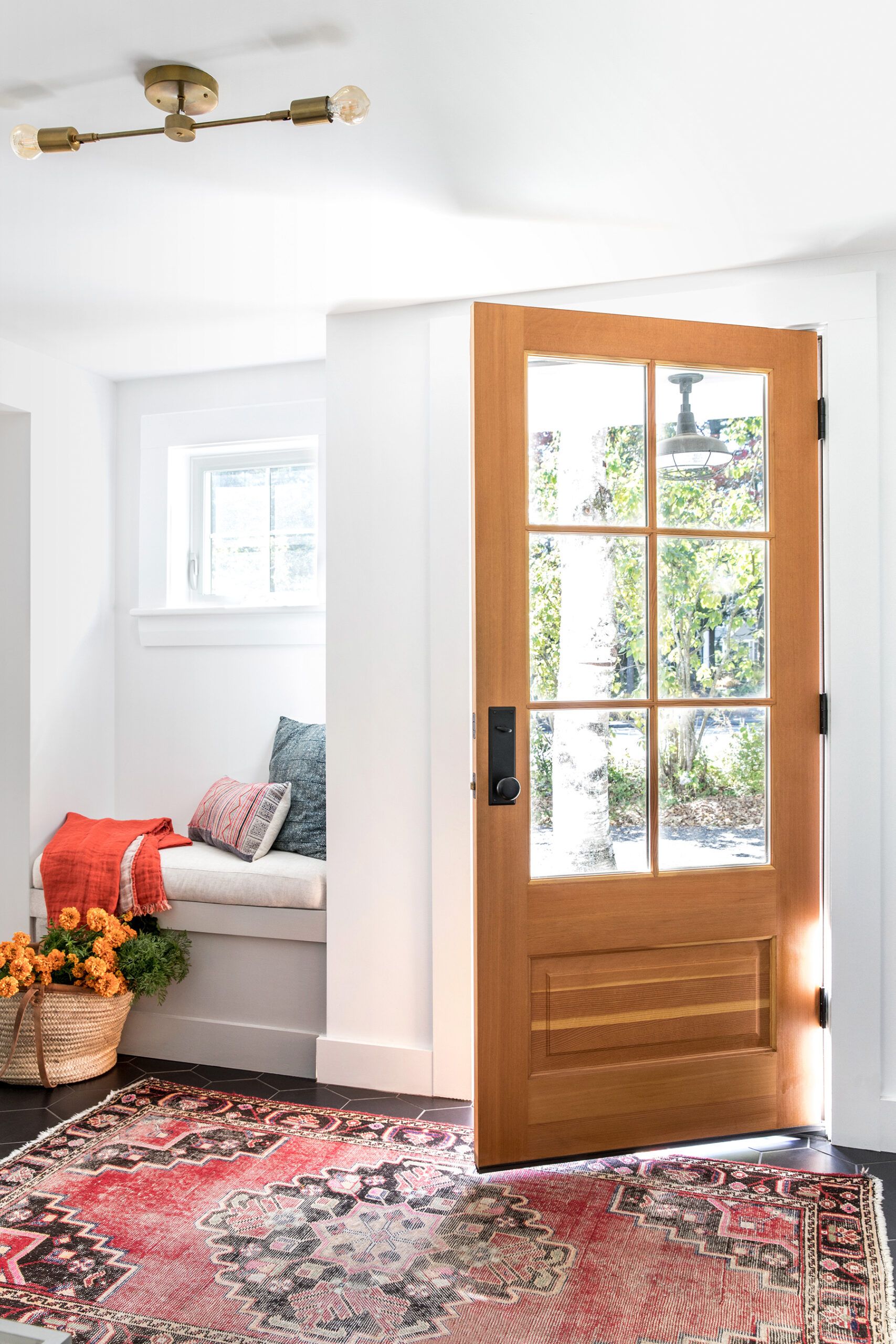
Shown: An alcove near the new side entrance is a natural spot for a window seat, with a cushion sewn by homeowner Sarah.
Entry door: Brosco
Still, no one is ever fully prepared for what an old house can dish out, and theirs was no exception.Having already survived the renovation of their first fixer-upper, in nearby Portland, the couple were now about to tackle a four-bedroom, one-bath Cape Cod-style house steeped in salt air and neglect. Real estate websites dated it to 1729—”You could say, ‘Great!’ or you could say, ‘Scary!’ ” Sarah observes.
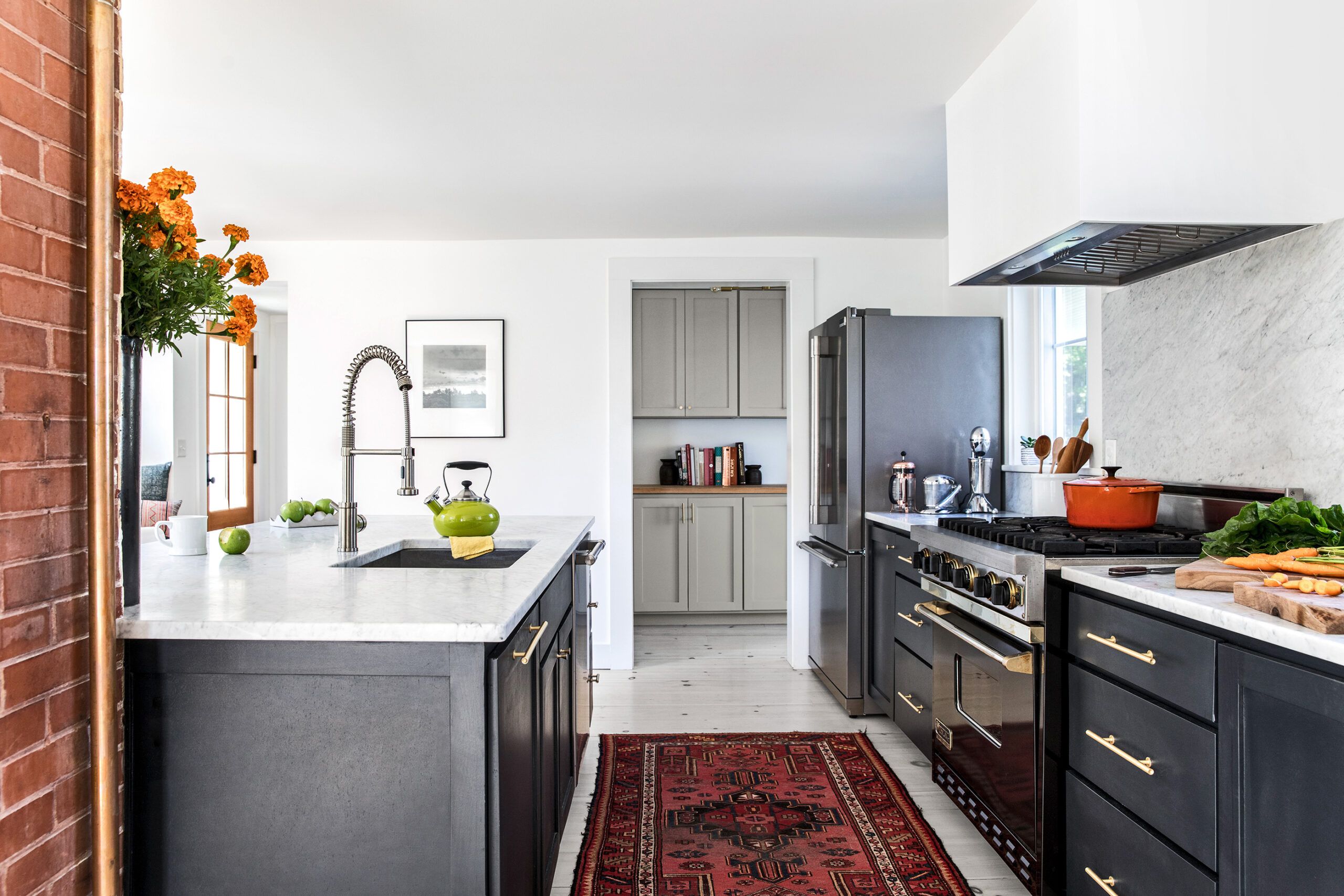
Shown: The open kitchen was designed to capture light and minimize clutter. Upper cabinets are relegated to a new pantry (glimpsed here) whose pale gray cabinet paint color and butcher-block countertops complement the cooking zone’s contemporary white walls, custom range hood (built by Wes), and expanses of marble.
Range: Viking. Refrigerator and dishwasher: Frigidaire. Cabinets: Island Cove Building. Cabinet pulls: Lew’s Hardware. Countertops and backsplashes: Bangor Wholesale Laminates. Sink and faucets: MR Direct Sinks & Faucets. Paint: Sherwin-Williams’s Inkwell (kitchen cabinets) and Light French Gray (pantry cabinets)
The place came with an old garage, giving rise to fantasies of a finished workspace. Much of the house, meanwhile, needed immediate care, though its roof was okay and the structure sound, if “extremely hot in summer and very, very cold in winter,” Sarah says. The yard was ragged, the roof, walls, and floors uninsulated, the wiring no-good knob-and-tube, and the wheezy oil-burning boiler in the dirt-floor basement could not keep up. The windows defied saving, the floors were uneven, and the water-damaged “kitchen” comprised discrete stop-offs in a rambling L-shaped wing added who knows when.
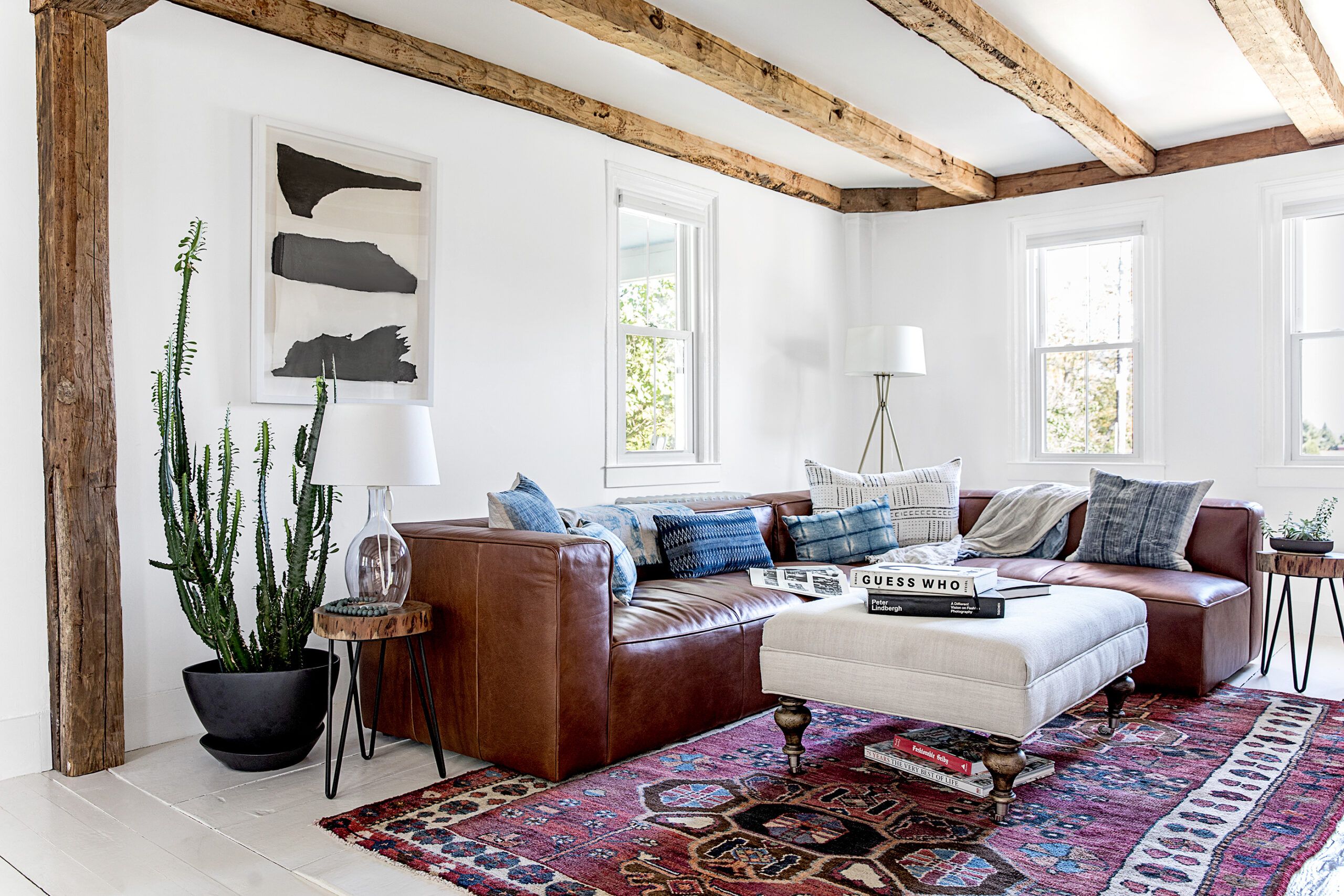
Shown: Like many older houses, this one featured small rooms with cramped ceilings and worn wood floors. During their first months as owners, Sarah and Wes pulled down walls, exposed original ceiling beams, and revived floorboards with paint. Richly colored vintage rugs now ground open spaces washed in white.
Rug: Portland Flea-for-All. Sofa: Mello Collection. Ottoman: Youngs Furniture. Artwork: Sarah Madeira Day
Then there were the head-grazing ceilings, particularly poignant in the only bath, where a good soak after an evening of scraping paint and tearing down walls meant folding up like an accordion in the miniature cast-iron tub (Sarah) or crouching under the shower and throwing water on one’s hair (Wes). The house had maybe three tiny closets, or as Sarah sums up the storage situation, “You wouldn’t want to live here as a normal person.”
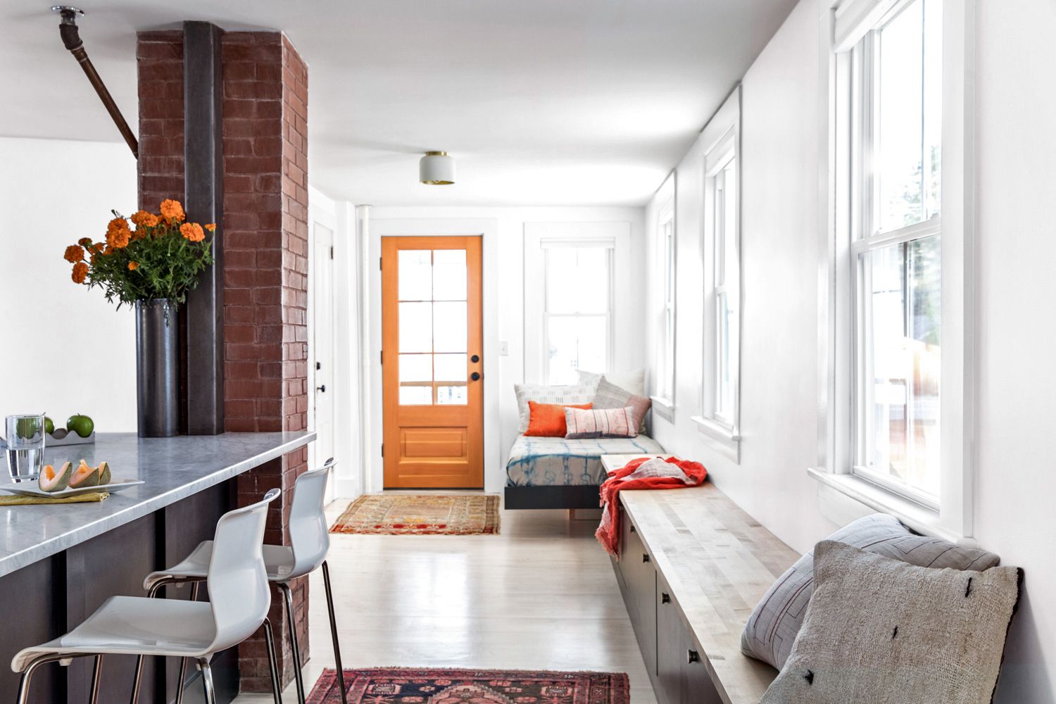
Shown: A built-in storage bench runs under new windows that draw light into the open kitchen, setting off a brick furnace flue that was exposed during the renovation.
Door: Brosco
The old wing that was added at some point holds narrow, semi-spiraling stairs to the second floor, where the steeply pitched roof ensures more headaches for tall people.
Perhaps the most striking feature inside is the ratio of fireplaces to square footage. Picture three large fireplaces downstairs facing three different directions in the center of the oldest part of the house. The brick structure is so large, “it feels like another room,” says Sarah. Alas, the chimney stopped working long ago and can’t be easily fixed.
As serial renovators often point out, your best investment may be the cheapest house in the priciest neighborhood, and a big attraction of this one was the way it fits in among gracious big guys along a coastal stretch favored by sunbirds. It sits on the far side of the main drag, but you can see the ocean, and that’s no small thing. The couple figured they could sell their old place, knock off their student loans, and still have enough to buy and upgrade—provided they did most of the work themselves.
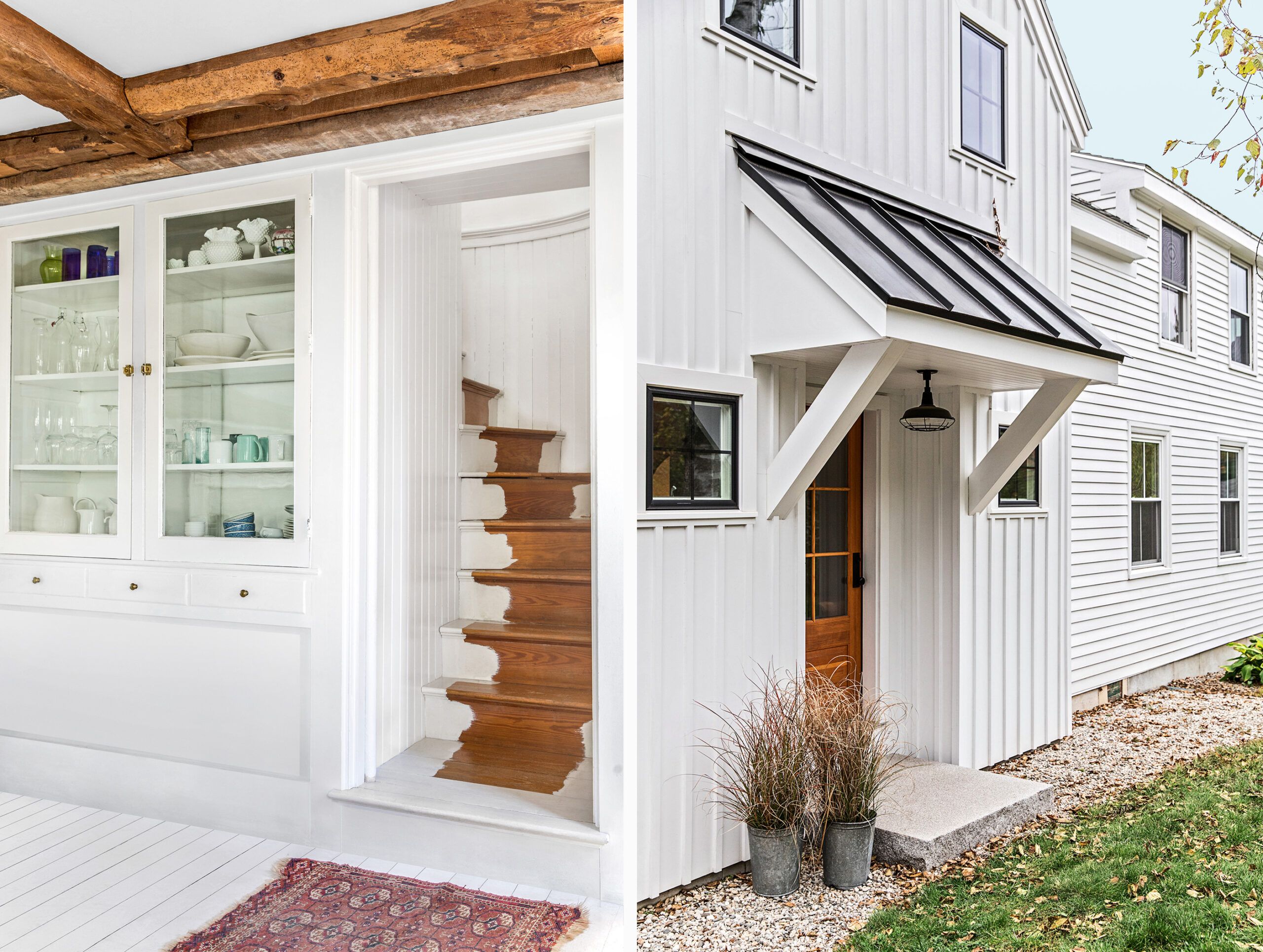
Shown left: The staircase winds as it climbs, creating a curved wall that continues up to the bedroom-now-studio above. It makes for a tight squeeze when furniture has to go up the artfully painted stairs. The built-in hutch in the kitchen-turned-dining room is original.
Shown right: The addition’s vertical board-and-batten siding and black casement windows contrast with the existing house’s clapboards and double-hungs. The side portico is topped with an aluminum standing-seam roof.
Siding: James Hardie. Windows: Mathews Brothers
Their first three months in the house were akin to an Olympic sprint—taking place amid chaos and with occasional visits by friends and relatives offering to help. The couple would run off to work in the morning and return home at night in time to demolish another wall, coaxing meals out of the stove’s one working burner and a microwave in the bedroom. When they were removing water-damaged plaster in the dining room ceiling one day, beautiful beams emerged, along with extra headroom. “It was fun, like a treasure hunt,” Sarah recalls. But there were also tears along the way, “because we sort of know what we’re doing, and sort of not.”
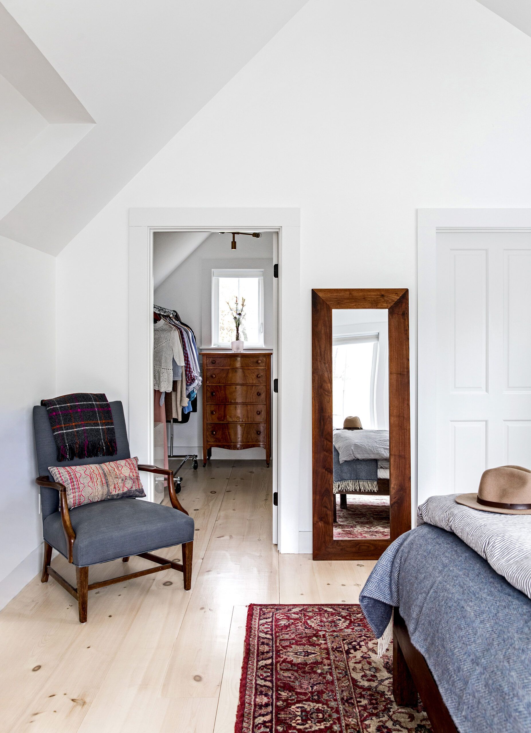
Shown: The compact master suite holds a windowed walk-in closet and new pine floorboards with a pickled finish. The new spaces in the addition rely on heat pumps to keep temperatures comfortable.
They took down walls, doing relays to a dumpster in the driveway. They turned four rooms downstairs into three, and assembled a no-froufrou kitchen that would serve until they could afford something better—if they could just get rid of the ugly vinyl floor. Ripping it up, they found six more layers, including vintage linoleum. And kept ripping and chipping until they reached the original pine. Later, when they were adding on and had to unite new and old flooring, they pulled up that pine and hired subs to put in a new subfloor and wider pine boards, which they topped with a pickled finish.
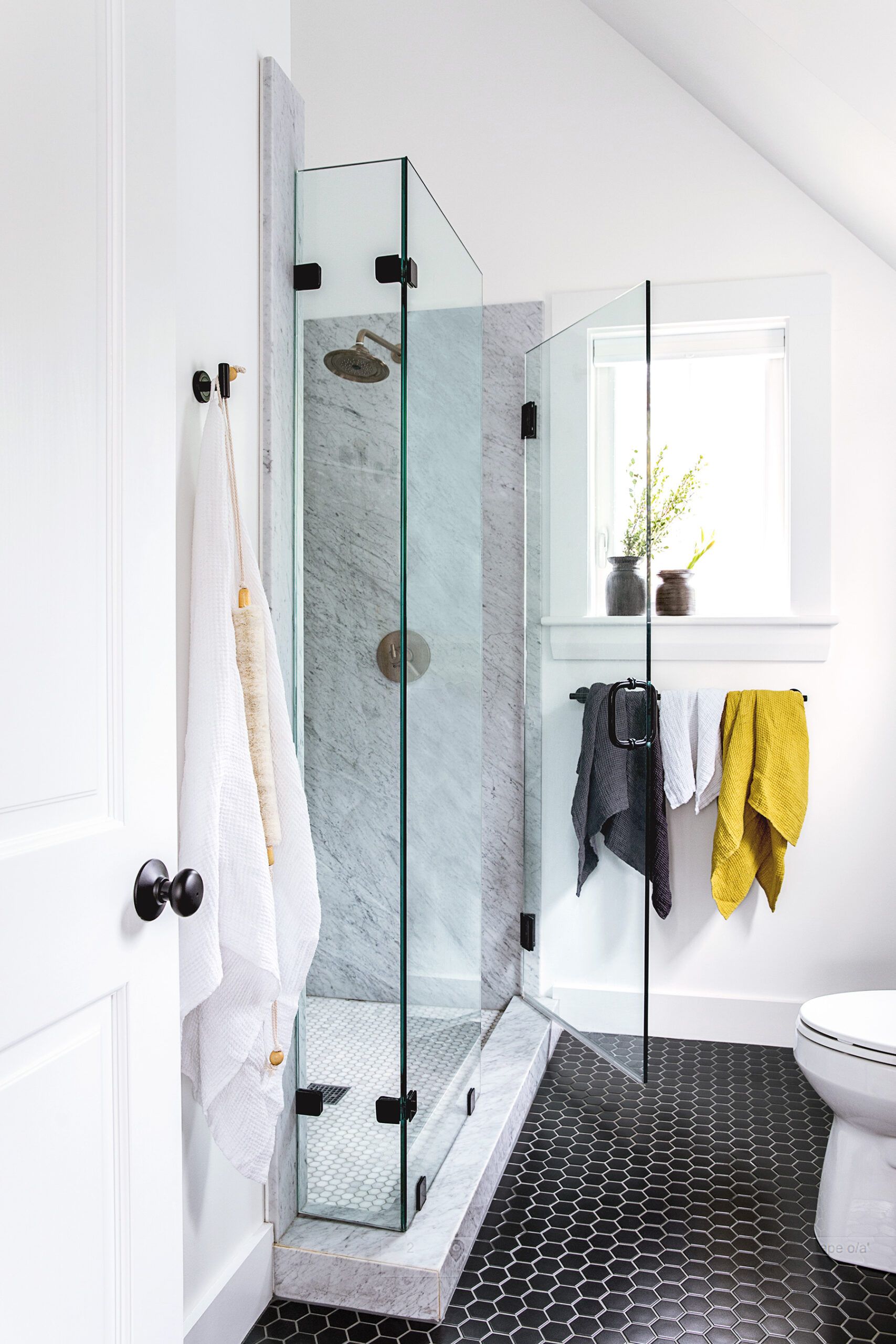
Shown: The new master bath features marble slab walls installed by Wes and his dad, and an updated frameless-glass enclosure.
Floor tile: The Tile Shop. Toilet: Kohler. Marble shower-floor tile: MSI
Wes and Sarah also gutted and rebuilt the tiny original bath on the second floor, salvaging and refinishing the claw-foot tub. They hand-sanded and -painted nearly all the old floors, which were pretty banged up. For most, they chose white—Sarah’s go-to color. Then, eyeing their small budget, they hired pros to replace the windows and wiring, convert the boiler to gas, remove a second oil tank that was no longer in use, and banish resident carpenter ants.
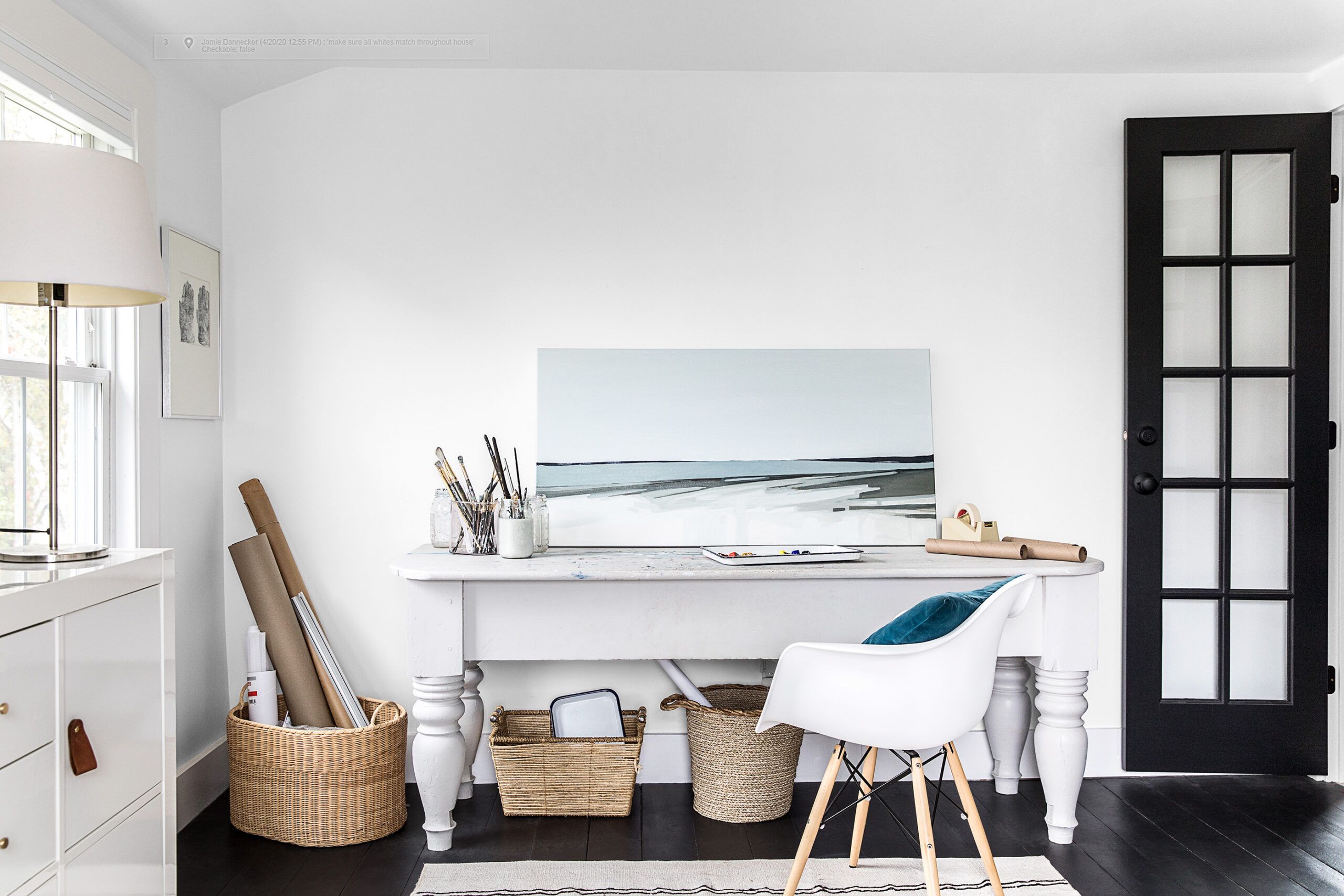
Shown: A former bedroom with no closet became a studio for Sarah with a light-channeling French door in a relocated spot and a wheeled storage unit for art supplies.
Storage unit: IKEA. Paint: Behr’s Ultra Pure White (walls). Artwork: Sarah Madeira Day
In their spare time, the DIYers had a baby—Elle, now 4. The expanding household led to a craving for more functional space, as in a real kitchen, a master suite with a shower you could stand up in, a centrally located playroom, plus a workshop for Wes and studio space for Sarah.
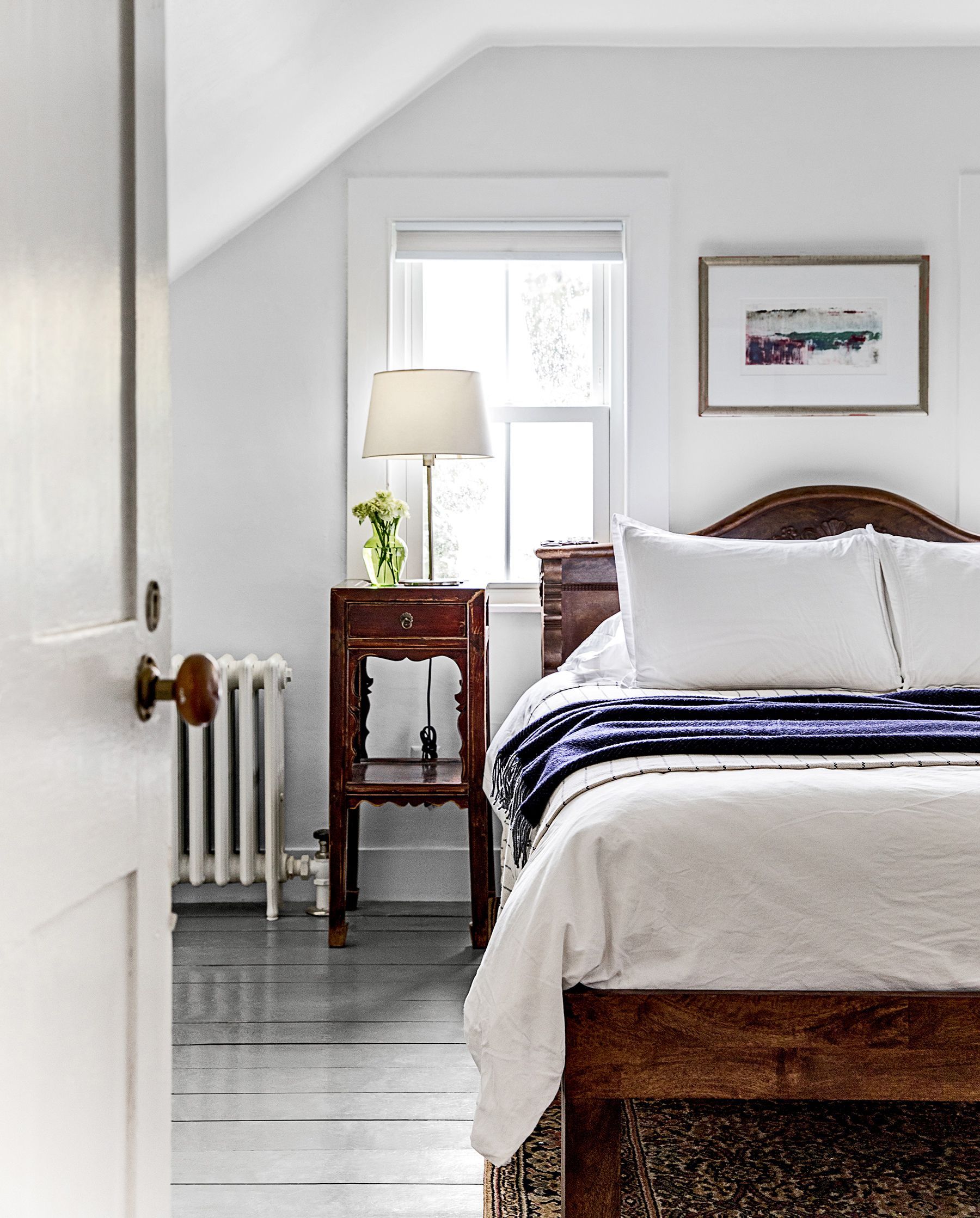
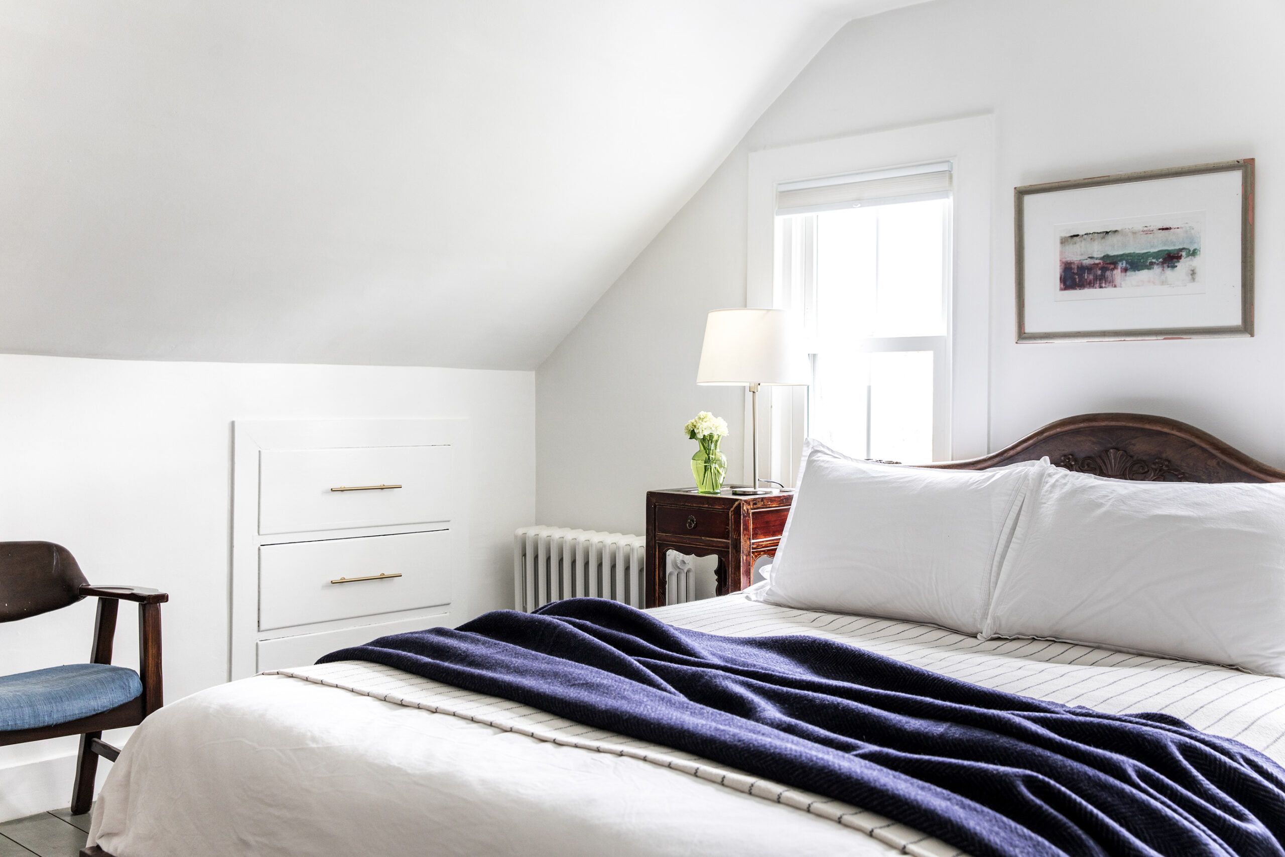
Shown: A guest room upstairs is kept cozy with the help of an existing cast-iron radiator. The artwork was nabbed at a flea market.
Bed linens: HomeGoods. Lamp: IKEA
But first, some unplanned trouble. Converting the existing boiler from oil to natural gas meant digging up the yard for a gas line. “We got this bad rainstorm,” Sarah recalls, “and water started spouting through the basement walls—it used to seep down without coming in, but the soil was disturbed, and it was really, ‘Oh my gosh, there is water pouring in!’—the floor just turned into mud.”
They discussed a water-diversion plan with a landscape contractor but deemed his bid too high, so the game young couple decided to regrade the yard and build a retaining wall and outdoor space themselves. “That was probably the project with the most amount of near breakdowns,” Wes says. “We were learning on the fly, moving steel beams and granite blocks that weigh 600-plus pounds with a little kid running around. It made us appreciate what professional hardscapers do.”
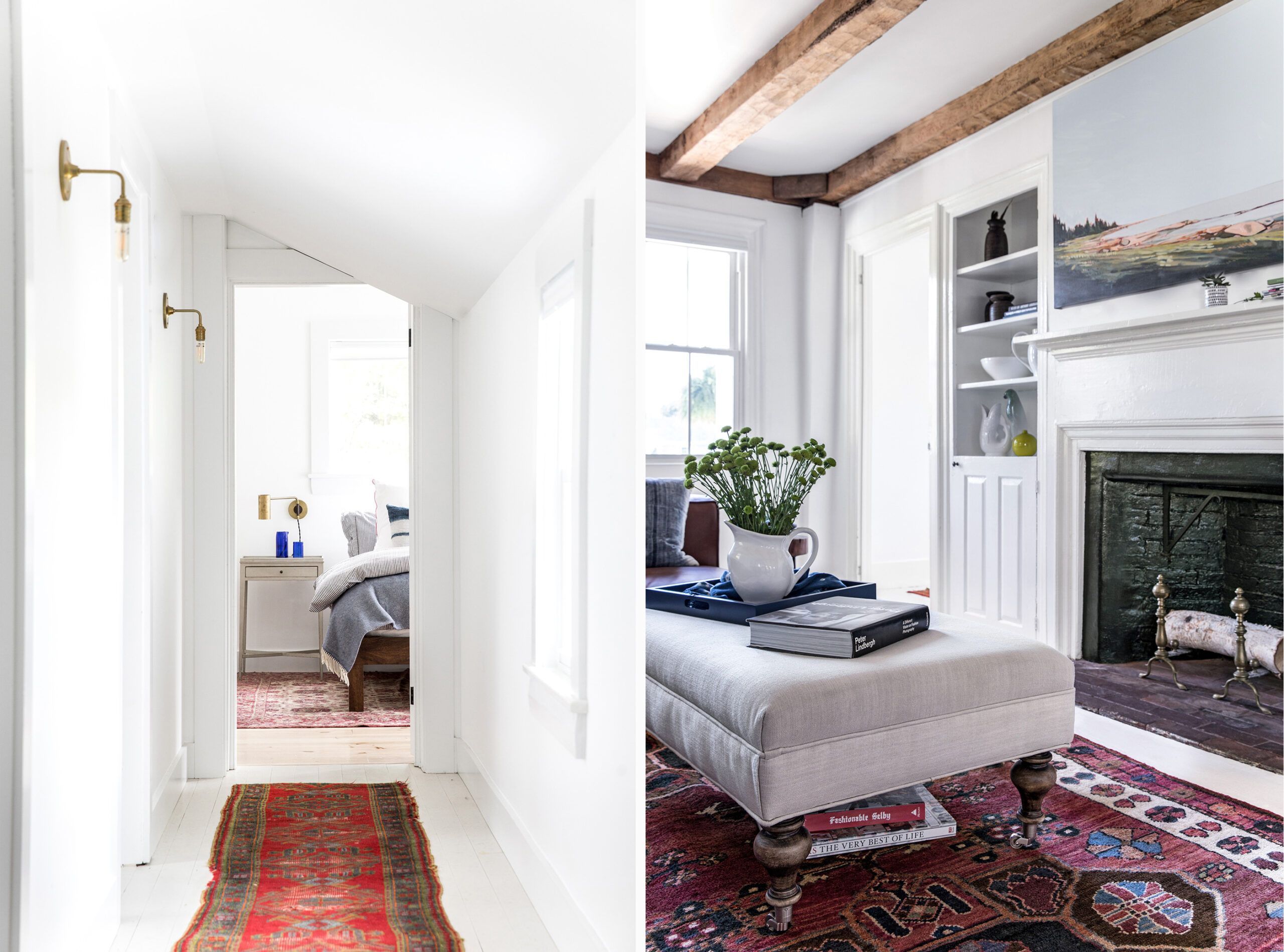
Shown left: The homeowners widened the upstairs hallway to meet code and let in more light, which is amplified by white-painted walls, ceilings, and floors.
Shown right: The built-in to the left of the fireplace and ceiling beams in the living room are original to the house.
With Elle scrambling around the house, the couple found an architect, Kevin Browne, who could deliver their wish list. Working with a structural engineer, Browne reinforced the old wing’s second floor with a ceiling beam before adding a two-story, 774-square-foot addition behind it, replacing a shed-like structure put on by previous owners. The addition’s side entry, off the driveway, would be the everyday entrance. Into the addition Browne fit a master suite above a porch and a cluster of workspaces: mudroom, laundry, powder room, closet. He also laid out a new kitchen open to the pantry.
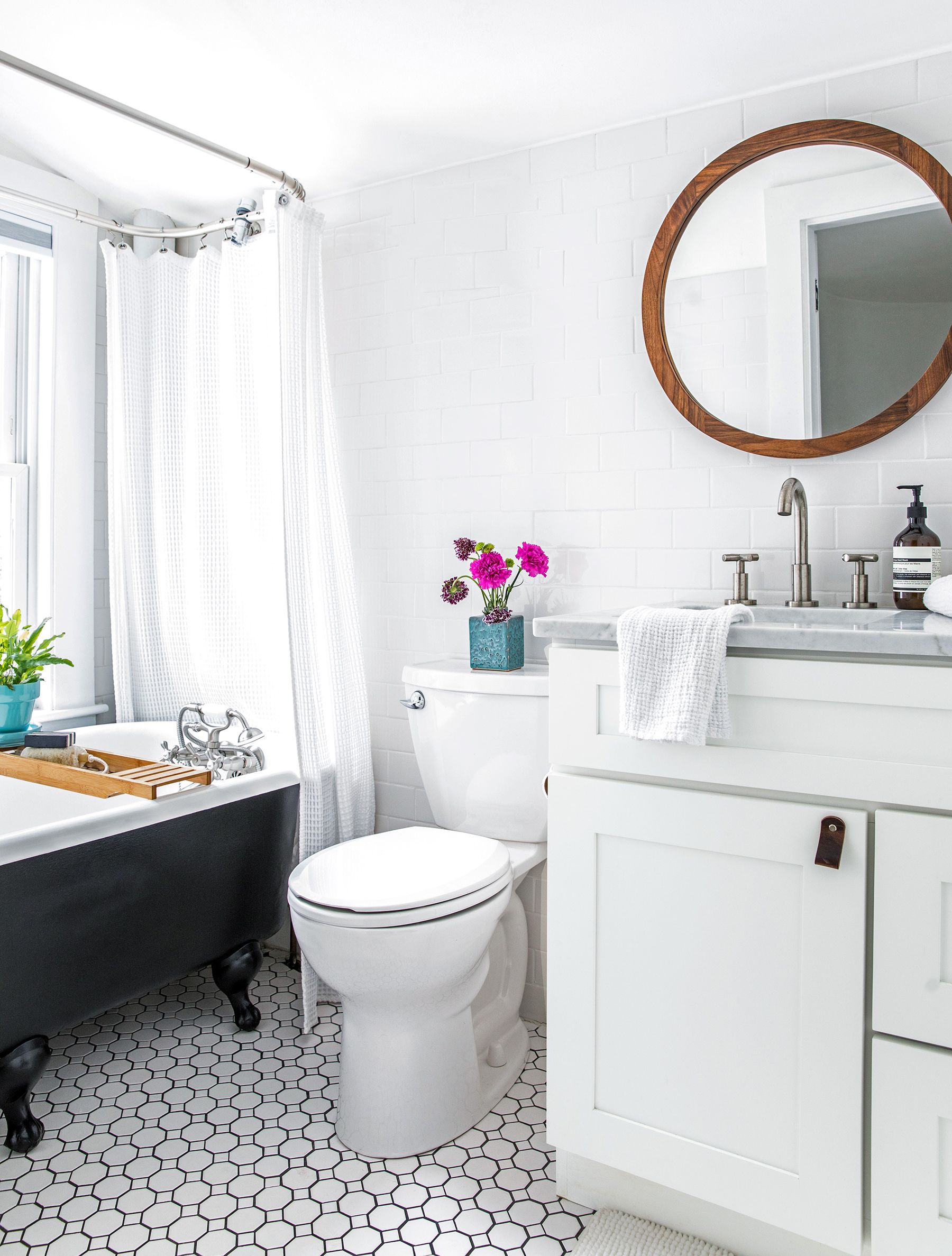
Shown: The upstairs hall bath’s small cast-iron tub was salvaged, painted, and reinstalled after the space was gutted and rebuilt. Homeowner Wes made the mirror frame.
Tub fittings: Kingston Brass. Vanity: Walmart. Faucet: Signature Hardware. Toilet: American Standard. Floor and wall tile: Daltile
Grafting new onto old would require marrying rooflines, widening a hallway, and knocking out the one upstairs closet. Sarah pitched the project to Mike Meyer, a general contractor with an unusual tolerance for homeowners moonlighting as subs.
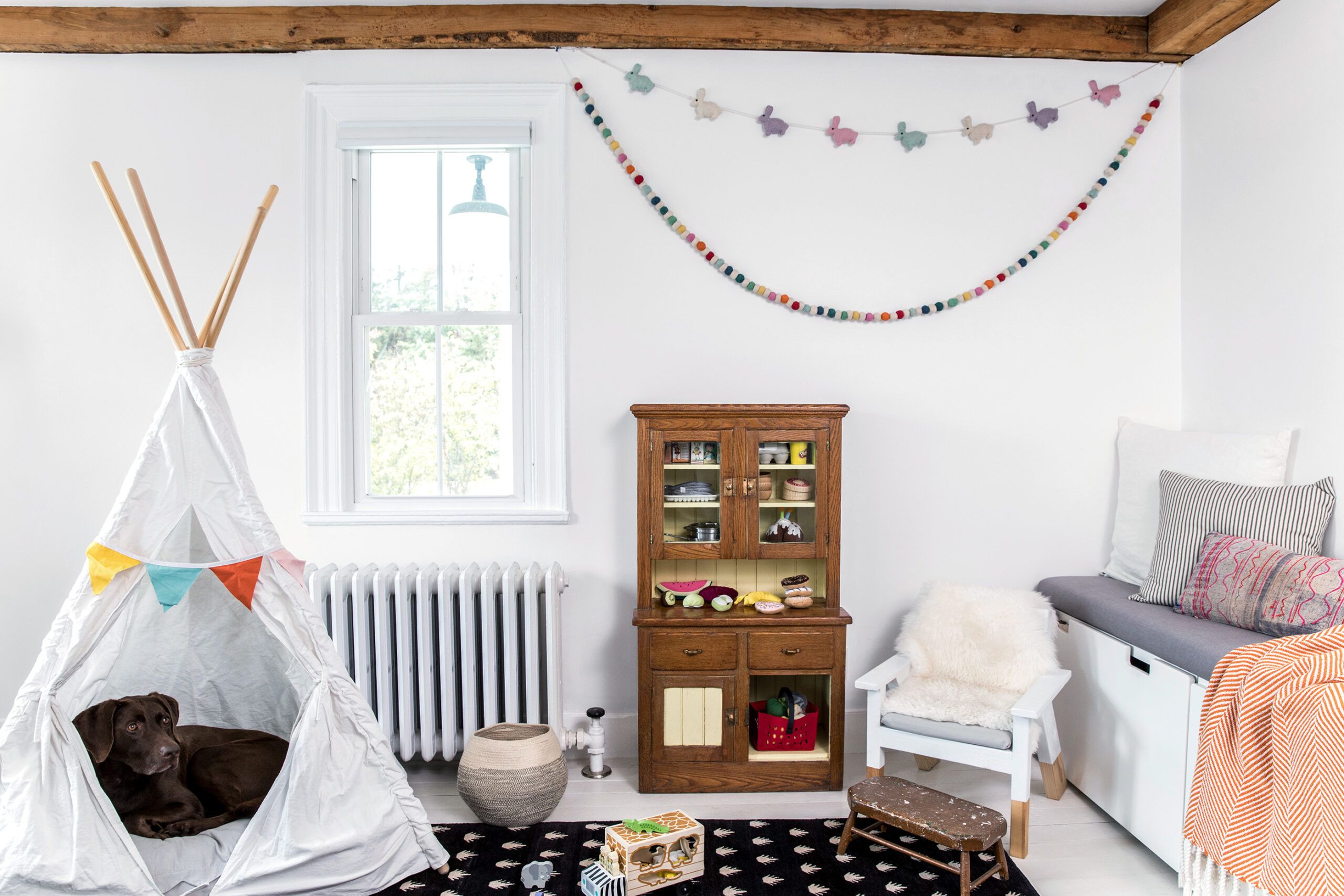
Shown: Highlights of daughter Elle’s first-floor playroom are a child-size hutch passed down to her from Sarah’s dad, and a play tent she sometimes shares with the family dog, Hartley.
Storage bench: IKEA
Because, of course, these homeowners could not keep their hands off the lumber and paint. Wes carpentered built-ins and called on his dad, a countertop wholesaler, to help with the kitchen and baths. Sarah harnessed her designer chops to help give the interior its Maine-meets-Scandinavia style. Somewhere in there they managed to stay solvent, while also buying, renovating, and selling another fixer-upper nearby.
And they’re still married.
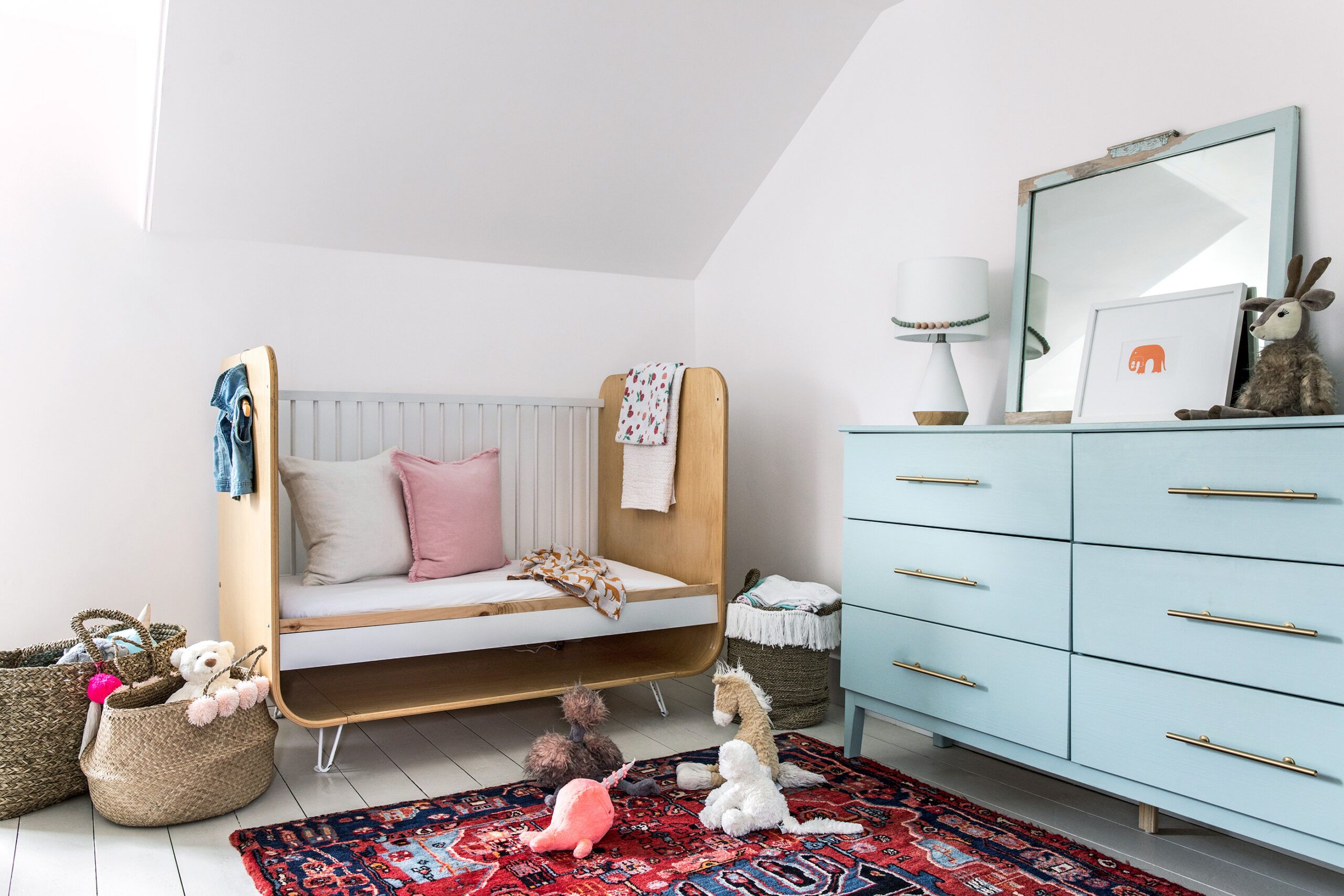
Shown: Lots of white paint, a sleek toddler bed, a refurbished dresser, and a vintage rug give 4-year-old Elle’s bedroom grown-up style.
Rug: eSaleRugs. Paint: Behr’s Ultra Pure White (walls)
Five years in, the ramshackle house and yard have become a gracious home. While the family, not surprisingly, gravitates around the new kitchen island, “I’d say our favorite spot is either the living room, when we are all settling down from the day, or the outside area,” Wes says. “When it’s nice in Maine, we try to be outside as much as possible.”
That window of time would be about now—and before these marathoners realize it’s time to start working on the garage.
Shown: A bank of drawers recessed into the wall boosts storage in one of the two guest bedrooms.
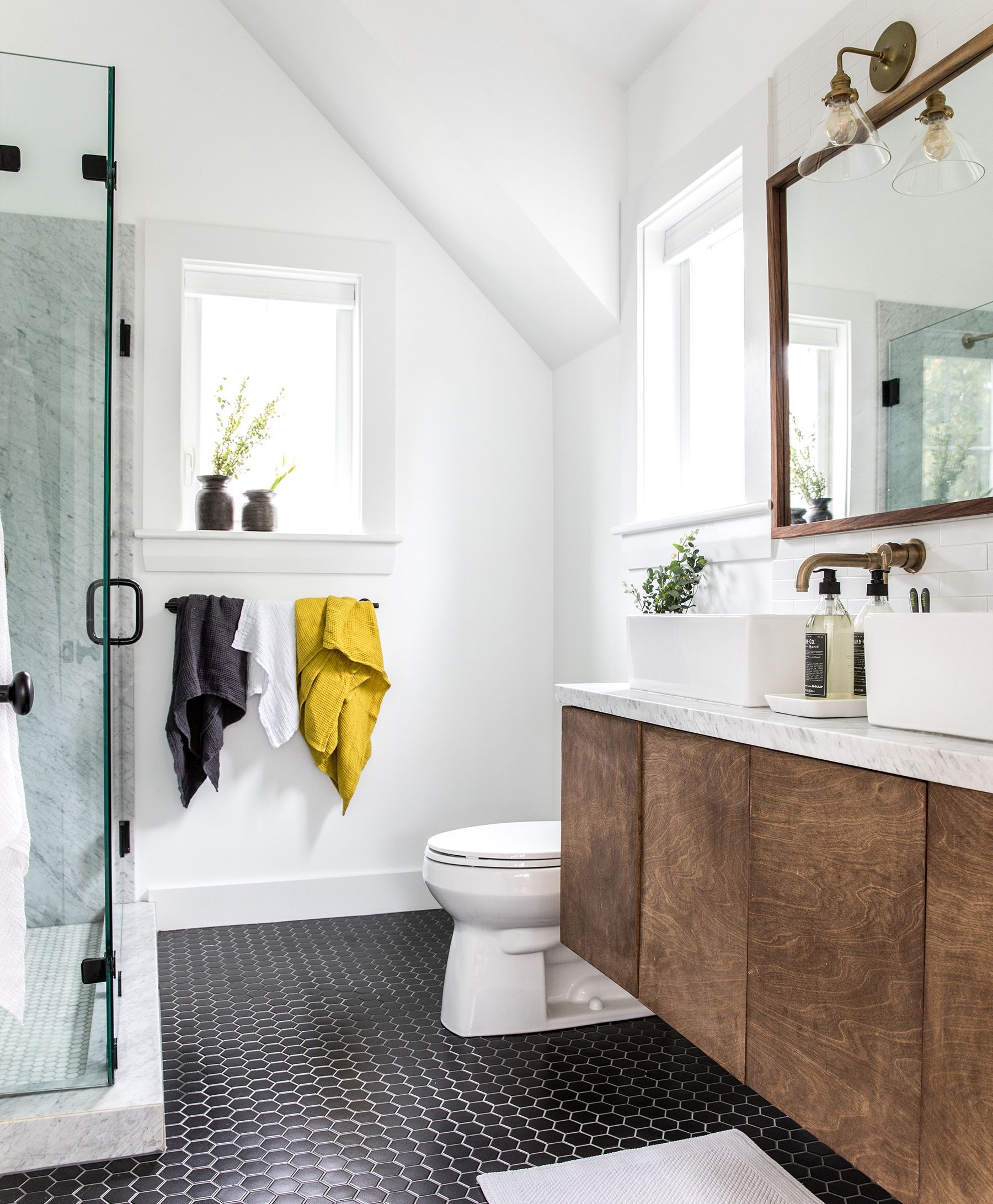
The mix of materials in the master bath includes champagne-brass-finished wall-hung faucets, matte-black hex tile, a period-inspired sconce with a contemporary glass shade, and a stained-plywood vanity with twin vessel sinks. Wes made the mirror, and his dad helped with the marble-slab shower walls and vanity top.
Floor tile: The Tile Shop. Sinks: Overstock. Faucets and shower fittings: Delta. Sconce: Schoolhouse. Toilet: Kohler. Marble shower-floor tile: MSI
Floor plans
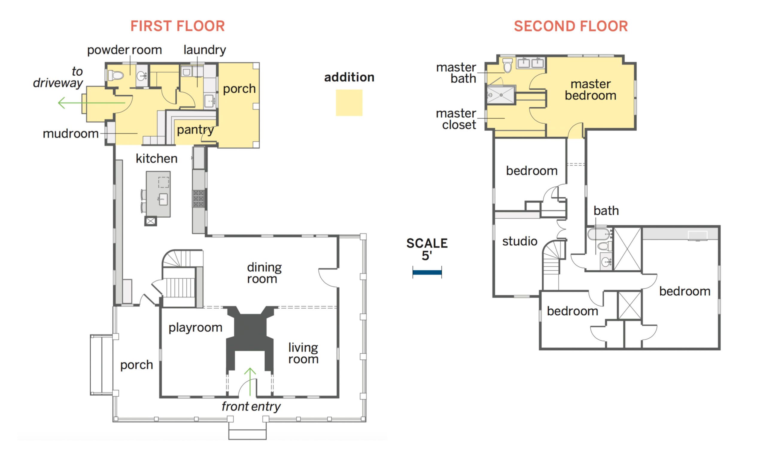
A shed-like rear add-on and several interior walls came down to open up the first floor, relocate the kitchen, and make way for a 774-square-foot, two-story addition. The new section holds a mudroom, pantry, laundry, and powder room; upstairs a master suite extends over a new side porch; a new portico on the other side of the house now serves as the main entry. In the existing house, which held four bedrooms and one bath, a second-floor hallway was widened, a closet demolished, and a window closed up; one bedroom became a studio. The house now holds 2,480 square feet of space.
Renovation Recap
The Homeowners: Wesley and Sarah Madeira Day, who became parents to Elle 11 months after buying the house.
The house: An existing 1,706-square-foot Cape Cod with three exposed fireplaces—plus a nonfunctioning chimney, head-grazing ceilings, no insulation, miserly closets, and no real kitchen.
Why they chose it: It had a half-acre lot, ocean views, and genuine old-house cred. And because it needed work, the price was right.
Their plan: Open up the cramped rooms, create a working kitchen, add a bath with a shower that Wes could stand up in, put on an addition, and do something with the backyard. Oh, and find a way to better heat and cool the place, which was freezing in January and hot as blazes in July.
What they did: Tore up the first floor within three short months while eating out of a microwave, then gutted and remade the one bath, upstairs. After their daughter was born, they called in pros to design and build a two-story addition and—finally—a proper kitchen. Excavated and reshaped the yard themselves. After five years they still want to add dormers in front, and do a major garage overhaul to give Sarah a bigger studio space.
Reno regret: Putting beautiful but stain-prone slabs of marble in the kitchen. Says Sarah: “Wes’s father tried to warn us.”
Lessons learned: “If you’re female on a construction site, you’re often asked, ‘Where is your husband?’ ” says Sarah. “This can be very frustrating. With my work on the house, this tune slowly changed. It seems you have to earn your stripes.” Adds Wes: “Sometimes you can get in over your head, and a good, honest contractor won’t take advantage of you, but will take over and complete the project and even show you where you went wrong.”
