As an event designer, Alexandra Azat is accustomed to immediate results. Turn a bland banquet hall into a floral fairyland? No problem. Transform a flat lawn into a mossy, undulating landscape out of The Lord of the Rings? In just a matter of days, the metamorphosis is complete. None of that prepared her for renovating a century-old Craftsman near Pasadena, California.
“I’m used to moving really, really fast,” says Alexandra, who trained in floral design and helms three companies offering event, floral, and interior design services. “Living here and watching how slow the construction would go, there were times where I wanted to say, ‘Just give me the paint! I’ll do it!’ “

While she laughs about it now, the process was a learning experience for the designer, who had never lived through a major renovation before. The night she and her attorney husband, Issa, moved in, the water ran cold in the primary bathroom and the tub faucet handle fell off in her hand when she tried to bathe her infant son down the hall. What did I get into? Alexandra recalls thinking, and that was before the pandemic—and a second pregnancy—threw a wrench into her renovation timeline.
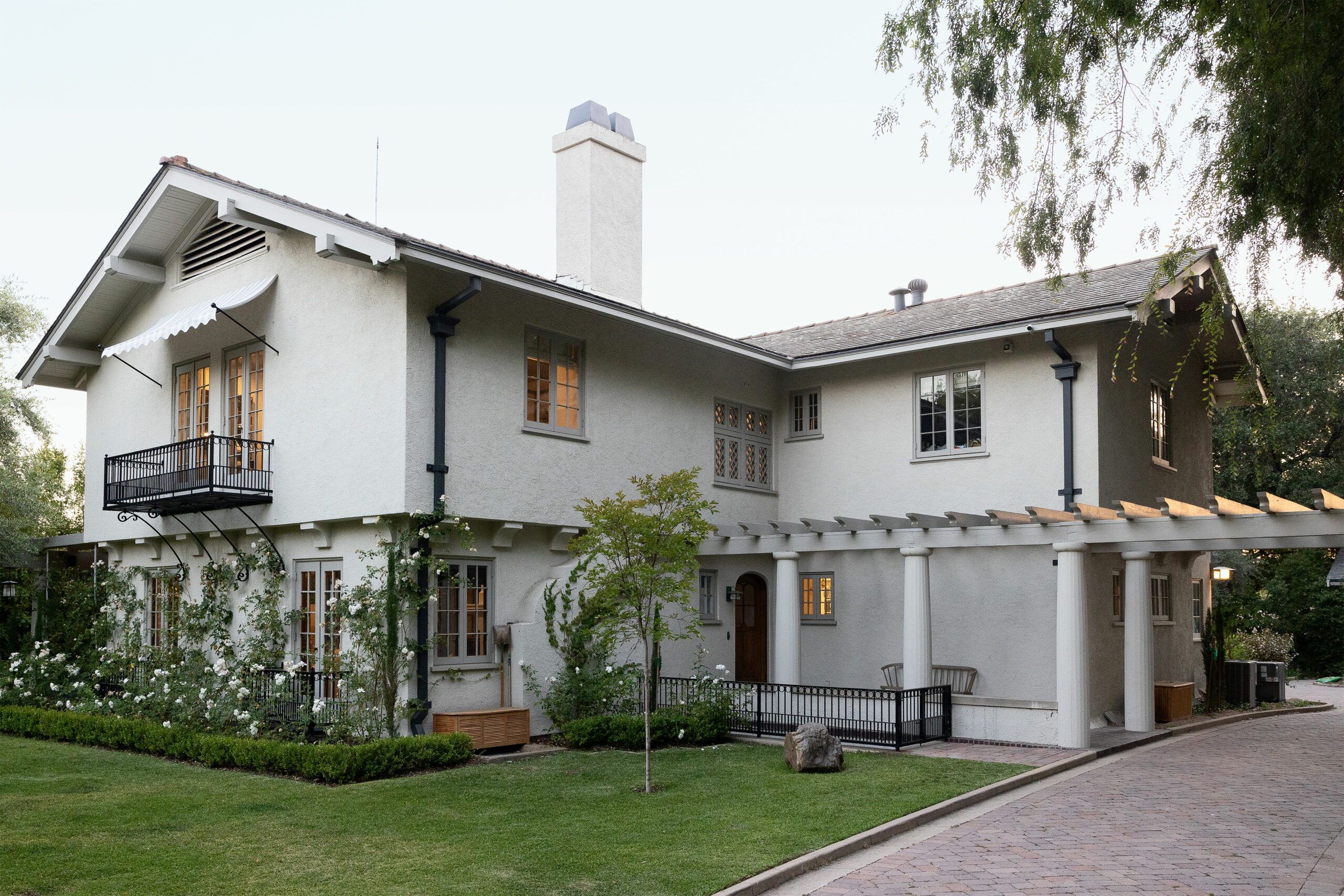
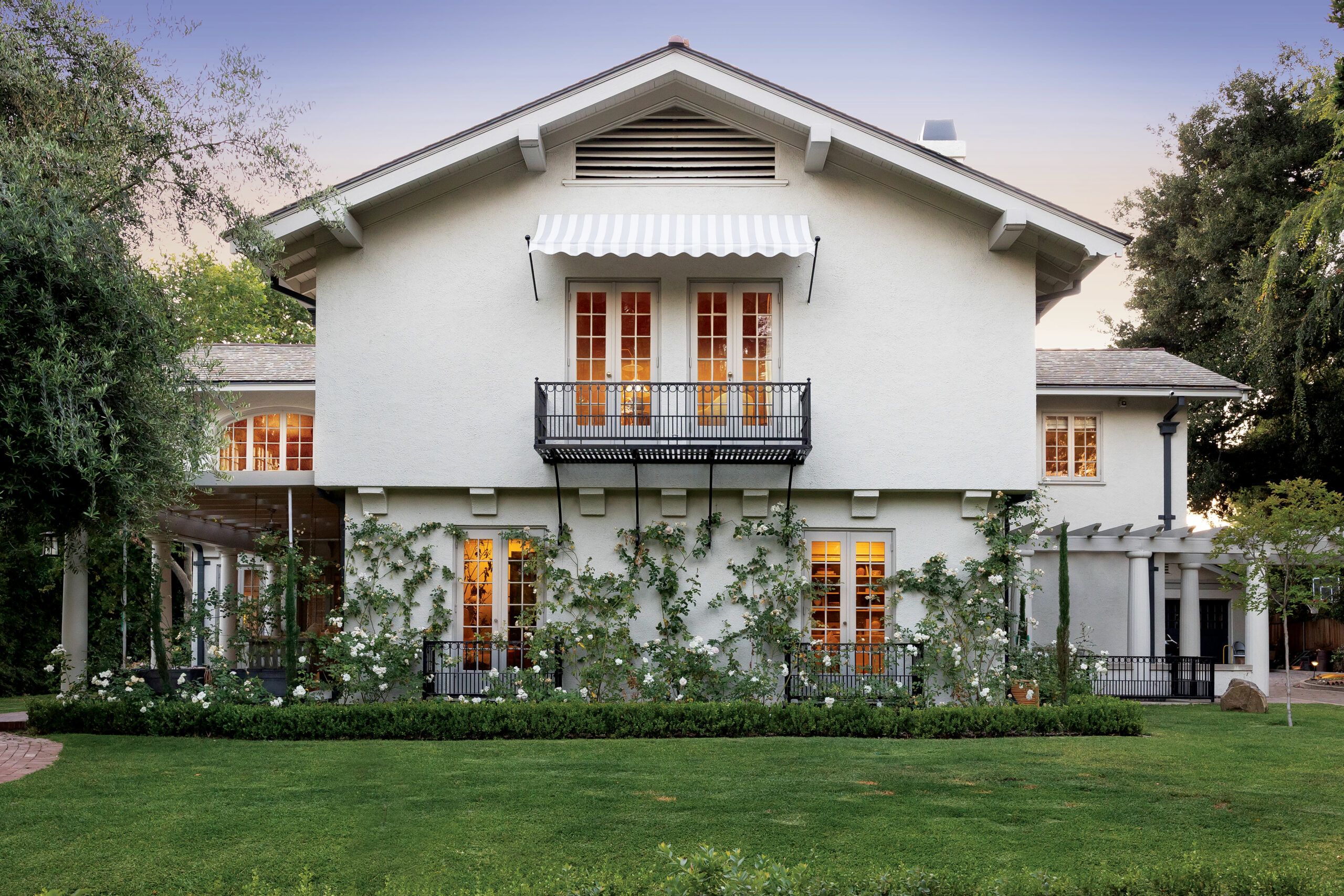
Plumbing problems notwithstanding, the house proved to be an ideal project for the San Diego transplants. mOne of the first homes built in the Los Angeles suburb of Altadena, 1915 home was brimming with Craftsman charm. Outside, broad, bracketed eaves shelter stucco walls punctuated with cozy iron balconies. Column-lined pergolas project from the front and rear, embracing the verdant landscape.
Inside, dark-oak wainscoting and crown molding framed the generously proportioned rooms, and an expansive leaded-glass window flooded the central staircase with light. “The structure was in fantastic shape,” says general contractor Bo Zarnick, who oversaw renovations on the second floor and attributes much of the building’s condition to the layer of diagonal 1×6 bracing covering the original framing. “There wasn’t a settled floor or a sagging header,” he observes, “and for a 100-year-old house, that’s incredible.”
Much of the credit goes to the previous owners, who watched over the property for more than 40 years. “They took really good care of the house,” Alexandra acknowledges. “But they didn’t really upgrade it.” In addition to plumbing issues, the 4,720-square-foot house lacked insulation and had no air-conditioning downstairs. Then there was the wiring. “When we bought it, it was all knob-and-tube,” she says. “Our electrician was like, ‘It’s amazing that this place hasn’t gone up in flames.’ ”
While Alexandra wanted to respect the home’s history and character, she didn’t want to live in a place that felt like it had been preserved in amber. “Sometimes these homes are so serious, and the way we live today isn’t quite like that,” says the mother of two young sons. “It’s a balance between respecting the old, original architecture and making it playful.”
Before moving in, the Azats made the necessary upgrades to the plumbing and electrical systems, insulated the attic, refinished the oak floors, and repaired and skim-coated the cracked plaster walls and ceilings. Then they tackled the exterior, replacing what Alexandra calls the “Band-Aid-tan and burgundy” color scheme with a pale shade of greige that unifies the structure and offers a softer backdrop for her climbing white roses.
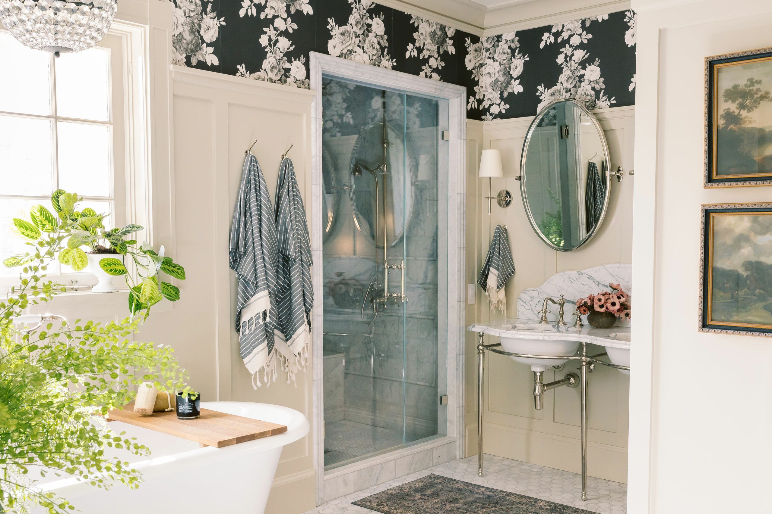
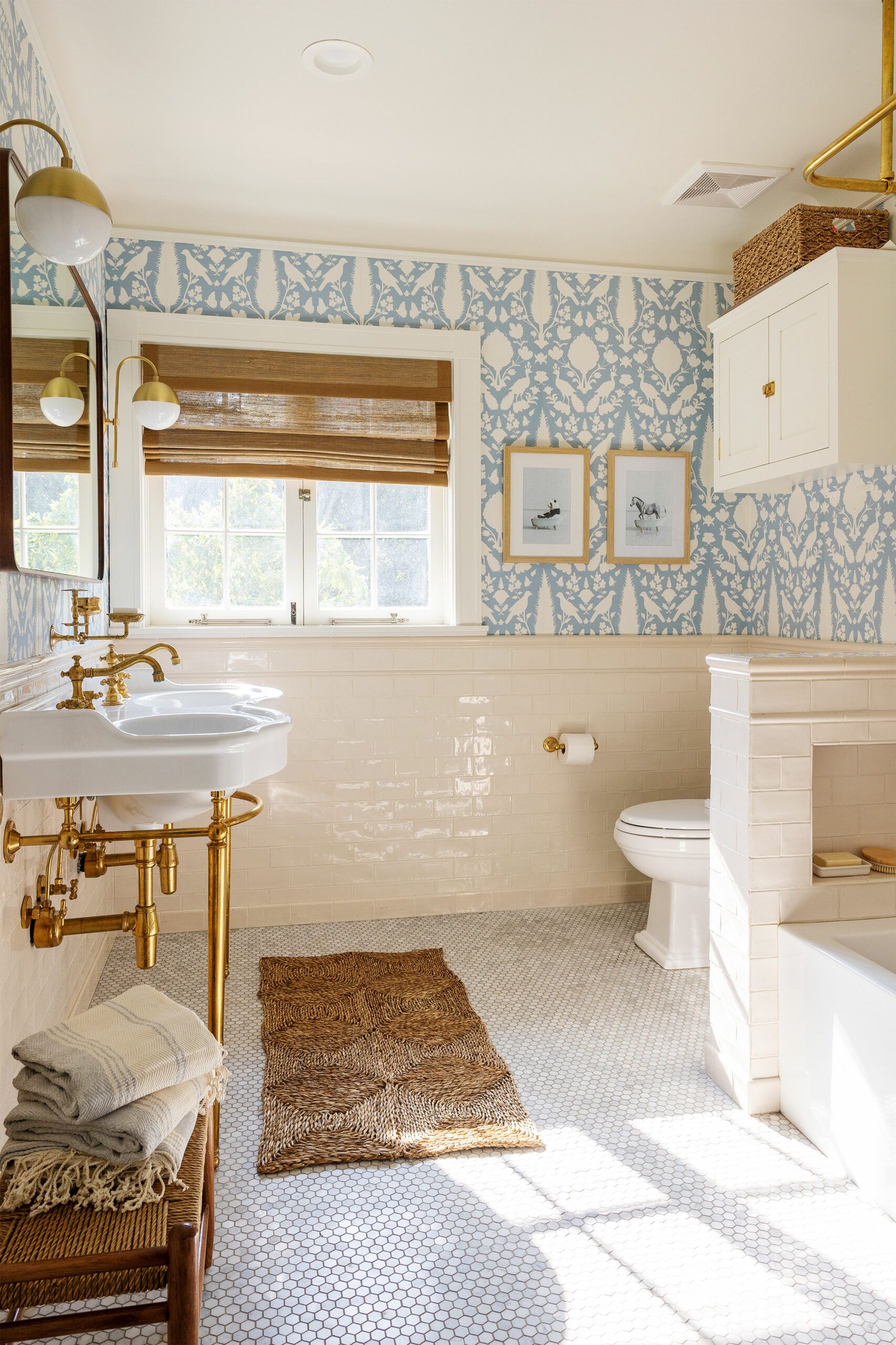
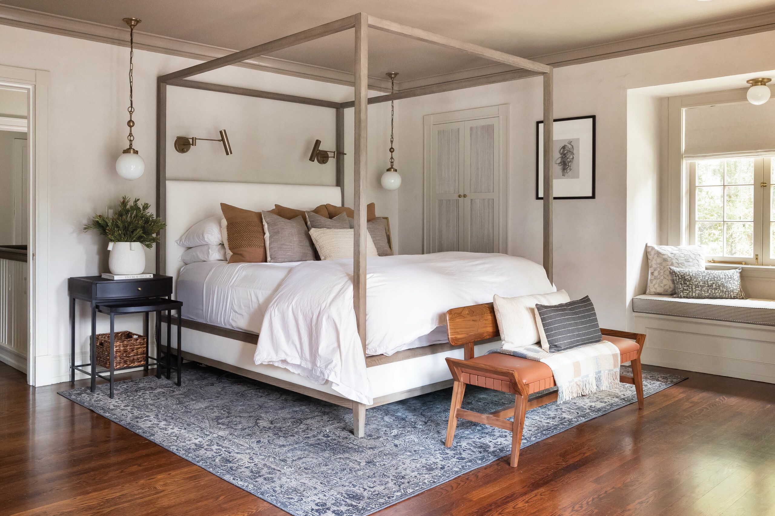
The first room to get the couple’s attention was the primary bath, which featured an unnerving see-through fish tank in the wall between the shower and the toilet. They gutted the room and closed up a second bedroom door that opened into it, creating space for a new shower and a separate claw-foot tub, then gave the flat walls wainscoting modeled after the paneling in the dining room. The adjoining primary bedroom was spacious but short on closets, so one end was enclosed to form a pair of walk-ins.
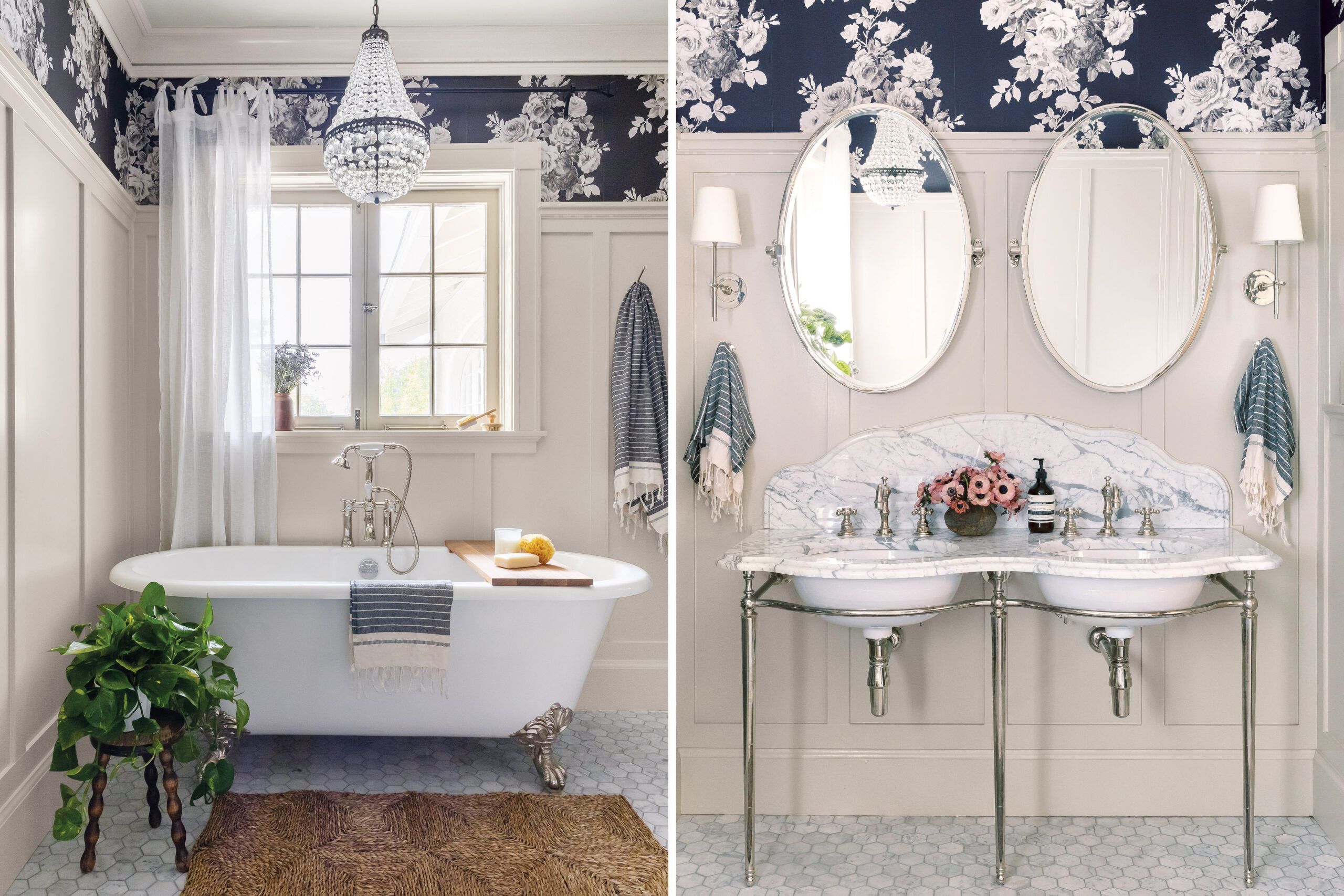
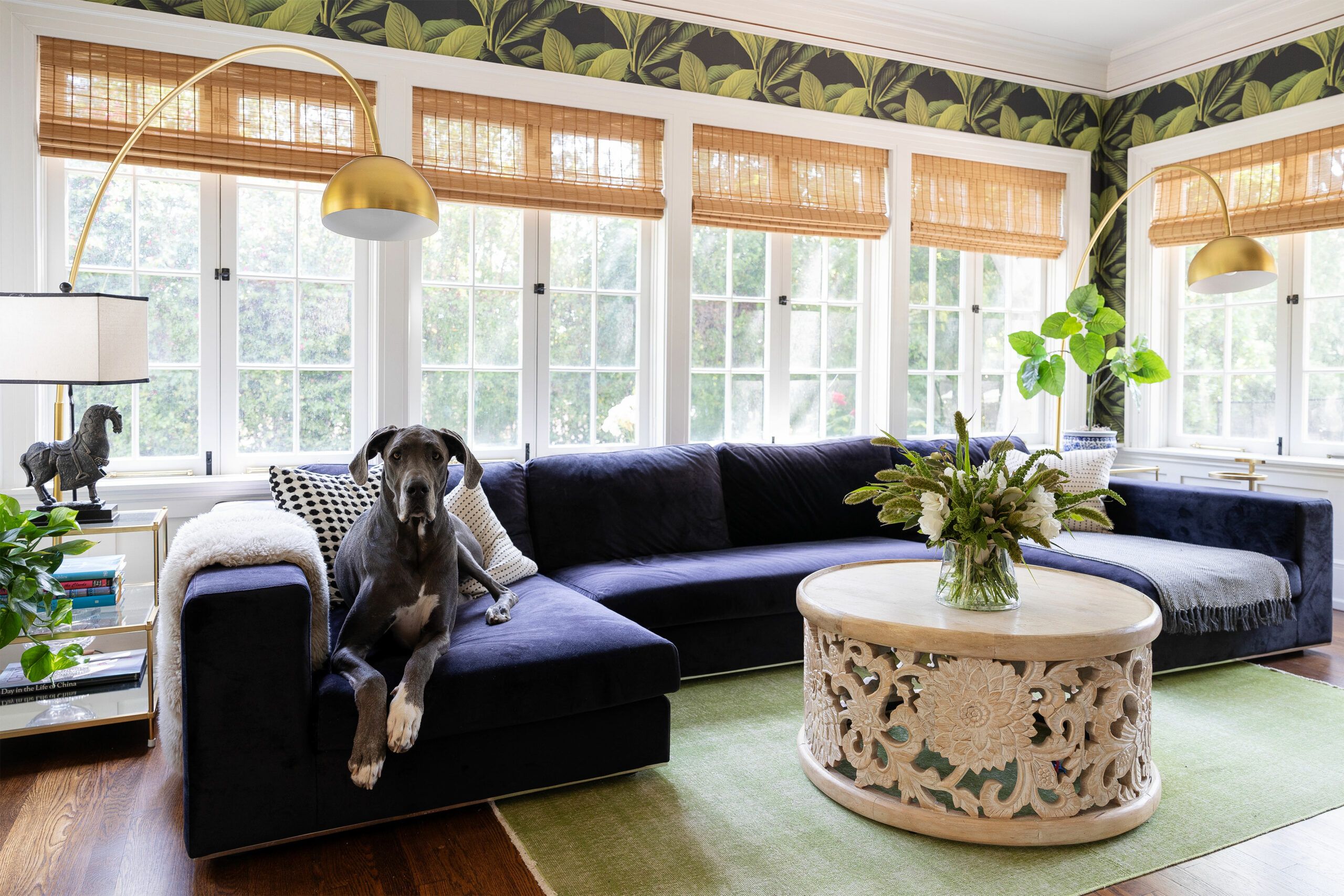
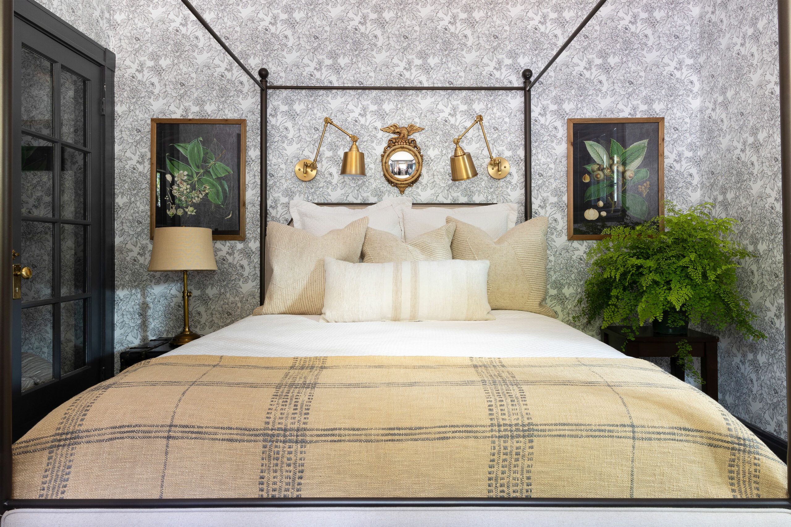
Indulging a passion developed during her childhood among the classic vintage houses of Brookville, New York, Alexandra lavished the interior with wallpaper prints. Among her effervescent choices: a bold black-and-white floral in the primary bath; a banana-leaf botanical in the light-filled sunroom; and subtle leopard spots to offset the formality of the dining room.
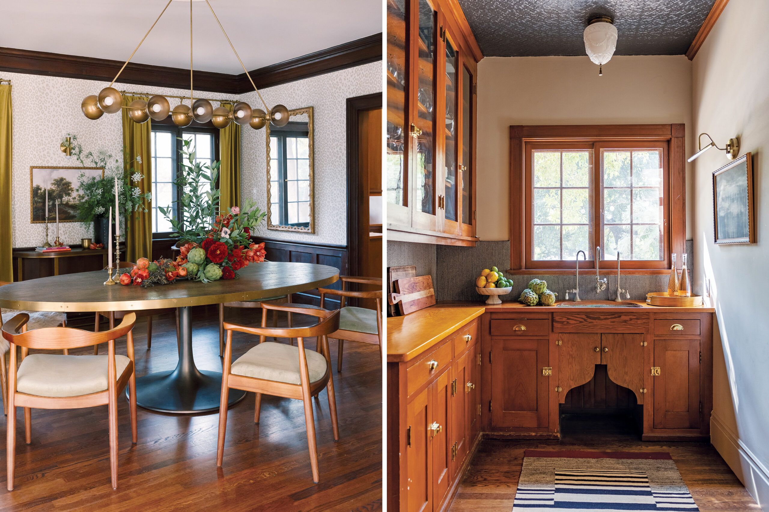
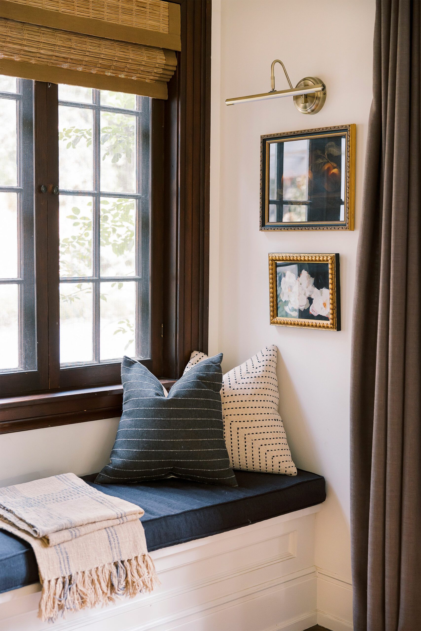
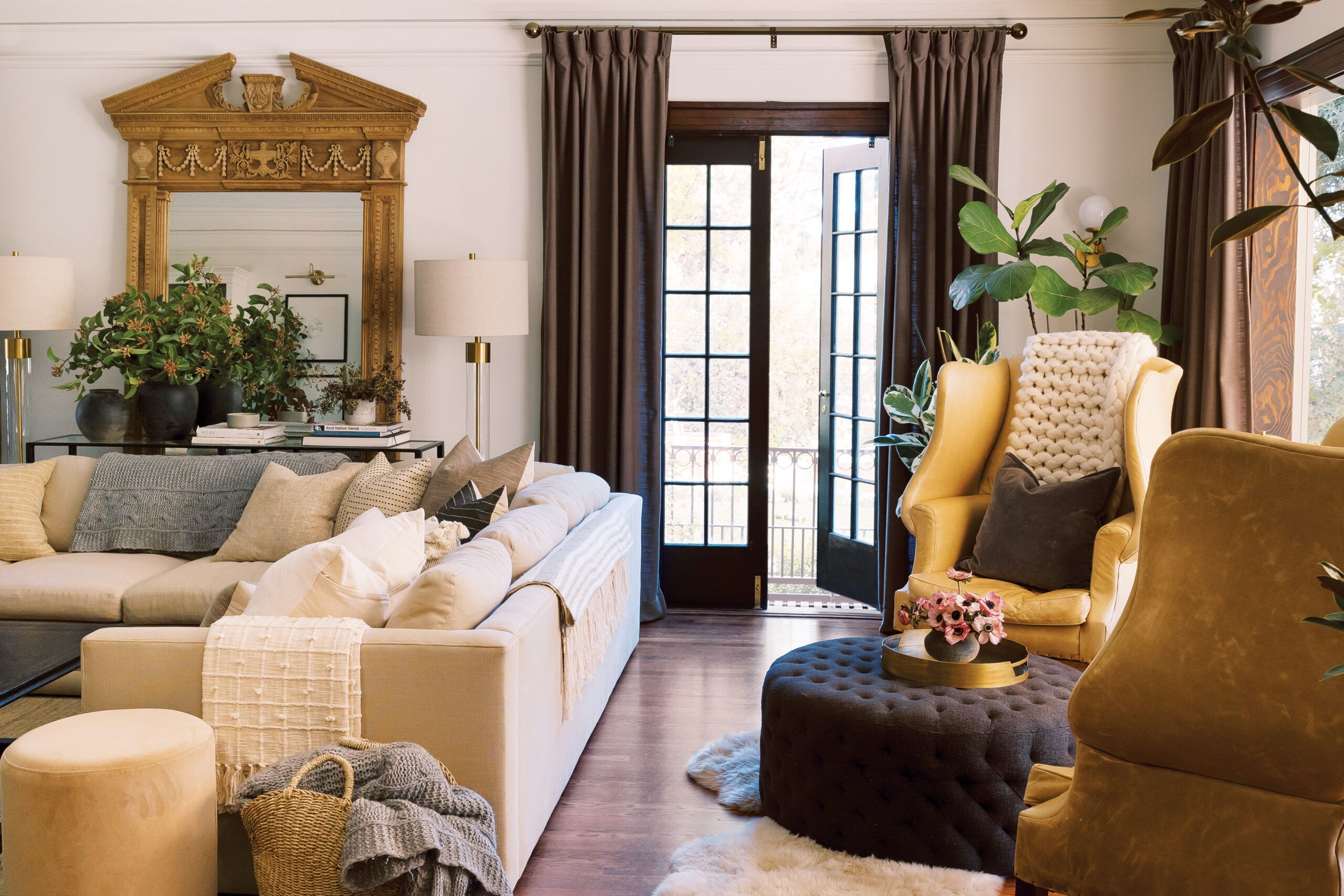
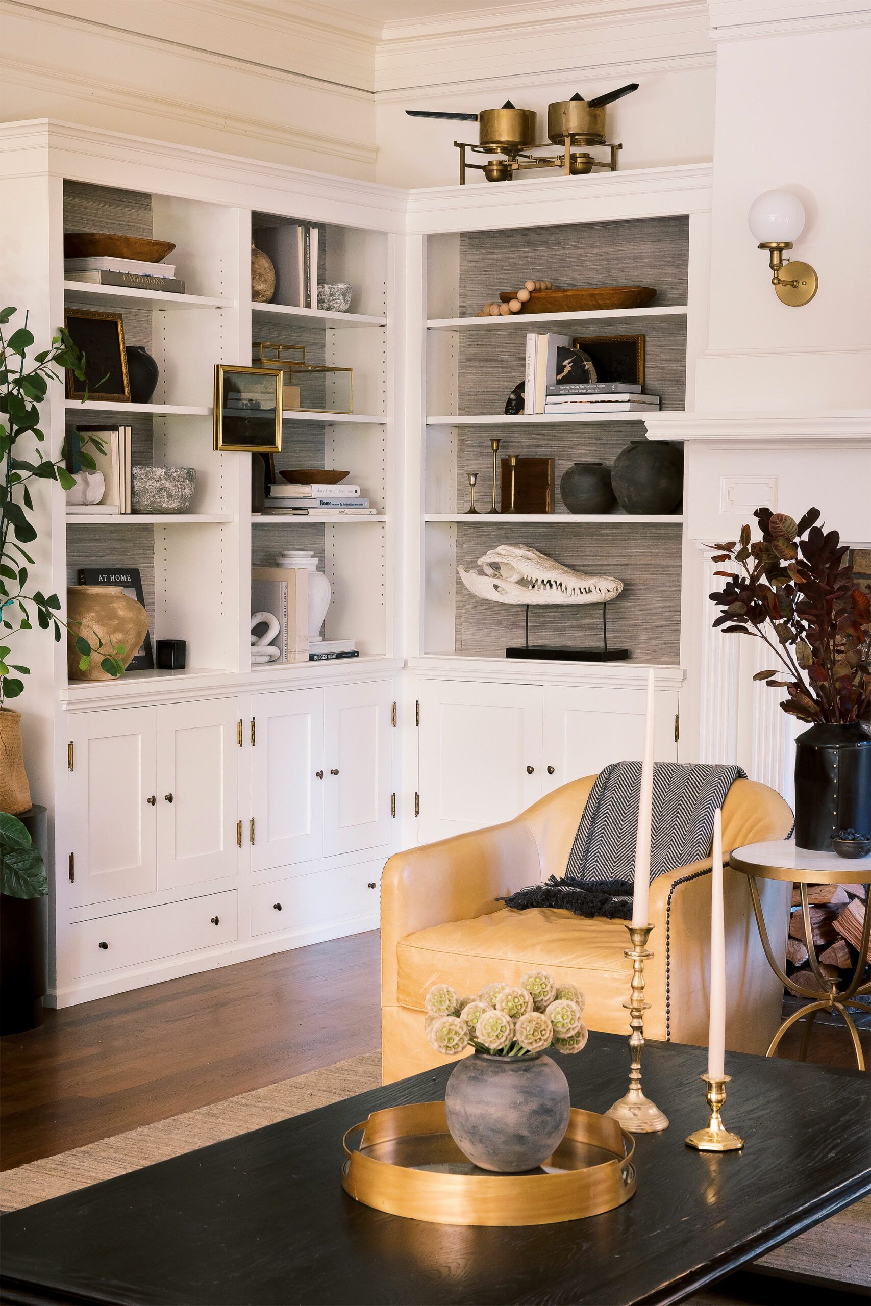
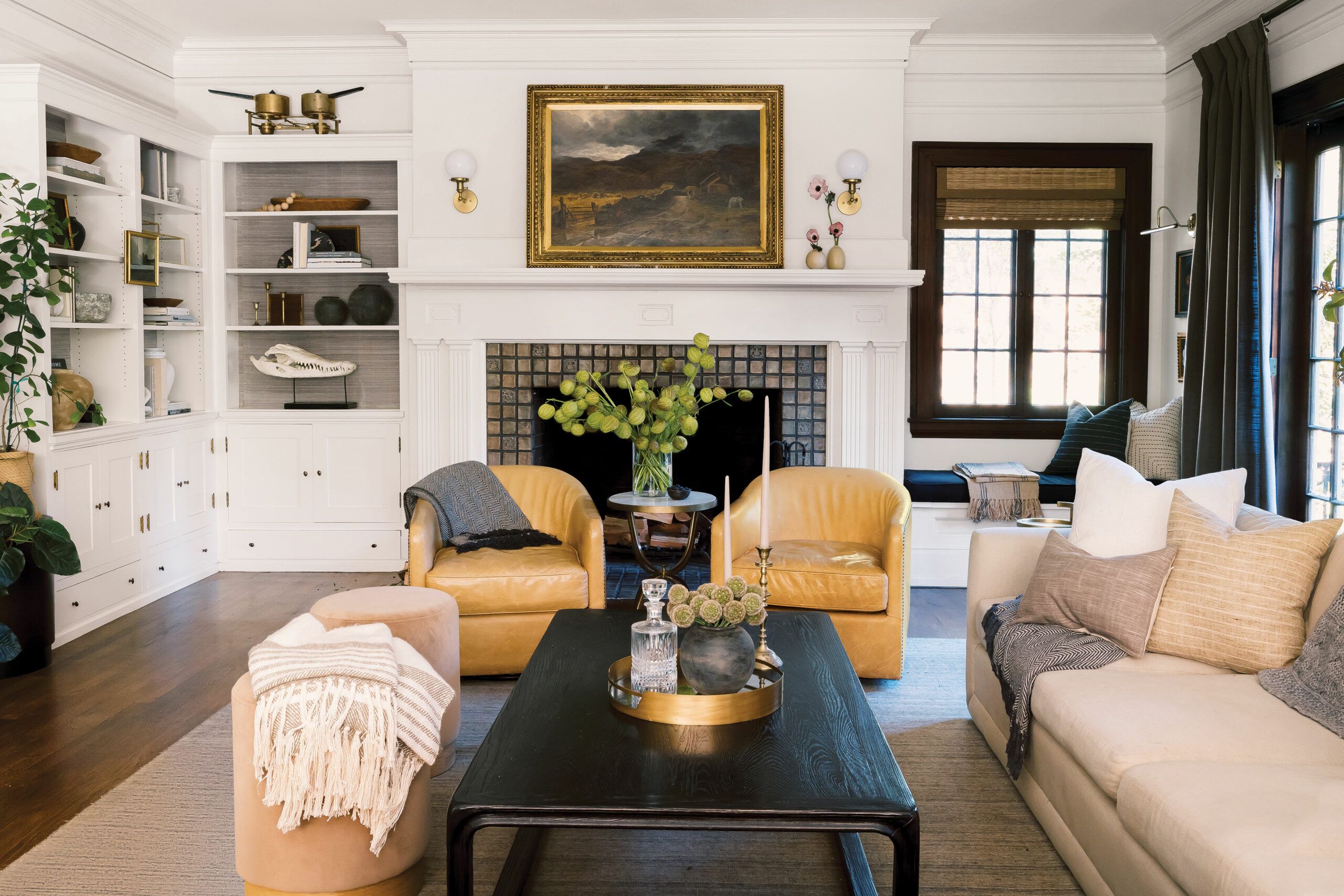
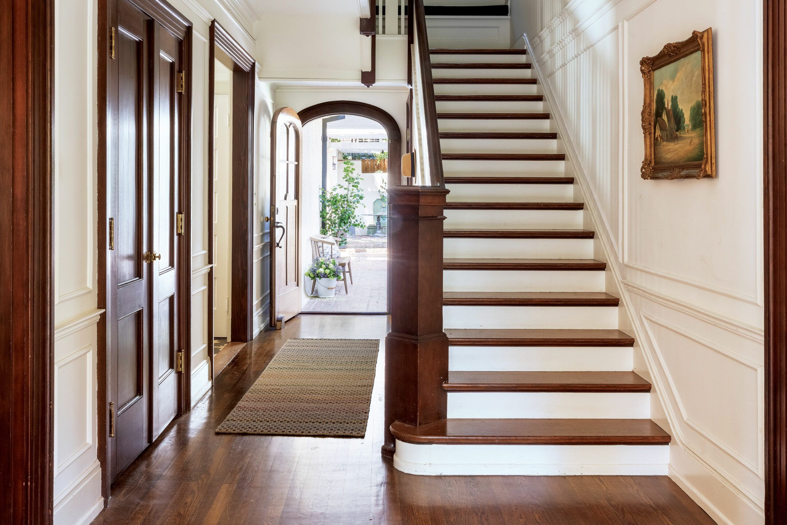
The furnishings do their part as well. An oval table counteracts the dining room’s boxy lines, as does a modern chandelier. “I just felt like that space was so old-school, we needed to fight against that a little bit,” Alexandra says. When it comes to original wood trim, homeowners tend to fall into two camps: preserve it or paint it. But Alexandra proves you can have it both ways, retaining the natural oak casings in the living room, for instance, but painting the crown molding, mantel, and cabinetry white to match the walls and brighten the room. In the entry hall, she preserved the stairway’s oak treads and handrail but painted the risers and balusters white for a fresher look.
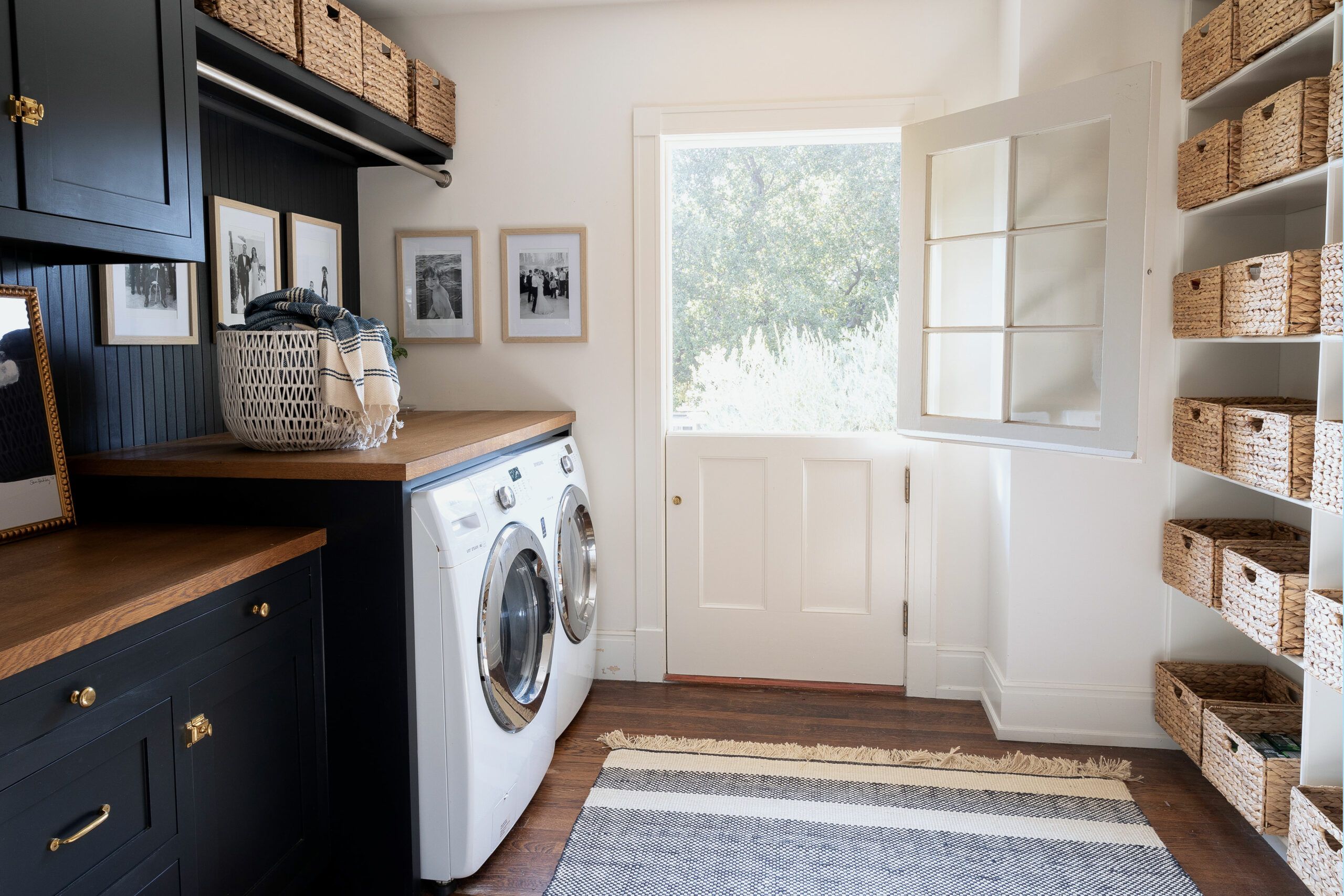
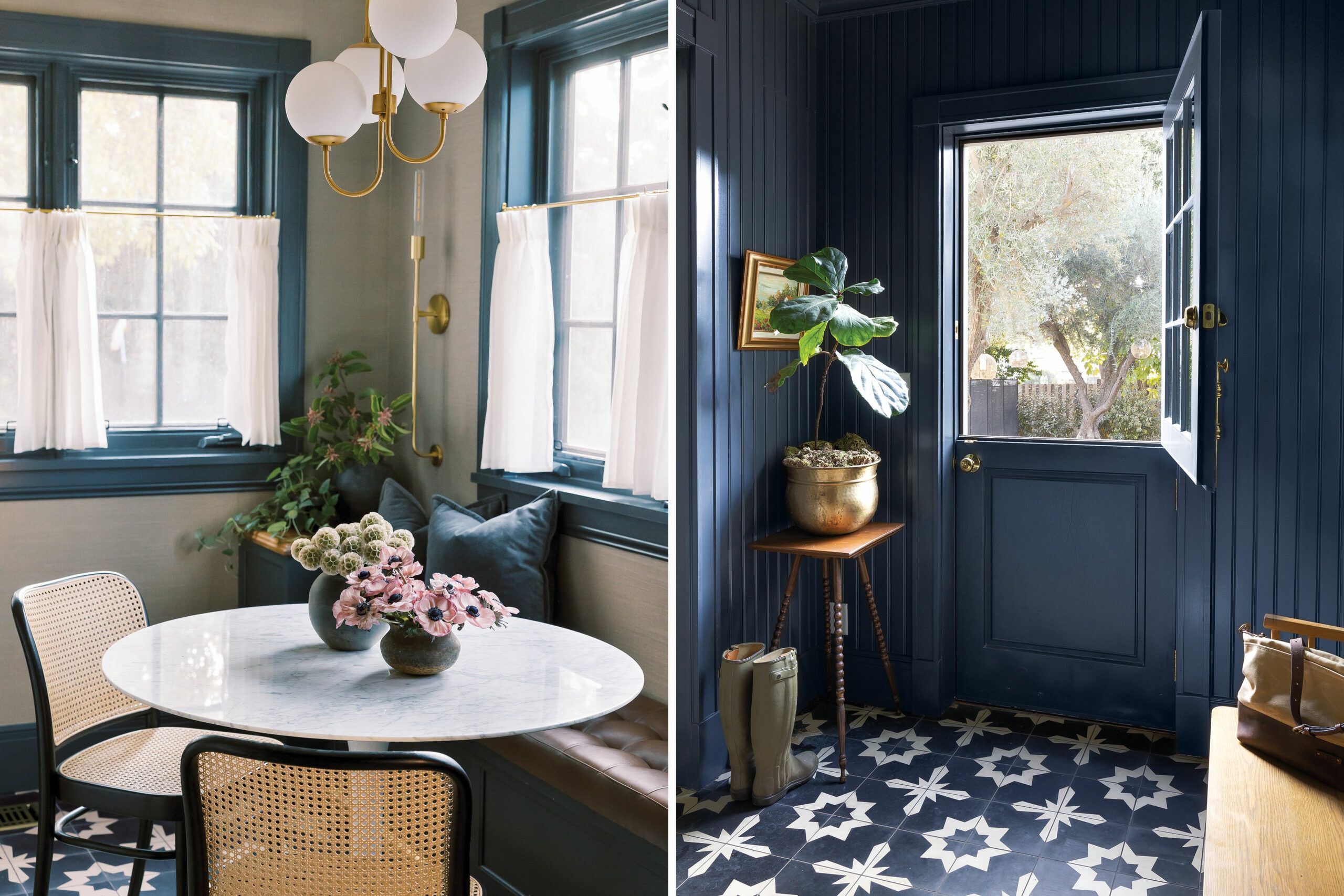
Eager to amplify the house’s architectural interest, Alexandra applied wall frames along the entry hall and covered the walls and ceiling of the utility-room-turned-mudroom with beadboard painted a moody charcoal. “I like a cozy, enveloping space,” she says of her color choice, which repeats at the other end of the room, where she carved out a breakfast area with a built-in banquette.
Figuring out the adjoining kitchen turned out to be the toughest puzzle of the renovation. Too small for the scale of the house and hemmed in by rooms and back stairs the owners didn’t want to sacrifice, it seemed to resist any solution. Expanding the back of the house would have meant costly structural work and a long wait for a permit during the pandemic.
“It was not a good layout, so we decided to gut the whole kitchen,” says architectural designer Luke Hamilton, who worked with Alexandra and contractor John Lopes to shave one wall of cabinetry off the butler’s pantry, widening the kitchen by a crucial 2 feet. A new floor-to-ceiling storage wall went in along one kitchen wall, plus additional storage framing the range. To make the space feel larger, Hamilton widened the opening to the butler’s pantry, so it looks like a continuation of the kitchen; added a door to a new deck addition in the rear, and lightened up the passageway from the front hall, so access feels more open and inviting.
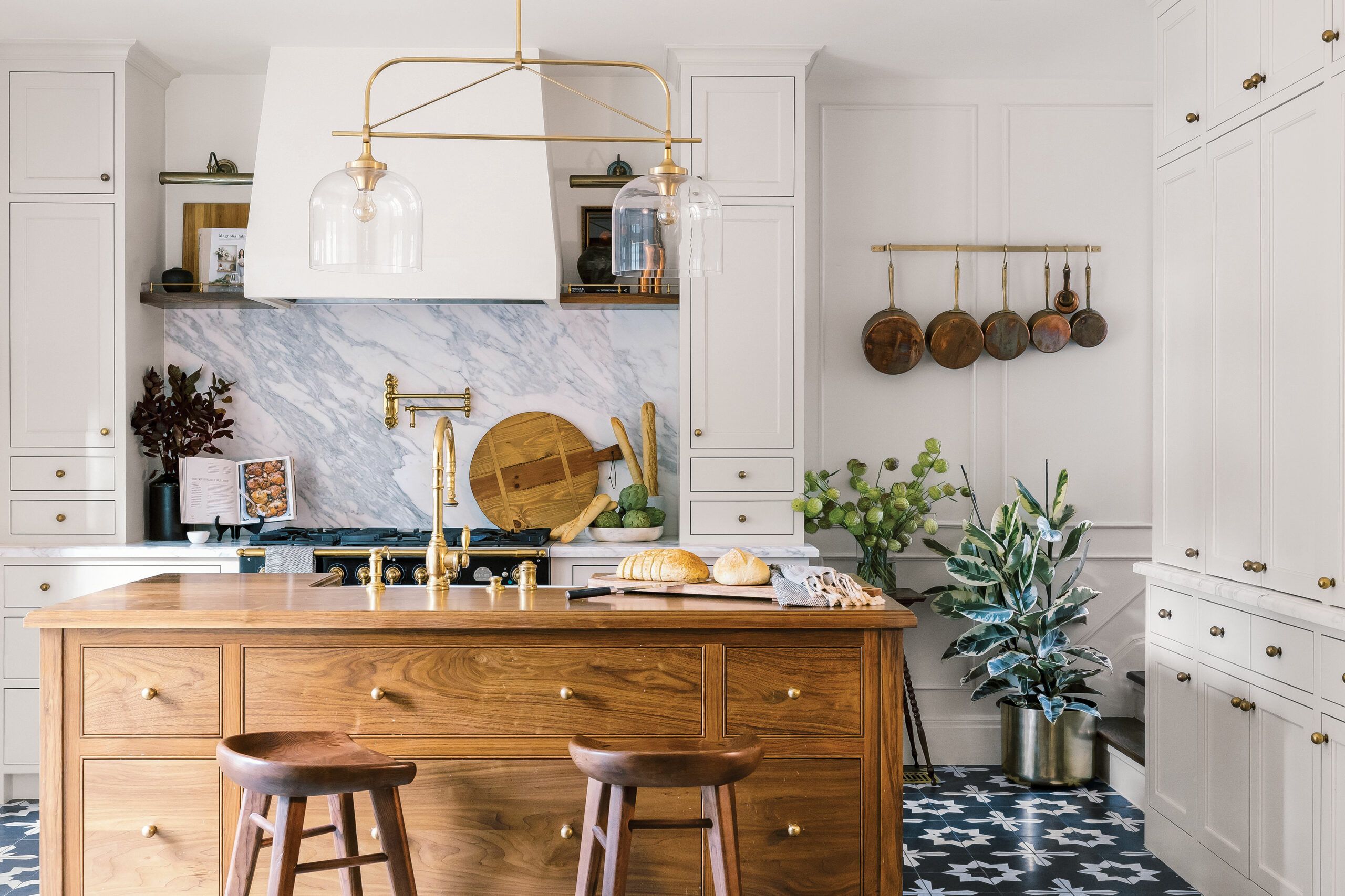
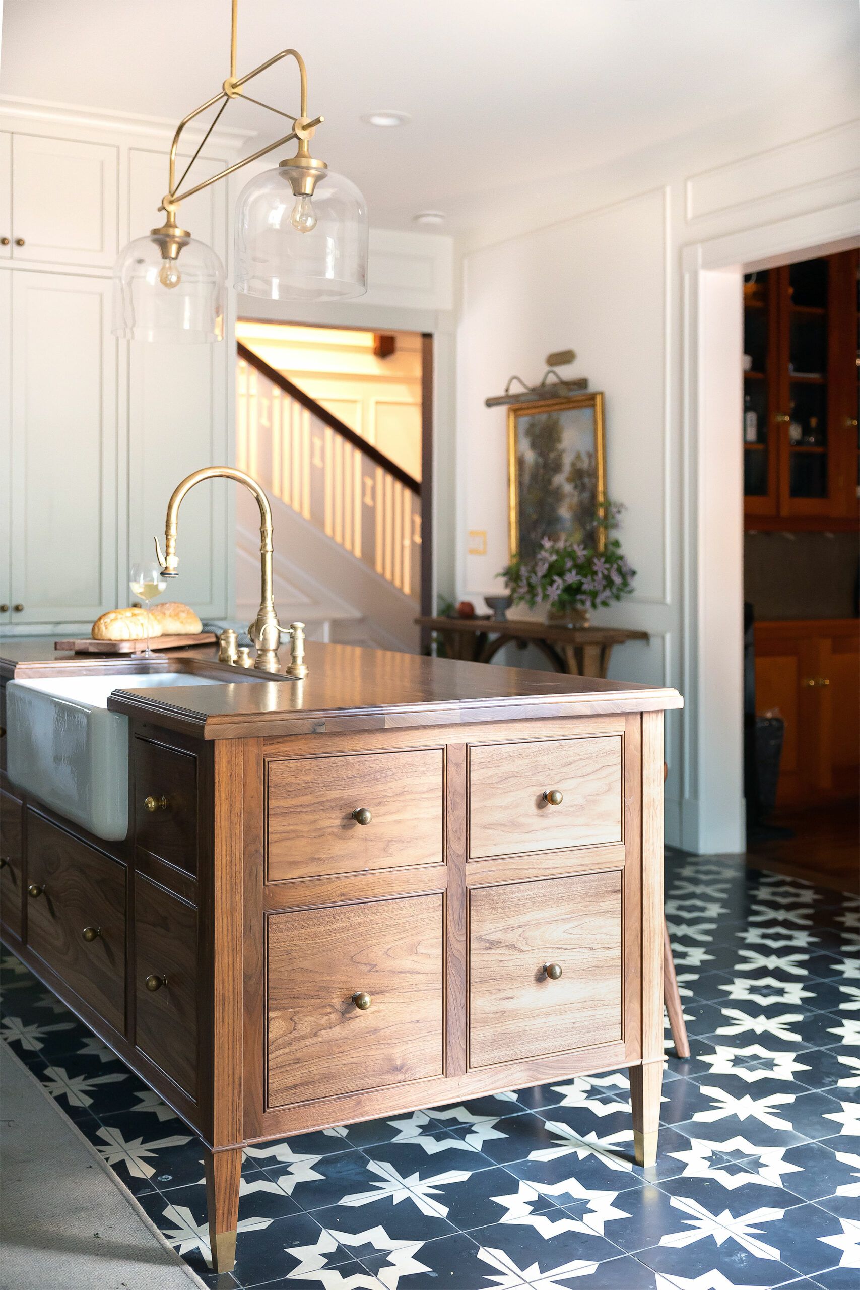
The crowning touch is the walnut island that Alexandra designed and had custom-made. “I told my carpenter I wanted it to feel like an old piece of furniture,” she says of the hardworking local point, which holds a sink, a dishwasher, and a recycling center and rests atop demure brass feet. “I think it gives the space the grounding it needs.”
As a child of immigrants, Alexandra traveled to Europe often when she was young and got to explore gracious country houses outfitted with white marble, natural wood, and unlacquered metal. “Seeing all those ‘real’ materials made me not afraid of them,” says the designer, who introduced these same finishes throughout her own home. “People seem to want everything so perfect and polished now, and that’s not me. I like patina.” So if the island’s walnut top gets nicked or the marble vanities get stained, she doesn’t panic.
“It reminds you that you are living in the space,” Alexandra adds, “and that there is life there, and love.”
Renovation Recap
The homeowners: Alexandra Azat (above) and her husband, Issa (who built houses before becoming a lawyer)—parents to sons Beau, now 4, and Brooks, 2
The house: A 4,720-square-foot Craftsman built in 1915 in Altadena, CA. It had great bones and was structurally sound, but hadn’t been updated in a decade
Why they chose it: The house offered that “something special” Alexandra was seeking—namely, period character on more than half an acre in a historical neighborhood.
What they did: Upgraded the wiring and plumbing, refinished the floors, insulated, and added central AC. Gut-renovated the kitchen and second-floor baths, turned a utility room into a breakfast area and a mudroom, and moved the laundry upstairs. Issa insisted on keeping a rear staircase to the basement, “and I’m so glad he did,” says Alexandra, who plans to turn the lower level into a speakeasy.
Biggest challenge: “Renovating with small children at home.”
Lesson learned: Alexandra says the project reinforced for her the importance of living in a home for a bit before remodeling it. “If you want to curate each space, getting to know the house, the flow, and the light is really crucial.
Floorplans
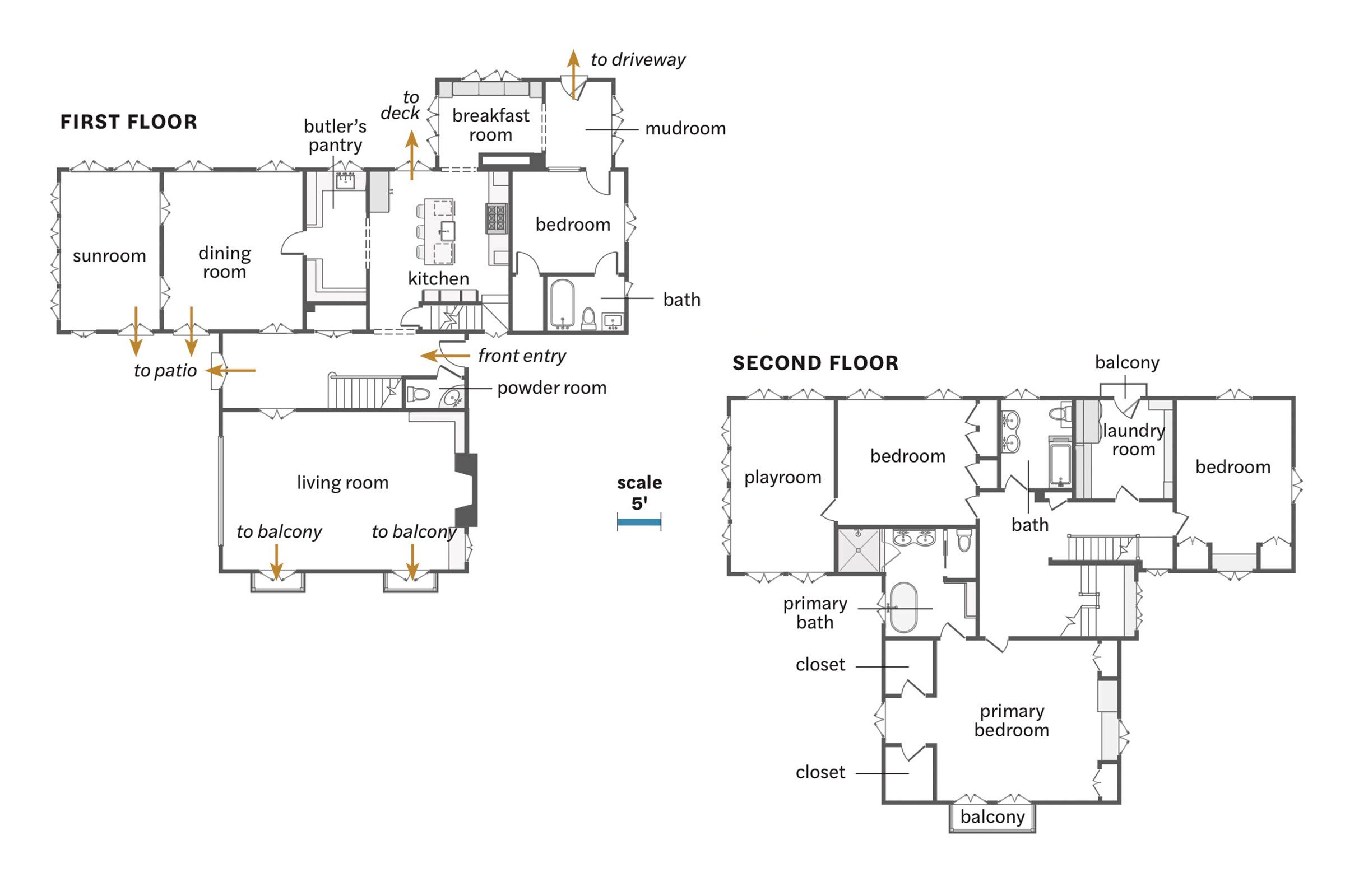
Inside the four-bedroom, three-and-a-half-bath house, the kitchen stole 2 feet from the butler’s pantry, a utility room became a mudroom and breakfast area, and the laundry moved upstairs. Both second-floor baths were gutted, and the primary bedroom gained two walk-in closets.
