If the whole point of having a vacation house is to escape your everyday life, why choose one that looks just like the place where you normally live?
That was the reasoning that drove Alan and Pam Grossbard to acquire a quirky, run-down compound in Montecito, California, a coastal enclave poised between the Santa Ynez Mountains and the Pacific Ocean less than an hour and a half from their home in Los Angeles. Hidden behind a hedge on a narrow lane, the scruffy lot measured just under half an acre and included a trio of Spanish-style buildings, the earliest said to have been built around 1930. Structurally sound, the modest main house, studio, and garage were clearly suffering from neglect and bore traces of their years as a purported hippie hangout in the 1960s.
“It was in some disrepair and a bit overgrown, but there was something charming about it,” Pam recalls of the property. “Like if you pulled back the layers, you would find something interesting.”
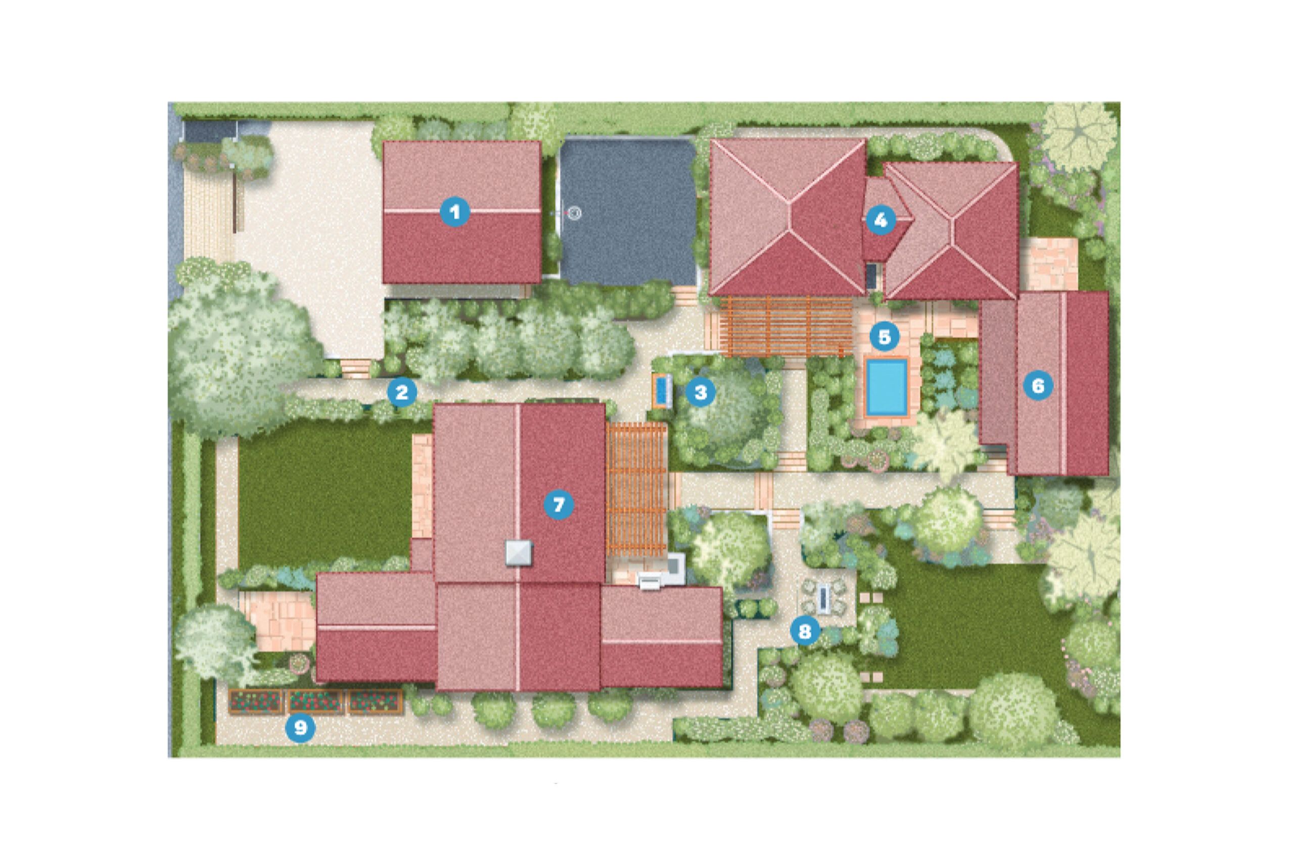
Since the compound no longer conformed to building codes, the Grossbards’ options were limited. “If we took the buildings down, we could only build a single-family house,” says Alan. “We thought, Why create what we already have? Let’s do something completely different.” Set on saving the original structures, they sought guidance from Kenneth Mineau, Paul Rubison, and Marc Appleton of Appleton Partners in neighboring Santa Barbara. After visiting the site, the architects proposed a novel approach: Why not think of the entire property as the house, and the individual buildings as rooms within it?
The firm had employed a similar tactic in its restoration of San Ysidro Ranch, a nearby resort the Grossbards admired, so the couple gave the concept their blessing. “We were ready to take on a project, and seeing something like this that needed so much help really piqued our interest,” says Pam, who, like her husband, works in the entertainment business.
Instead of expanding the existing structures, the architects agreed it made more sense to improve what was already there—or what they hoped was there. “The property had become significantly overgrown over the years, so we didn’t know exactly what we were going to find,” recalls Ryan Prahm of DD Ford Construction. “Some buildings turned out to be in better shape than others.”
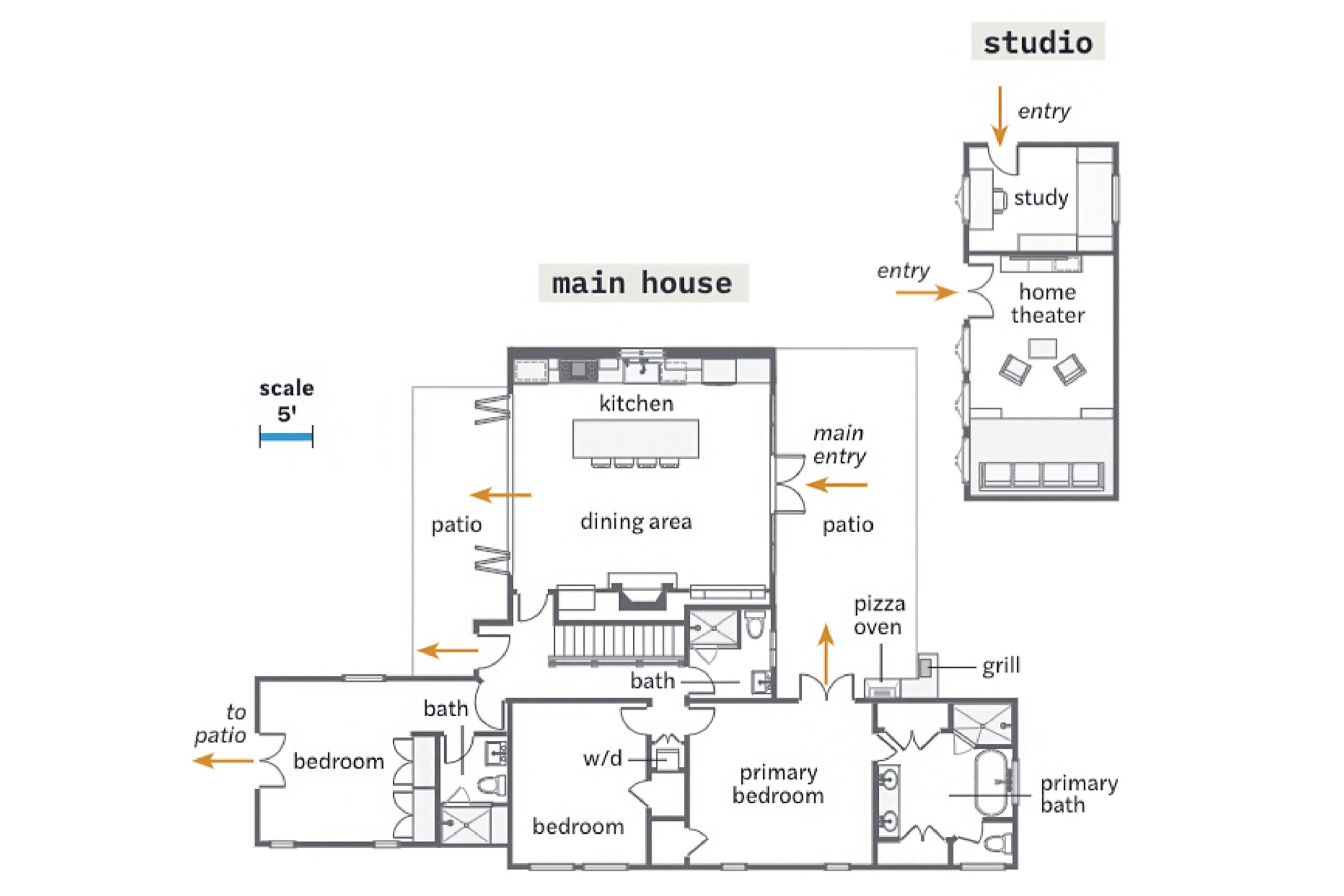
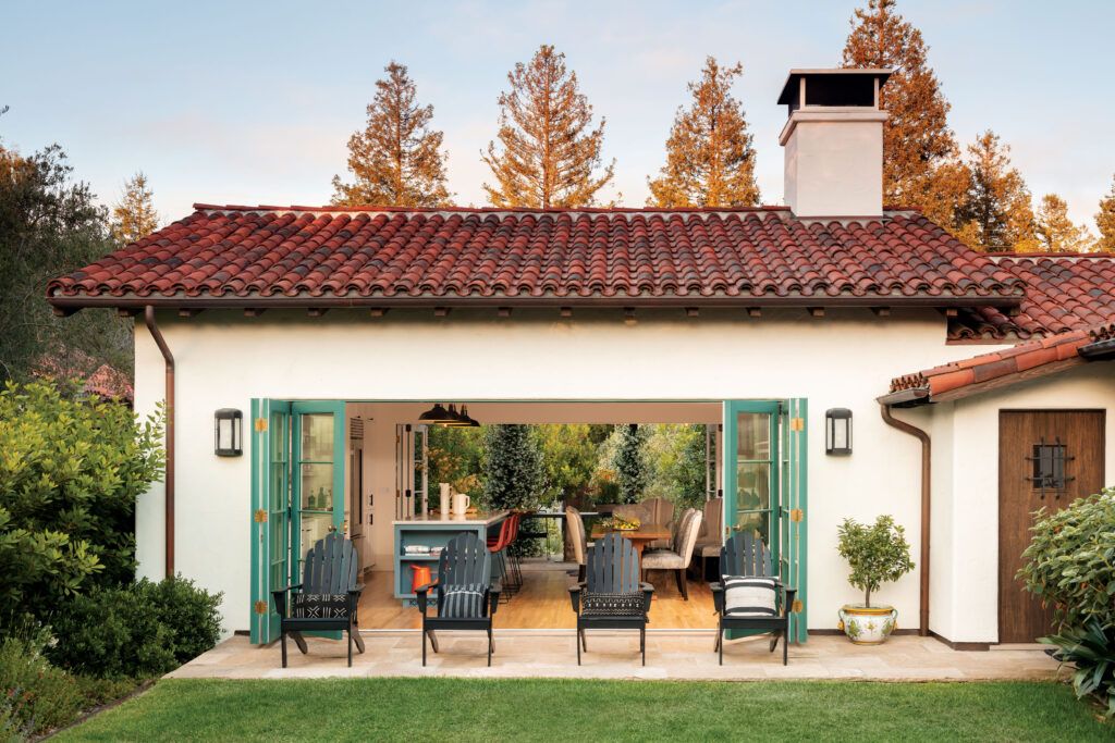
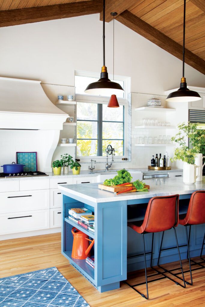
The 1,684-square-foot main house received the lion’s share of attention. “It was just a rabbit warren of little rooms,” Mineau says of the T-shaped structure. The architects converted the living room into a guest room, creating a dedicated bedroom wing, then gutted and rebuilt the kitchen wing, moving a basement staircase and raising the roof to create a vaulted kitchen and dining area. Custom folding doors composed of narrow, divided-light panels line the walls on either side, transforming the space into an open-air pavilion
while remaining faithful to the period house. Casement windows that couldn’t be saved were replaced with new windows modeled after the old ones. The Grossbards loved the ball shapes on the old crank handles, so all the working ones on the property were salvaged, then put to use in the main house. “We wanted these little artifacts to remain and be functional,” says Rubison, whose team managed to find matching doorknobs.
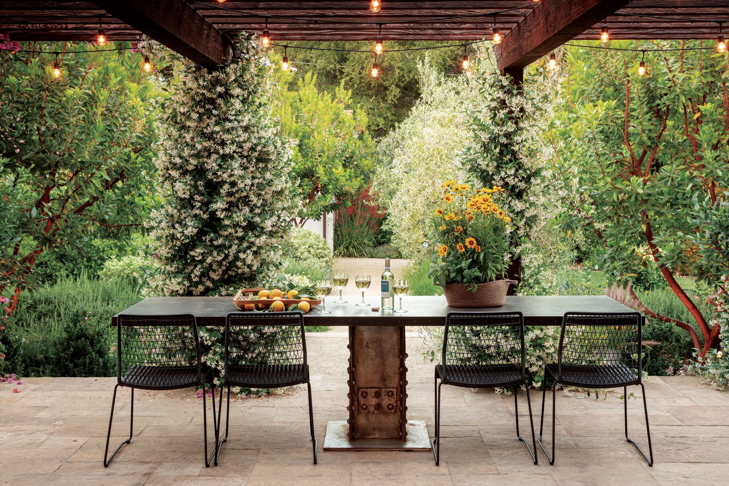
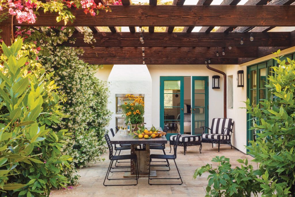
One side of the kitchen opens onto a massive Douglas fir pergola laced with bougainvillea and jasmine. “The pergola makes it feel more like an intimate interior room, even though you’re outdoors,” says Rubison of the open-air dining space. A built-in pizza oven and grill beckon in one corner, while further exploration reveals a kitchen garden, a fire pit with seating, and a spa tucked into the surrounding landscape. “We set out to create spaces that would inspire you to spend time outside,” Rubison adds.
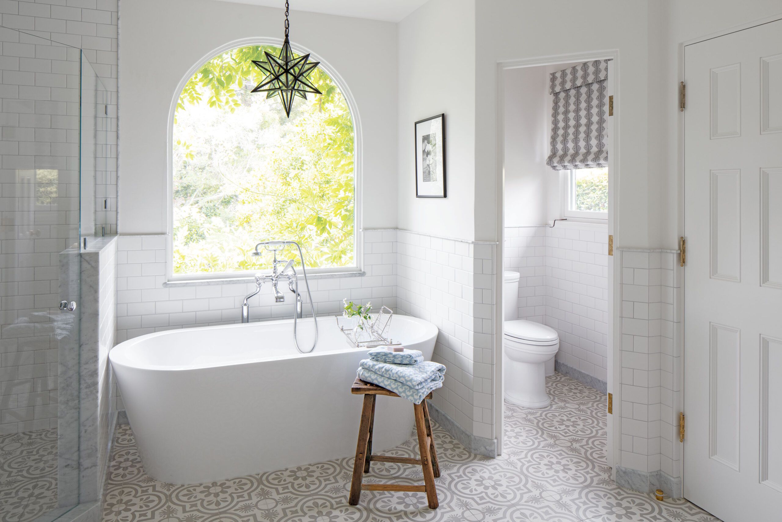
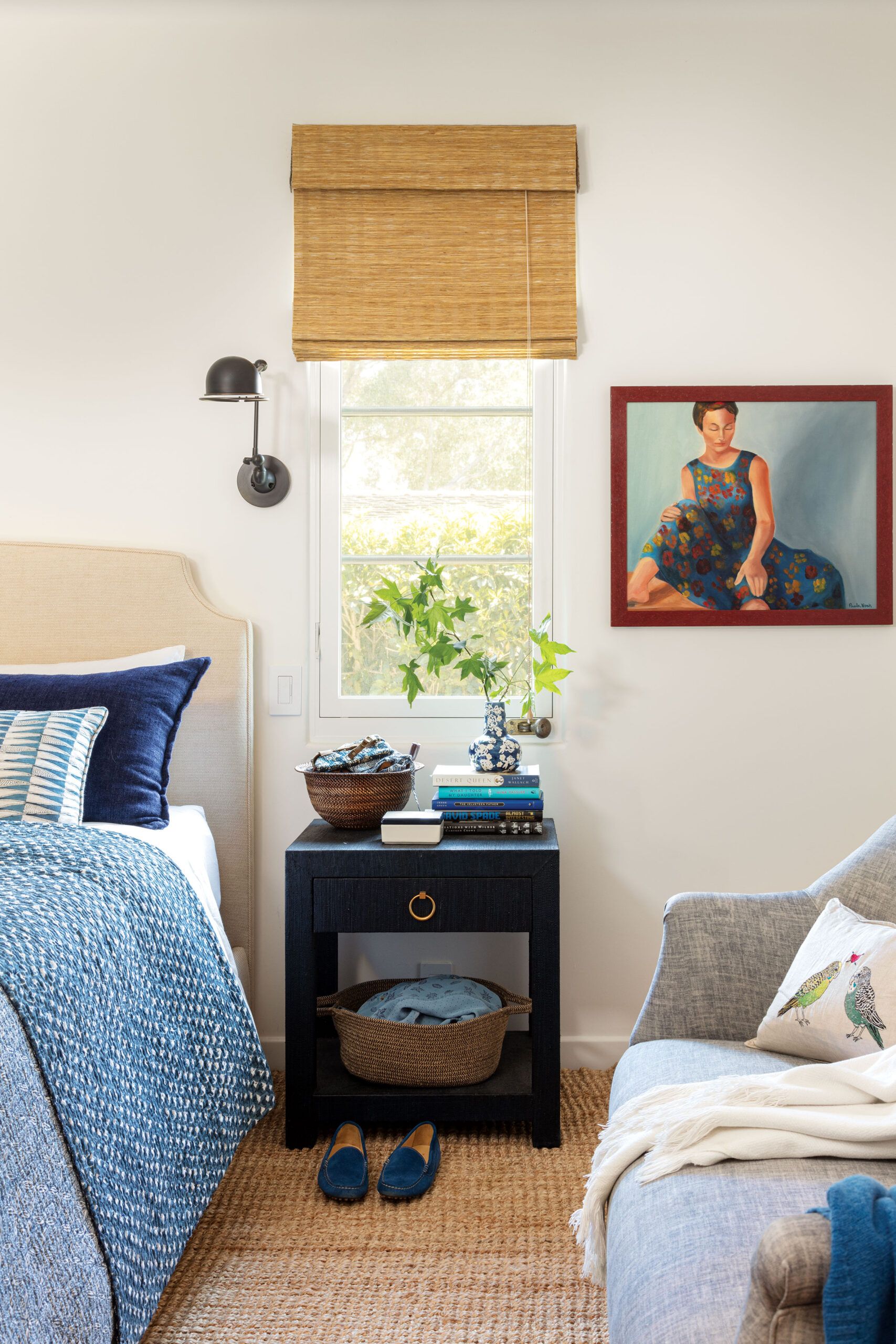
Of the three buildings, the 900-square-foot garage-turned-guesthouse was in the worst shape. It had held a workshop and car bay, with maid’s quarters tacked on in the back in the mid-1940s. Since the main house no longer had a living room—people tend to congregate in the kitchen-dining area—the architects put one where the car bay once stood. Old oak wine-vat staves were bleached and applied to the vaulted ceiling; the sandstone floor extends under accordion doors onto a terrace facing the central gardens, creating a seamless transition between the two. The workshop was turned into a bunk room, connected to the renovated bedroom by a Jack-and-Jill bath. Cars now park in a new freestanding garage built in the same style, closer to the street.
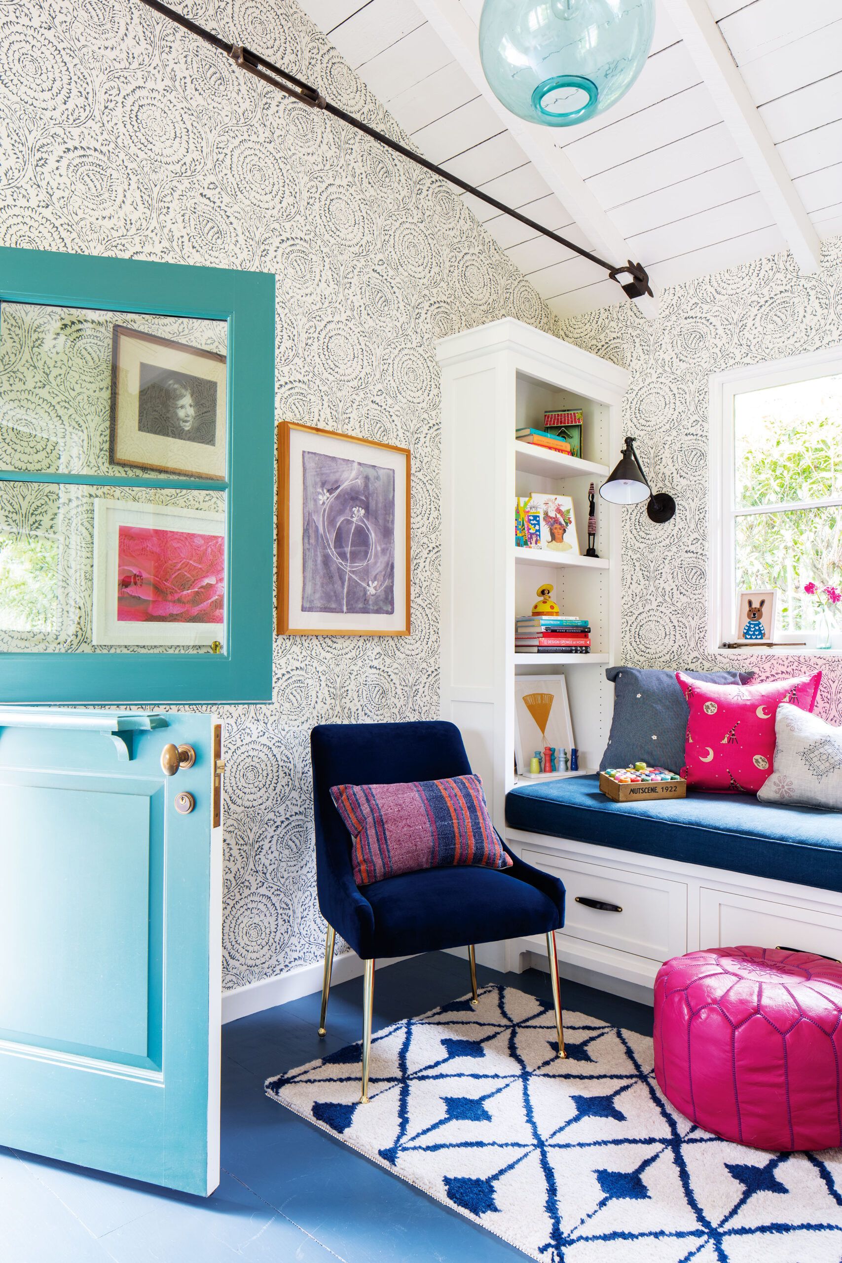
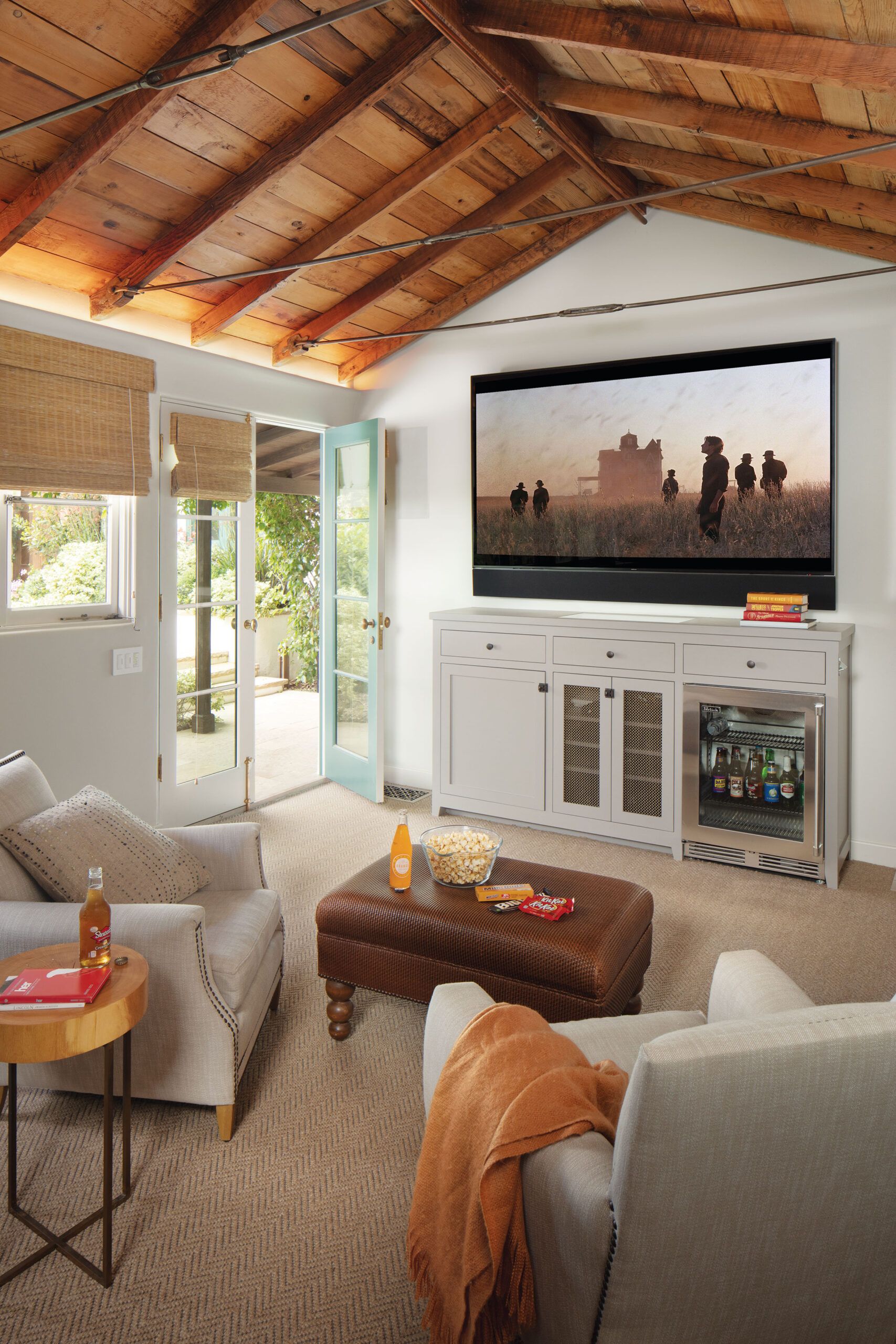


The third and smallest structure on the property was the 350-square-foot studio, which hugs the rear of the lot and now features a small study for Pam and a home theater with tiered seating. (The candy drawer beneath the screen has turned out to be a favorite feature.) The vaulted ceiling is supported by original collar ties, which were repaired and duplicated to support Pam’s study ceiling, too. Although all three structures were essentially sound, there were enough alterations to doors and windows to justify stripping the exteriors to the framing, allowing for new insulation, building wrap, and sand-finished stucco. On the roofs, existing S-style terra-cotta tiles were traded for more period-appropriate two-part barrel tiles. At the same time, the old HVAC system was replaced with heat-pump units and the partial basement under the main house was enlarged to accommodate a new mechanical room, a laundry, and a storage area, alleviating the need to intrude upon the living space above.
Santa Barbara County doesn’t get much rain, but last winter’s torrential storms proved how vulnerable the area could be to flooding, so Prahm’s team installed new site drainage throughout. “It turned into a fairly sizable civil engineering project to get that whole house and that whole property to drain properly,” he says.
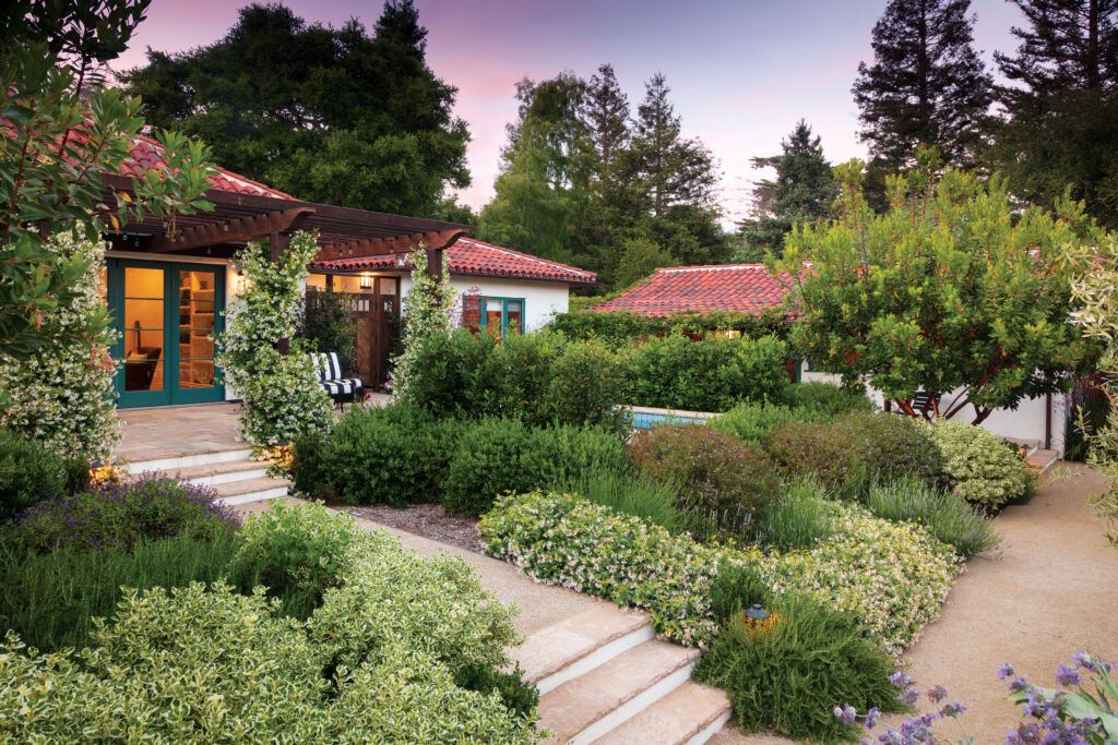
Once that was done, the grounds were terraced to create patios that are on grade with the living
spaces and several steps up from the landscape, which is knitted together with decomposed- granite pathways flanked by evergreen beds of bay laurel, pittosporum, and dwarf olive trees punctuated by agapanthus and marina strawberry trees, providing privacy and defining a multitude of outdoor rooms. “It’s a small property,” Rubison observes, “but there’s a lot to explore here.”
The Grossbards assembled the interiors themselves, with an assist from the Brown Design Group in Santa Barbara. “We wanted something that was not at all pretentious,” Pam says. “We wanted it to be a place where anybody could come and put their feet up and have a good time.” The pair incorporated furnishings from their childhood homes and mementos from their parents, like the vintage iron patio furniture they revived with powder coating and new cushions. “It’s fun to get creative and look around and see what you have and how you can reinvent it,” she adds.
While the total living space approaches 3,000 square feet, the couple say they never feel dwarfed by it when they’re alone, since the space is divided between three cozy structures. Conversely, when friends or the couple’s grown twin daughters visit, no one feels crowded. “Because the buildings are scattered around the property, friends can come and stay and we don’t even have to see each other,” Alan says. Although the arrangement might not suit everyone, it offers the Grossbards an inviting alternative to their life in LA. “If we had torn it down and built a brand-new house,” Alan says, “it wouldn’t have the character that it has now.
The Plans
The nearly half-acre lot was home to three buildings, the earliest built circa 1930. All were renovated and a new garage was built, for a total of five bedrooms and four baths spread over 2,934 square feet of living space, woven together by a network of pathways and plantings.
