This article appeared in the Fall 2023 issue of This Old House Magazine.
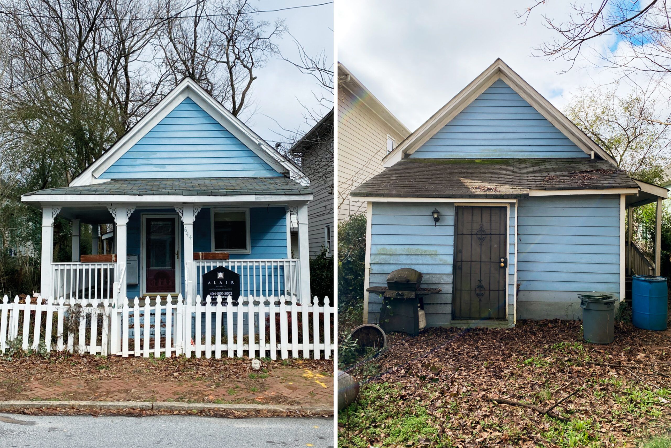
“I’m not sure what this house was used for, but it wasn’t for anything legitimate,” Scott Evans confided to his wife, Donna, the first time the couple toured their new Atlanta home. With enough locks on the front door to secure Fort Knox and a second locked room inside, the 700-square-foot shotgun-style house certainly raised some suspicions. Boarded-up windows, grimy walls, and a rank smell didn’t help.


Still, the price was irresistible, and so was the location: a sliver of land in Grant Park, one of the most well-known historic districts in the city, just a mile from the Atlanta BeltLine, a rejuvenated railroad corridor, now a popular pedestrian and bike path that has given new life to every neighborhood it passes through. Having already renovated a house in a neighboring historic district, the Evanses were familiar with the complicated permit process involved and were ready to try it again.
“This neighborhood is historic, so whatever this house looked like on the front, we would have to do a renovation that maintained the integrity of the architecture,” says Donna, who, like her husband, works in the technology sector. Fortunately, the couple had a friend, the late Frank Neely, who was an architectural designer and had owned a shotgun house himself, so he would know what was needed. While this was a smaller job than his firm would take on, the Evanses had been friends of his for years. When the couple said they wanted to do a tiny house, he thought it would be a fun challenge.
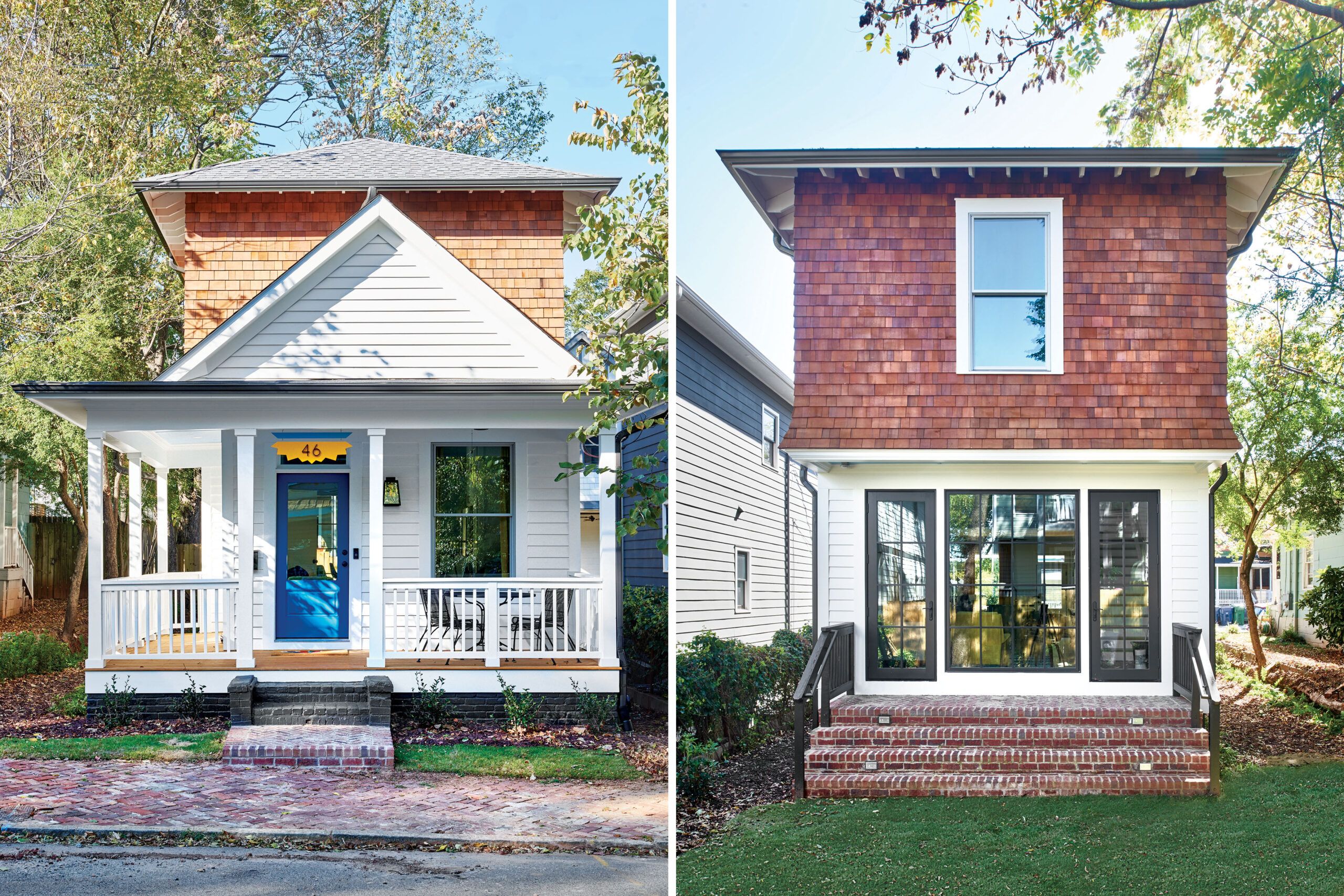
Given the lot’s scant 30-by-85-foot dimensions, and the owners’ desire for additional bedrooms and baths (they have two children), all agreed that the best approach would be to expand upward. The result is a 679-square-foot addition that straddles the old house, front to back, effectively doubling its space. Bowing to a request from the Atlanta Urban Design Commission (AUDC), they pushed the addition several feet back from the facade to preserve the shotgun’s street-facing profile and keep the scale consistent with the other houses in the neighborhood.
After obtaining approval for a historical renovation from the AUDC and the Grant Park Neighborhood Association, the construction team from Alair Homes Decatur began peeling back the layers of the little house, with the goal of preserving its framework and foundation. But as demolition progressed, it became increasingly clear that the existing structure could not be saved. “Each layer was in terrible shape,” says Heather Shuster, a partner and co-owner at Alair who collaborated on the construction with project manager James Matthews. “We made an effort to salvage what we could. Unfortunately, it really was very little.
“Water is a really big challenge in Atlanta,” she adds. “When you’ve got the constant water that we do here, and a house is not maintained—if you don’t keep it painted, if you don’t keep it caulked, if you don’t keep it sealed—water gets in and starts to deteriorate the materials.” Even the old brick foundation was beyond salvation, as a lot of it had been sitting directly on the soil.
With a renovation no longer feasible, the homeowners applied for a construction permit, and after another round of design reviews by the city and neighborhood, their application was finally granted. After pouring a new concrete perimeter foundation, the team from Alair rebuilt the house in its original footprint—minus later alterations. Following telltale clues in the old framing, the window openings were enlarged to their original proportions, then fitted with aluminum-clad wood double-hungs. The front porch lost its poorly built railing and tacked-on gingerbread trim, and a shoddy lean-to addition was eliminated out back.
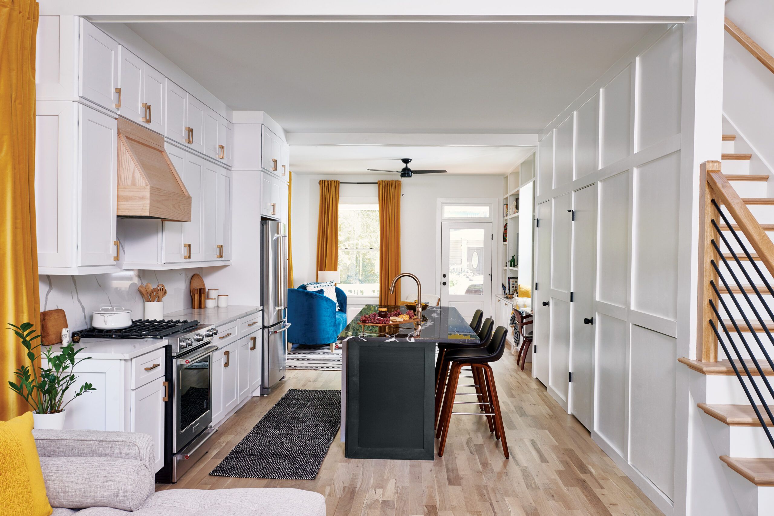
The interior was rebuilt following the initial renovation plans, which eschewed walls and corridors on the first floor in favor of a single space containing a living room, a kitchen, and a family room. “In an old, tiny house, all the rooms are chopped up,” Donna explains. “None of us wanted that. We wanted a house that felt wide open and full of light, but also looked like a tiny house from the street.”
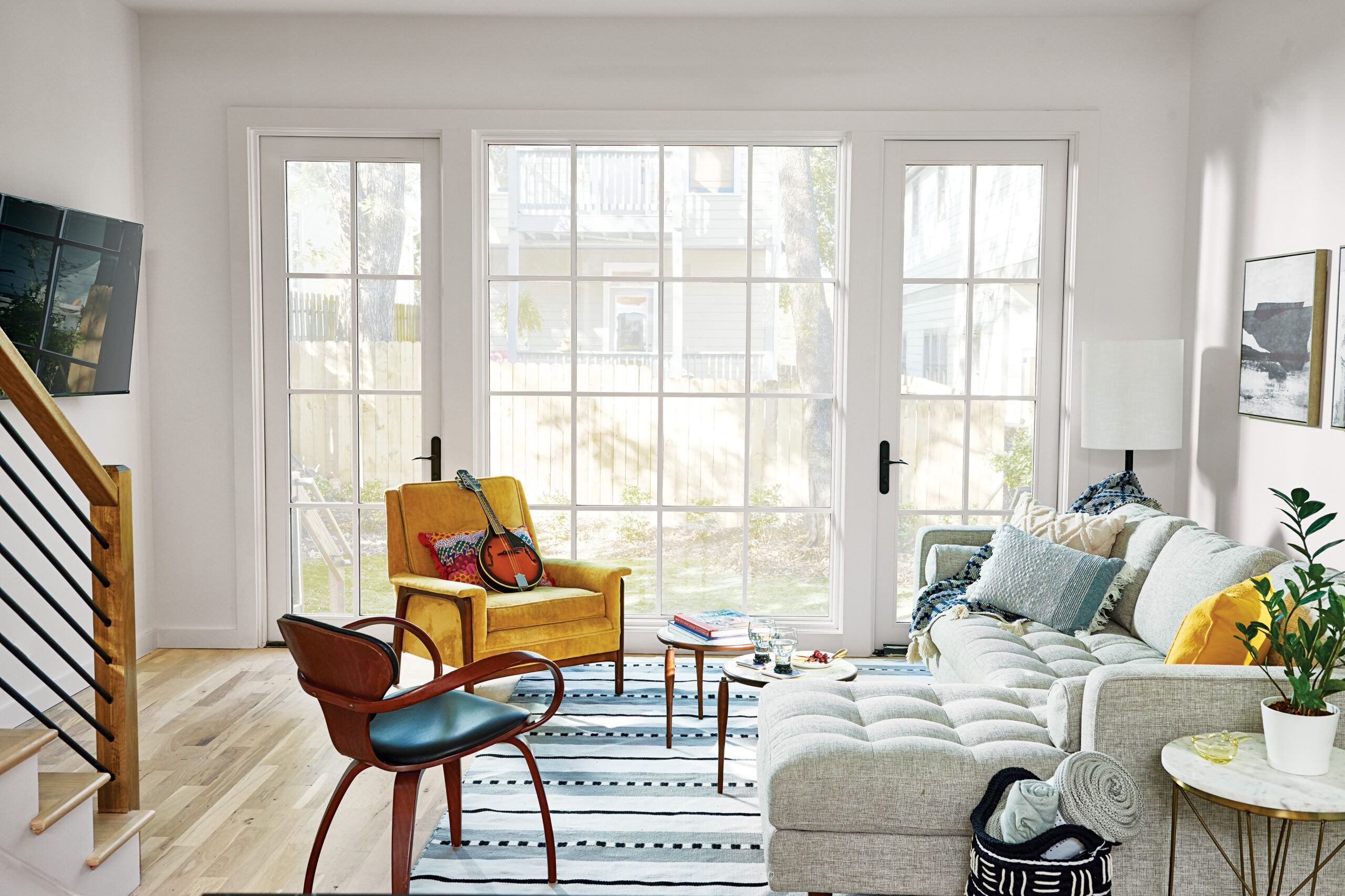
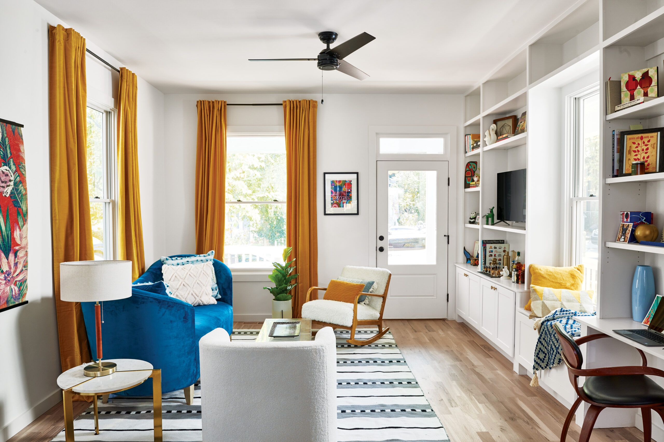
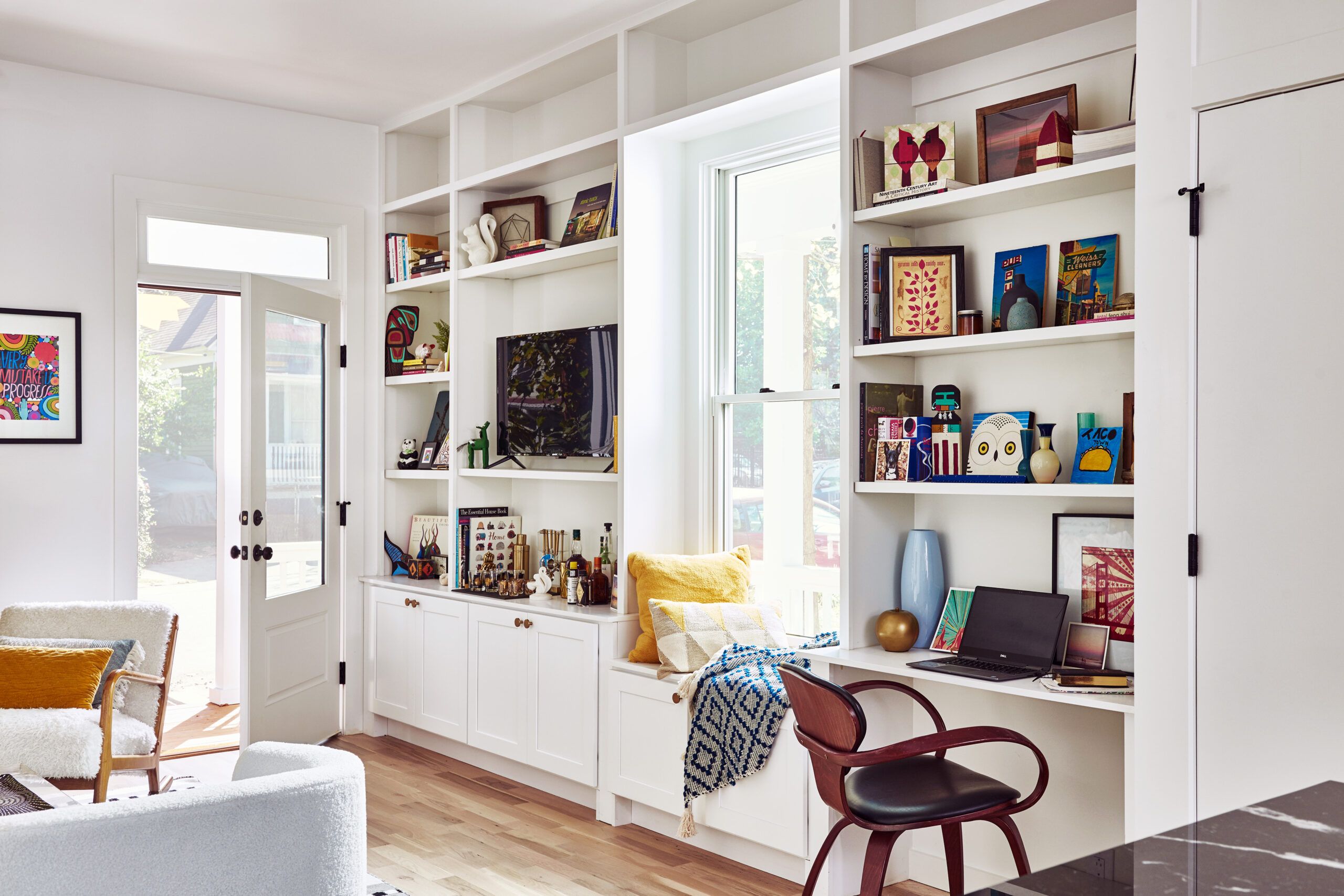


Despite the open plan, there are visual cues—built-ins in the living room, paneling in the kitchen, changes in ceiling height—that distinguish each area. The furniture plan allows traffic to move through each room, instead of through hallways, to maximize space. “Frank had a crazy talent for looking at a small footprint and leveraging the most livability out of it,” Donna says.
The front living room packs a lot of function into a small space, thanks to a wall of floor-to-ceiling cabinetry that includes a built-in desk. The expanse of glass at the rear of the house invites the outside in and provides easy access to the backyard through a pair of French doors. (The owners were granted more design leeway in the back, because it’s not visible from the street.)
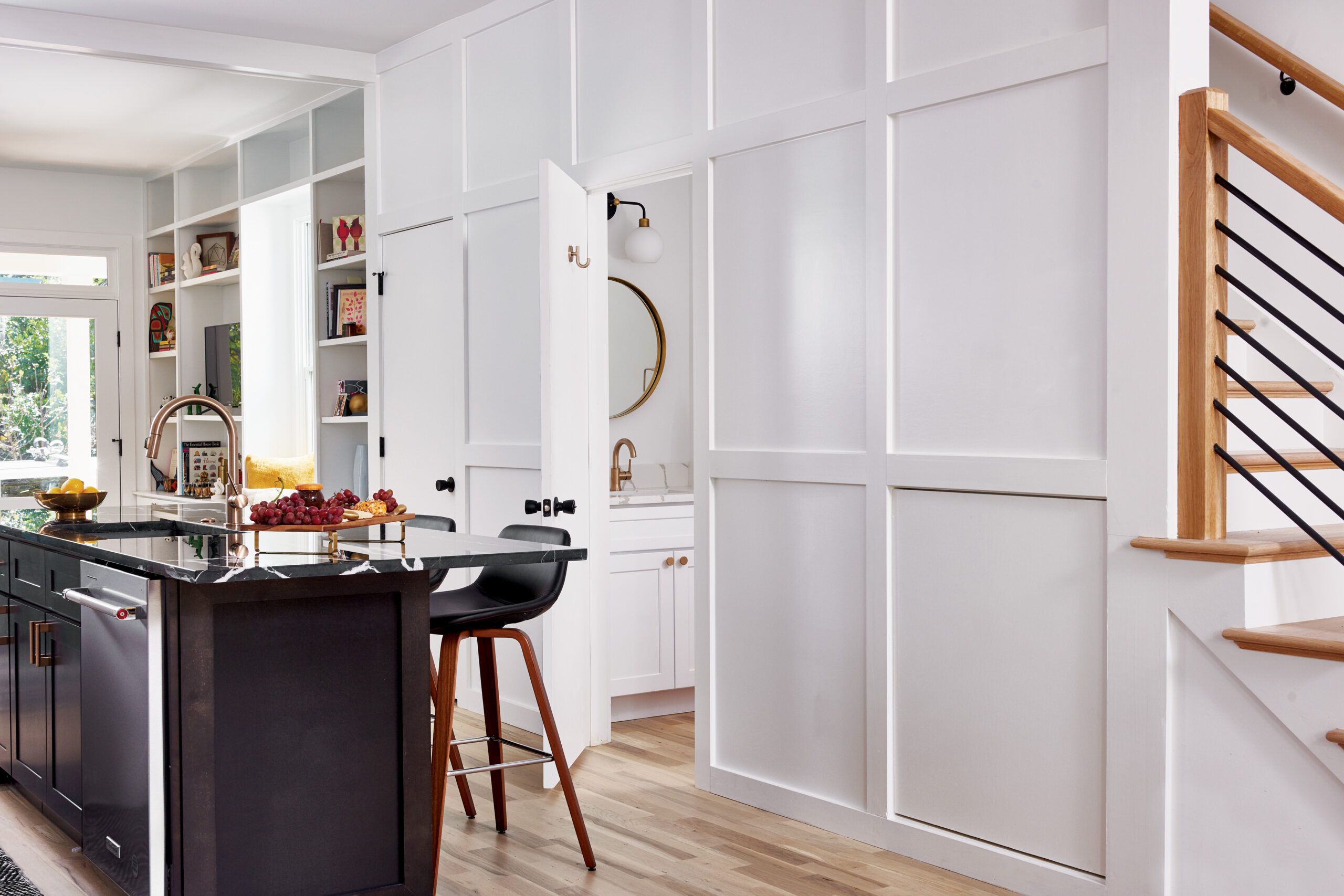
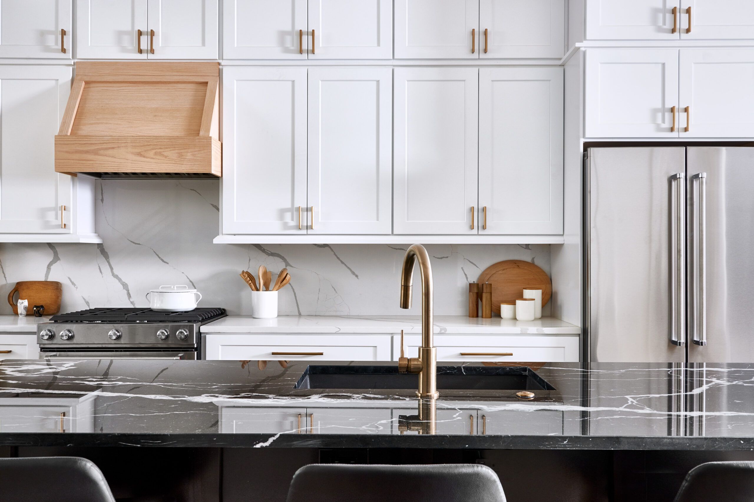
The central kitchen feels much larger than its footprint might suggest, owing to the lack of walls on either end. Food prep is confined to one side, which is fitted with white cabinets and matching quartz counters that continue up the backsplash. The contrasting island features a black-marble top and black cabinets, and holds a sink and a dishwasher—as well as seating for six. “I wanted a place where people could come in and congregate, and have it feel really comfortable,” Donna says.
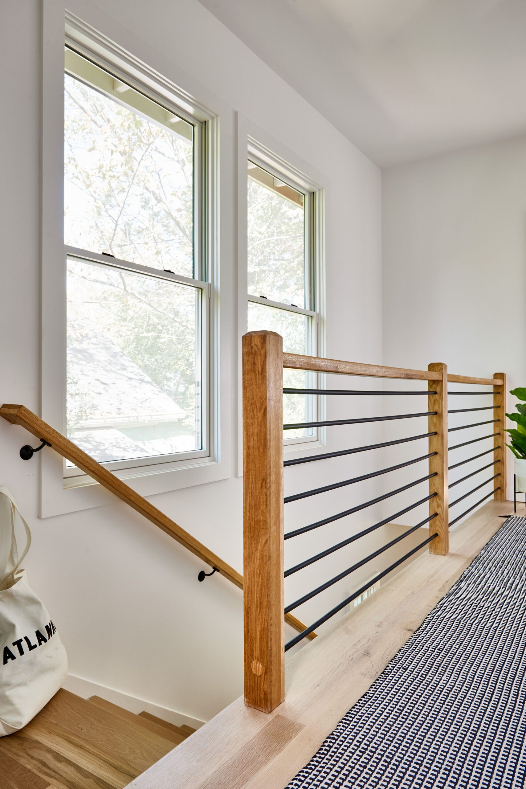
The new second-story addition is accessed from the family room via a staircase that hugs the side wall, leaving light and views unobstructed while preserving privacy from close-by neighbors. With the staircase rising in a single run, there was enough height to tuck a powder room and closet underneath it, behind doors that blend inconspicuously with the surrounding paneling.
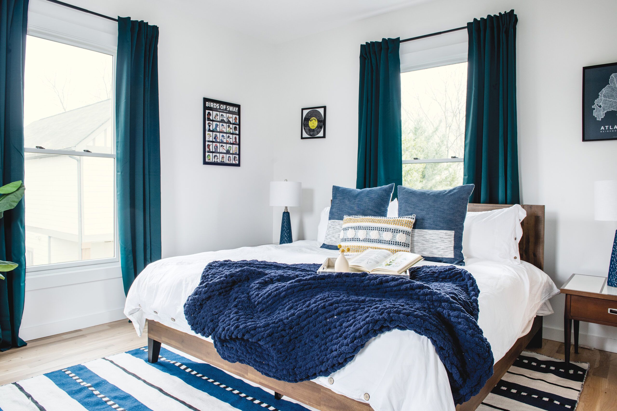
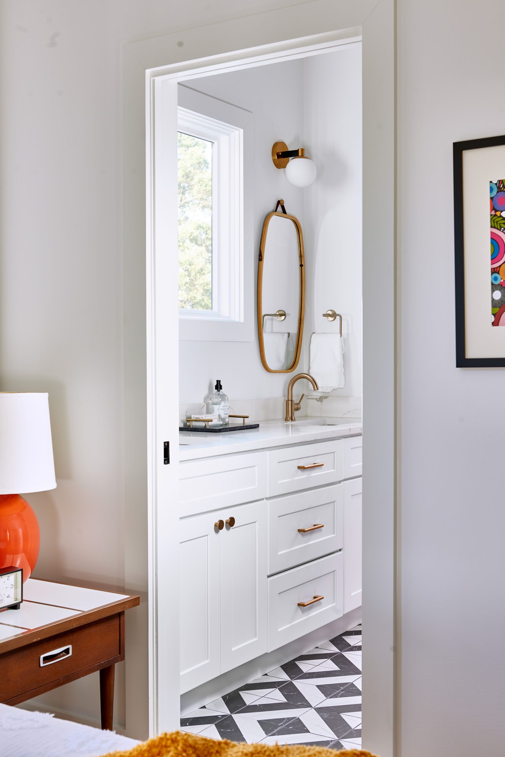
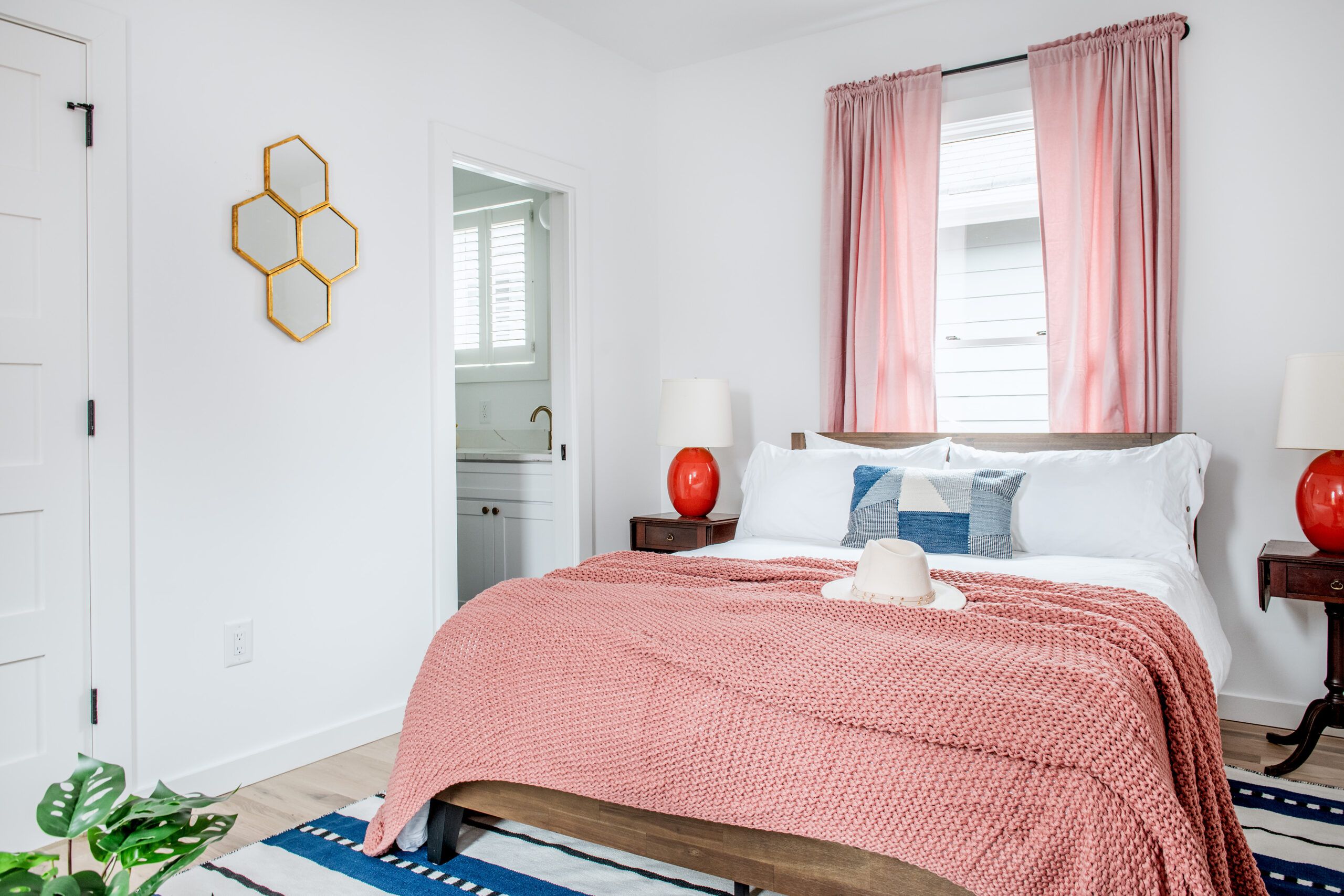
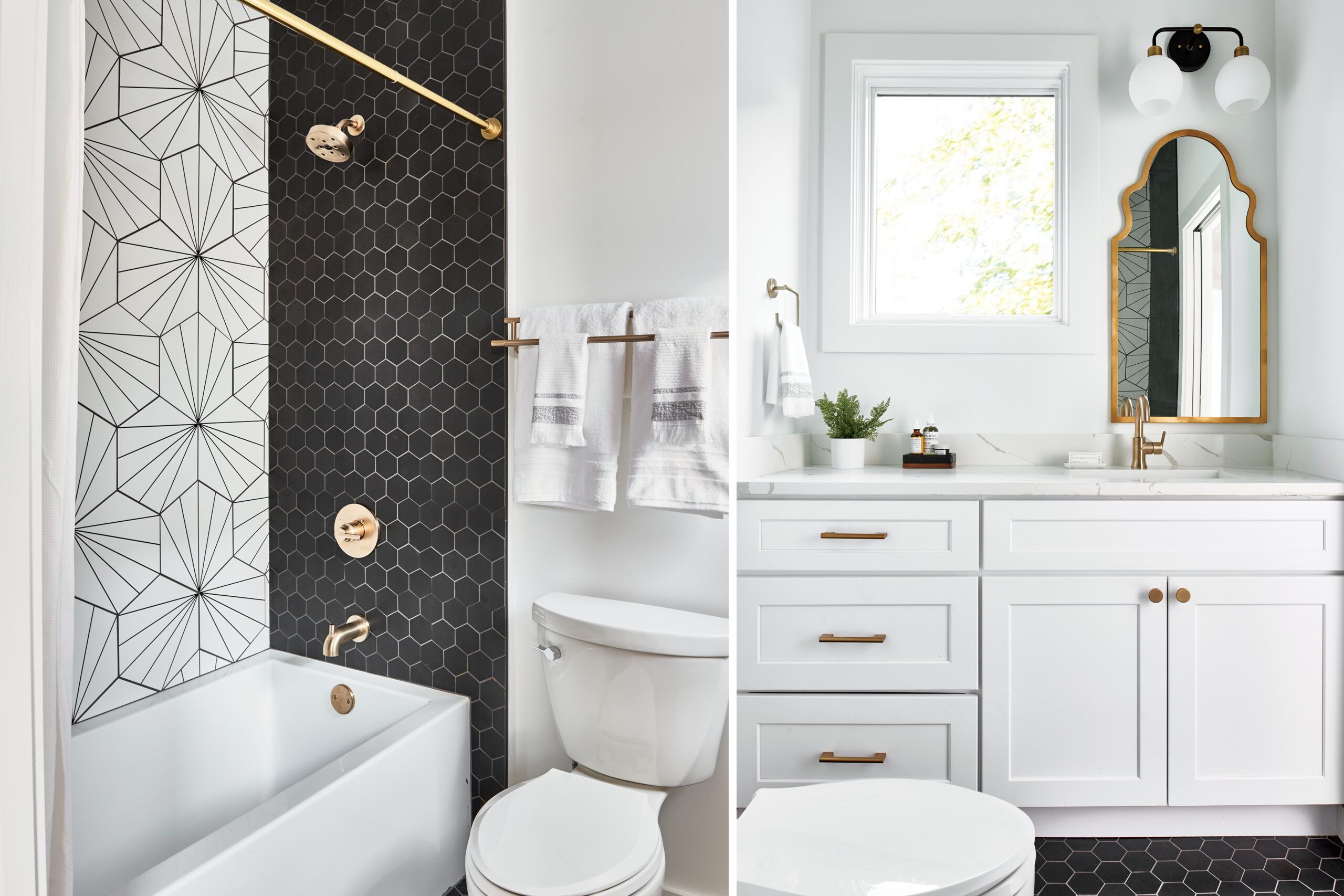
Upstairs, front and back bedrooms bracket a pair of bathrooms and a laundry closet. A hobbit-size hatch in the front bedroom provides access to a storage space carved out of the shotgun’s front gable, ensuring no space was wasted.


What was originally foreseen as a one-year construction project stretched to four years, owing to the need to secure historic-district approval and permits twice, as well as Covid-19 and its attendant supply-chain issues. Did the couple ever regret taking on the project? “Oh, multiple times!” Donna says with a laugh, adding that she’d probably think twice before tackling another renovation as complex as this one.
“But,” she adds, grateful to have the project complete at last, “the house looks beautiful.”
Floor Plans
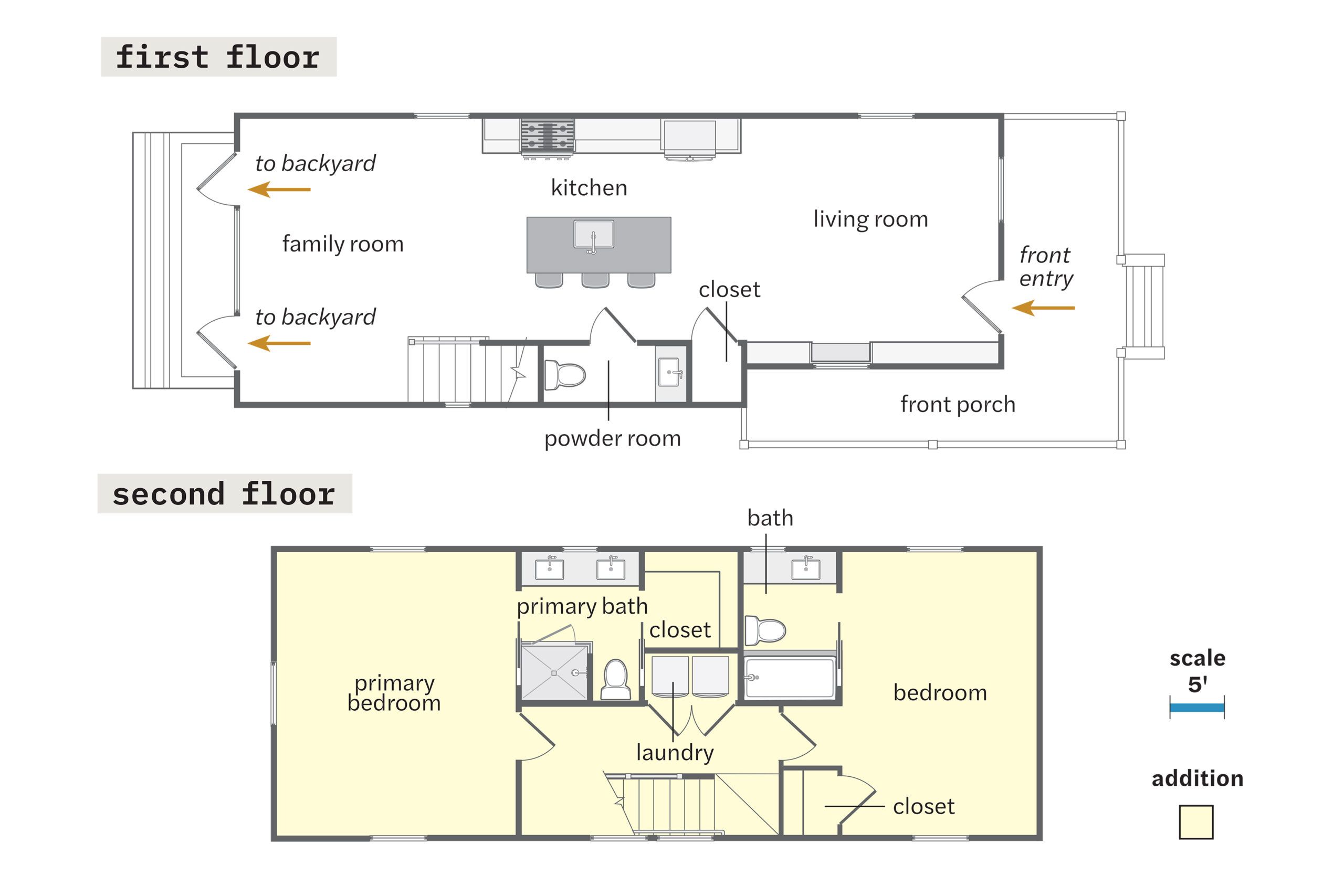
The existing 700-square-foot 1920s cottage was chopped up into small rooms, with one bedroom, one bath, and a fireplace with no evidence of a chimney. Eliminating the first floor’s interior walls created one large space that holds a living room, a kitchen, and a family room, distinguished through changes in wall treatments and ceiling heights. A powder room and a closet are tucked beneath a new staircase that leads to the 679-square-foot addition above, which features a primary suite at the rear, another bedroom suite in the front, and a laundry closet in the hallway between them.
