One way to create a kitchen that’s distinctly yours is to choose a color for the cabinetry that you really love. The trouble is, paint shades can go in and out of fashion fairly quickly, so you might want to ask yourself if the hue you’re drawn to today will hold your interest long term. While you can repaint cabinets yourself, a smooth finish requires careful, patient sanding between coats. No wonder most folks hope they won’t tire of the color or have the kitchen look dated in a few short years.
“There are always trends, especially with color. But when it comes to timelessness, think about meeting the space where it is rather than trying to force a style that isn’t congruent with the era,” says Portland, OR-based designer Stephanie Dyer, who has a background in historic preservation. “If you root your choices in the whole design and structure of the home, it ought to stand the test of time.”
Check out the cabinet color counsel from in-demand designers for help picking shades that reflect your personal taste and suit the era and style of your home for lasting appeal.
Trend-Proof Cabinet Colors
Bold black and white
“Black is the most timeless color, and it can work in a traditional or modern kitchen, but it must be used mindfully,” Dyer says. “Generally, I like the darker, more saturated color for base cabinets, which makes the space feel grounded, and everything above in a lighter shade. Black and white? Completely classic!” A bonus to this two-tone strategy: It makes a small kitchen with a low ceiling look larger.
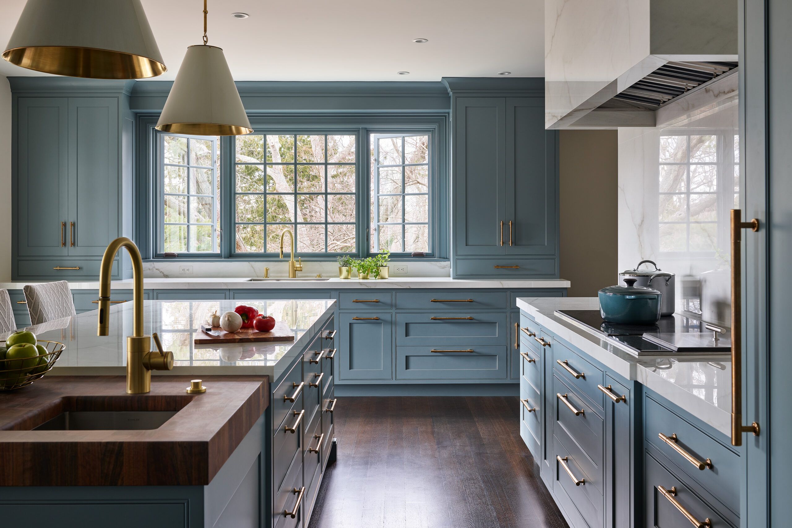
Beautiful french blue

Long associated with French country décor and design, this medium blue with subtle gray and/or green undertones is intimate and inviting—ideal for a cozy yet elegant kitchen. A great version of this color is Sherwin-Williams’ Delft—a favorite of Indianapolis-based interior designer Tiffany Skilling—which is inspired by the Dutch pottery of the same name. “This shade of blue is sure to have longevity, just as the popular pottery, which has been around since the 1600s!” Skilling says.
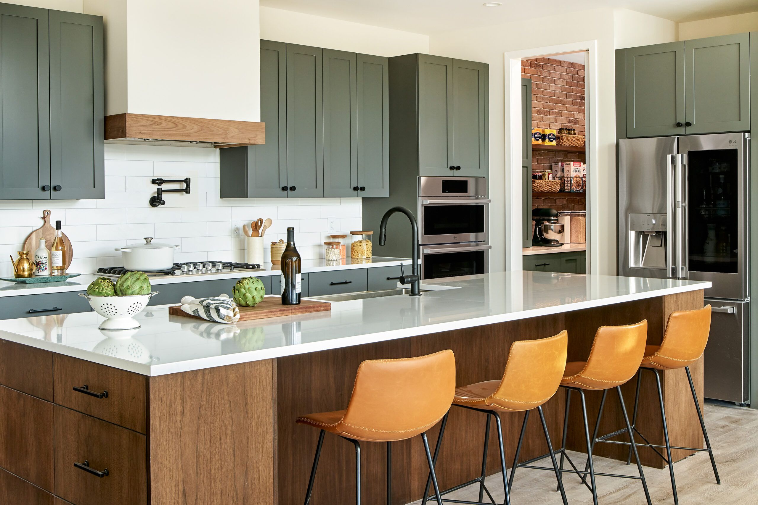
Tasteful greens

Greens are having a major moment in kitchen cabinetry. The right shade of green can often look like its an original component of a woodsy Craftsman or cabin-style home. The variety of greens is vast—just keep in mind that some may have an expiration date. A bright, lively Kelly green may grab your attention now but are you sure you’ll want to wake up to it every morning? Subtle picks like jade and sage, or Sherwin-Williams’ Rosemary if you want to go darker, are easier on the eyes. “A soft, subdued green is soothing and doesn’t overwhelm a space,” Skilling says.
Earth tones forever!
“Colors that are more complex and dynamic tend to be more timeless than primary colors and other straightforward brights,” Dyer says. For staying power, perhaps pick terracotta or ochre over citrus-y yellow or orange. These earthy hues can be pure perfection in the kitchen of a Southwestern- or Mediterranean-style house.
Deep purple drama
Eggplant makes a bold statement yet keeps it classic, in both modern and traditional settings, thanks to its rich, complex quality. Dyer recently used the dark, moody shade in the cook space of a modern home—but rather than paint, the cabinets are composed of plastic laminate that’s ultra durable and resistant to stains.
A winning wine
“I opted for burgundy for my own kitchen cabinets, knowing it would be timeless because I took it from a tone in my dining room’s antique wall covering,” Skilling says. Indeed, vintage materials can be a great inspiration: If the colors used way back when are still around, chances are, they’ll continue to have longevity in the kitchen of a colonial or other traditional architecture style. The effect: cabinet color that feels like it’s always been there.
White alternatives

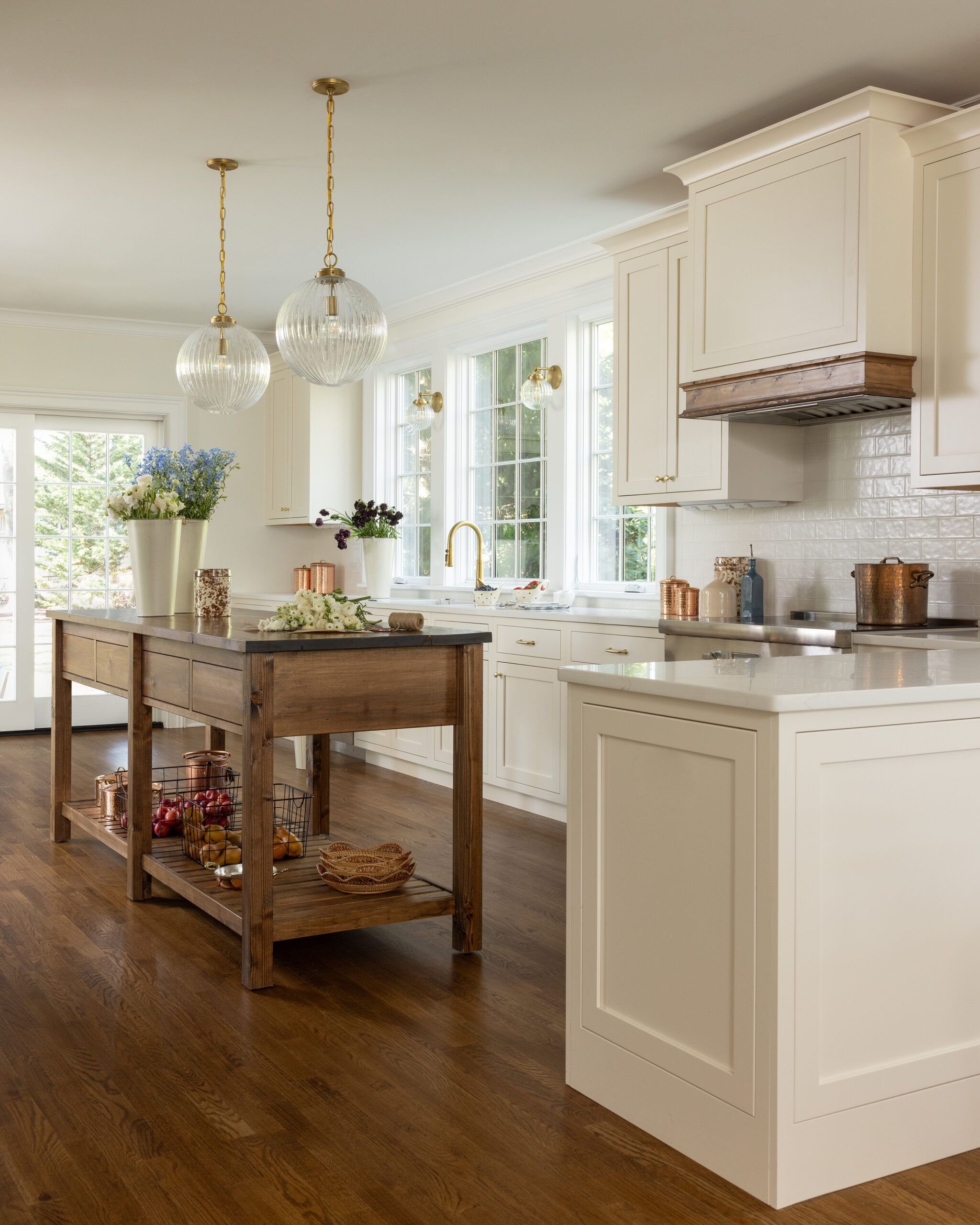
Bright white may be a no-brainer—both classic and currently popular—but Charleston, SC-based interior designer Christyn Dunning-Gauss of The Guest House Studio leans in to softer shades. “Bright white can feel cold and devoid of personality,” Dunning-Gauss says. “Off white—such as Sherwin-Williams’ Alabaster or Benjamin Moore’s White Dove—is truly timeless and has a warmth that makes it approachable and welcoming. Plus, it translates well with a wide range of countertop, hardware, and tile choices.”
Timeless tan and taupe
Dunning-Gauss also turns to subdued neutrals such as tan or light taupe for a sophisticated “forever” feel. “Sherwin-Williams’ City Loft and Benjamin Moore’s Natural Cream are beautiful classics that can be easily combined with other colors in the cook space,” she says, adding: “For a brighter look, have them mixed about 50 percent lighter.”
Classic blue and white
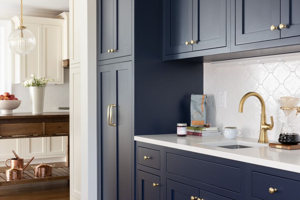
Designers often hear clients say that they want a kitchen that looks crisp and clean—and Dyer favors the duo of white with cool blue, like Benjamin Moore’s Providence, to foster that feeling. A slate blue with dark gray undertones, it’s subtle, chic, and not about to fall out of fashion any time soon. The combo can work in a host of settings yet brings the blissfully breezy atmosphere so desirable in a beach house.
What Else to Consider When Picking the Right Paint for Your Cabinets
The colors that hide stains best
Busy kitchens are spill zones, especially with multiple home chefs and/or little kids around, so you’re smart to wonder what colors best conceal spots and smears. Such cooking accidents practically disappear on stained wood cabinets, but if opting for paint, darker shades are less likely to reveal messes, so consider the camouflaging power of smoky blue or pewter gray. “Steer clear of ultra bright white—it shows literally everything!” Dunning-Gauss warns.
What works well with wood
Natural wood is classic in the kitchen—be it for flooring, a countertop, a built-in hutch, and of course, cabinetry—and the right shade of paint can be a lovely complement. You may want to think about pairing wooden upper cabinets with colorful lower cabinets, for instance. The caveat? The shade must vibe with the wood species and stain. “I love how deeper hues—black, navy, and dark greens—look with walnut,” says Dunning-Gauss. “With white oak, avoid colors with a yellow undertone—that means yellow, orange, and most reds.”
Supersize your swatches
It can be challenging to read a color’s true nature from small sample swatches and photos, so designers often recommend buying a smallest size of the paint and testing it out by brushing it on one area to see how it looks as light changes throughout the day. Skilling has become a fan of something even simpler, a peel-and-stick product called Samplize, which features paint shades from the brands Benjamin Moore, Farrow & Ball, PPG, and Sherwin Williams. Order swatches of the colors you’re considering and study them in the space for a while to determine which ones work best and hold your interest.

