BEFORE | Busy Cookspace
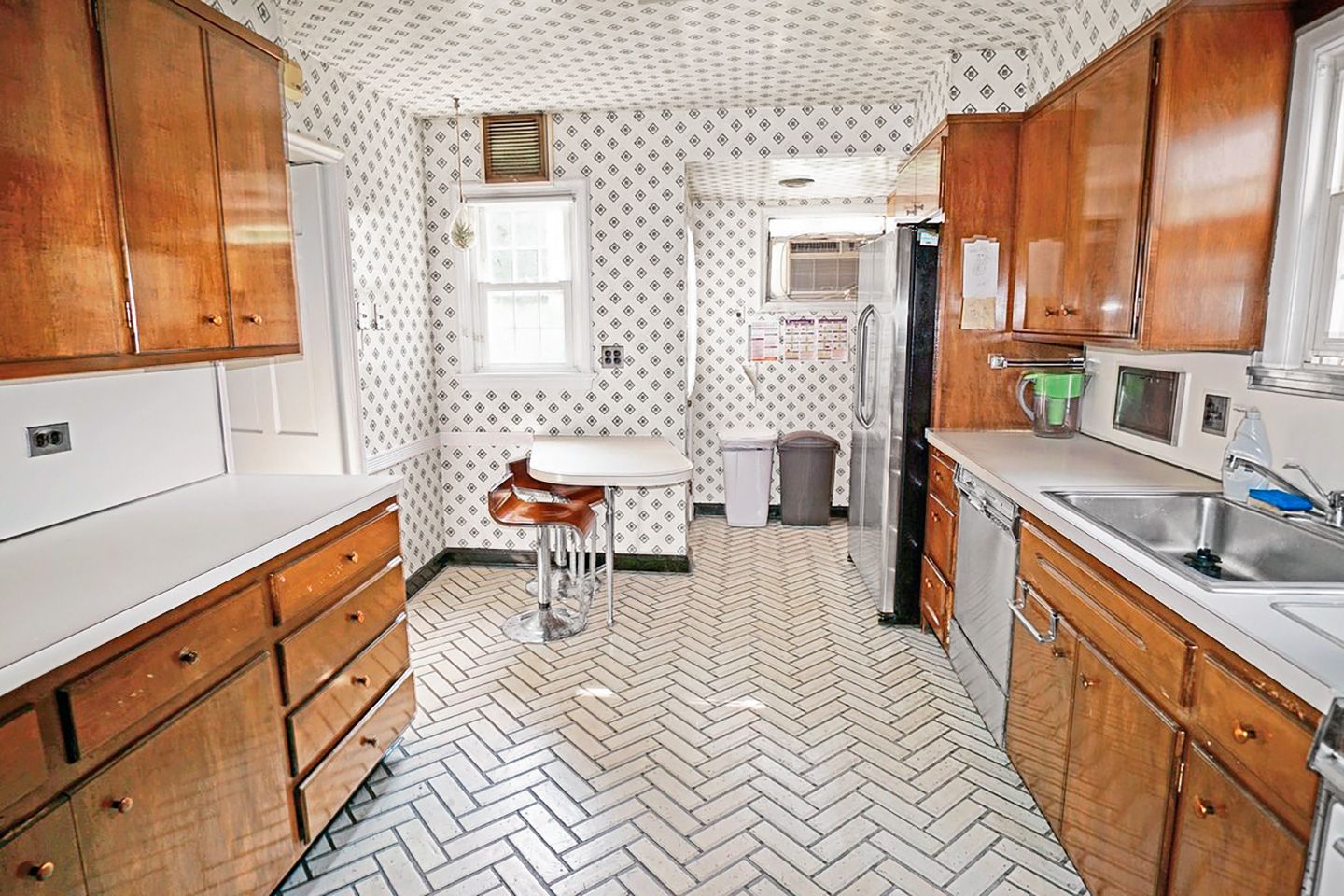
Live with it for a year. That standard advice to new homeowners—allow enough time to get a solid sense of what you want from a remodel—just didn’t work for Melissa and Dheeraj Maria. The kitchen that came with their 1936 Colonial Revival in New Rochelle, NY, was so unlivable, they had to act fast. “The range and dishwasher were broken, the fridge wasted space, and a peninsula blocked the dining room,” says Melissa. Plus, geometric wallpaper and herringbone vinyl flooring were migraine inducing. “It was painful,” says Dheeraj. “We avoided going in there.”
Shown: Busy patterns wrapped the room; old maple cabinets felt dreary. Lining one wall with all the appliances wasn’t the smartest use of space.
AFTER | Open Efficiency
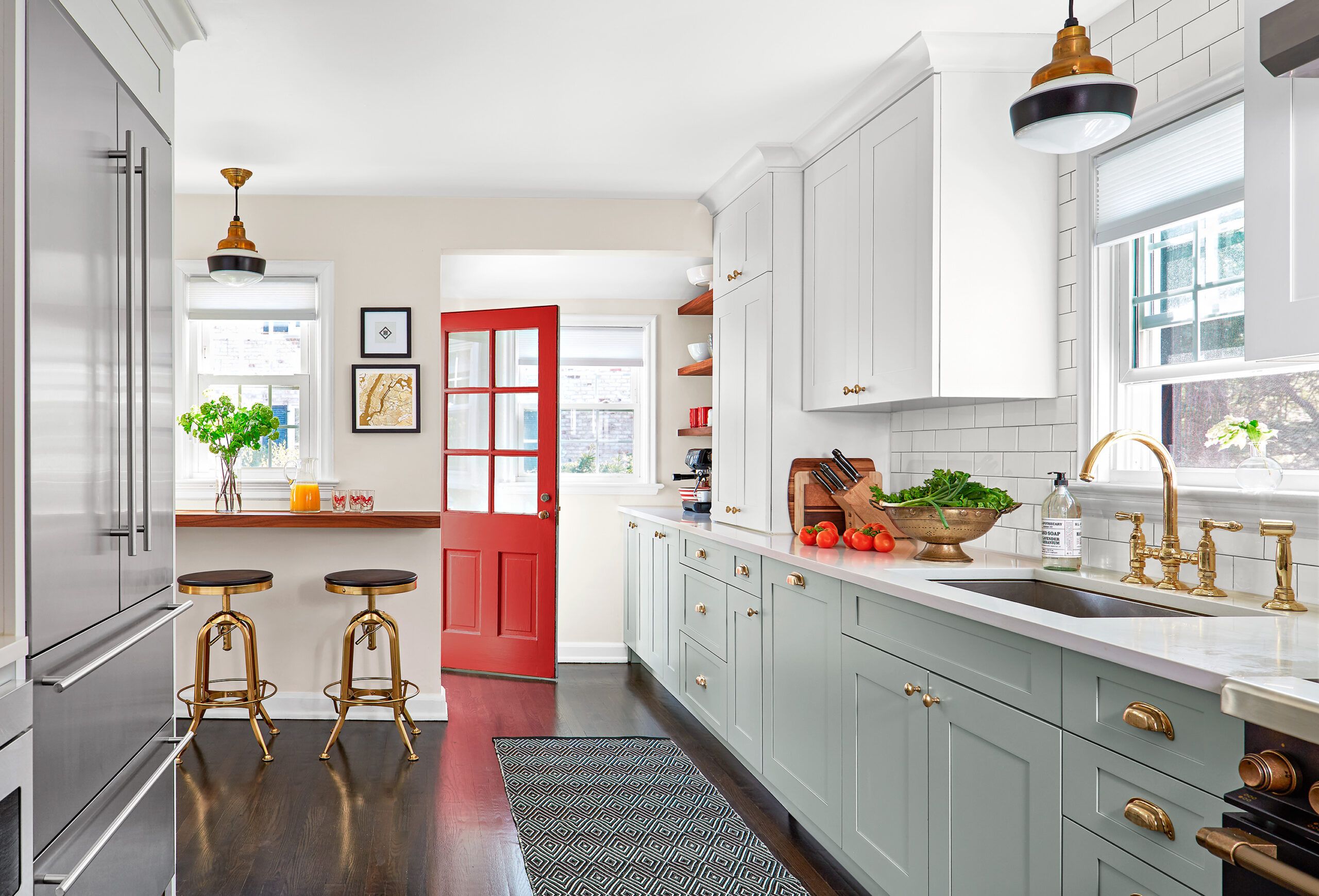
So the couple designed their dream kitchen. Staying within the footprint of 166 square feet, they relocated the fridge, added a coffee station, and scrapped the peninsula for a wall-hung breakfast bar. Dheeraj enlisted a friend to help empty the space and rip up the floor; they hired a contractor for the rest.
Gray base cabinets, white quartz counters, and classic subway tile make a refreshing change from the once dizzying decor. And did we mention they pulled off the transformation in six weeks? A major time-saving trick: They chose semi-custom cabinets rather than custom. But that didn’t mean sacrificing on efficiency—or style. Says Melissa, “We love how warm and inviting the kitchen is now.”
Shown: With a functional work triangle, a breakfast bar, and a coffee station, the room is more open and efficient. Bold brass accents create a warm contrast with clean white and soft gray cabinets.
Cabinets: Touchstone Fine Cabinetry
Cabinet layout: KBS Kitchen & Bath Source
Cabinet install: Cutelo Construction, New Rochelle, NY
Paint: Cliffside Gray (base cabinets); Benjamin Moore, Alabaster (walls) and Antique Red (exterior door); Sherwin-Williams
Windows and door: United Windows and Doors Series 4800; Lowe’s
French-Door Fridge
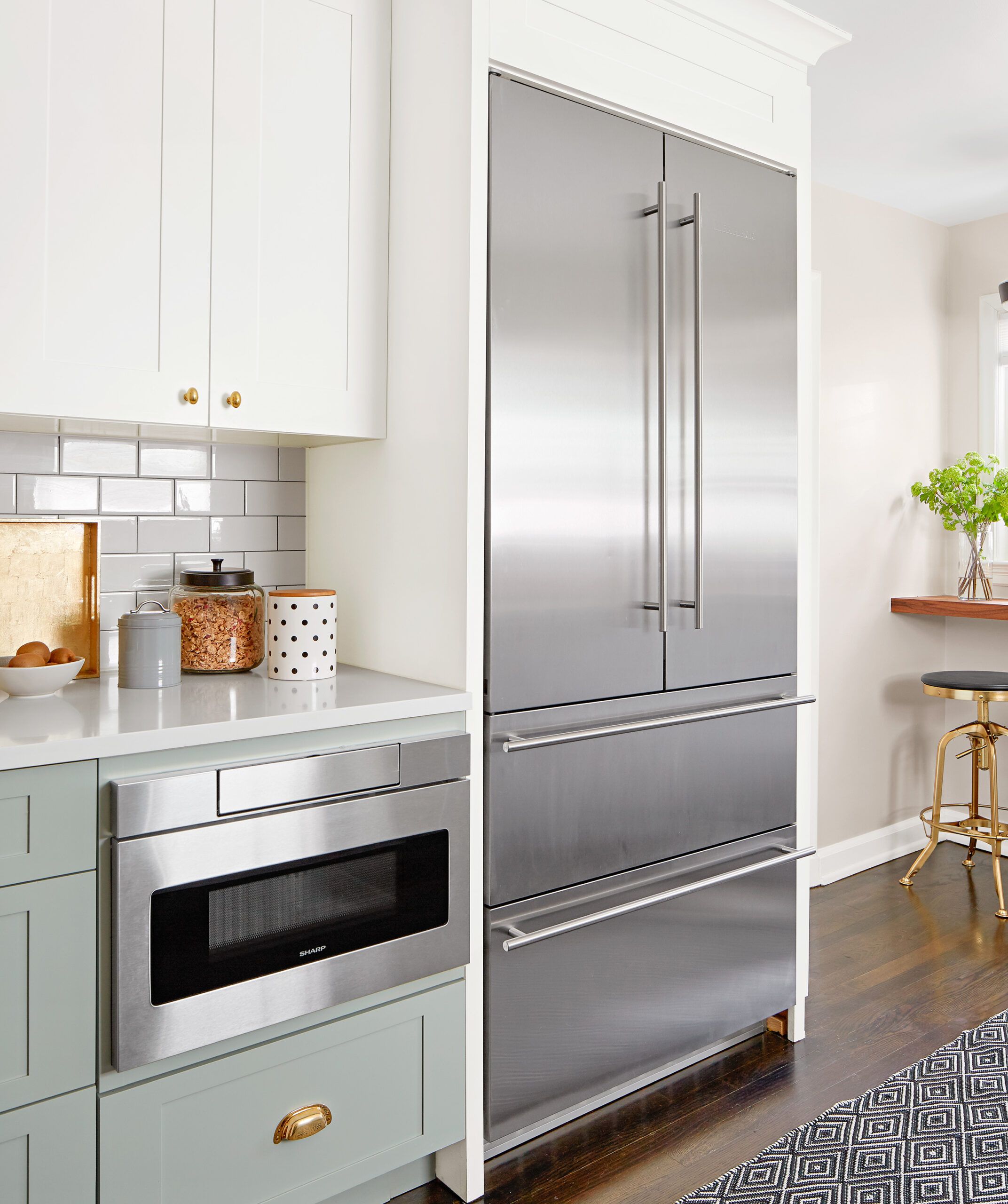
The couple saved about $2,000 by doing the demo themselves, then splurged on high-end appliances. “The French-door fridge doesn’t block traffic or doorway access,” Melissa says.
Refrigerator: Liebherr
Built-in microwave: Sharp
Dramatic Contrast
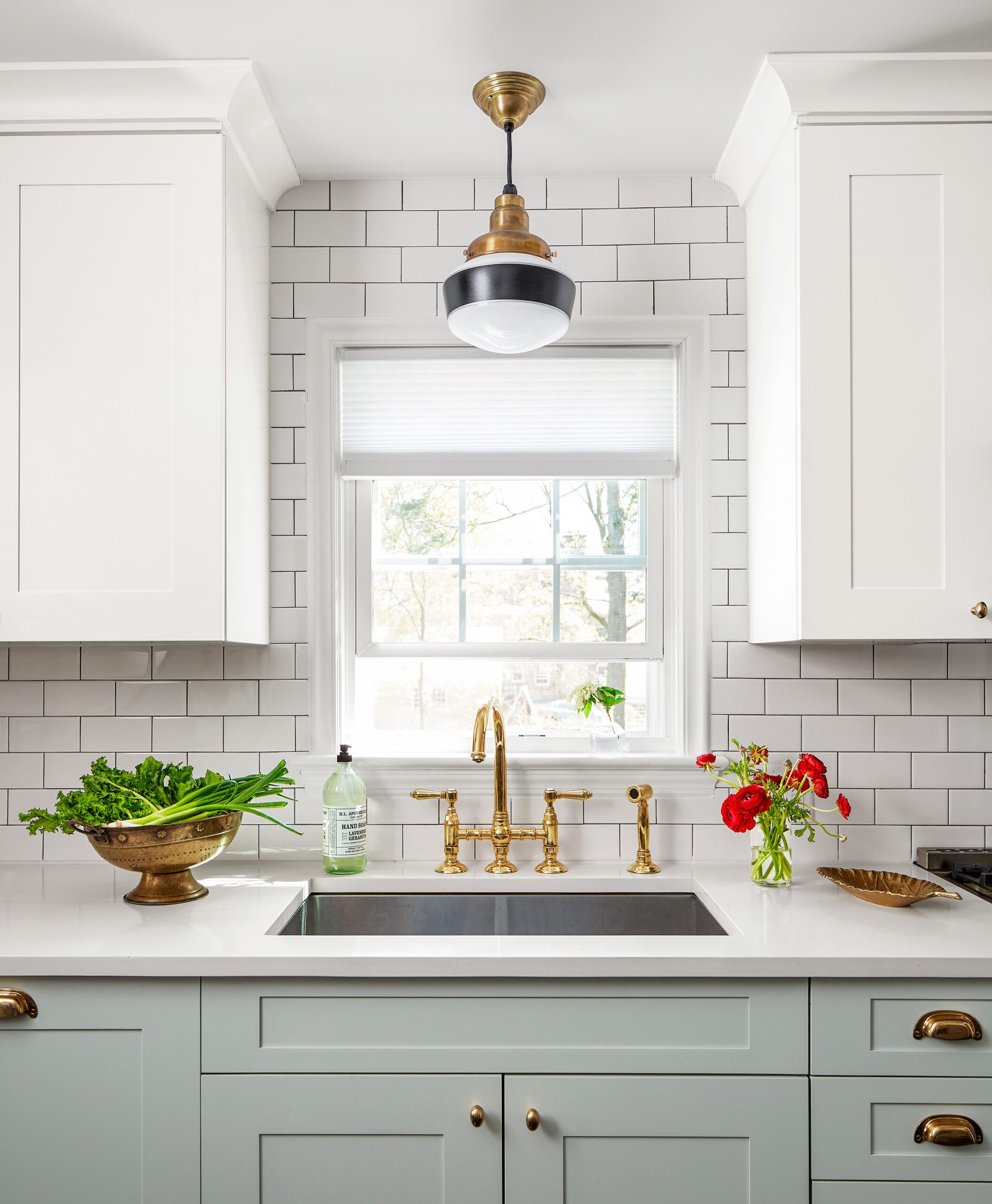
A brass faucet and cabinet hardware offer a dramatic contrast to the neutral surfaces in the room.
Faucet: Rohl
Sink: Kohler
Meet the Family

To stay on schedule, “we had everything delivered in advance to avoid installation holdups once the cabinets arrived,” says Melissa Maria, here with Dheeraj and son Dhilan, now 19 months.
High-Tech Six-Burner
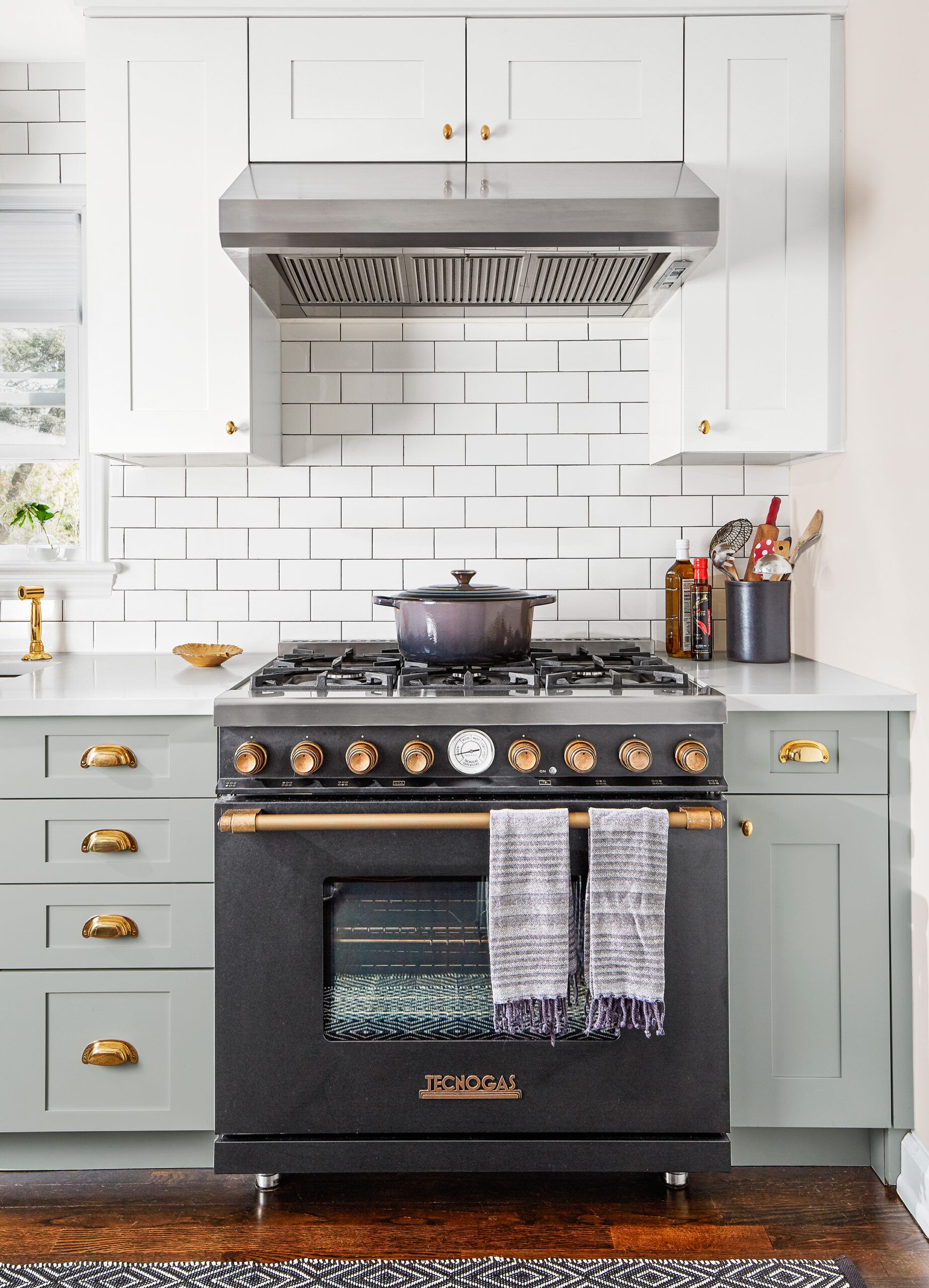
A brass-accented black-steel range suits the 1930s house, but this six-burner also boasts high-tech features such as an airflow system that keeps knobs, handles, and exterior surfaces cool to the touch—crucial with curious little fingers around.
Range: Tecnogas
Vent hood: Faber
Perfect Nook
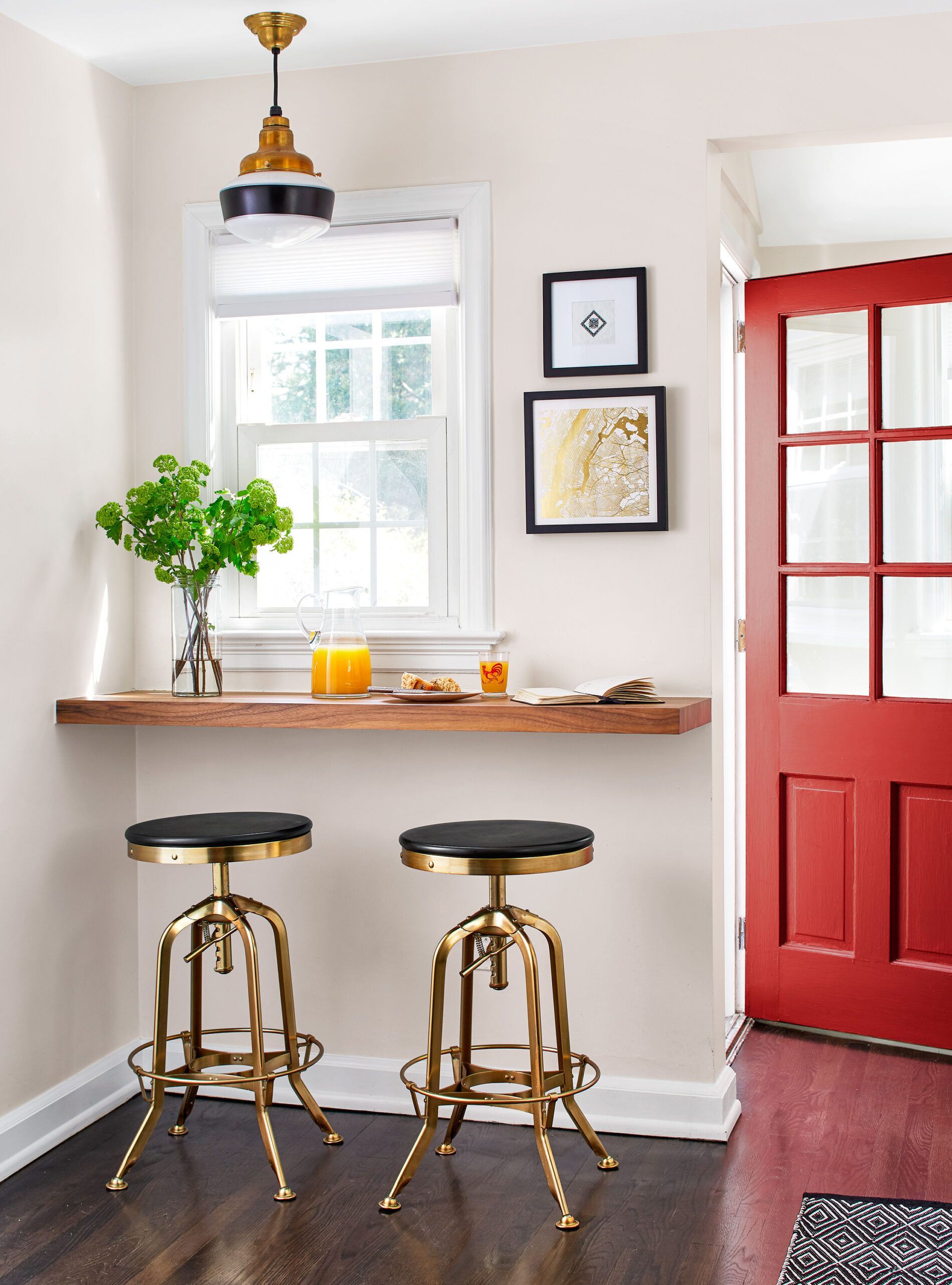
A floating shelf made from walnut butcher block and tucked between the back door and the dining room entry makes a perfect breakfast spot that doesn’t obstruct traffic.
Walnut butcher block: Rustica Hardware
Ceiling light: Barn Light Electric
Stools: Restoration Hardware
Oak flooring: Home Depot
Ebony floor stain: Minwax
Room to Brew
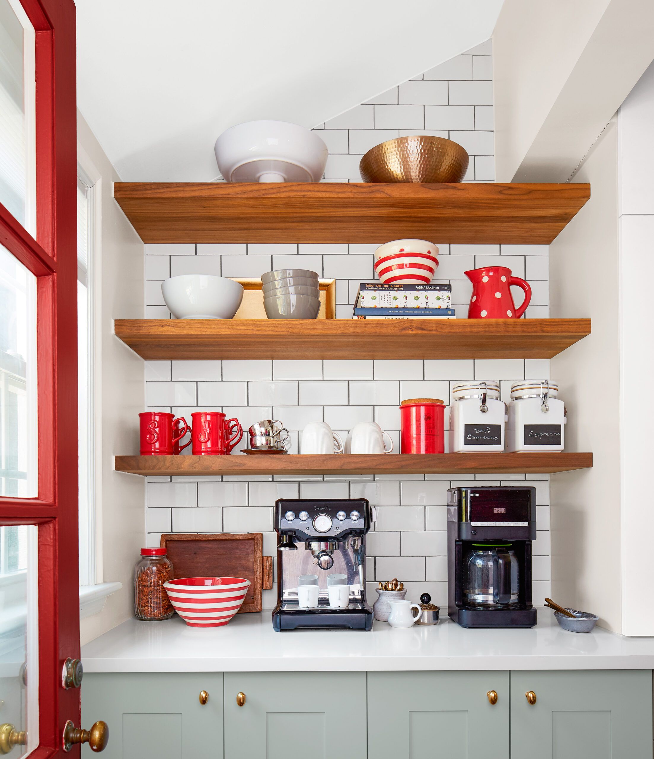
The corner across from the back door is now devoted to the couple’s coffee cravings. Counter space offers room to brew; ample open shelves keep cups, canisters, and the like close at hand. Base-cabinet rollouts hold bulky items.
Subway tile: Lowe’s
Breathing Room
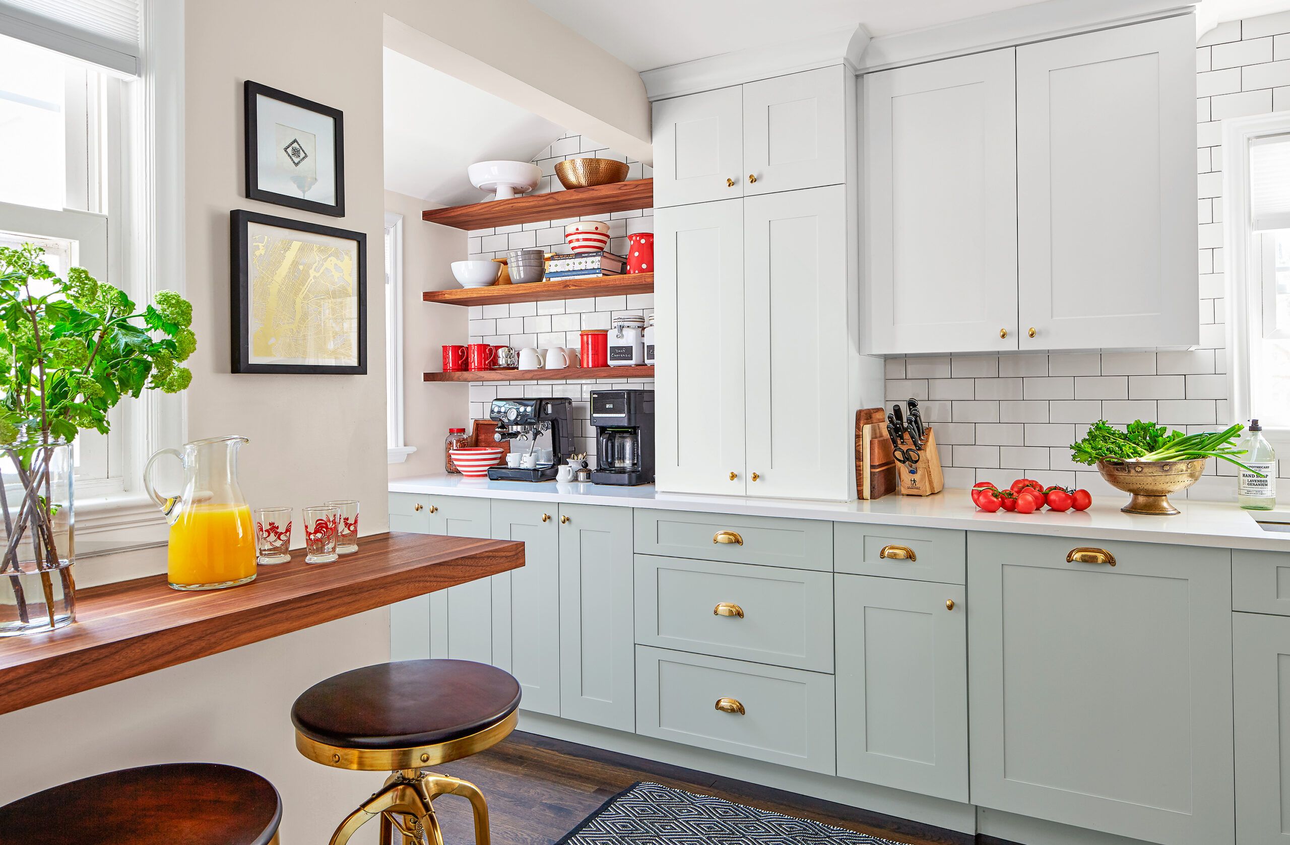
A deep full-size refrigerator previously blocked access to what is now the corner coffee station. Open shelves give the kitchen some breathing room.
Quartz countertops: Big Apple Granite
Hardware: Rejuvenation
Before Floor Plans
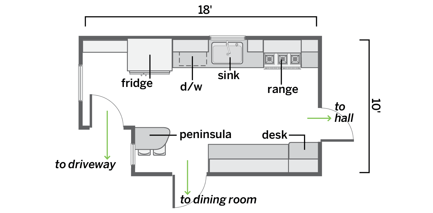
A full-size fridge closed off a back corner, and a table-height peninsula blocked the path to the dining room
After Floor Plans
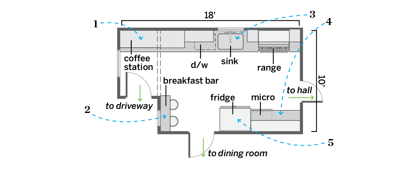
The new fridge placement created a functional work triangle in the 166-square-foot space; placing the breakfast bar against the wall improved flow.
1. Tapped an underused corner for a coffee station with open shelving and base cabinets with pullouts.
2. Replaced a traffic-stopping peninsula with a 15-inch-deep wall-mounted breakfast bar for unimpeded access to the dining room.
3. Kept the dishwasher, sink, and range in their same convenient locations.
4. Scrapped a built-in desk in favor of more counter space, banks of drawers, a built-in microwave, and more upper cabinets.
5. Moved the fridge across from the sink to create a work triangle and free up a corner.

