BEFORE | Tight Space
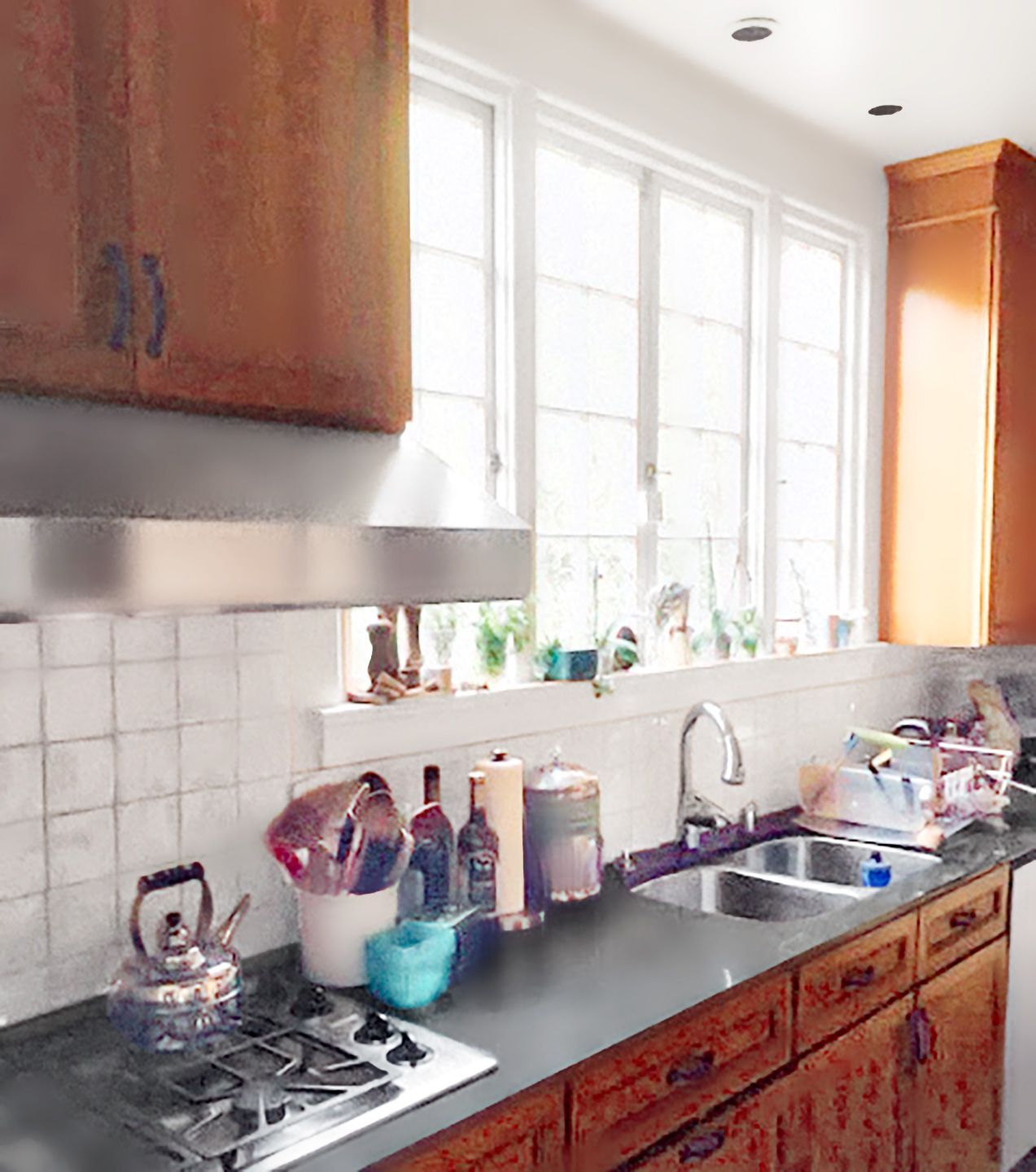
To butcher a famous phrase, a house divided can be a drag. For Sarah Postyn and Carl Goldberg, the small, narrow kitchen in their 1926 Tudor in Oakland, CA, was hemmed in by a breakfast room, a laundry room, and an underused full bath. Dark, dated finishes didn’t help. “We wanted more prep area and space to congregate when we entertain,” Carl says.
Shown: Dark cabinets and counters made the narrow galley space—less than 9 feet wide—feel even tighter.
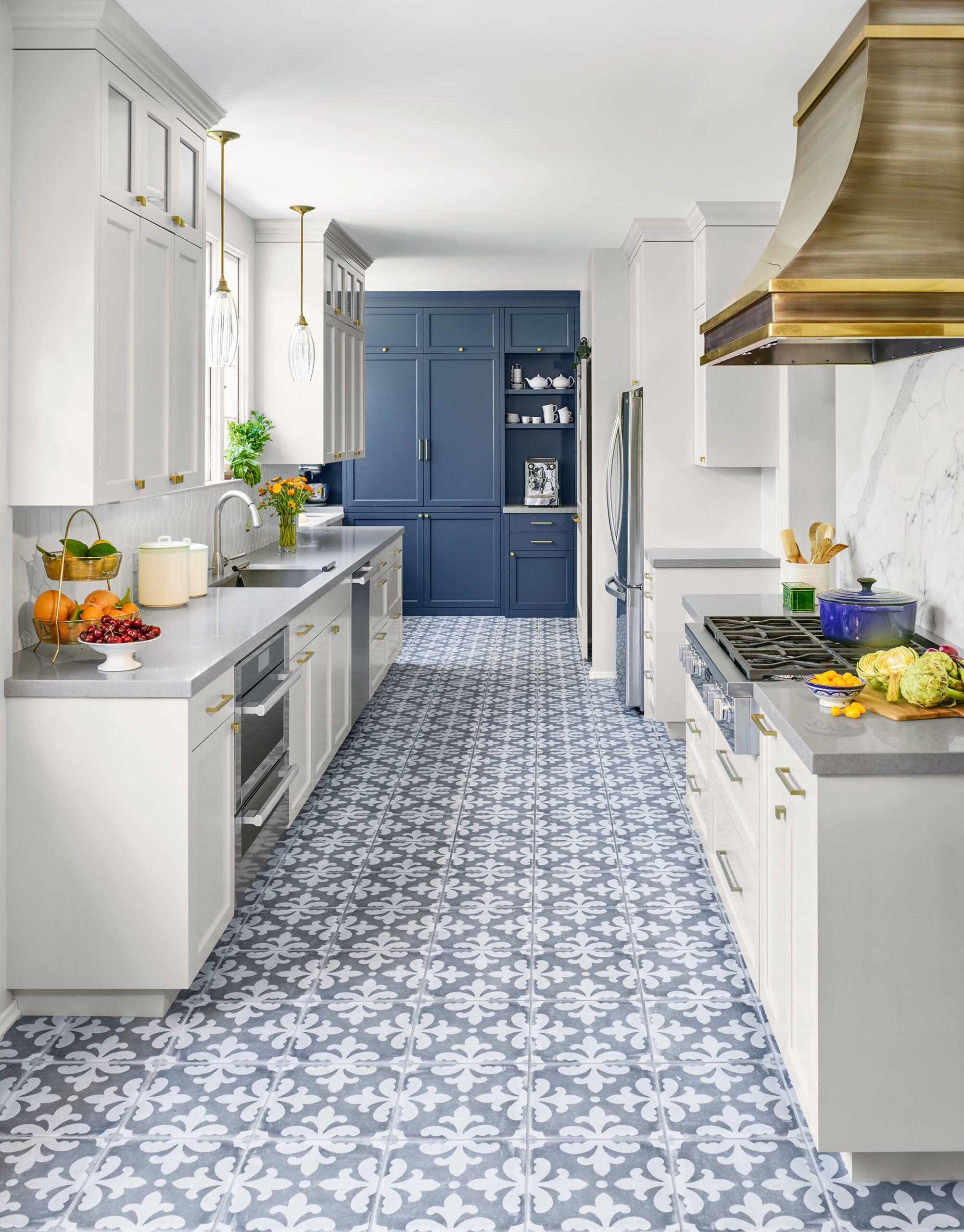
AFTER | Efficient and Welcome

Designer Nicole Yee found an extra 123 square feet by annexing the spaces at either end of the room and removing the bath’s tub. The former laundry now hosts baking and coffee stations, with a roomier pantry and a washer/dryer in the old tub alcove. A movable island in the breakfast area doubles as a bar for guests. White paint keeps the room light and airy, while patterned floor tile, a wall of blue cabinets, and an orange island jazz things up. “Better workspace, flow, and storage make cooking easier every day,” says Sarah. “And parties now are much more fun!”
Shown: Extra prep space on either side of the cooktop, light-reflecting surfaces, and ample room annexed at either end make for an efficient, welcoming kitchen—just right for a pair of avid home cooks and their two teenage sons, as well as their guests.
Architect: Jack Backus, Oakland, CA
Designer: Nicole Yee, Oakland, CA
Sink: Julien
Faucet: Rohl
Top Brass
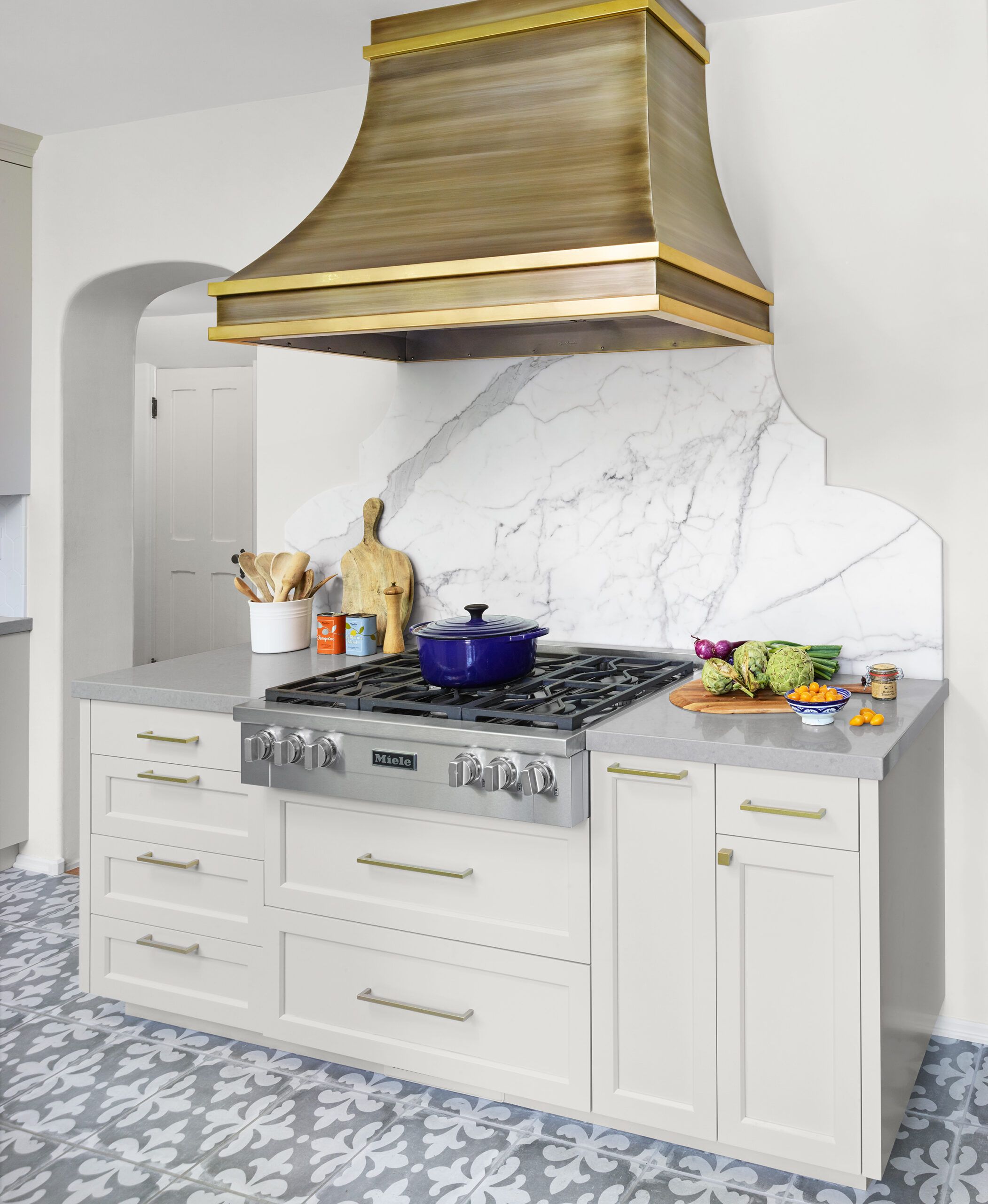
“We wanted something visually interesting but not too busy,” says Carl of the brass-trimmed-zinc vent hood with an antiqued finish. Landing space on either side of the six gas burners helps streamline meal prep.
Paint: Shoreline (cabinets); Benjamin Moore
Vent hood cover: Mio Metals
Vent hood insert: Vent-A-Hood
Cooktop: Miele
Marble Backsplash
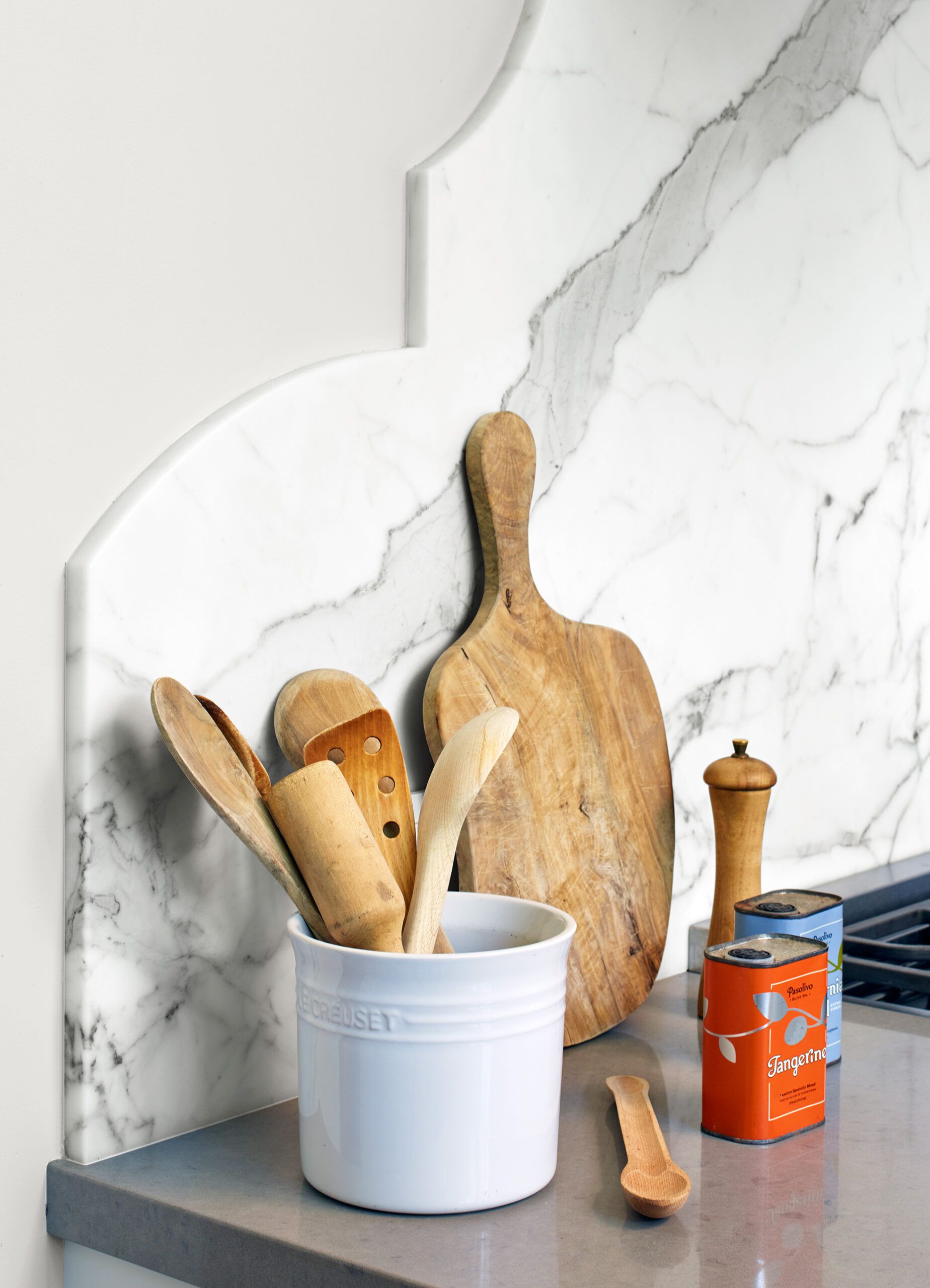
The curves of the dramatically veined Calacatta marble backsplash subtly echo the arched doorway and the pattern on the floor tile.
Quartz countertops: Caesarstone
Bake Station
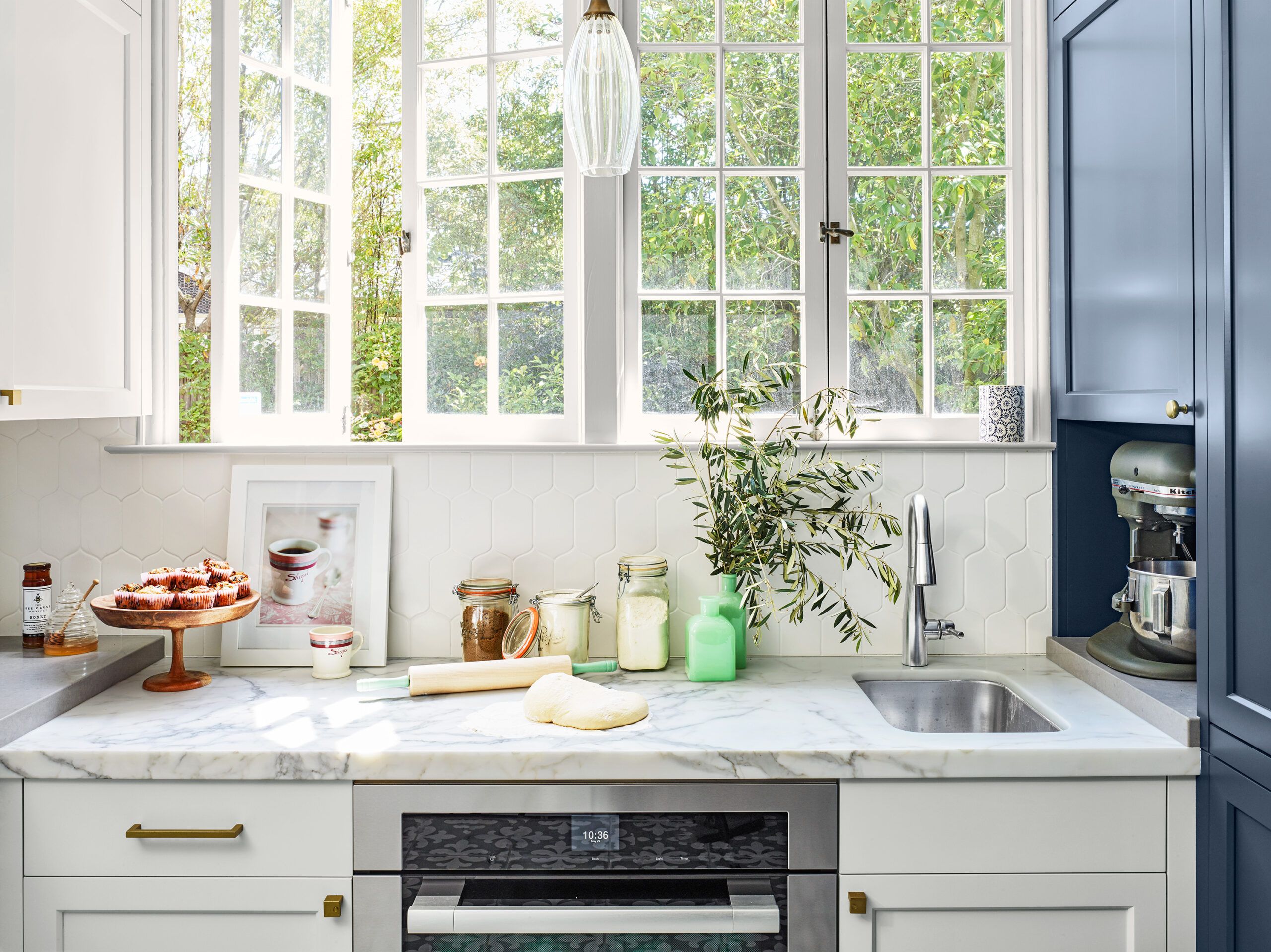
The baking station has a marble countertop for rolling out dough, a second oven, and a prep sink. “Cleanup is so much easier having the sink right there,” says Sarah. “And when Carl is at the main sink, I have access to water for another cooking project.”
Sink: Franke
Faucet: Delta
Glass pendant: Metro Lighting
Sliding Barn Door
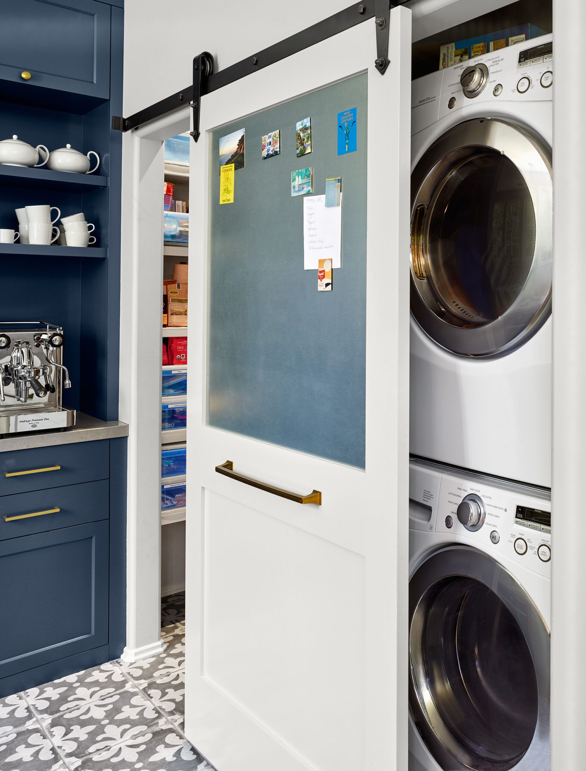
A barn-style sliding door hides the laundry machines when not in use without obstructing traffic the way a swinging door would. It holds a magnetic board that serves as a family message center.
Sliding-door hardware: MacMurray Pacific
Washer and dryer: LG
Home Office
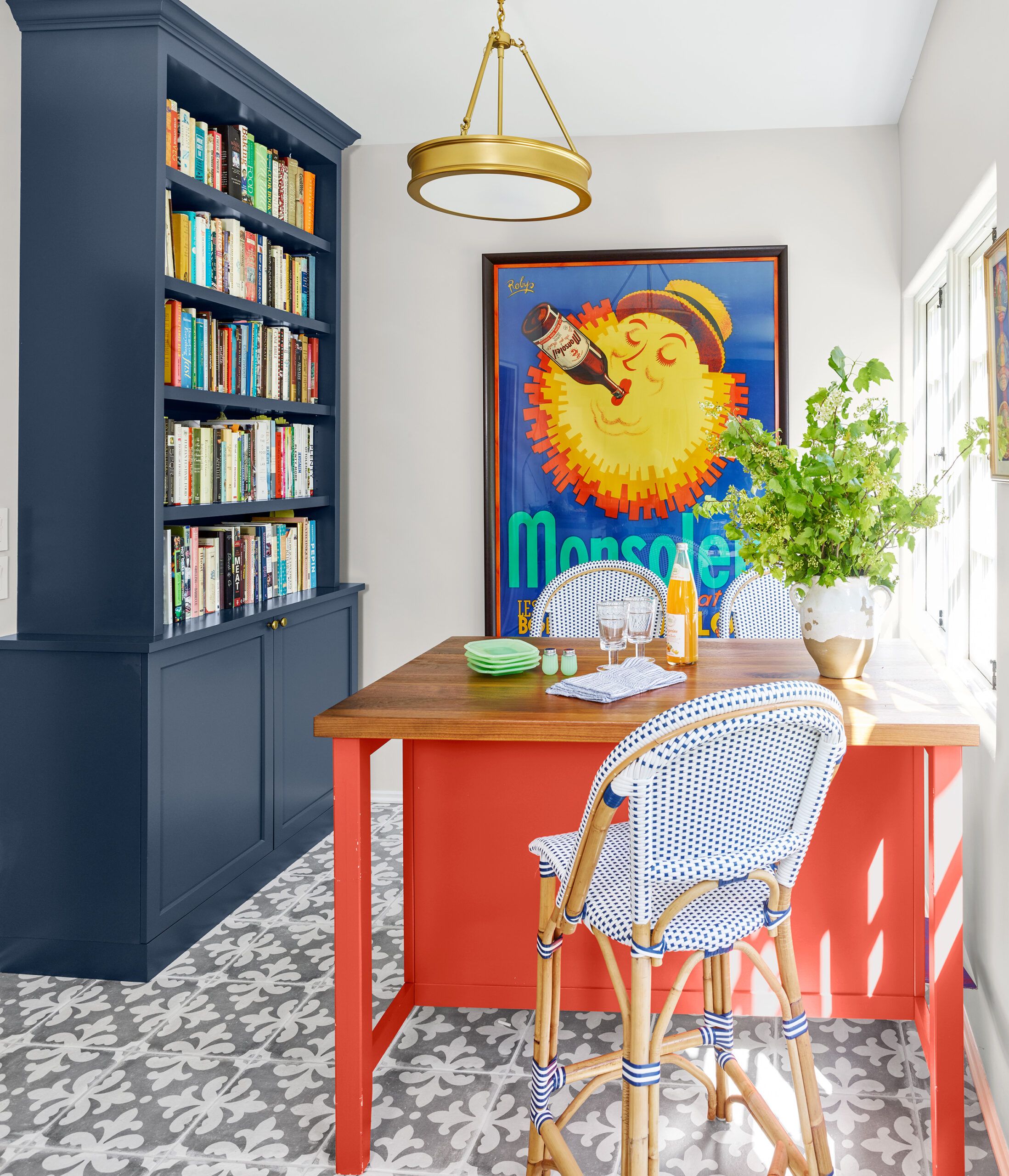
In what had been the breakfast room, a new kitchen island functions as a home-office desk for daily use and a cocktail station when company comes over. “The black walnut top feels so warm and inviting, it’s ideal for people to gather around,” says Carl.
Paint: Warm Comfort (island), Newburyport Blue (shelves); Benjamin Moore
Island top: Craft-Art
Floor tile: Bedrosians Tile & Stone
Pendant: Shades of Light
Homeowners

Homeowners Sarah Postyn and Carl Goldberg worked with their designer to allocate space for everything—glasses, dishes, small appliances, trays, flatware—on the floor plan. That way, once the work was done, they knew exactly where each item would go.
Wall-To-Floor Cabinets
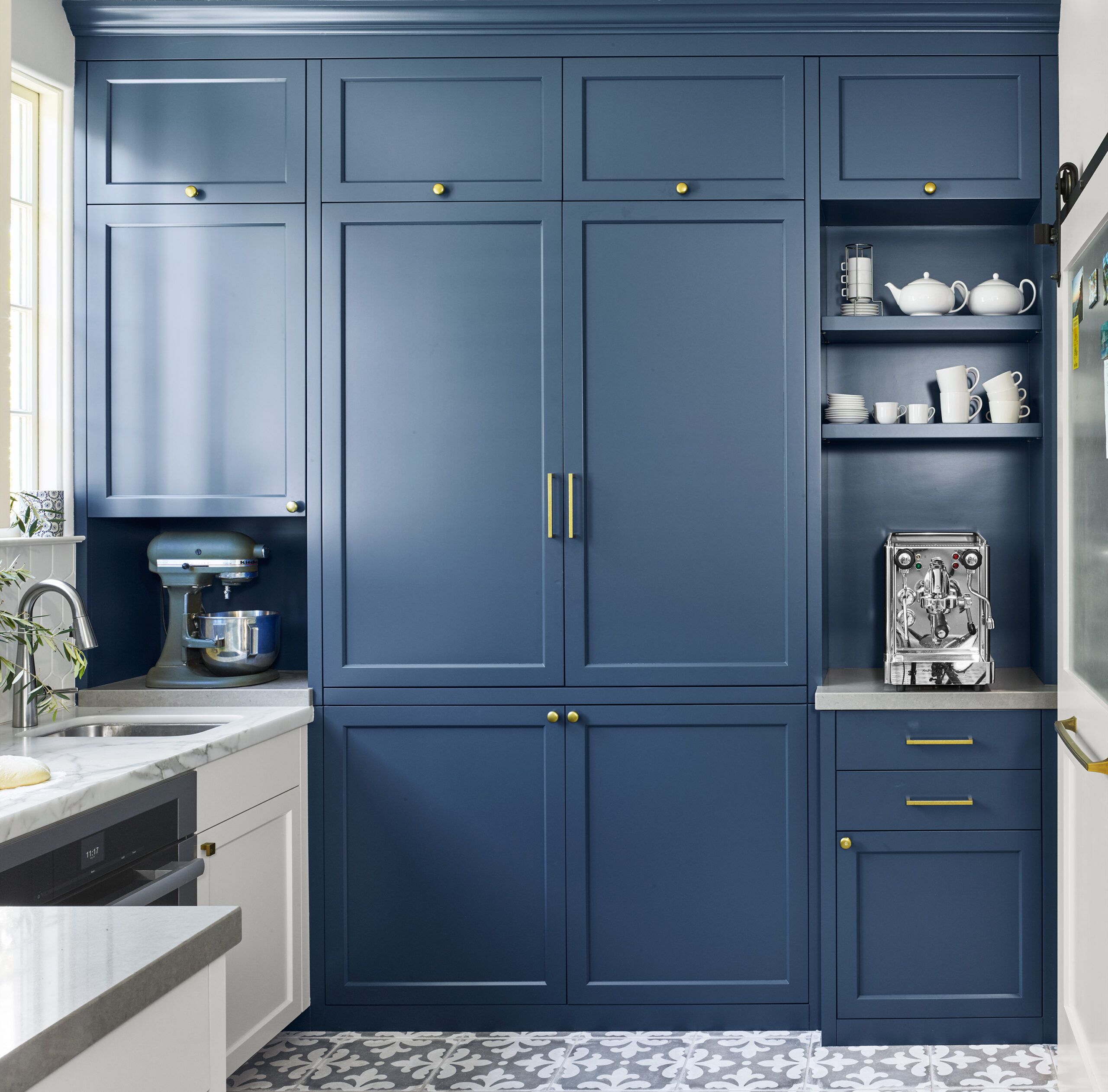
Small appliances are stowed behind a wall of floor-to-ceiling cabinets for a clean, uncluttered look. Keeping the cabinets one item deep allows easy access—no need to move the food processor to reach the blender.
Paint: Newburyport Blue (cabinets); Benjamin Moore
Custom cabinets: Bartlett Cabinet
Blender Selection: World of Blenders
Sleek Pulls
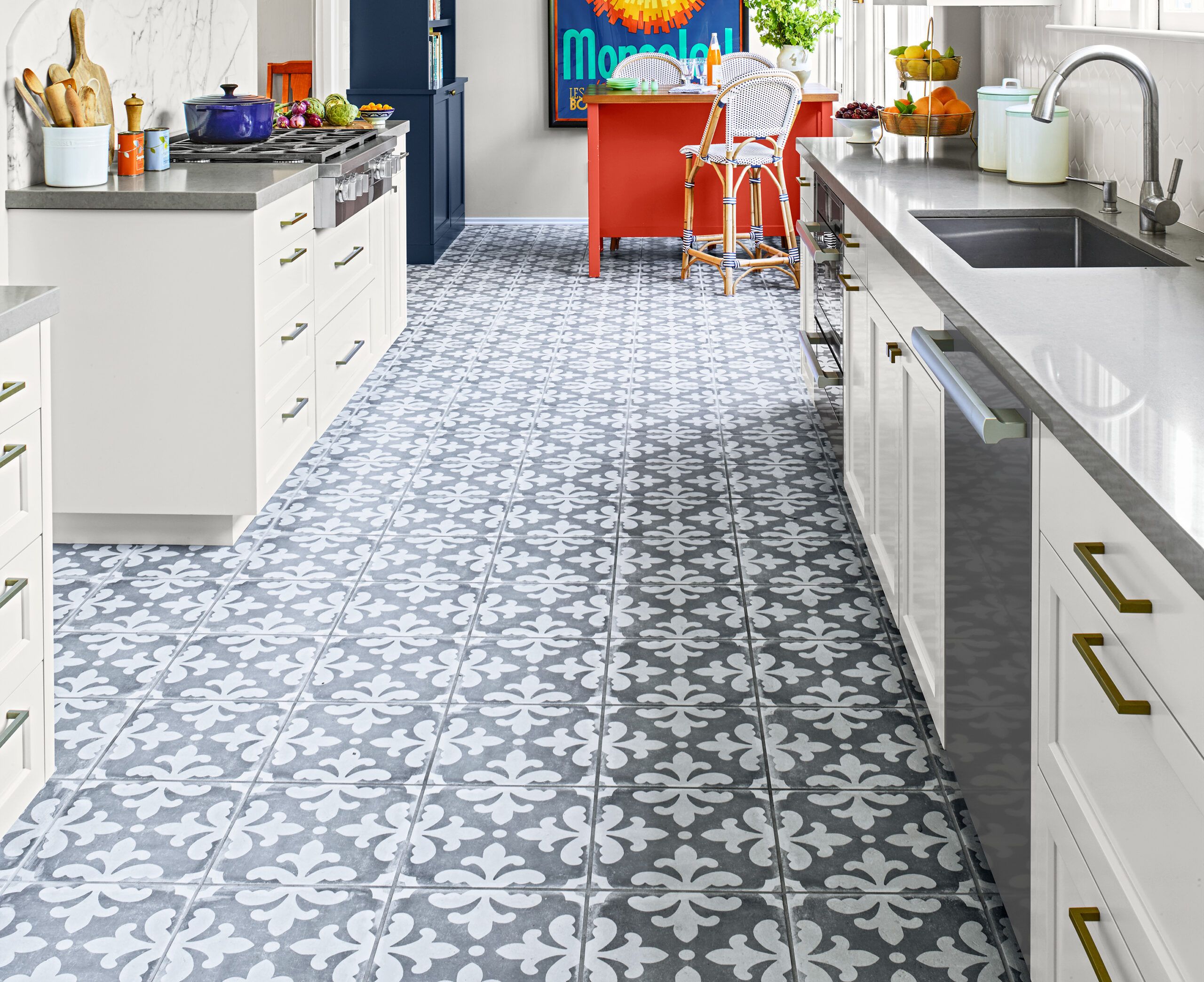
The sleek brass cabinet hardware doesn’t compete with more intricate design elements, like the patterned floor tile, and is echoed in the vent hood and light fixtures.
Cabinet hardware: Atlas Homewares
Arabesque White Tiles
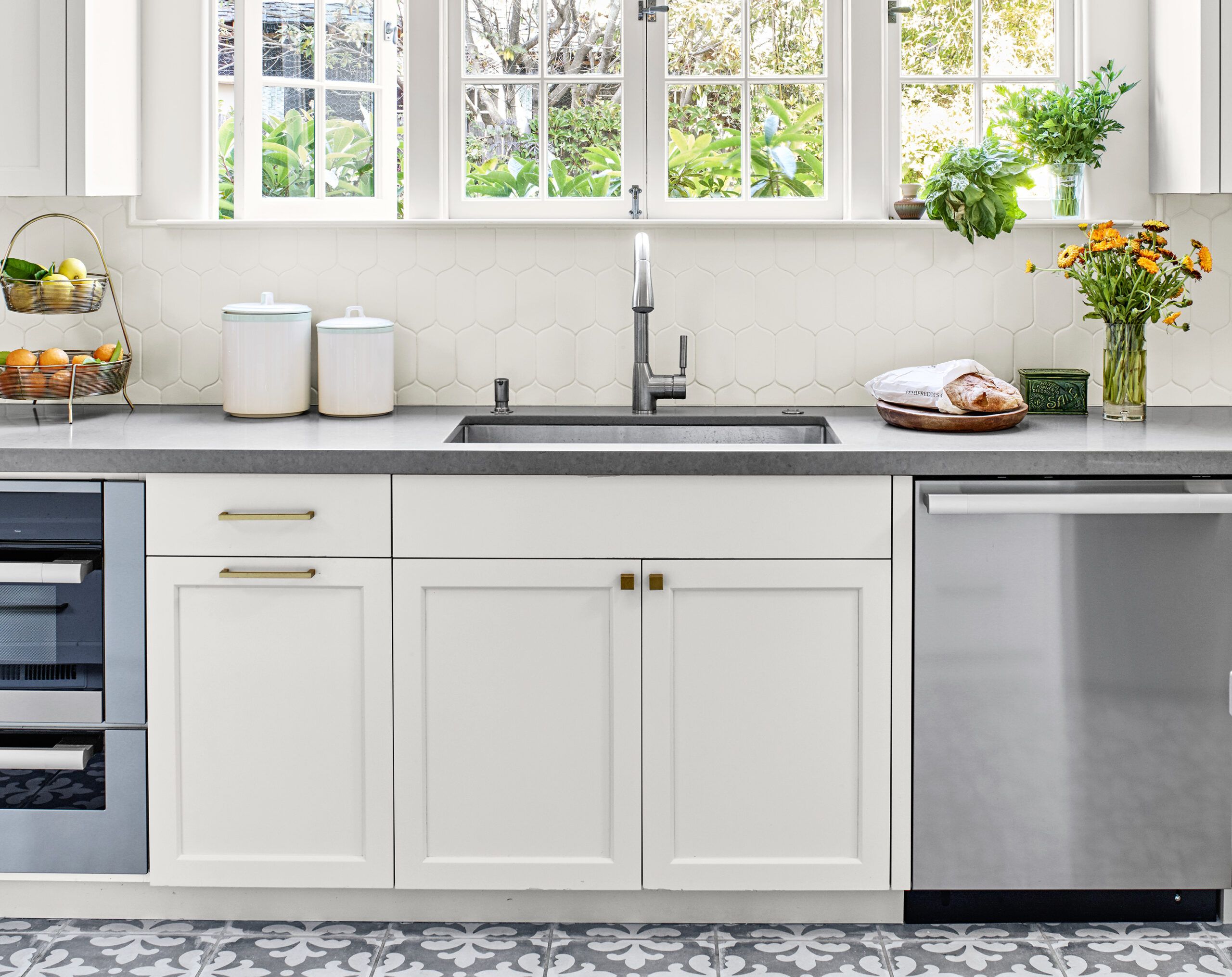
The elongated white arabesque tiles that form the backsplash are a special touch that doesn’t compete with the fleur-de-lis flooring. The couple love the undercounter steam oven and warming drawer for “everything from roasting chickens to de-crystalizing honey,” says Sarah. They’ve even cooked ribs low and slow in the warming drawer.
Backsplash tile: Walker Zanger
Steam oven, warming drawer, and dishwasher: Miele
Before Plans
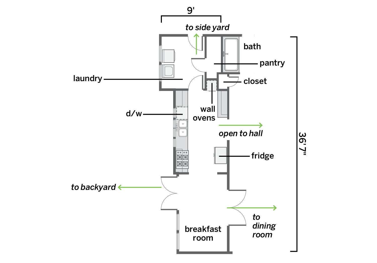
The minimal 230-square-foot kitchen was marooned between two space-hogging rooms.
After Plans
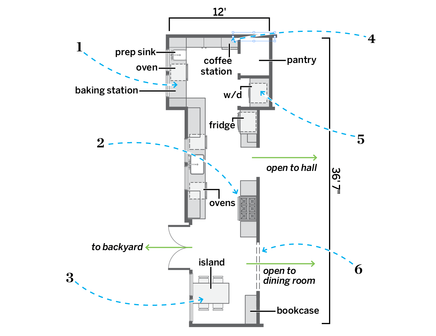
Annexing rooms at either end and a few feet from the adjacent bath allowed for a more functional, unimpeded 353-square-foot space.
- Removed the laundry room entry and built a baking station, with a sink and an oven, where a washer and dryer had been.
- Took out the wall that defined the breakfast room; moved the cooktop to the wall opposite and flanked it with counter space.
- Put in a table-style island and built-in shelving for cookbooks.
- Closed up a door to the side yard to gain space for wall-to-wall cabinets with small-appliance storage and a coffee station.
- Scrapped the tub in the adjacent bath and a hall closet for a larger pantry and an alcove for a stacked washer and dryer alongside the relocated fridge.
- Removed double doors to the dining room to create a wide cased opening for easier flow.
