They dreaded the sound of heavy rain during those first few years. “We would go into flood mode, grab buckets and pumps, and head to the basement,” recalls Lindsay Donaldson. Shortly after moving into the 1925 house in Indianapolis, she and her husband, Jack, had renovated the basement to gain more living space. But the garage, at the bottom of a slope and on the same level as the basement, continued to let rain pour in. After numerous flooding events, Lindsay reached her breaking point in 2021, by which time their family had grown to include two young sons.
“‘That’s it,’ I told Jack. ‘If we can’t fix the water problem, we’re moving.’”
To guide what would be a significant rethinking of their space, the Donaldsons turned first to interior designer Tiffany Skilling, whose work Lindsay had admired in neighboring houses. Skilling suggested they consult a local design-build firm, William Gordon Group, to address the water issues—and then some.
Although they loved the house’s architectural charm and location, walkable to neighborhood shops and restaurants, they had come to know its faults, too: The interior was divided into distinct first-floor rooms with no flow between spaces other than single standard-width doorways; the three bedrooms were adequate for their family of four but left no guest room available for visiting friends and family. They rarely used the formal living room at the front of the house, and the family room added on at the back in the 1990s felt out of sync with the rest of the home.
“Our main renovation goals were to get rid of the water issues, gain more space, create an open- plan layout, and have a dedicated playroom for the kids,” says Lindsay. A former teacher, she believes strongly in the developmental importance of play and envisioned a room where the toys could be organized and neatly tucked away. “We also wanted a screened porch so we could spend more time outdoors,” she adds.
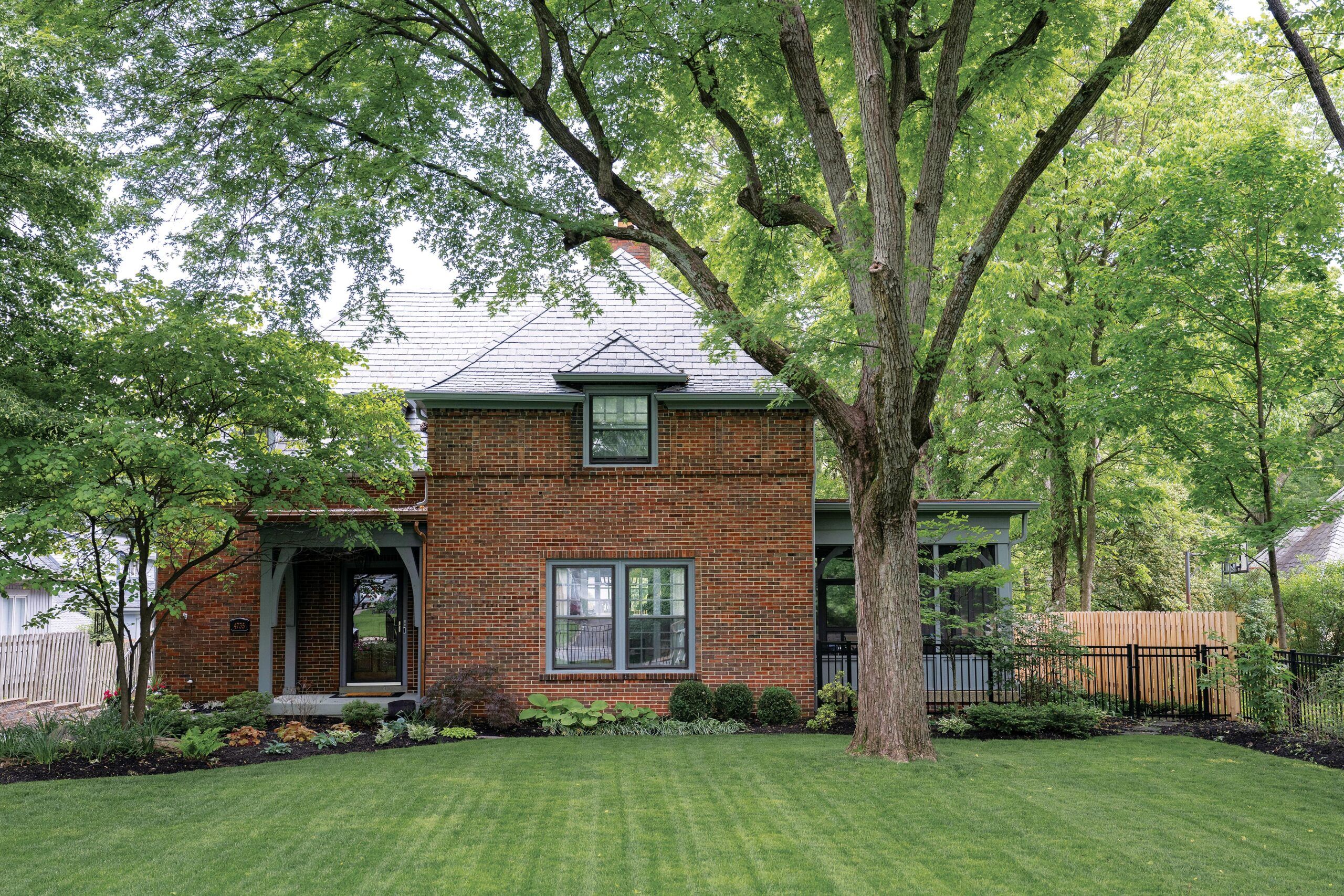
They were also committed to maintaining the home’s architectural charm. The brick two-story house features hipped roofs, through-cornice dormers, and horizontal brick banding below the second-floor windows; houses with Tudor, Prairie, and Craftsman elements are found throughout the neighborhood. Its interior details included a front staircase with an original newel post and balustrade just inside the front door, built-in bookcases, original double-hung windows, and paneled doors.
After a yearlong design phase with multiple rounds of ideas exchanged among homeowners, designer, and builder, the family moved out so work could finally begin.
Builder Bill Brosius tackled the water issue head-on. “It turned out the garage was the low point in the entire neighborhood, so all the rain collected around it, and since it was on the same level as the basement, water got in there, too,” he says. “We had to elevate the garage and correct the grade to solve the problem.” After demolishing the existing garage, and the family room that was sitting on top of it—a poorly built addition, Brosius discovered, evidenced by repeated leaks—his crew raised the grade 2 feet to direct rainwater away from the house. They attached the new garage farther back on the property with doors facing the driveway on the north side— previously the garage door was on the east side, at the bottom of a slight slope, necessitating two 90-degree turns to pull in. The new garage entry is now half a story higher than the basement; inside, a short stair run leads down to the basement and up to the first floor of the house.
To create a more free-flowing, open layout on the first floor, the team built a two-story rear addition in the area between the original house and the new garage, creating space for a new kitchen-dining area on the first floor and a new primary suite on the second floor. “The open floor plan was really important, along with keeping the original character of the home,” says Skilling. “Lindsay wanted the kitchen next to the living room for all the entertaining they love to do, and she also wanted to be able to see the kids while cooking.” To make that happen, the kitchen-dining area in the addition connects to the living area via a 14-foot-wide opening where the original exterior wall stood; LVL beams in the opening and spanning the living area itself provide the needed support.
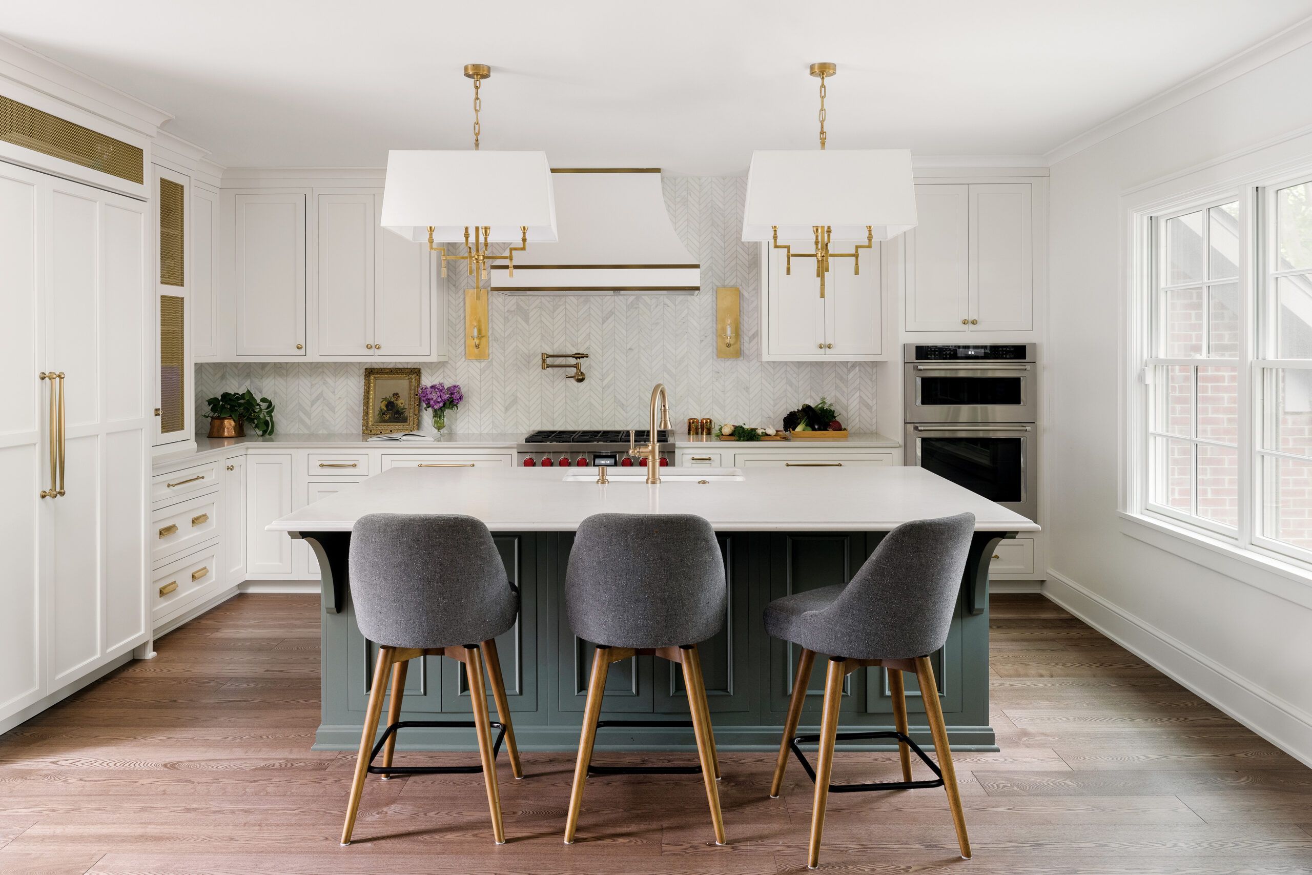
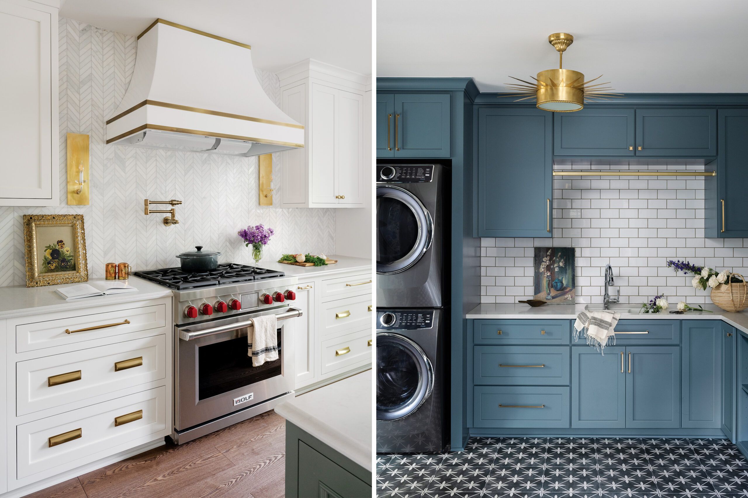
The new 14-by-17-foot kitchen features an L-shaped layout that maximizes storage space with wall and base cabinets painted white and given a touch of old-school warmth with satin-brass accents. A pantry closet tucked between the kitchen and dining areas boosts storage even more. Placing the main sink in the island enables prep and cleanup tasks to be done facing the stool seating and the dining and living areas beyond.
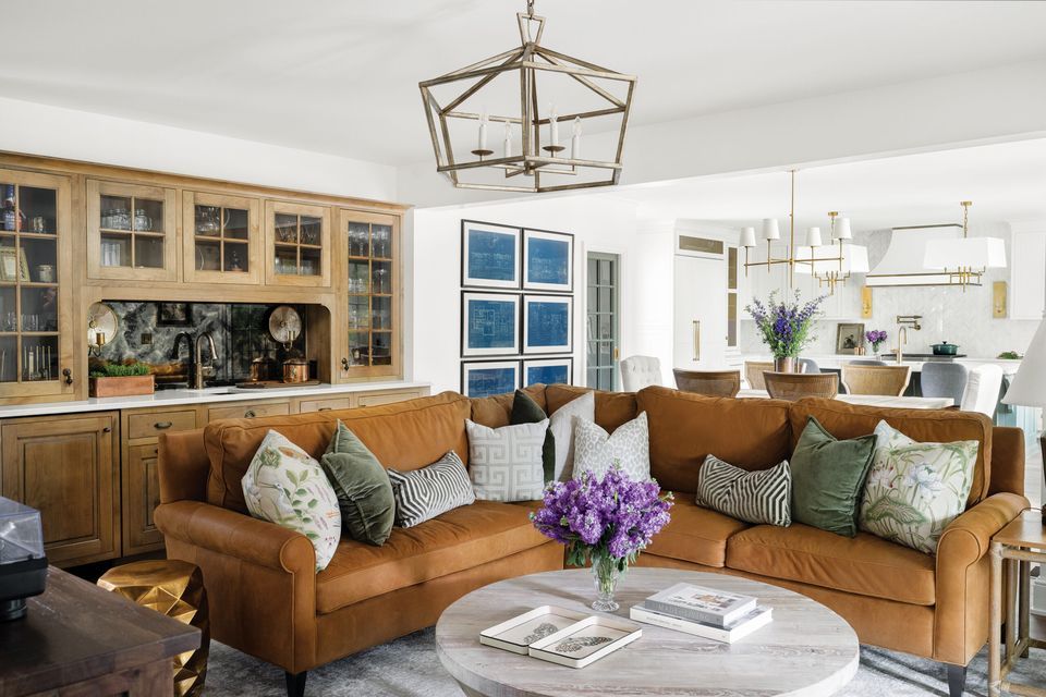
The living area, which occupies space where the original dining room and kitchen were, is a key gathering and entertaining spot, so Skilling gave it a massive hickory built-in wet bar with a distinctive look and plenty of glassware storage. “We used a smoky antiqued mirror for the sink backsplash and added interesting cabinet-door hardware,” says Skilling of the Victorian drop and cup pulls.
Getting a dedicated kids’ playroom in line of sight from the kitchen proved more challenging, but a clever solution emerged: The team repurposed the existing formal living room at the front of the house and added a cased opening from the playroom to the new living area, creating a sight line from the kitchen sink. “This was a genius solution,” says Lindsay, who was happy to give purpose to a room they had previously ignored.
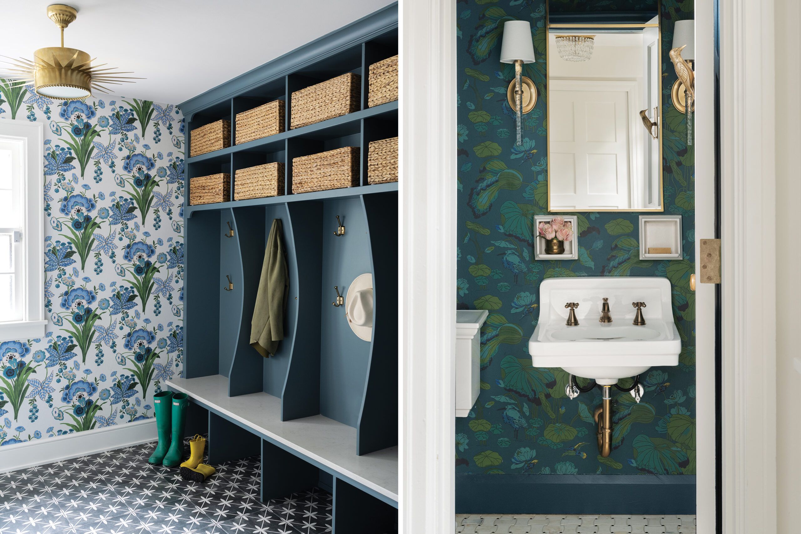
But creating a mudroom-laundry in the former breakfast room provided the most bang for the buck as far as Lindsay is concerned. “It is my favorite room for both looks and function,” she says. Located on the north side of the house, the room is just inside the side entry off the driveway that Lindsay and the kids use most.“They can come in and immediately take off their shoes and store them under their cubby,” Lindsay says. Cabinetry painted in one of her favorite shades of teal blue provides organized storage for laundry essentials and built-in cubbies for each of the four family members. The bold-patterned porcelain-tile floor hides dirt and scuffs.


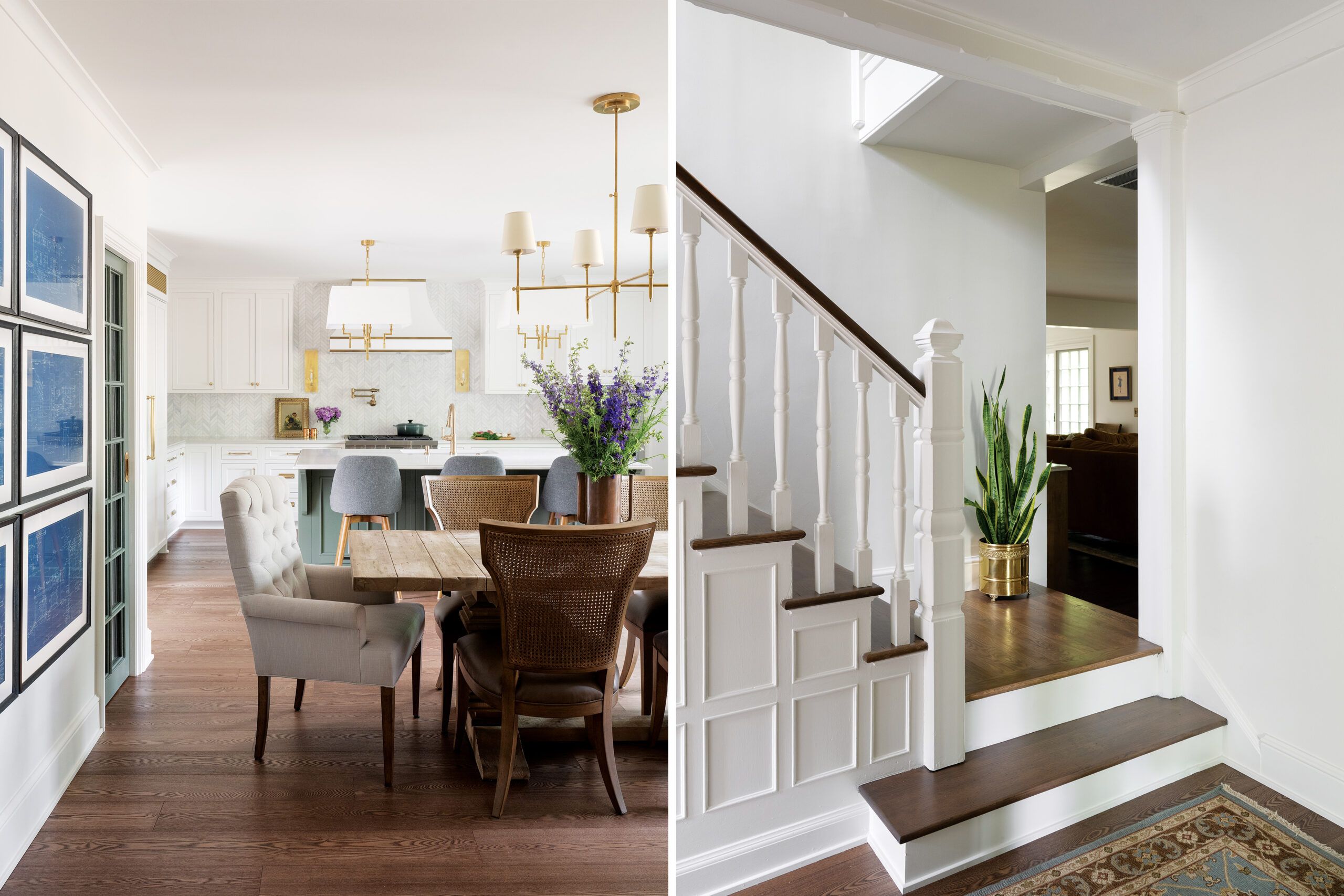
Retaining the house’s period feel started right inside the front door, where they left the entry foyer and main stairway intact. The team also preserved the nearby powder room’s original porcelain sink, wall niches, and black-and-white tile floor, enhancing the space with new brass sconces and a mirror, a richly patterned wallpaper, and a sweet vintage-inspired touch: a brass door knocker in the shape of a bird.
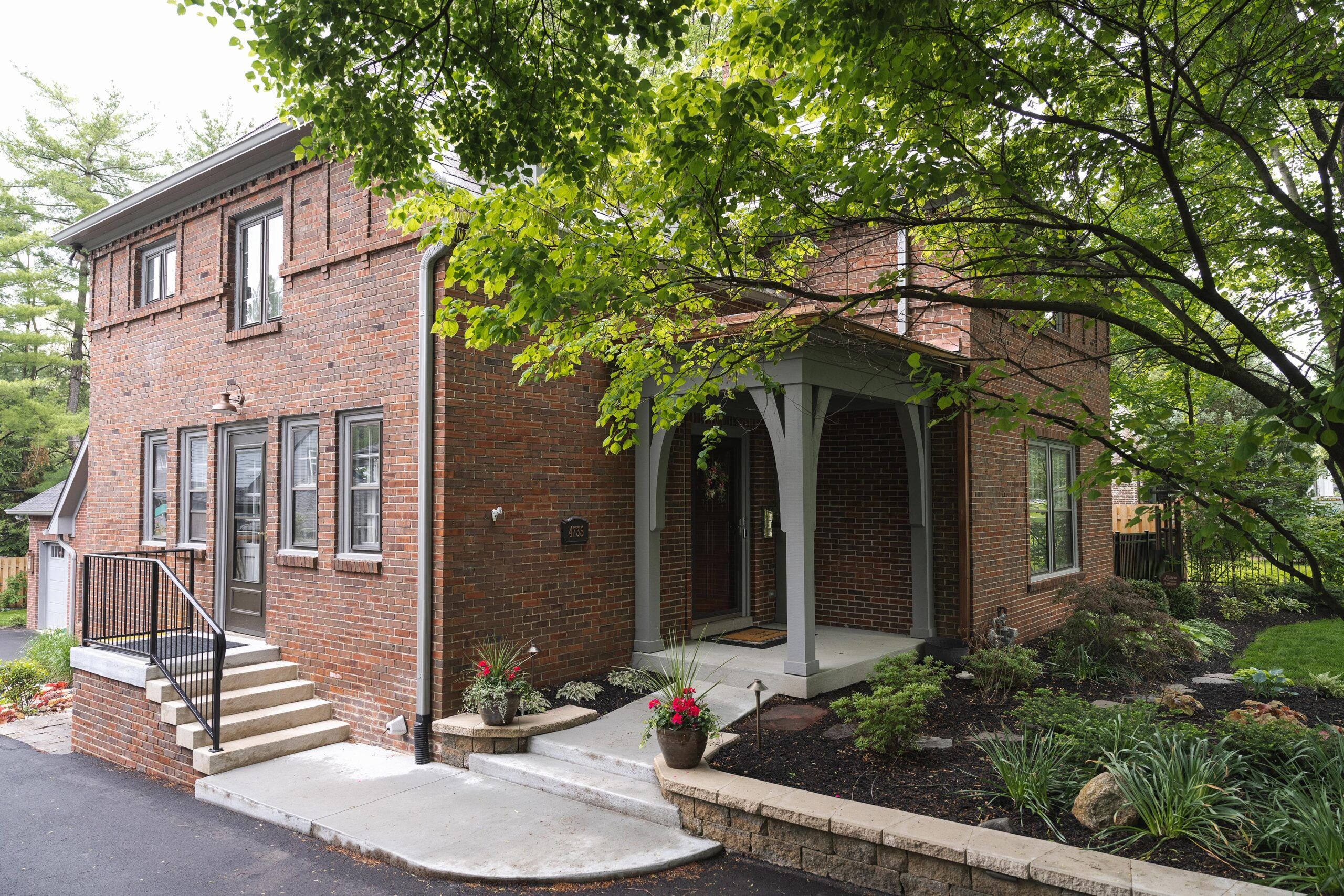
Original details throughout were refurbished or replicated. Brosius reused the brick from the back of the house and old garage to blend new structures with old; he also retained as much of the original slate roof as possible, opting for practical asphalt shingles for the new garage. The majority of windows were reconditioned, and interior doors were saved or copied for the new spaces, as were all window and door casings. One element that couldn’t be saved was the flooring. “There were too many different types of flooring and so many out-of-level floors that it didn’t make sense to stay true to the original,” says Skilling. Wide-plank engineered wood flooring now unifies the rooms.
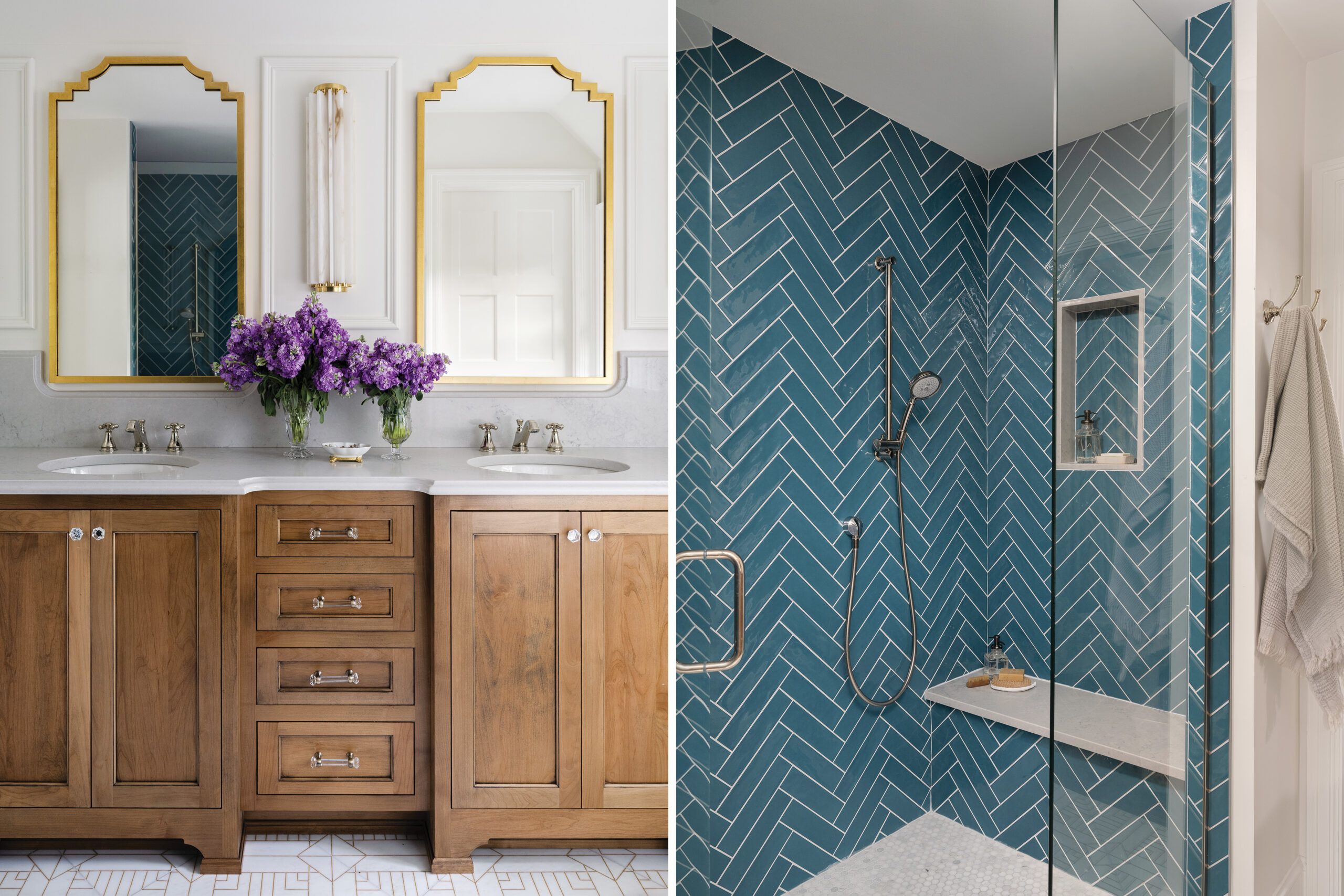
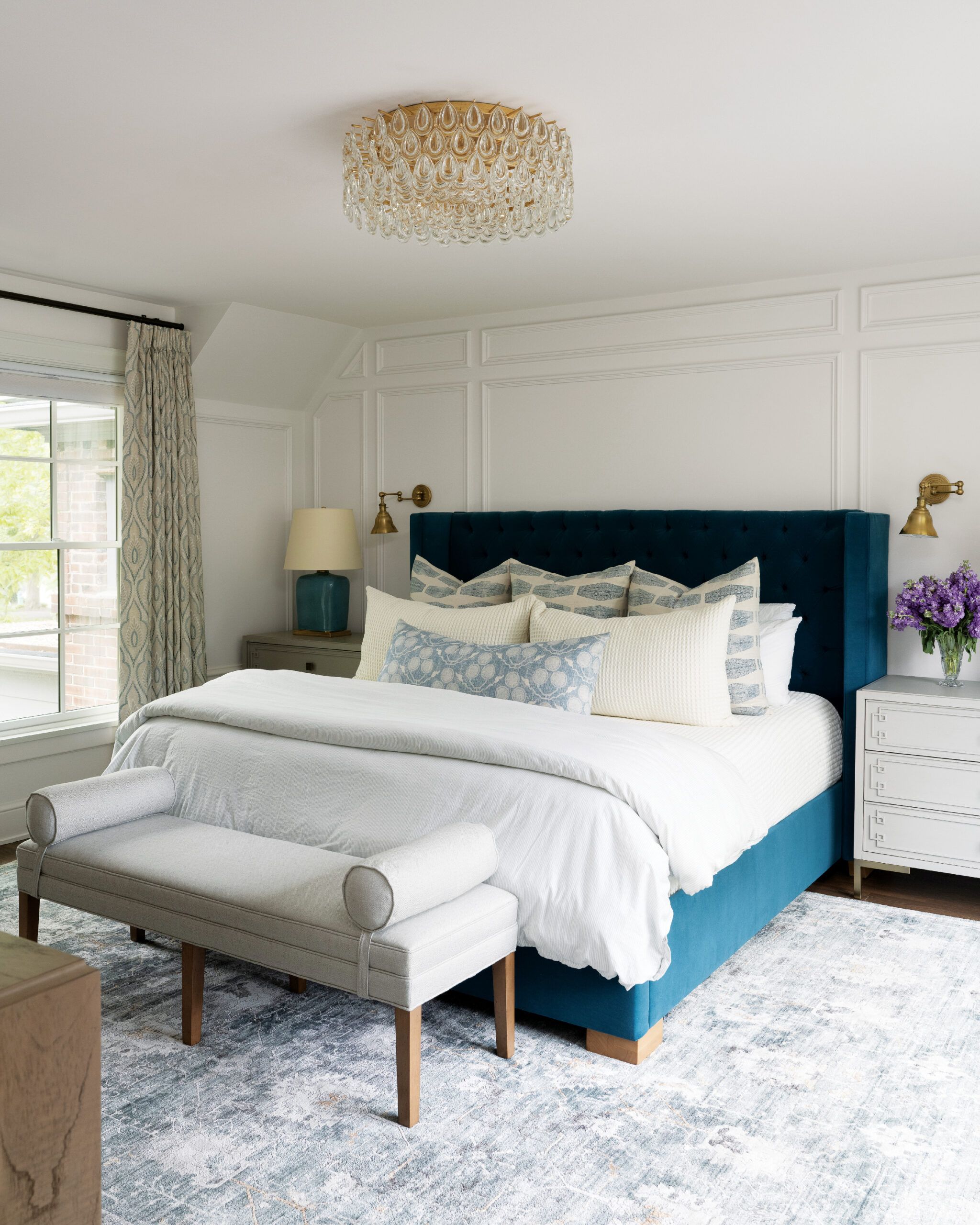
New spaces were warmed up with thoughtful details, like the panel molding that enhances the primary bedroom walls. In that room, the ceiling follows the rooflines with angled corners that give the room as much height as possible.
To maximize their entire 1/3-acre property, Lindsay and Jack longed for a screened-in porch in the backyard, where previously there was only a wood deck. After the driveway was regraded on the north side of the house, they decided to landscape the south side, where the yard had maintained its gentler slope; they created a patio with an outdoor grilling space, accessible just off the dining area, and added a 12-by-24-foot screened porch off the living area. Furnished with a sofa, a TV, and a dining table, the screened porch has become a favorite family hangout even into late fall.
“We love having our coffee out there in the morning,” says Lindsay. And if it happens to start raining, they just keep sipping.
Floor Plans
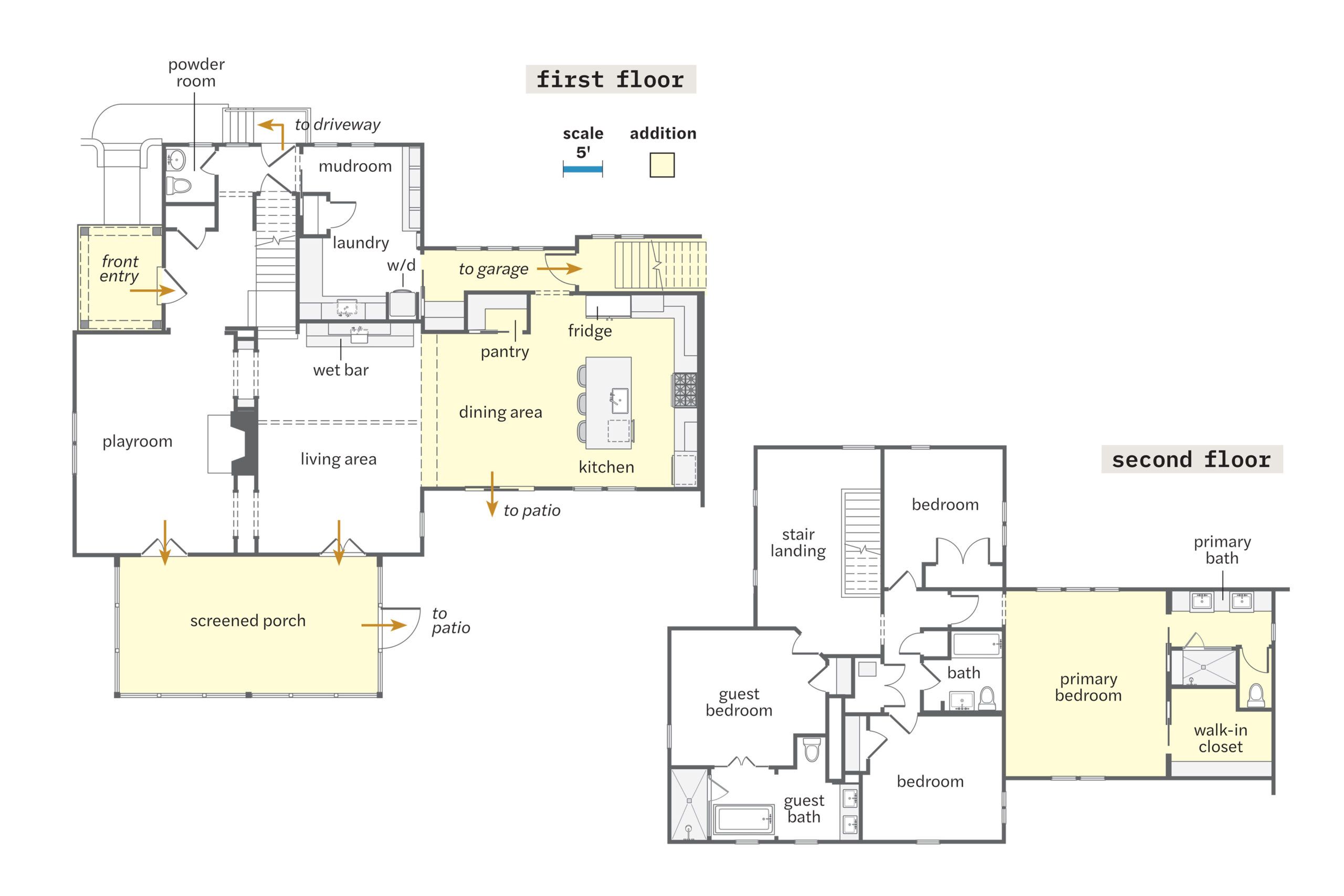
The house grew from 2,600 to 3,500 square feet with four bedrooms and three and a half baths. The first floor of the rear addition holds dining and kitchen areas, a pantry, and a hallway to the rebuilt garage; the original living room became a playroom, a mudroom/laundry replaced the breakfast room, and the living area occupies the former dining room and kitchen. New porches add outdoor functionality. Upstairs, the addition made way for a new primary suite; the former primary suite now welcomes guests.
Renovation Recap
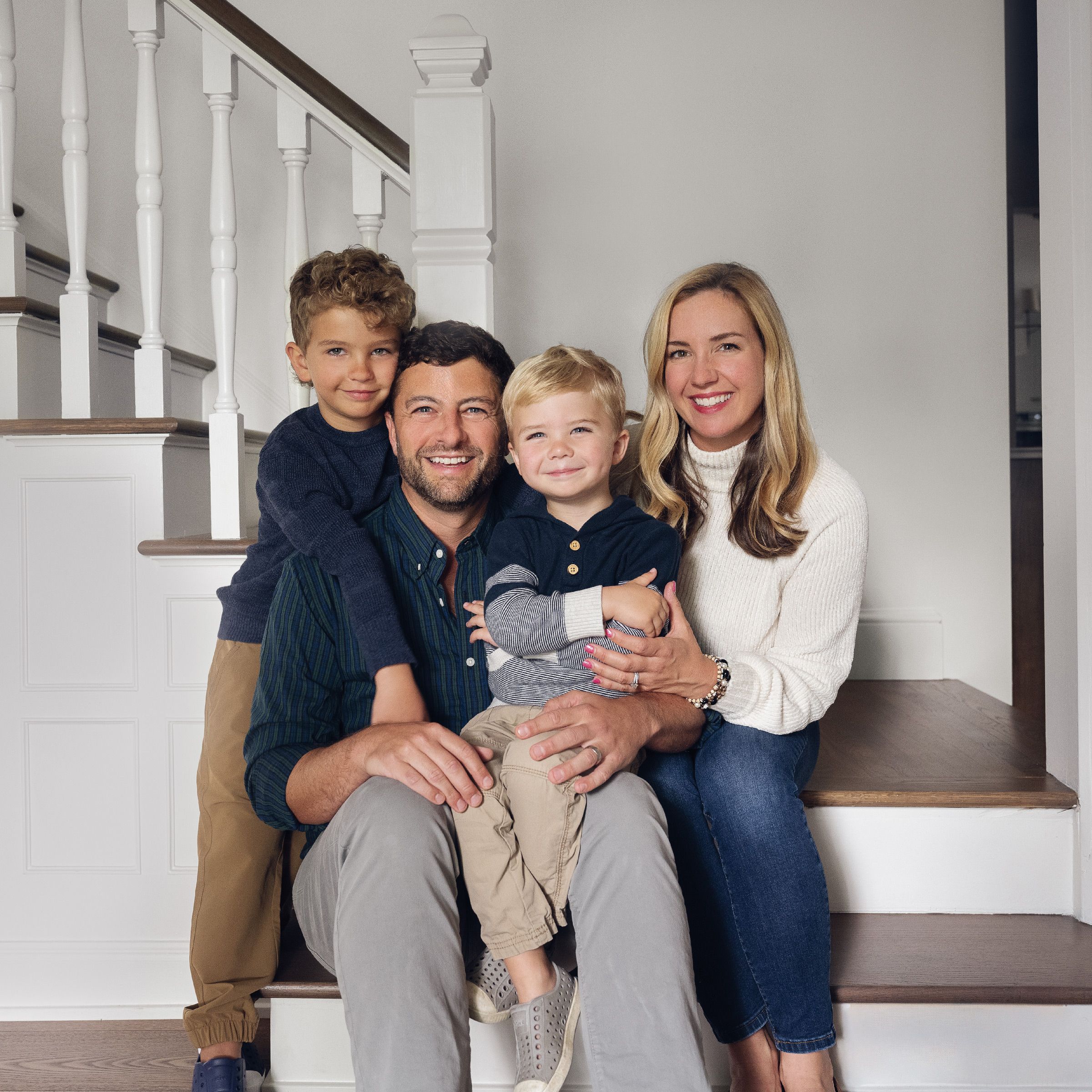
- THE HOMEOWNERS: Indiana natives Jack and Lindsay Donaldson, with their sons, Walter, 6, and Bruce, 4.
- THE HOUSE: Built in 1925 on a 1⁄3-acre lot, the three-bedroom, two-and-a-half bath brick house had architectural character, but its enclosed first-floor rooms felt formal and cramped.
- WHY THEY CHOSE IT: The couple had been living in the suburbs of Indianapolis, where everything felt brand-new. They bought the house because it was close to the city and in a well-established neighborhood of older houses in a good school district, and Lindsay’s sister lived nearby; although they weren’t parents at the time, they hoped to be.
- THE PLAN: As soon as they bought the house, they finished the basement to add living space, but it flooded repeatedly. Six years after moving in, and having expanded their family with two young sons, they knew they had to address the water issues once and for all, add more space, and create an open-plan layout for better flow and to facilitate entertaining.
- TEAMWORK: The couple hired designer Tiffany Skilling, whose work in the neighborhood Lindsay admired; Skilling suggested they consult the local design- build firm William Gordon Group.
- LESSON LEARNED: Once they had a good design team, they didn’t rush the planning. Says Lindsay: “We were in the design phase for a year, and I’m glad we took our time. We explored lots of ideas to make sure the house met our needs.”
