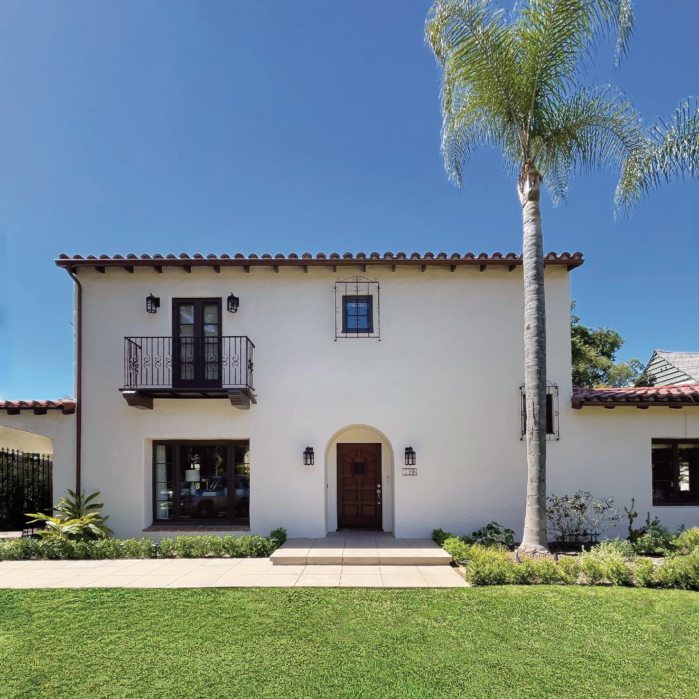
When you’re hunting for an old house, it’s not uncommon to find curb appeal ends at the street. That was certainly the experience of Steve and Kate Sachs, who were enchanted by this house the minute they saw i —until they stepped inside. Built at the onset of the Great Depression, the Los Angeles–area home measured just under 3,000 square feet, but had no family room and only two bedrooms upstairs, a deal-breaker for the couple, who had two young sons. The updated kitchen felt cut off from its surroundings and out of sync with the home’s style, which had been compromised by years of piecemeal renovations. “It just wasn’t functional for us, and it needed a lot of work,” recalls Kate. So they moved on.
Six years later, having bought and remodeled another home and welcomed their third child, the pair were feeling pinched for space. Learning that the Spanish Revival was back on the market, they decided to take another look. This time it wasn’t its shortcomings Kate and Steve noticed as much as the house’s attributes, namely the glorious views outside and the neighborhood, which they had come to know and love in the intervening years. With one renovation under their belts, the prospect of fixing the home’s problems seemed a lot less daunting this time, and they decided to take the plunge. “We were older and had more experience,” Kate says.
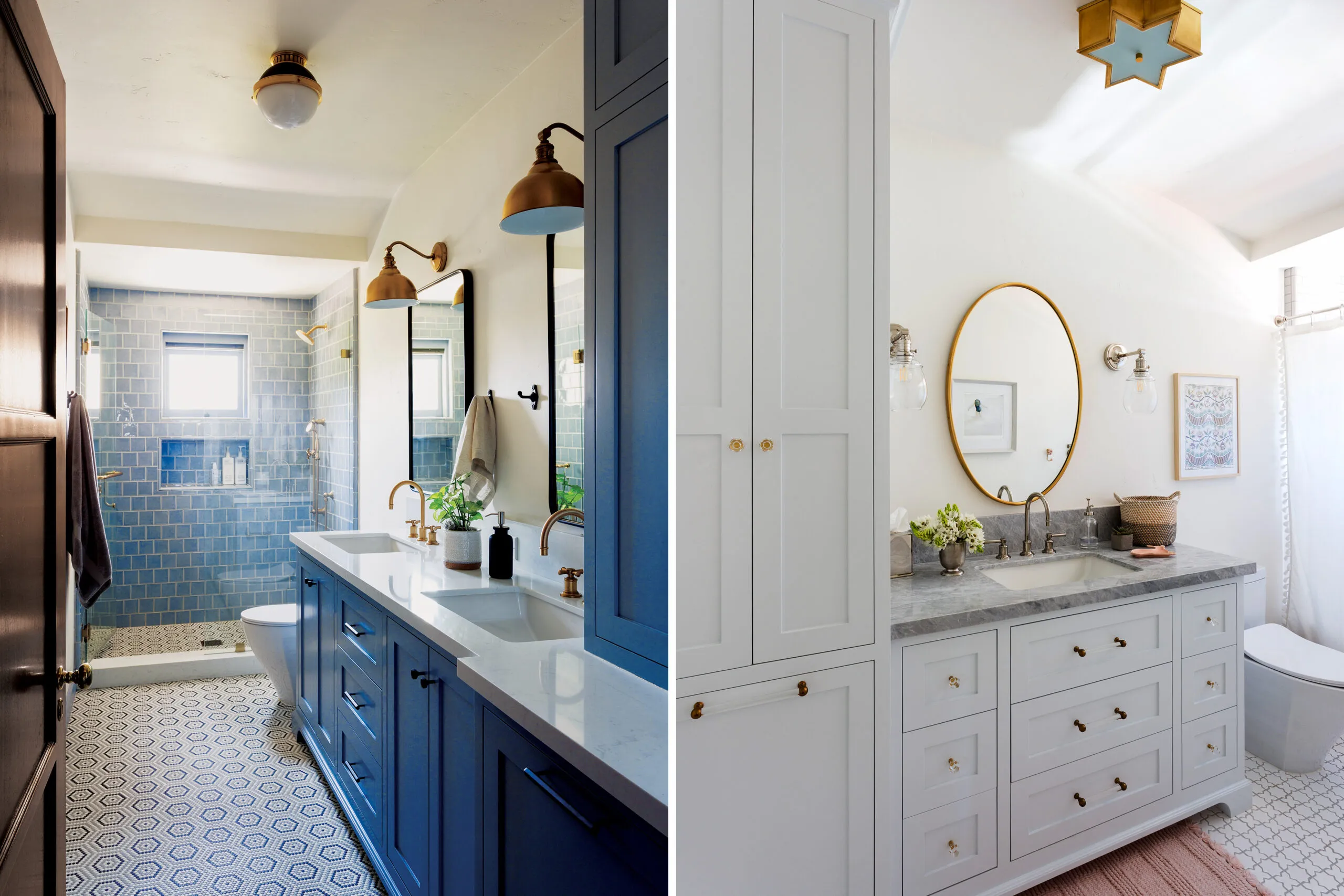
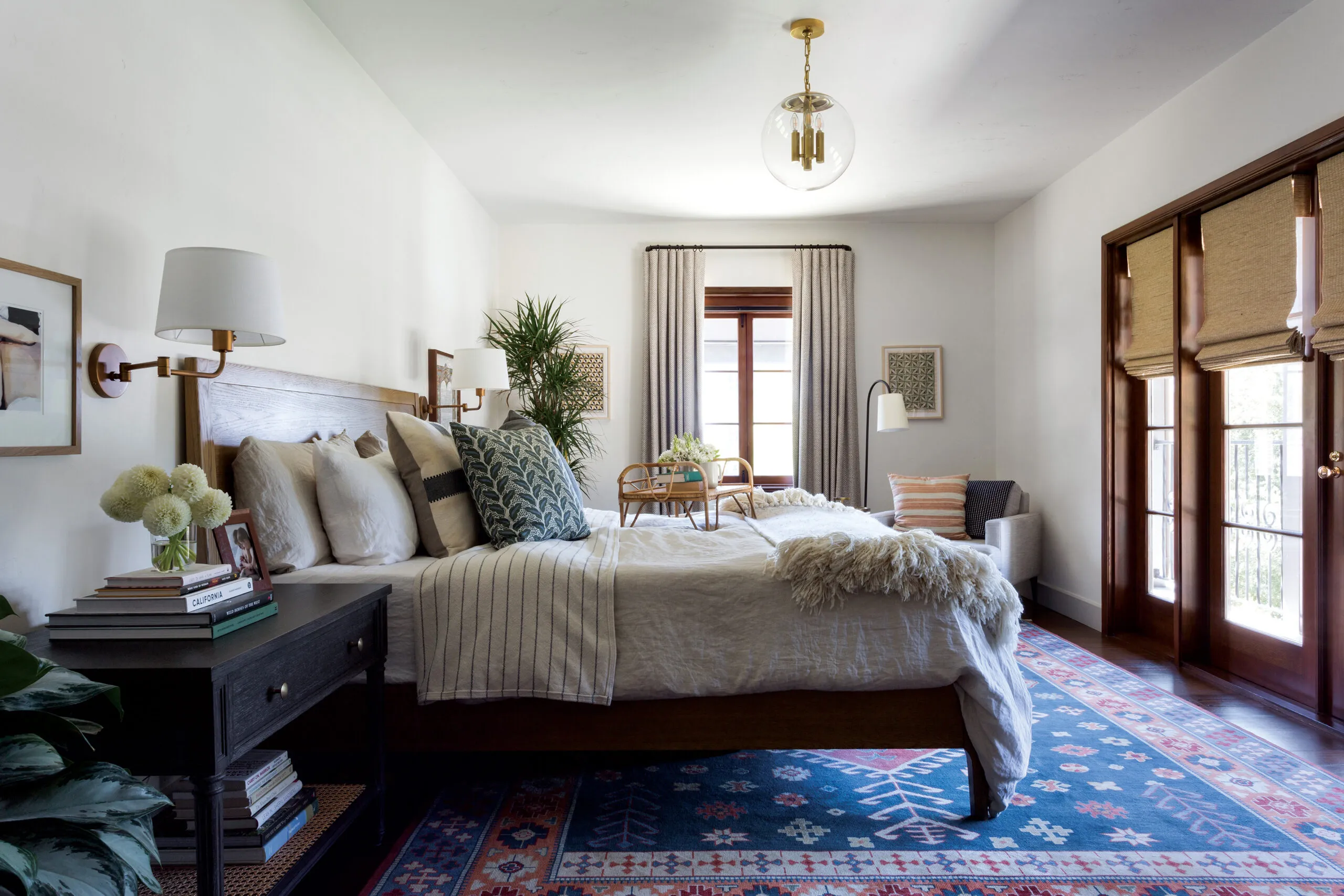
“It took some vision to see how it would fit their family,” recalls designer Stacy Chiavaro, who had collaborated with the owners on their previous house and stepped in to tackle the architectural and interior design work on this one. Dividing the massive primary bedroom into two children’s rooms helped solve one of the problems, but there was still a need for more square footage. Since the Sachses wanted to keep the front facade the way it was, Chiavaro and builders Laura and Patrick Vargas focused their attention on the rear, co-opting space occupied by an old concrete patio to build a 1,333-square-foot addition with a family room and mudroom area on the main floor, with a primary suite above, plus two new upstairs baths.
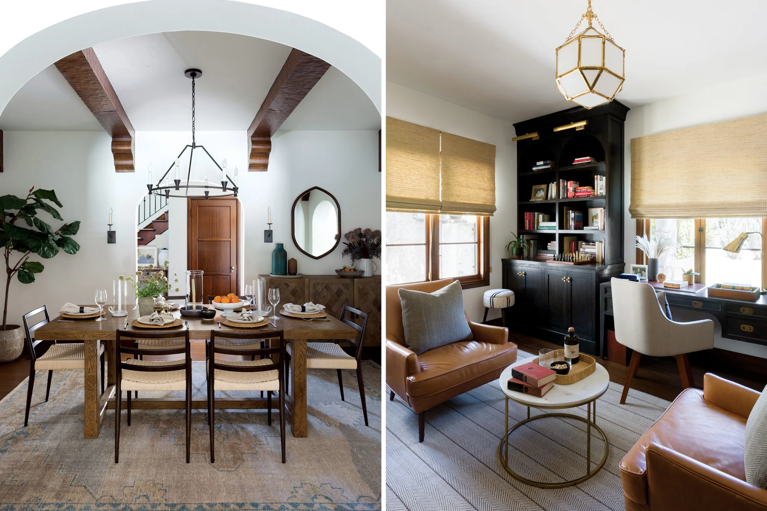
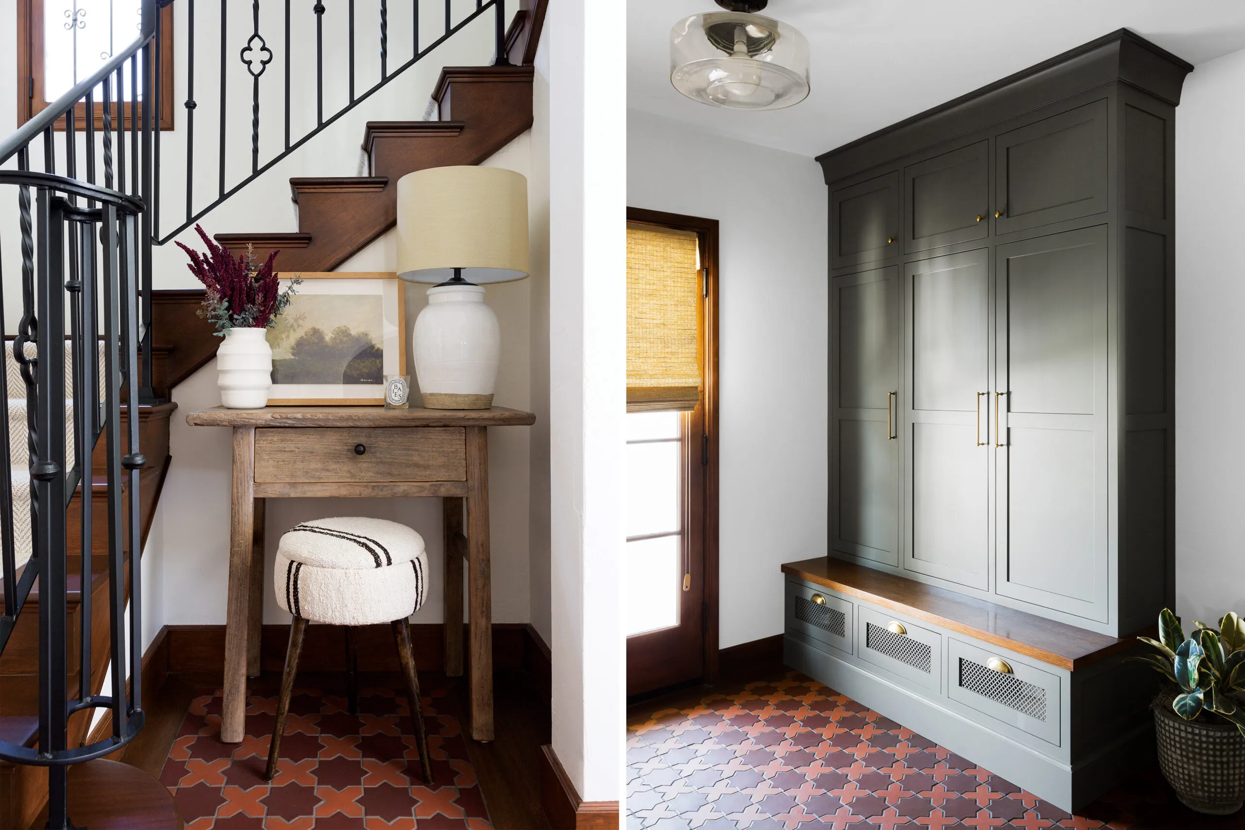
Today the addition blends seamlessly with the existing house, echoing the arches, textured stucco walls, and clay-tile roof of the original. “We used a lot of the old tiles and got a close match on the new ones, so we used the old tile on the front and the sides, and the new tile on the interior portion of the roof, where you can’t see it from the street,” says Patrick Vargas. Mahogany interior doors were refinished and reused, brass doorknobs were refurbished, and new code-compliant stair and balcony railings were fabricated to match the originals.
“We really tried to repurpose a lot of the materials that we had,” says Kate. Although everyone hoped to save the original windows, they didn’t function well and weren’t energy efficient, so duplicate double-pane casement windows were commissioned in their place, complete with recessed roll-down interior screens just like the originals.
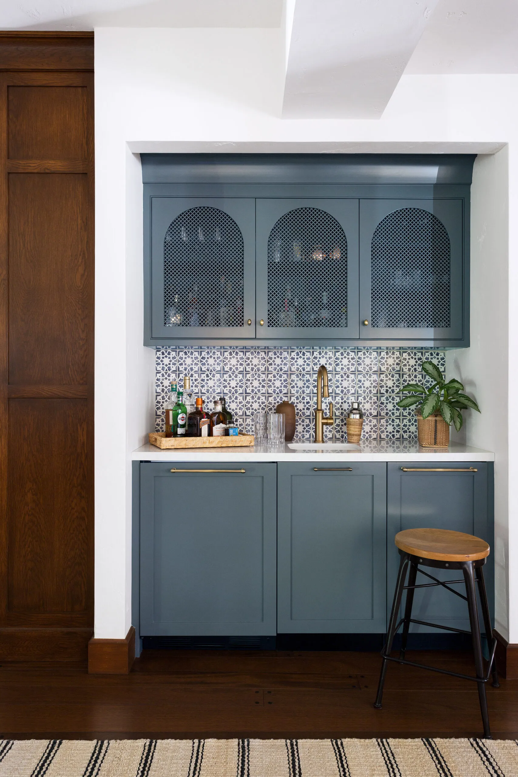
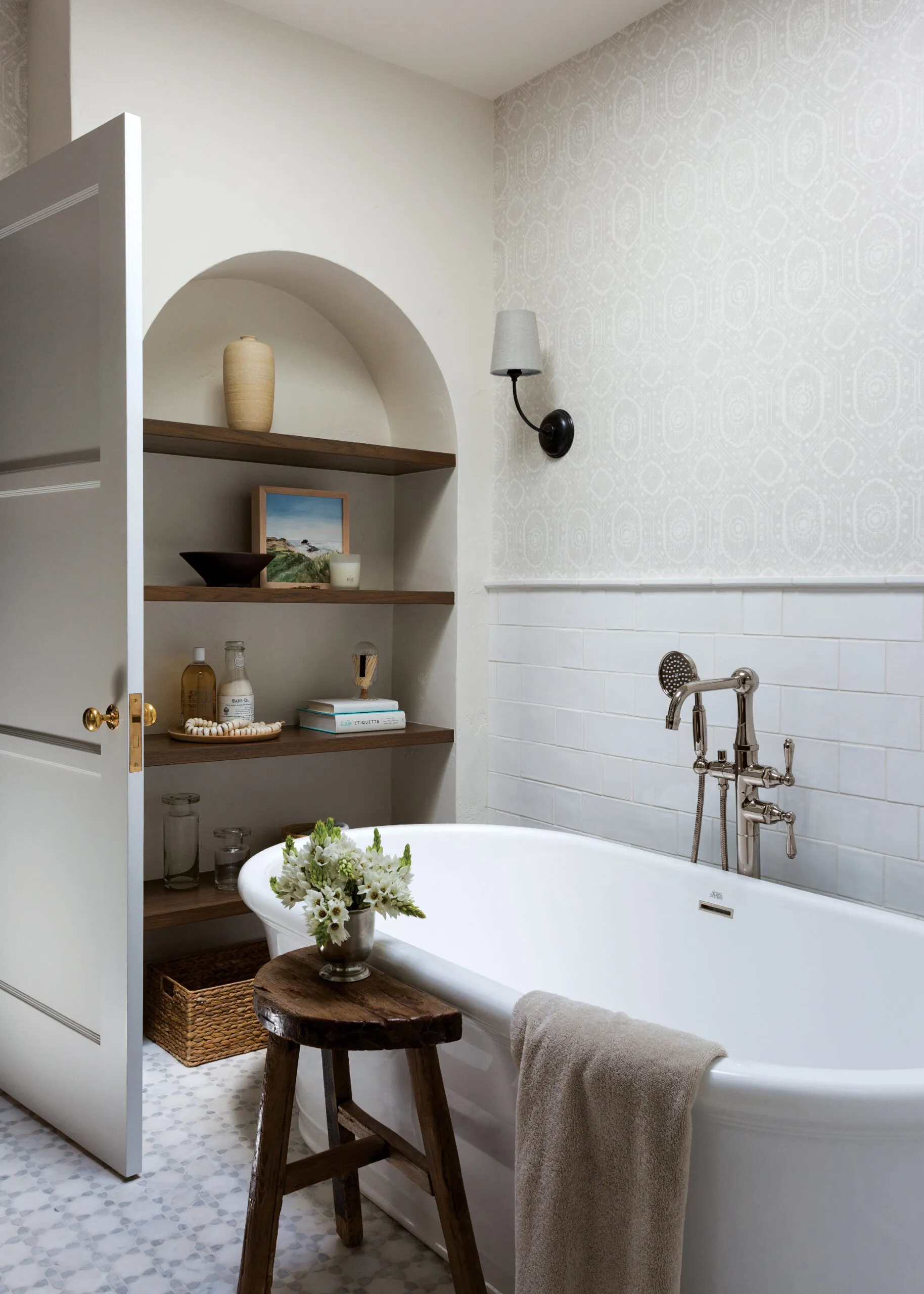
Despite the extra space, Chiavaro had to do a bit of juggling to accommodate the owners’ re- quests for two walk-in closets and a second-floor laundry, stealing some depth from the primary bedroom and keeping the kids’ rooms compact. On the main level, she resisted the urge to open up the floor plan, maintaining distinct divisions between rooms. “Kate wanted cozy spaces for the family to be together while accommodating the need for personal space when desired,” says Chiavaro. To make the segregated existing spaces flow better, she widened the openings between them, replacing narrow, squared-off doorways with generous arched openings that reinforce the home’s architectural style. Custom cabinets crafted by Chiavaro’s husband and business partner, Sandro, repeat the arch motif.
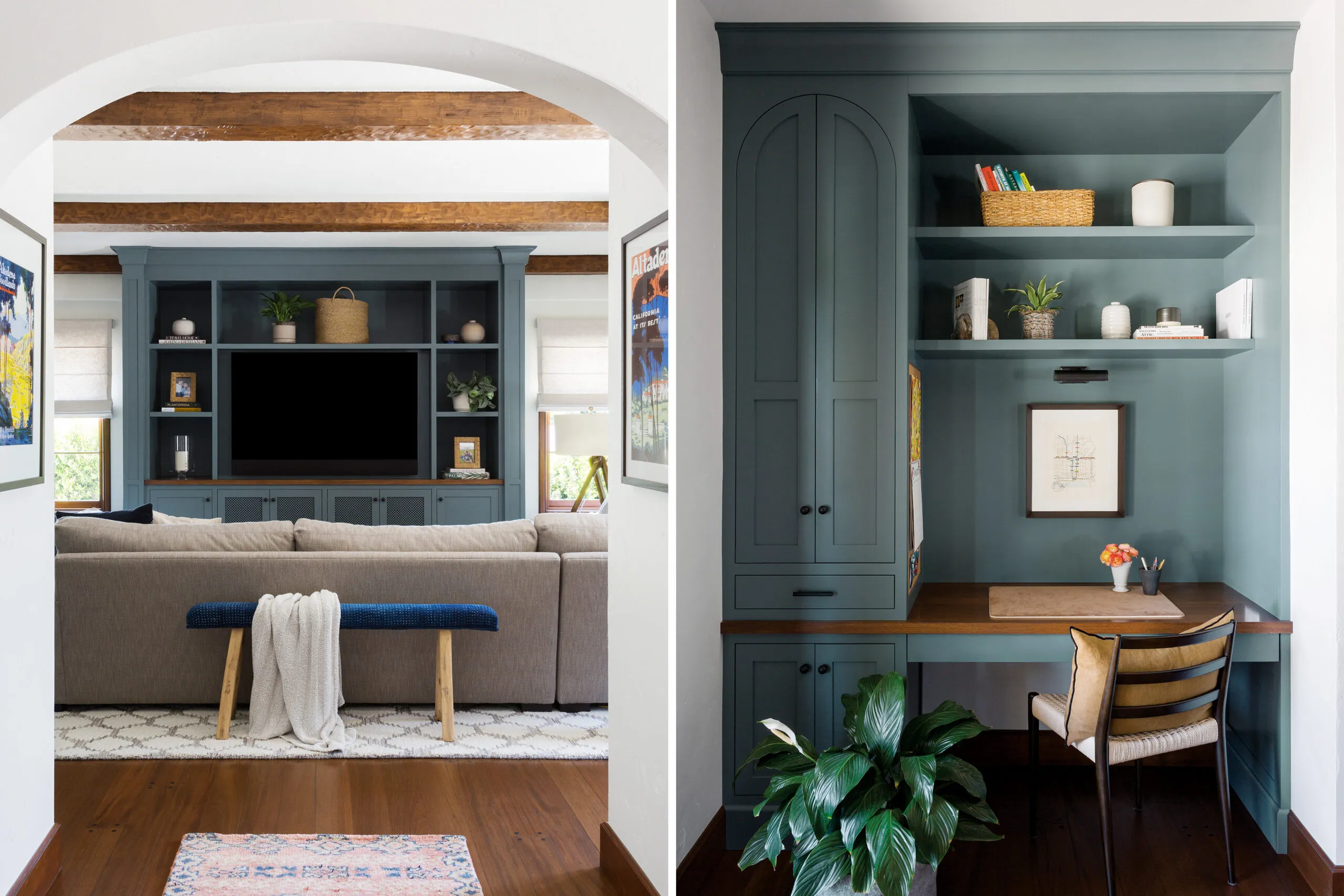
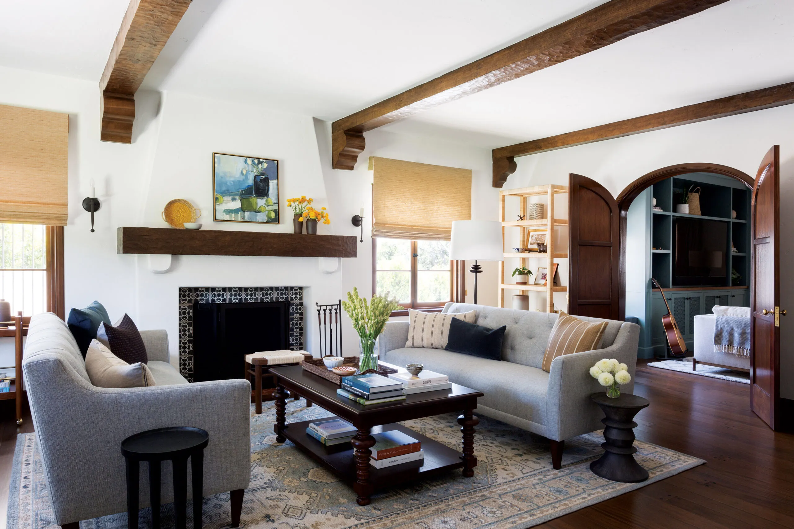
The living room fireplace—typically a focal point in Spanish Revival homes—was utterly devoid of character, its flush firebox outlined in brick and topped with an undersized mantel. Stacy Chiavaro corrected this oversight by bringing the firebox forward and framing it with patterned ceramic tile, then crowning it with a hefty mantel with sculpted corbels. Existing corbels adorned the beamed ceiling but were not repeated in the dining room next door, so she added them, then installed beams and corbels in the new family room, after carpenters aged the wood with planers and scrapers.
The owners loved the pegged mahogany floors in the living and dining rooms, but the flooring in other rooms didn’t match it. To unify the interior, new engineered pegged mahogany flooring went in throughout the house—easier and less costly than trying to match the original floorboards. The baseboards were also inconsistent, so Patrick Vargas reproduced the originals with custom molding knives and installed them throughout.
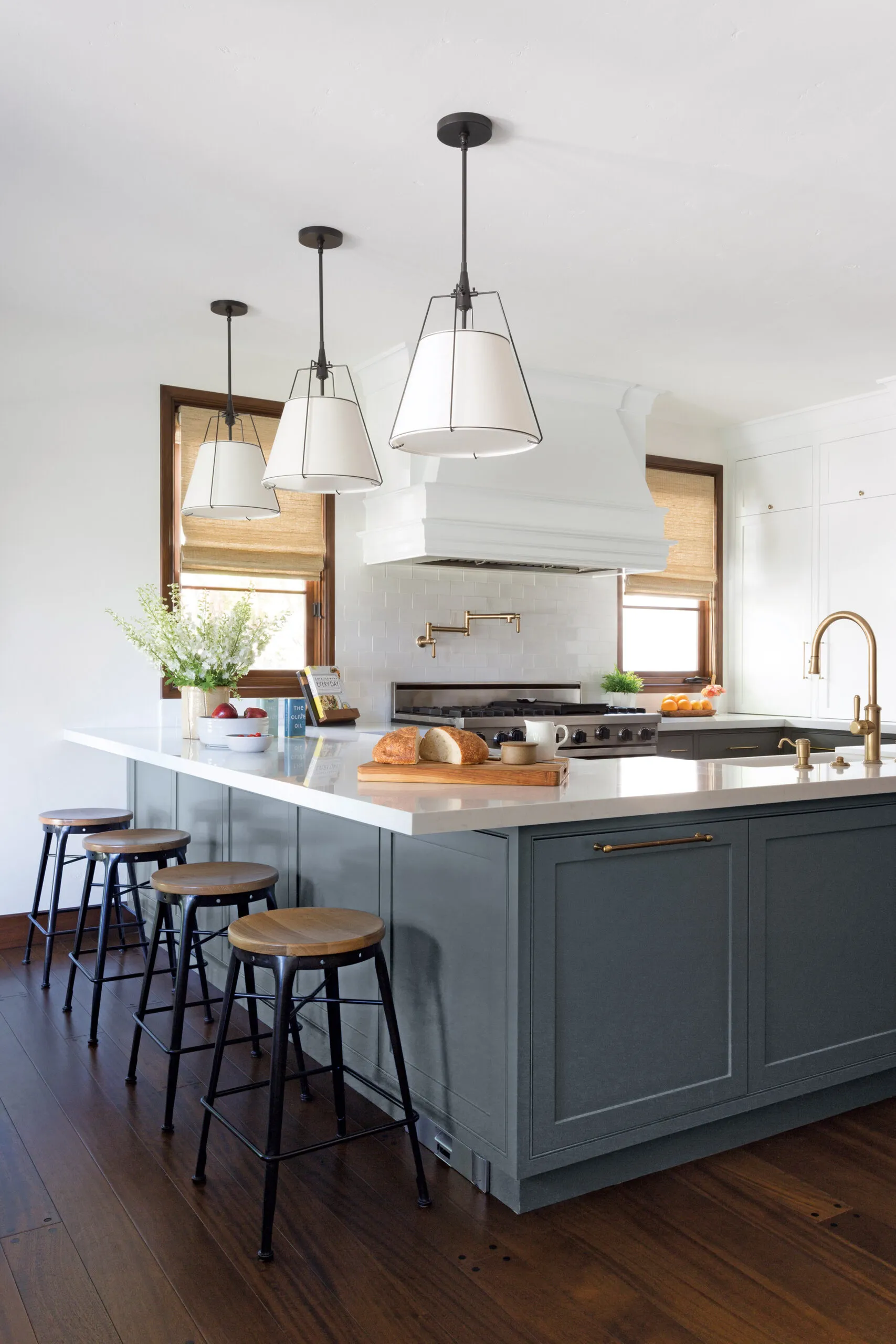
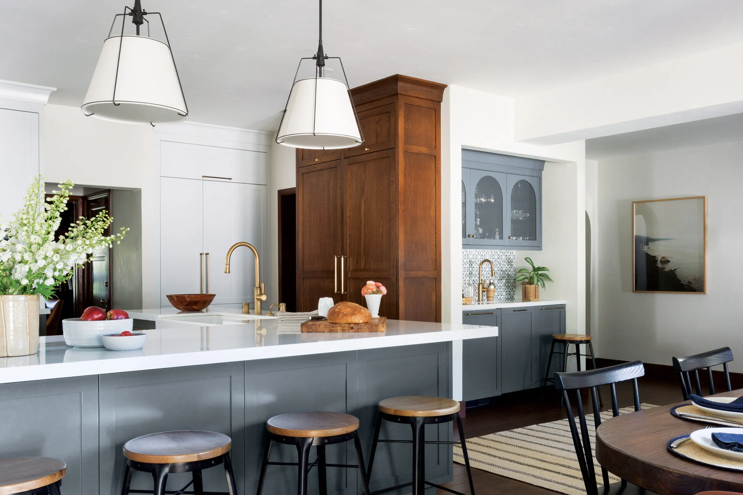
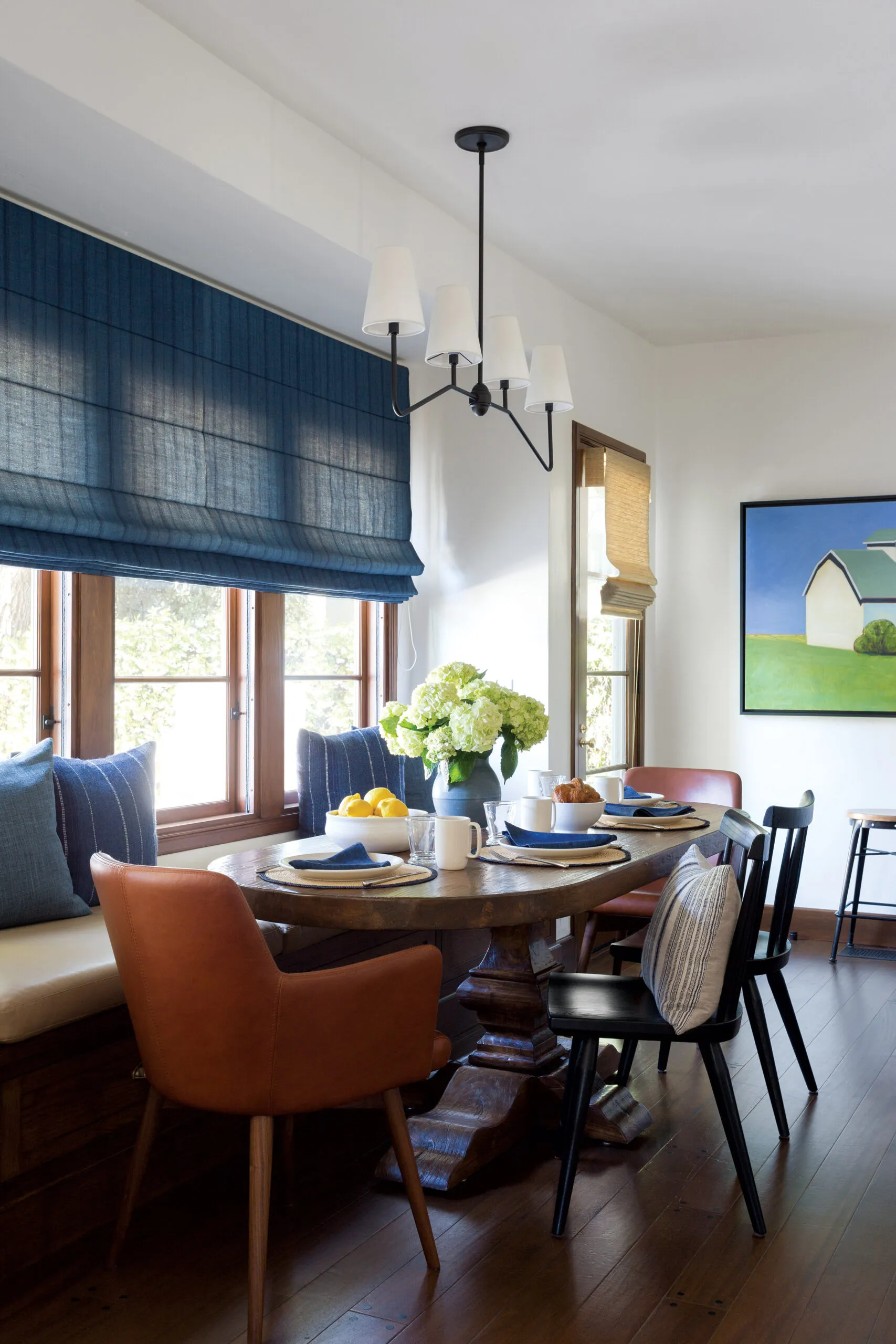
Although the existing kitchen still looked perfectly respectable, it wasn’t all that the Sachseswanted it to be. “The kitchen is not that big, relative to the house,” Kate says, “so I wanted it to be really functional.” Enter kitchen designer Laurie Haefele, who preserved the layout and peninsula but commissioned new cabinets from Sandro Chiavaro that incorporate swing-out shelves in the corners, as well as custom compartments for spices and knives. An auxiliary trash bin and cutlery drawer were placed outside the workspace, to prevent the kids from getting underfoot when Kate cooks, and a toekick vacuum makes it easy to sweep up crumbs.
Replacing an exterior wall of cabinets with a trio of windows signifi cantly brightened the space and opened up views of the backyard; an adjacent mudroom area with built-in cubbies gives the kids a place to unload when they come home. Tableware is concealed in a towering stained-wood cabinet that offers a break from the painted wood lining the room. “It really gives the kitchen a very warm, rustic, more historical feel,” says Stacy Chiavaro.
Throughout the house, the designer was careful to balance built-ins with freestanding furniture, so the decor doesn’t look too regimented. “It gives the rooms more personality,” says the designer, who achieved a high-end look by mixing furniture from a wide array of popular furnishings brands and adding extra character with designer fabrics, boutique accessories, artisan ceramics, and original artwork.
All the walls were opened up to accommodate upgrades to the plumbing, electrical, and HVAC, then insulated with batts. Since it would have been too costly to replicate the original plaster, drywall was skim coated and given a light “cat face” texture. “It’s actually a pretty good match,” says Kate. Since the old staircase railing didn’t meet code and alterations would have left holes in the treads, both were replaced. The new railings are a bit more toned down than the previous ones, which Stacy Chiavaro deemed “very 1980s.”
As is often the case, the renovations proved much more extensive than the Sachses originally anticipated, lasting a year and a half. “Once the work started and the roof came off, Steve and I were like, “‘Well, there’s no going back now!’”Kate recalls with a laugh. Fortunately, she adds, “we had an outstanding team that we felt really confident in. We all had the same vision and passion to make this house awesome, and to keep a lot of the fabulous original characteristics. And we did.”
Floor Plans
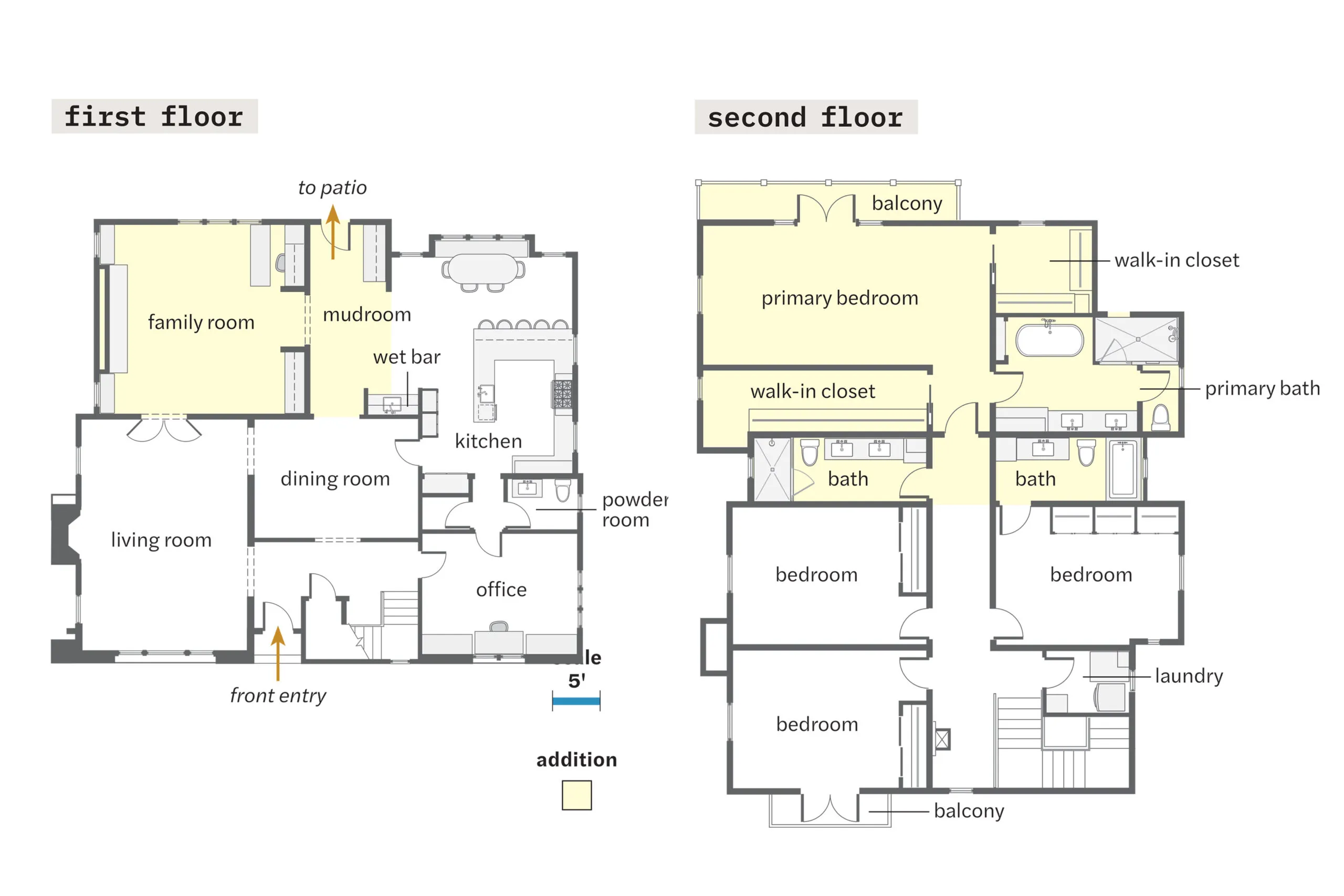
The original 1929 house held 2,967 square feet of living space, with two bedrooms and two baths upstairs and a guest room and full bath on the main floor. Adding a two-story, 1,333-square-foot rear addition supplied a family room and mudroom area downstairs and a primary suite with two walk-in closets and two new baths upstairs. The old first-floor guest room became an office; the existing second-floor space was reconfigured as three bedrooms and a laundry room.
Renovation Recap
- THE HOMEOWNERS: Steve and Kate Sachs, parents to twin sons Ryan and Jake, 13, and daughter Sloane, 7.
- THE HOUSE: A 1929 Spanish Revival outside Los Angeles. Its 2,967-square-foot floor plan didn’t really support family living, with just two bedrooms upstairs, three small bathrooms, and no informal living spaces. Piecemeal renovations left the interior looking ragtag and out of sync with the home’s architectural style.
- WHY THEY CHOSE IT: Location, location, location. The Sachses loved the neighborhood, as well as the home’s period charm. With enough work, they figured they could overcome its problematic floor plan.
- WHAT THEY DID: Updated all the systems and built a 1,333-square-foot addition with a family room and mudroom area on the main floor and a primary suite and two new baths above. They divided the old primary bedroom to carve out two additional kids’ bedrooms and added a laundry room where an existing bath had been. On the main level, openings between rooms were enlarged to create better flow.
- BIGGEST CHALLENGE: Squeezing everything they wanted into the second floor under a tiled roofline that knitted together old and new.
- LESSON LEARNED: Decide early where to spend and where to save. “We invested in things we felt would give back to the house,” says Kate, like the roll-down window screens, pegged mahogany flooring, and barrel roof tile key to preserving the house’s character. “They’re small things, but they add up,” she says. “You start messing with that stuff, and before you know it, it looks nothing like the original house.”
