We’ve all been taught that it’s what’s on the inside that counts; but when it comes to your home, the outside is certainly just as important. A drab exterior can make you cringe every time you approach the front door, while a handsome, thoughtfully designed one can turn the experience into a true pleasure.
The good news is that you don’t have to spend a bundle to enjoy a happy trip up your walkway. Budget-friendly shortcuts, such as reusing old hardware or choosing high-quality replicas of expensive materials—plus some good old sweat equity—can lead to major transformations. They can even put big projects, like adding on a new porch, within reach.
Here are some great examples on how to make an old house look modern on the outside.
Curb Appeal Ideas
A Charmer Revealed: Before
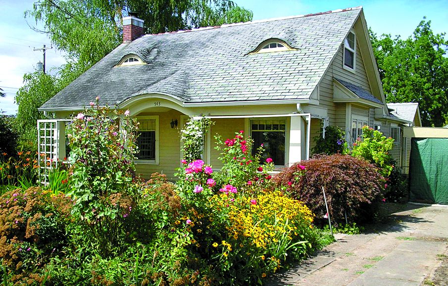
An overgrown yard detracted from the sweet architecture of this 1938 cottage in Carlton, Oregon. By clearing the space, homeowners Darci and Matt Haney brought the focus back to the front door—and all the other improvements they made.
Money-Saver: “Cleaning up your yard—mowing the lawn, trimming bushes, sweeping the steps—hugely boost curb appeal and doesn’t cost a thing.” —Jill Simmons, Zillow
A Charmer Revealed: After
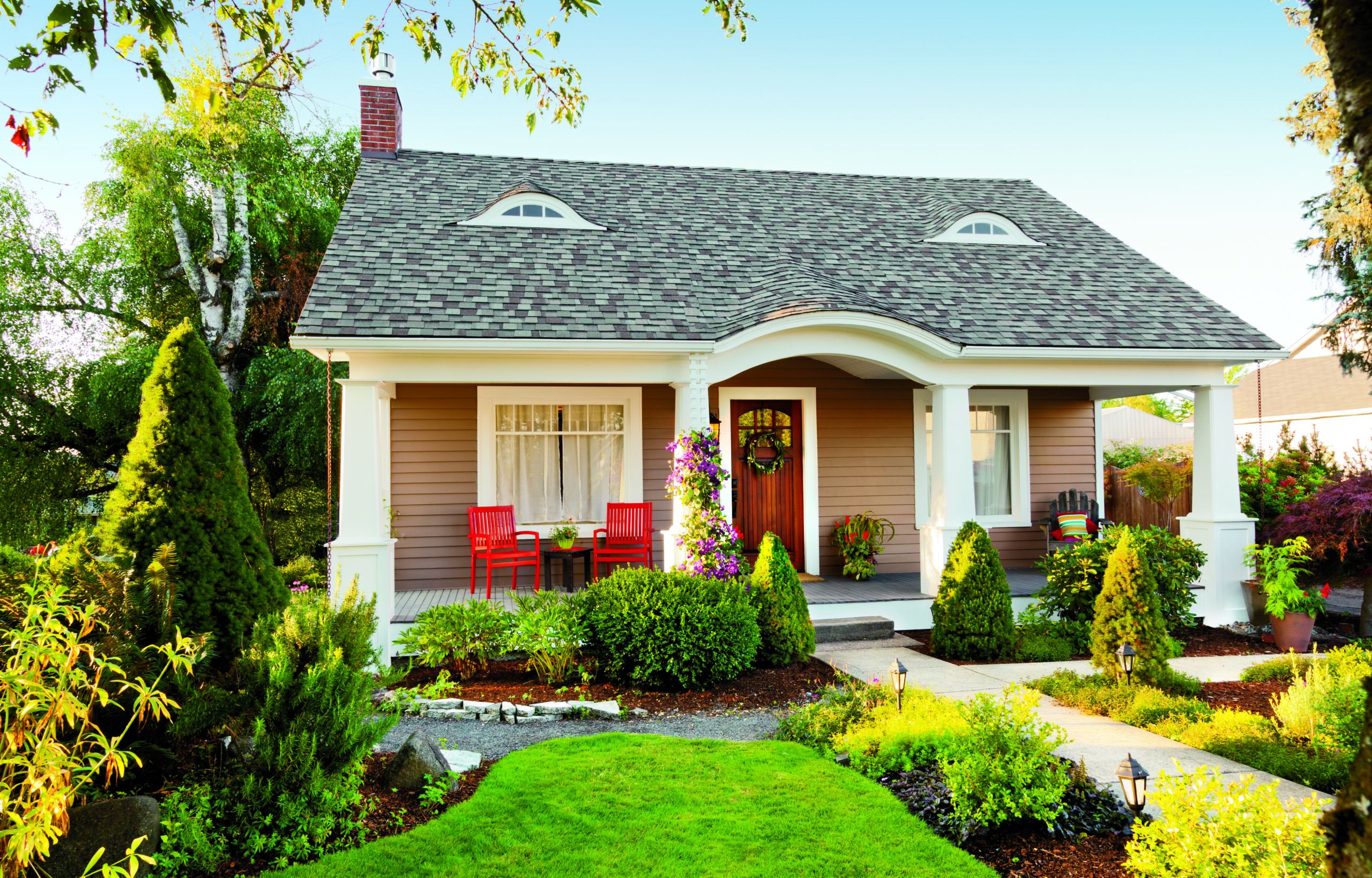
Landscaping: Darci and Matt saved all their mature trees but swapped everything else in favor of tidy boxwoods mixed with rose and hydrangea bushes for a lush look that doesn’t overwhelm the walkway. Landscape lighting and a new gravel path make it easy to get around, even at night.
Entry: Beefy posts, accented with molding and clad in PVC for durability, give the porch more presence than the house’s flimsy, rotting originals. Their crisp white columns stand out against the mocha-hued siding, while a solid-fir door lets in light without compromising privacy.
Windows: Energy-efficient models take the place of almost all the originals, except for the two front windows, which the homeowners kept for their handsome divided-light design. New glass and frames freshen up the eyebrow dormers and help protect against drafts.
Shown: Bright red patio chairs add an easy-to-change pop of color for as little as $20 each.
Redefined Queen Anne: Before
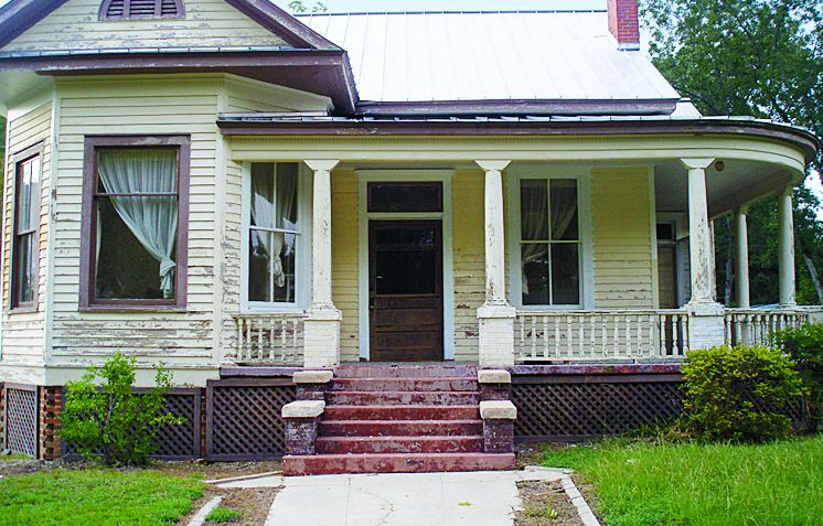
This 1904 Queen Anne in Prattville, Alabama, had been in Andrew Sanders’s family for about 30 years, and by the time he moved in, it was showing its age. Luckily, the house needed minimal structural work, so he focused on the cosmetic, including updating the paint and landscaping.
Money-Saver: “Can’t afford fancy landscaping? A few container plants placed by the front door or hung from your porch’s ceiling will give your home a friendly, finished look.” —Rick Tourgee, real estate agent, Provincetown, Mass.
Redefined Queen Anne: After

Paint: Warm gray trimmed in soft white lends the facade timeless appeal. Forest green subtly draws attention to some of the home’s architectural details, including the front gable and lattice porch skirt. The porch ceiling is painted pale blue in traditional Southern style.
Entry: To tie the front steps in with the rest of the house, Andrew coated the original brick with gray concrete. Under the porch, he knocked out old brick and put in new lattice to provide ventilation.
Door: Andrew loved the old oak door even though it was falling off its hinges. To copy it would have cost $4,000, so he restored the original on his own, stripping the wood, then rebuilding it piece by piece.
Windows: Previously painted shut, the single-pane windows sport repaired sash weights and new storms.
Landscaping: A fresh layer of sod and a narrower walkway mean more green grass and less crumbling concrete.
Shown: Instead of paying for custom lattice, cut panels to fit from off-the-shelf sheets.
Lakeside Inspiration: Before
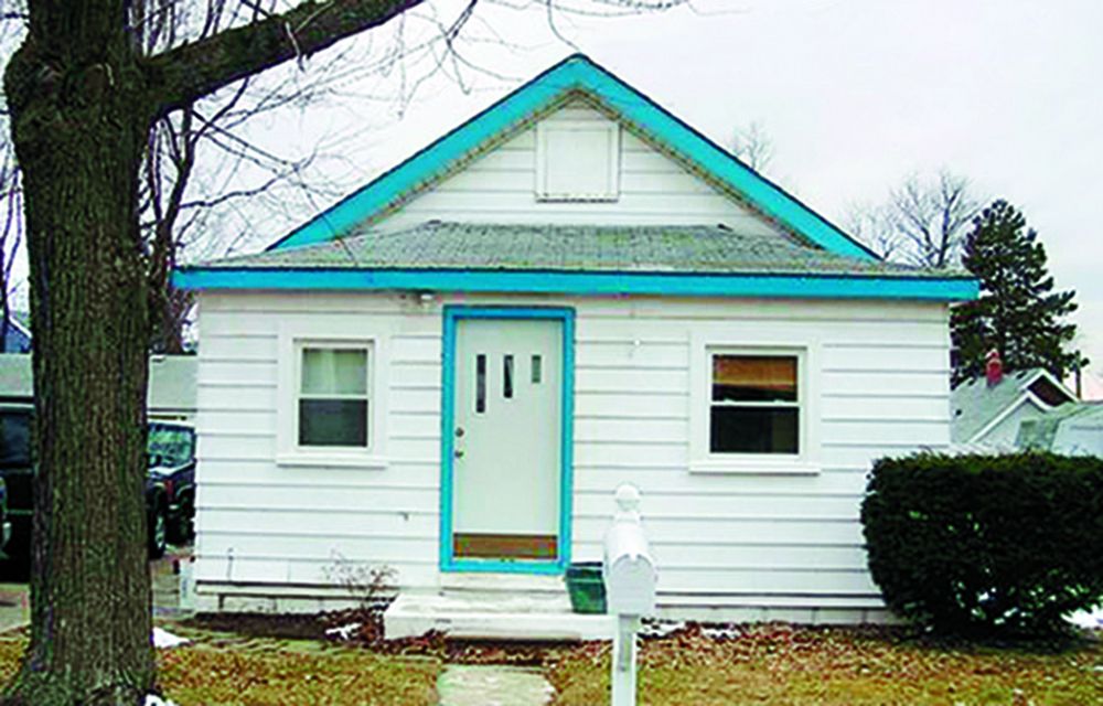
When Jim and Sandy Barrett moved into their 1930s cottage, in Keego Harbor, Michigan, “it was the street’s ugly duckling,” Sandy says. The sparse facade and dingy siding looked forbidding but offered the perfect blank slate for making a cheerful statement that suits their lakeside locale.
Lakeside Inspiration: After
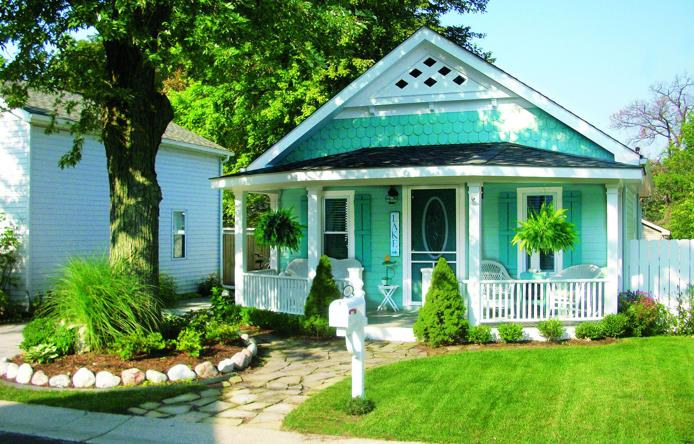
Entry: By bringing the gable roofline forward about 10 feet (flush with the existing facade) and adding a porch, they softened the division between the house and the street. Simple porch posts and railings that angle toward the walkway help give the space dimension.
Paint: A beachy combination of vibrant turquoise, aqua, and white invigorates the front and evokes the area’s history as a resort town.
Landscaping: Once a flat expanse of dying grass, the yard now features perennial beds and small shrubs, and is anchored by a walkway constructed from pavers that they got for free from a friend.
Siding: Jim and Sandy splurged on fiber cement to replace the bent aluminum. They added character by installing fish-scale shingles above the porch and wood painted to resemble lattice at the roof’s peak.
Windows: Previously located on the side of the house, these windows let in more sun than the small, improperly aligned originals. The DIY shutters are hung on hooks so that they can be removed for painting.
Shown: Nailed-together board-and-batten shutters cost only a few bucks each to make.
Highlighted Craftsman Details: Before
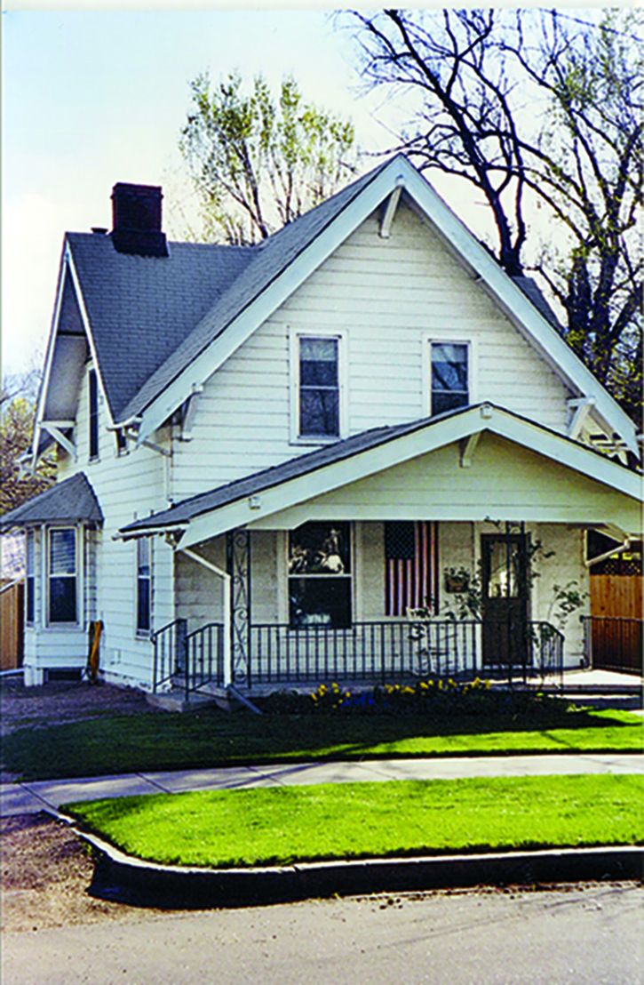
Eleven years ago, when Aaron Stern bought this early-1900s home in Colorado Springs, Colorado, it boasted tons of traditional Craftsman features—not that you’d ever notice, thanks to the monotone paint scheme. His task: Enliven the exterior with period-appropriate colors.
Shown: This house’s old aluminum siding earned the owner $250 at a recycling center.
Highlighted Craftsman Details: After
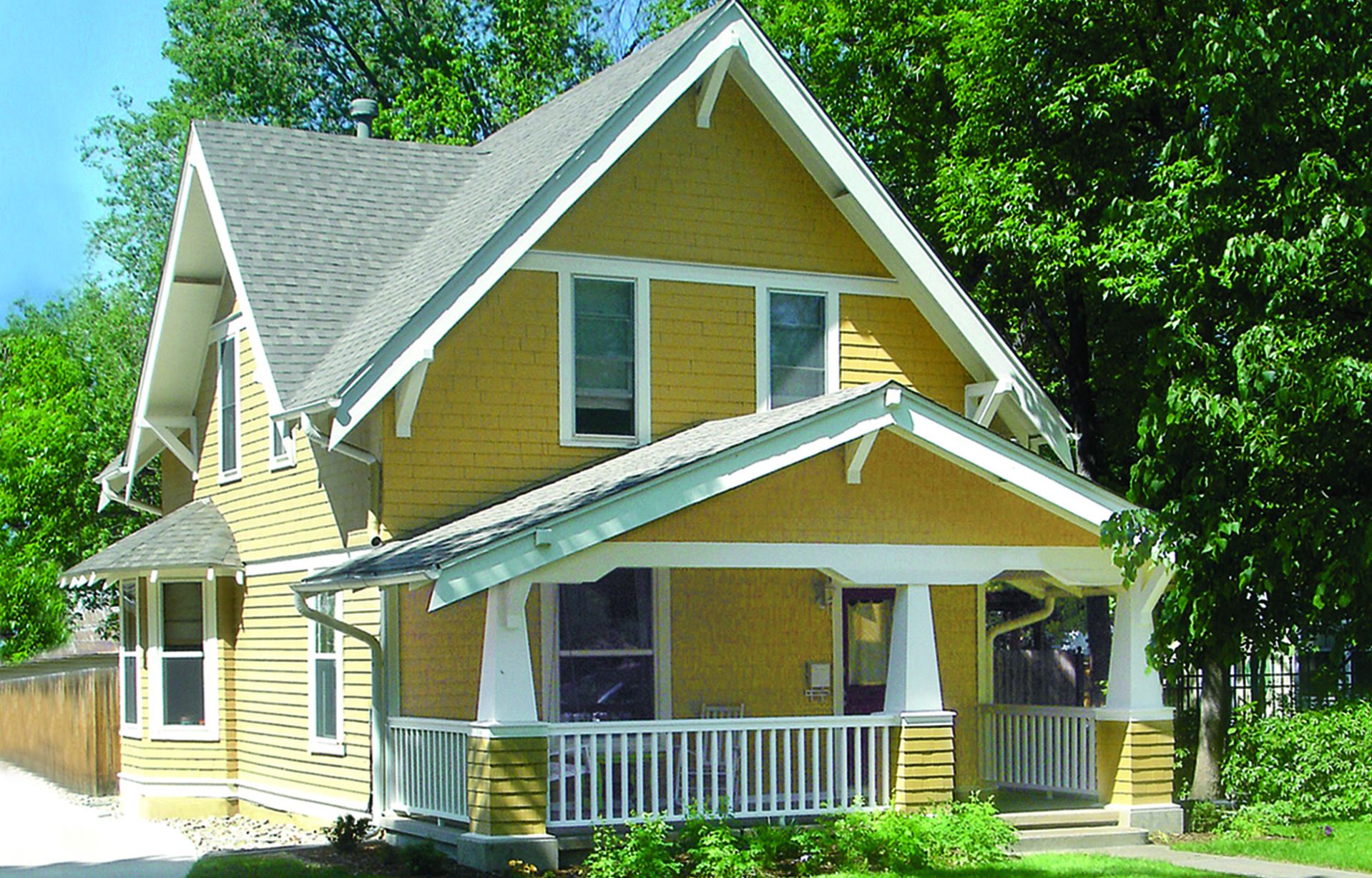
Paint: After checking out other Craftsman houses in the area, Aaron settled on a muted mustard hue—”it was different from my neighbors, but not too different”—accented by white trim and a barn-red door.
Siding: In addition to finding wood clapboards and shingles under the beat-up aluminum, Aaron discovered remnants of Craftsman-style trim work above the windows and porch. He designed replacements, then filled in any missing siding with redwood.
Porch: Chunky, tapered columns and painted railings fit much better stylistically than the old iron.
Embraced Open Space: Before
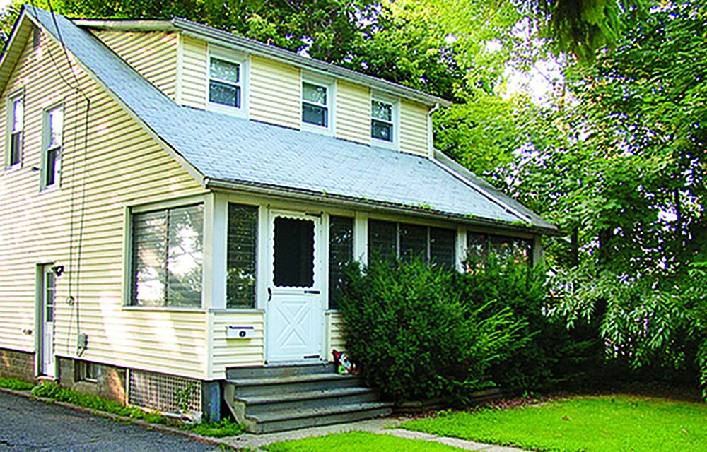
“It was like a woman in need of a makeover,” says Chrissy Doremus of the Denville, New Jersey, home that had been in her husband’s family since the 1940s. An awkward enclosed porch and out-of-control juniper bushes boxed off the house from the yard; now the transition is more fluid.
Embraced Open Space: After
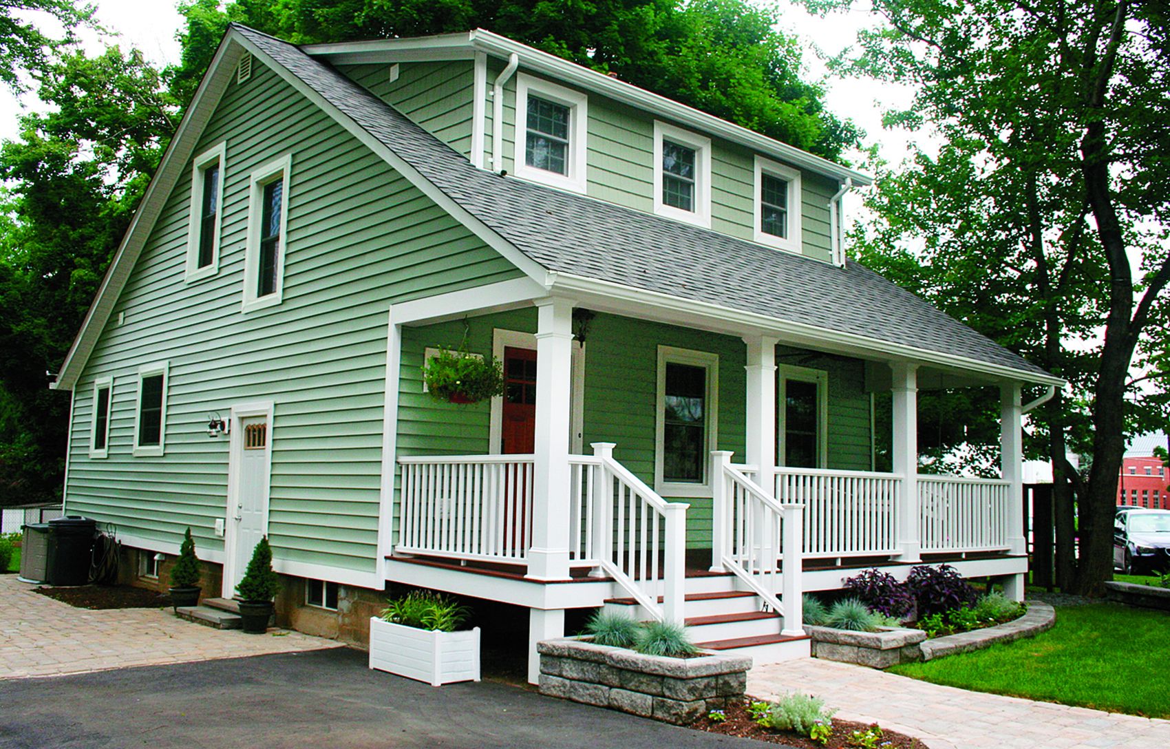
Entry: New composite railings define the airy porch, which the owners opened up and rebuilt on the original footings. The columns are 66s wrapped and trimmed in PVC, and the floors are meranti, a wallet-friendly mahogany look-alike. A Craftsman-style fir door adds more warmth than the boring builder-grade white one.
Landscaping: A curving walk made from tumbled concrete pavers meanders past beds of succulents and other drought-tolerant plants. Their silvery hues complement the house’s now sage-green siding.
Shown: Use stones and concrete blocks left over from other projects to frame foundation plantings.
The Past, Revisited: Before
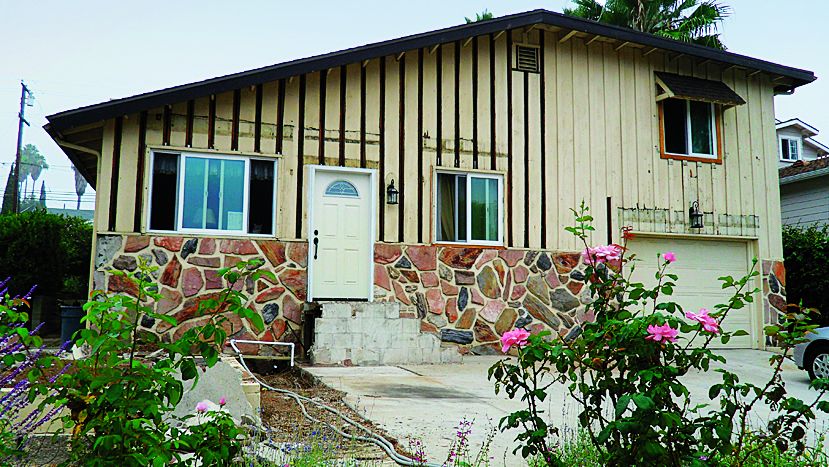
Numerous renovations throughout the 1960s and 1970s had left Taryn and Luke Serna’s 1940s home, in La Mesa, California, stuck in an unstylish past. “It was originally a Craftsman, but it really just looked like a hodgepodge,” says Taryn. By making a few clever Craftsman-inspired upgrades, the owners brought the house into the 21st century.
Money-Saver: “If you’re tired of spending loads of money on your lawn, replace the grass with ground covers. They need little attention but still add greenery and color.” —Jill Simmons, Zillow
The Past, Revisited: After
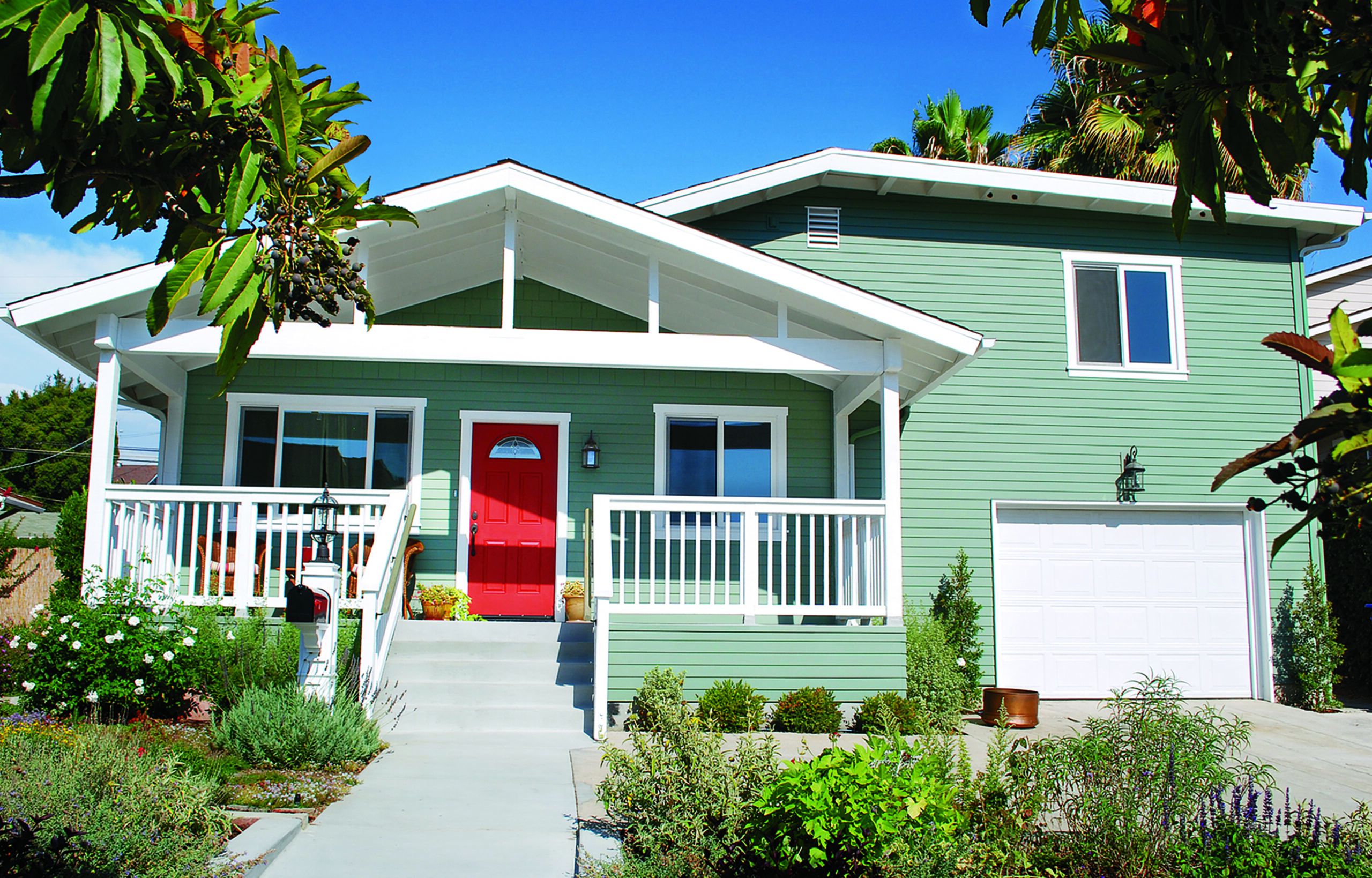
Entry: The homeowners’ first goal was to find a way to distract from the asymmetrical roofline. “It was lopsided and odd—and the first thing your eye went to,” says Taryn. To avoid a major renovation, they added a gable-roofed porch, which masks the main roof’s harsh angle. White rails and trim, plus new house numbers, a post-mounted mailbox, and a red door, ensure that the porch stays center stage.
Paint: A green-gray hue provides a neutral, just-dark-enough backdrop for the house’s vibrant door and textural native plantings.
Siding: Taryn and Luke replaced the dingy board-and-batten out front with new fiber-cement clapboards. To save money, they left the rest of the house faced in stucco, which they refreshed.
Landscaping: Off the main walk, a side path made with flagstone pulled from the original house takes visitors on a scenic stroll past flower beds. Nearly all the plants are drought resistant to keep water usage low.
Added Dimension: Before
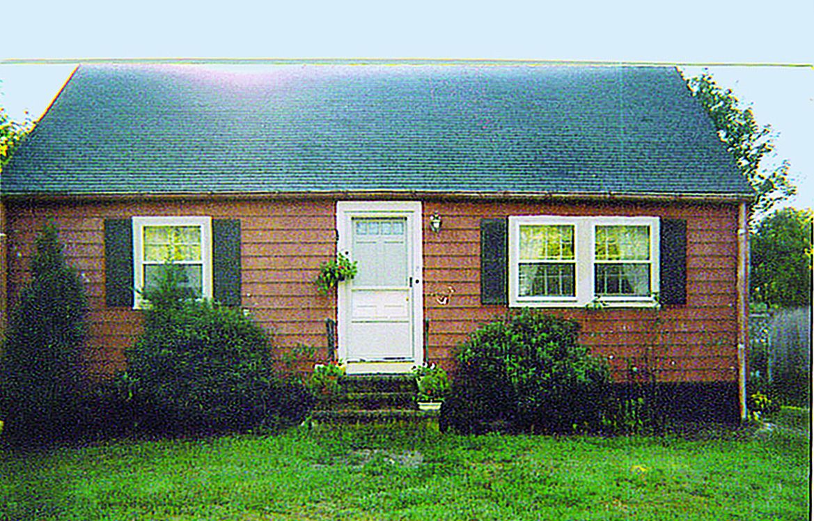
Years of neglect had left this 1940s Cape Cod in Rockport, Massachusetts, looking battered and bare. It took a sizable addition—plus fresh landscaping—for owners John Frisone and Mark Jurewicz to give it new life.
Money-Saver: “Update your house quickly and cheaply by changing the light fixtures. Home centers always have outdoor sconces on sale for as little as $20 or $30 each.” —Rita Wolff, real estate agent, Newberg, Oreg.
Added Dimension: After
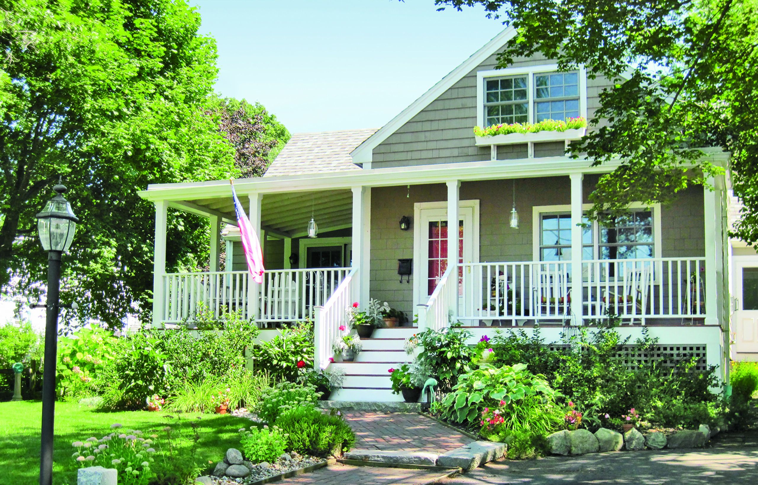
Entry: A huge porch, which is attached to a two-story addition that bumps out from the front of the house, added 300 square feet of outdoor living space. It also lends the home a cozy, farmhouse vibe, thanks to dark mahogany floors, vintage-style lights, slender rails and columns, and a fire-engine-red door.
Roof: Textured architectural shingles take the place of the disintegrating composite roofing material.
Siding: “Half the shingles were one shade of red and half were another,” says John, so he and Mark replaced them with new ones, painted taupe.
Windows: Generously sized energy-efficient windows share the same six-over-six design of the originals but are airtight. The old window on the house’s left side was enlarged to accommodate two French doors.
Landscaping: To brighten up the lackluster lawn, the owners grouped leafy clusters of hydrangea, holly, and rhododendron around the porch and brick walk, which John edged with granite left over from the porch footings. Window boxes hung from the second story and planted with annuals connect the addition with the lush yard below.
Shown: An antiqued-brass mailbox adds instant charm for around $40.
A Friendly Facade: Before
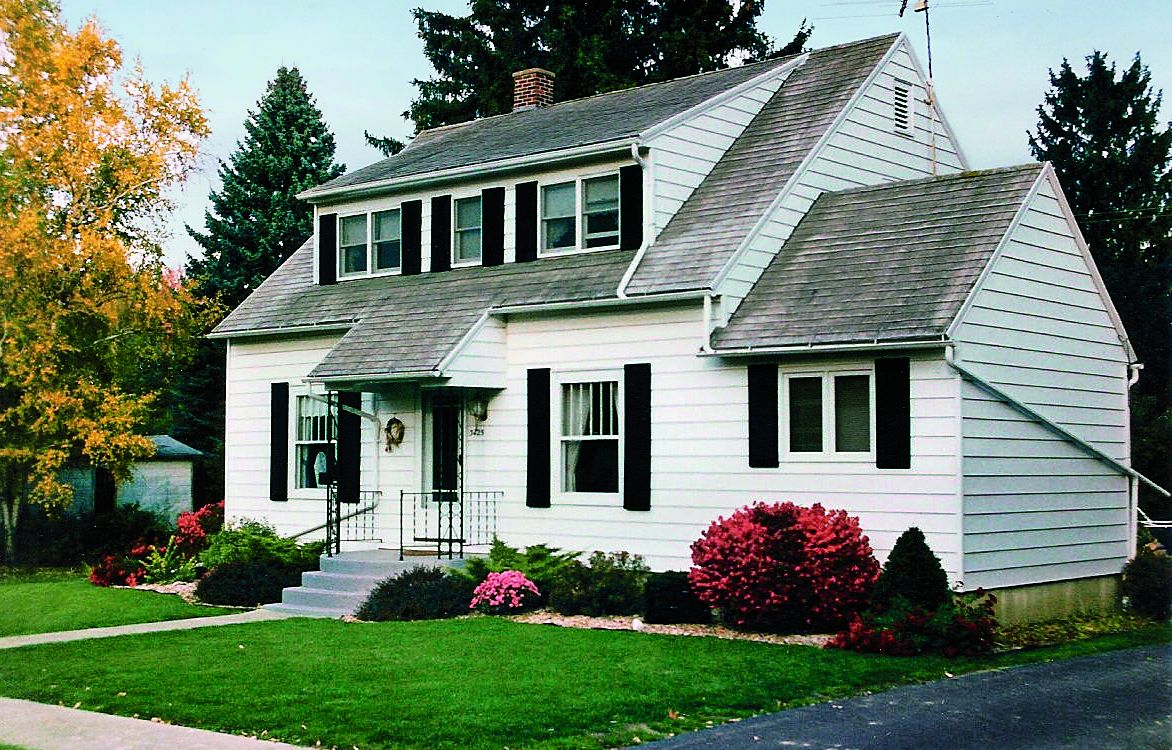
Sharon and Louis Wenzlaff share a lot of history with their Colonial Revival, in Kingston, Michigan. Louis’s family built the house in 1936, and the couple has been living there for nearly 30 years. But the home’s stark black-and-white color scheme and relatively flat facade eventually inspired them to design something friendlier.
A Friendly Facade: After
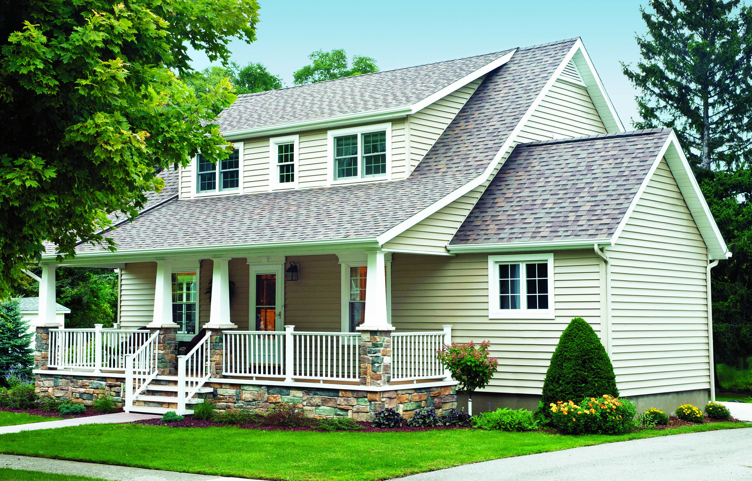
Porch: To make the entry more welcoming, the owners expanded the porch to cover nearly the whole front of the house. Intent on keeping it as maintenance-free as possible, they used composite decking for the floors and PVC wainscot on the ceilings. The railings, which sit on handsome stone-veneer skirting, are also made of PVC.
Siding: The old, weathered wood clapboards, which required annual paint touch-ups, were replaced with easy-to-care-for vinyl in an earthy sandstone color.
Roof: An extended roofline makes the porch feel like a natural addition to the home. New, impact-resistant asphalt shingles top off the structure.
Windows: For a more eye-catching look, the homeowners had all the existing windows, which are vinyl-clad wood, cased in white PVC trim.
Shown: By offering shade, deciduous trees can reduce cooling costs by up to 35 percent.