Favorite Projects
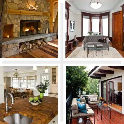
This month, TOH TV host Kevin O’Connor releases his new book, The Best Homes from This Old House. In it he shares photographs taken over nearly a decade, celebrating his favorite TV project houses. None of these photographs has been published before; TOH is delighted to give you special preview of what you’ll find in this beautiful volume.
The images are as much about the houses as the craftsmanship that went into them. As Kevin says in the book’s introduction, “The pictures and stories that follow are a small contribution to a much larger effort: work done by real people who labor for long days over many months. Gathering their work in a single volume is a fitting way to celebrate their efforts.”
The Best Homes from This Old House is now available wherever books are sold. Take a peek inside the book, or order the book online through Amazon.
Auburndale by the River
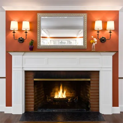
At the Auburndale project, a Colonial Revival on the banks of Boston’s Charles River, bright colors and crisp woodwork replaced dark paneling.
Auburndale: Welcome
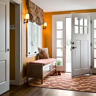
New wood floors, a door flanked by windows, sconces, and a coatroom make the entryway warm and welcoming for the first time in seventy years.
Auburndale: Furniture in the Kitchen

The kitchen island’s freestanding legs make it feel like a piece of furniture; its bold green color is complemented by the subtle strip of tile in the white backsplash.
Carlisle: Greek Revival With Attached Barn
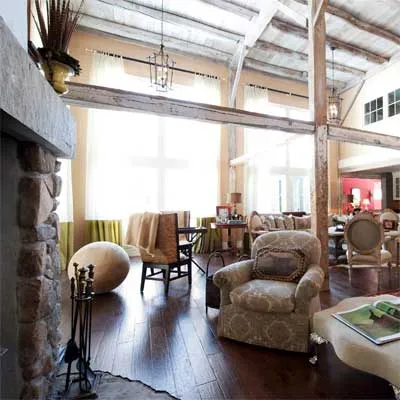
The converted barn at the Carlisle project boasts two-story, floor-to-ceiling windows and exposed beams.
Carlisle: Cozy Master Bath
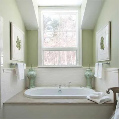
An addition off the back of the house made room for a new first-floor master suite. In the bathroom, the soft green paint plays off the stone tub surround; the raised window provides privacy and lots of light that casts shadows on the irregular handmade tiles wrapping around the bathing area.
Carlisle: More Windows
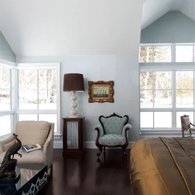
In the bedroom, asymmetrical roof lines and corner windows distinguish this space from the original Greek Revival house. Twelve-inch-square, luminescent paper tiles cover the walls.
Roxbury: Second Empire Reborn
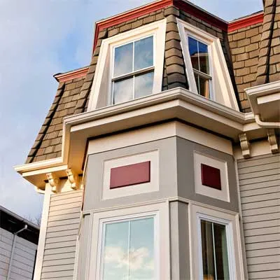
At the Roxbury House, a Second Empire, we used bright colors and details like the corbels under the mansard roof to return some Victorian flourish to the exterior. New clapboard and shingles are a vast improvement over the many layers we stripped off the house.
Roxbury: Grand and Formal
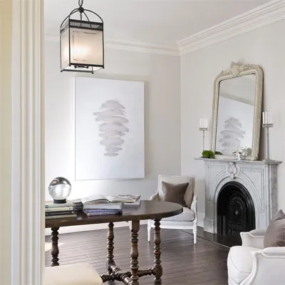
The front of the house is formal, with dark wood floors and large moulding reminiscent of the home’s original features. Eleven-foot-high ceilings show off the grandeur of the structure.
Roxbury: Bay-Windowed Bedroom
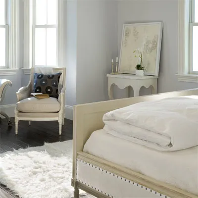
The restored window bay became a favorite seating area in the new master bedroom. Only this unit in the two-family house had a bay, making it the new homeowner’s first choice.
New York Brownstone
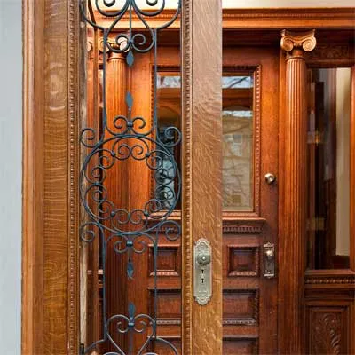
Traditionally, brownstones like the one we renovated in Brooklyn, New York, had two sets of entry doors. On warmer days the outer set might be left open, inviting neighbors to drop in. Our outer doors have a hinged glass panel behind the ornamental ironwork that let in breezes—but not unexpected guests.
New York City: Parlor Floor
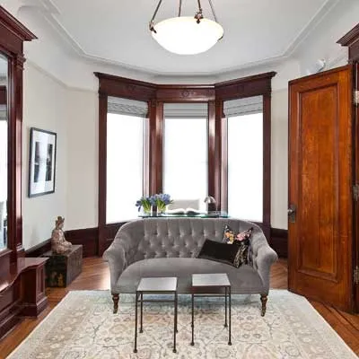
Details abound in the new front parlor. The sweeping cove between wall and ceiling is punctuated by the ornate woodwork above the windows. The mirrorreflects the oak doors leading from the foyer and makes the narrow room feel spacious.
New York City: Going Up
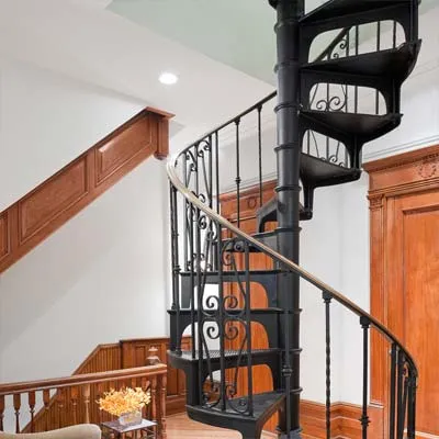
The homeowners purchased this metal spiral staircase online and made it the focal point in the first-floor sitting area. It allows the family to move between their two floors without using the public stairway.
Weston Timber Frame
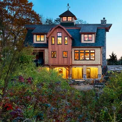
The Weston house was actually a new house, built in an old style—timber frame—with new prefabrication technology that allowed the house to be created in a controlled factory environment and assembled on site.
Weston: Home Is Where the Hearth Is
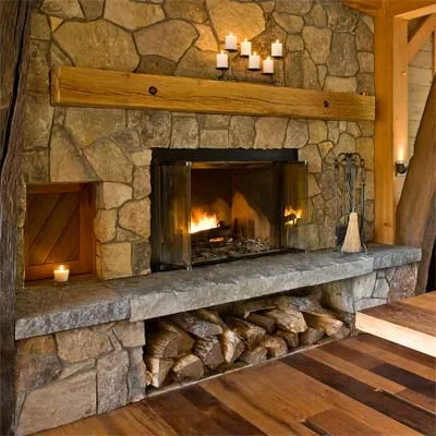
The fireplace, with its raised hearth, takes center stage in the dining room and can be enjoyed from the whole first floor. A small door to the left opens to the outdoors, making it easy to restock the woodpile.
Weston: Industrial Meets Rustic
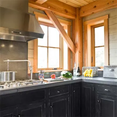
The kitchen is a collection of materials: wooden beams and paneling, stainless steel fixtures, concrete countertops, and painted cabinets.
Newton Centre Dutch Colonial Revival
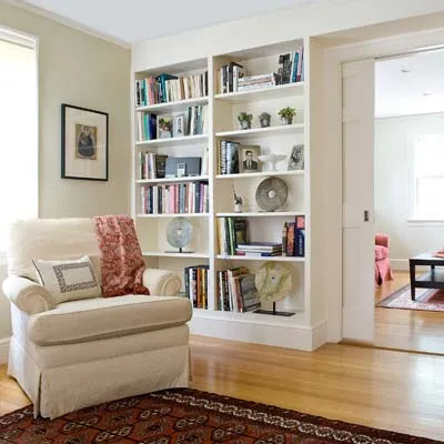
The Newton Centre house was a more modest project for TOH, centered around an addition that included a new family room, seen here through the renovated living room, and an upstairs office and library.
Newton Centre: Expanded Kitchen
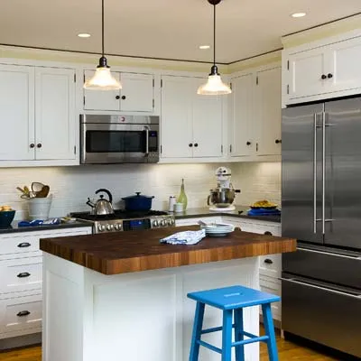
The homeowners fretted endlessly over the position of the kitchen island—no doubt a result of living in tight quarters for years—to make sure there was proper clearance for the refrigerator and oven doors.
Newton Centre: Dreaming of Books
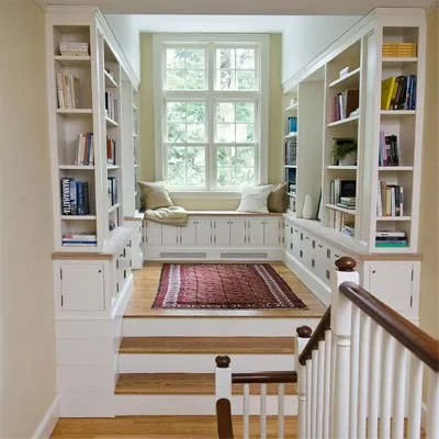
The homeowners got their dream library. The stairway landing was pushed back into the addition; a new office is tucked out of sight beyond this comfortable sitting area.
West Newton Shingle-Style
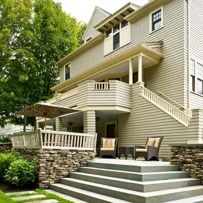
The West Newton house, a Shingle-style, was one of our grander projects. The back yard went from a steeply sloping hill to a stepped series of patios more appropriate for the homeowners’ two young boys.
West Newton: Open Kitchen
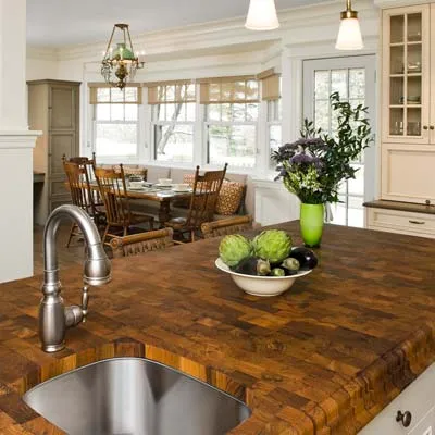
The kitchen, no longer a warren of small spaces, connects to the rest of the house and is opened to the backyard for the first time. The door to the right of the kitchen table leads to a new covered porch and a spacious patio.
West Newton: Old-Fashioned Bath
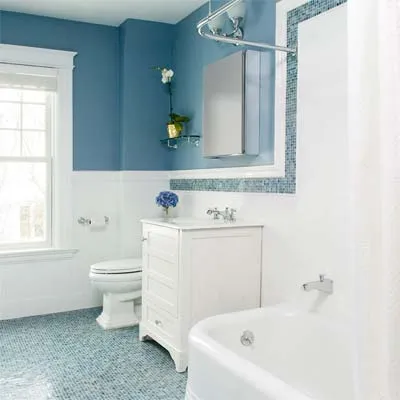
Despite the modern upgrades, this bathroom has a scale and details that give it a vintage feel. Note the faucet coming out of the wall just above the tub.
West Newton: Grand Staircase
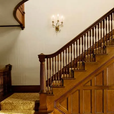
The large, sweeping staircase that fills an oversized entry hall is a distinctive feature of Shingle-style houses. Walking through the front door and past the stained and leaded glass leaves no doubt about the style of home you’ve entered.
Austin Green Renovation
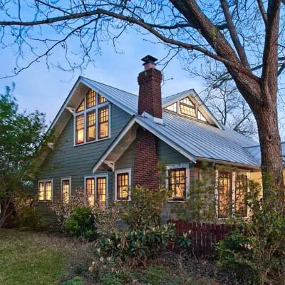
A reflective metal roof with lots of insulation beneath it is the best way to keep a Texas house like the Austin project cool in the summer. Thanks to this roof (and its insulation), the home’s electric bill, including air conditioning, averages a mere $25 a month, one of the reasons the home earned a 5-star rating from the city’s green building program.
Austin: Propped Back Up
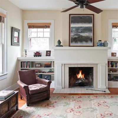
Over the years the home had settled several inches; this chimney was the low point. The builder used screw jacks under the house to re-level the floor, leaving a few behind so the homeowners could make adjustments as needed in the future.
Austin: Colorful Kitchen
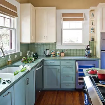
The homeowners asked for nine different colors in the kitchen and chose a green-glass backsplash to complement the recycled glass countertops.
Austin: Screened Porch

Screens block nearly half of the airflow through an opening, so a screen porch built around double French doors is a good way to get cool breezes into the house on a hot summer day.
Los Angeles: Outdoor Living
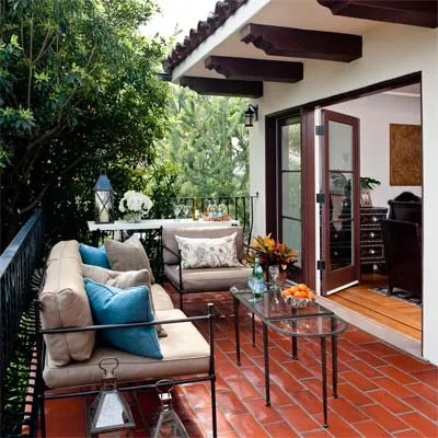
The Los Angeles house homeowner and his father had built a small deck off the dining room of the Spanish Colonial Revival. We replaced it with this courtyard, which is also accessible from a new guest bedroom on the first floor.
Los Angeles: Bedroom With Details
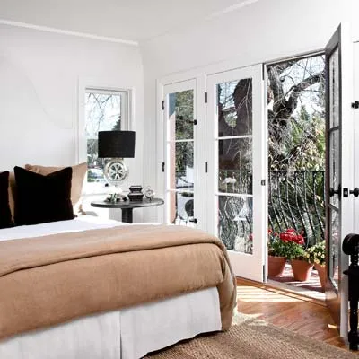
The new master bedroom is smaller than the one the homeowners gave up but much improved, with two French doors leading to the balcony. The bedroom shares the same plaster cove-and-tray ceiling detail found throughout the first floor.
Los Angeles: Plaster-Wrapped Details
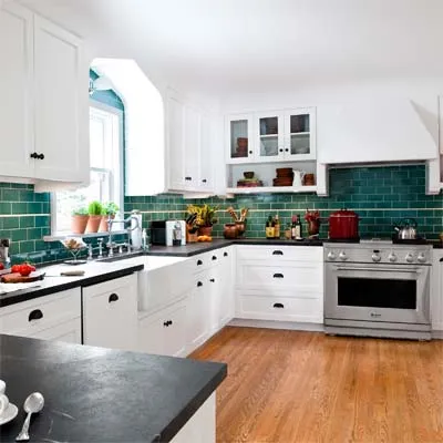
The kitchen is now three times its original size, which may be the homeowners’ favorite feature. But my favorite is the plaster cove that wraps into the upper cabinets and makes them feel integrated with the wall. Even the stainless-steel range hood was plastered over, and small corbels under the cabinets give the entire room an Old World, Spanish feel.
Cambridge: Elegant Modern
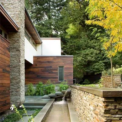
The waterfall that greets visitors to the Cambridge house, a modern house built in 1950, appears to spring magically from the stone wall, and the bluestone steps are set on a hidden stringer, giving the illusion that they support themselves. The water flows the length of the house before starting the trip all over again.
Cambridge: Views of Nature
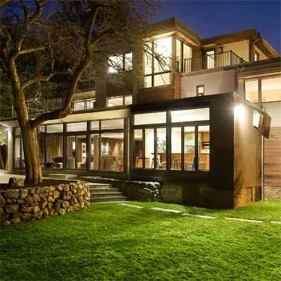
We kept the glass across the back of the house and added more. A two-story staircase has a glass wall looking out over the apple tree; a guest bedroom has a wall of glass, too, as does the new third-floor study, which the homeowner likens to working in a tree house.
Cambridge: Modern Layout on the Move
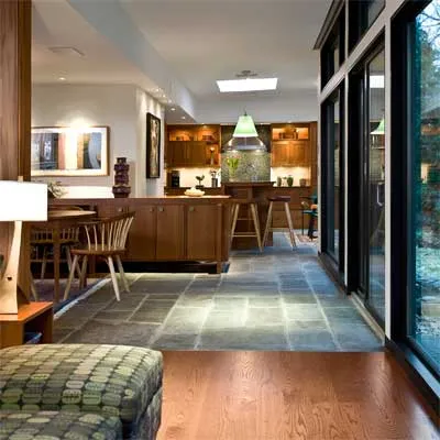
We used different materials and ceiling heights to temper the wide-open floor plan of the living room and kitchen. Notice how slate adjoins wood on the floor and how the ceiling is high near the wall of glass but drops down in the living room and at the kitchen soffits.
